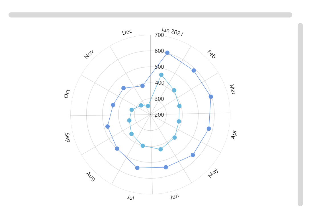
Radial Line Graph
Radial line graph (also known as Polar line chart) is useful for displaying cyclical data of several series in a circular form.
Key implementation details
We create a DateAxis as our X (circular) axis. AxisRendererCircular handles its rendering. ValueAxis is rendered by AxisRendererRadial. Then we create RadarLineSeries for our line graphs and set valueXField to date and valueYField to the respective value fields from the dataset. Finally, we add both horizontal and vertical scrollbars and they handle zooming automatically without us having to do any extra work.
Related tutorials
Build this chart with AI
The prompt below can be used to build this chart with AI. For best coding results, use the most advanced AI models, like Claude Opus 4.6 and GPT-5.3-Codex. For more info and tips, check out amCharts AI docs.
Create a radial line graph (polar line chart) displaying cyclical data with two line series. Generate 12 monthly data points with a date axis on the circular dimension and a value axis on the radial dimension, both with tooltip support. Plot two series with values fluctuating between roughly 400-700, each rendered as a line with bullet point markers at each data value. Add both horizontal and vertical scrollbars for navigation. Enable mouse-wheel zoom on both axes, with the cursor set to zoom on the circular dimension. Show tooltips displaying the value on hover. Animate series and chart appearance on load. Use amCharts 5 library.
Demo source