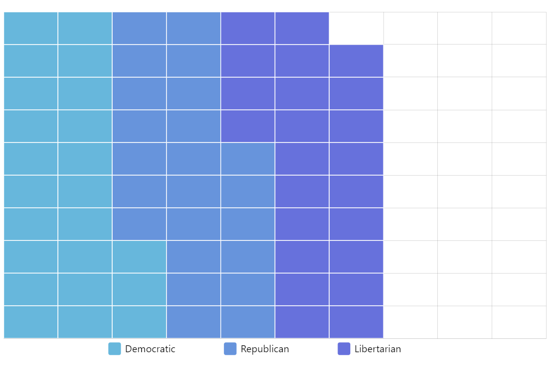
Waffle Chart
Waffle Chart is an alternative to pie chart for displaying data in relation to the whole.
Key implementation details
To implement a Waffle chart with amCharts we use our trusty XY Chart. The trick here is that we use a Category axis for both X and Y axes. This way we can crate a grid with no values in-between grid lines.
Then we set openCategoryXField and openCategoryYField in addition to the regular category fields on the column series to specify the starting positions of the values.
Related tutorials
Demo source