Chart With Gaps In Data
Breaking the line
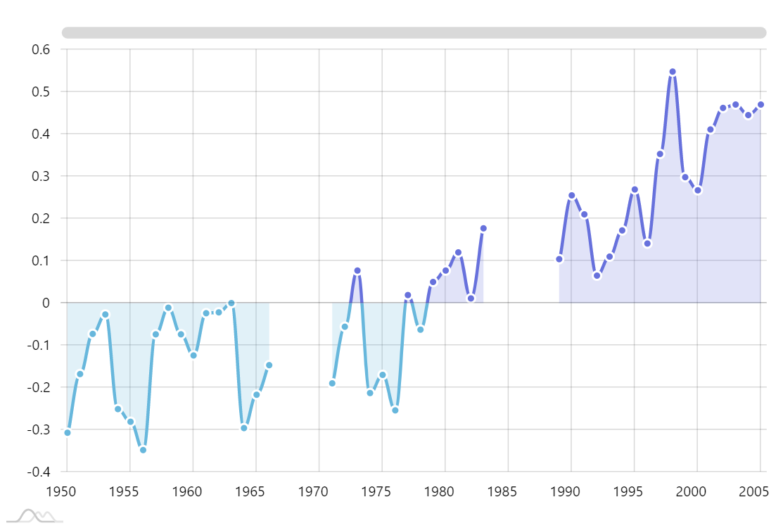
If your data contains gaps – data points without values – you can easily make the chart display a gap as well. Just set its connect = false setting.
More about line series with gaps
Defining value ranges
You can apply different colors and other visual properties to the segments of series that fall within certain range of values. For that you can use “axis ranges”.
Demo source