We use XY chart to plot any kind of serial 2/3-dimensional data, including line, area, column, bar, candlestick, ohlc, stepline, even heatmaps. Basically, any data, that requires 2 dimensions can be depicted using XY chart. This tutorial will guide you through the fundamentals.
Creating an XY chart
Before we can do anything, we need to create a chart object, which in this case an instance of an XYChart class.
An XY chart, at the very least needs the following things:
- Chart instance;
- Data;
- At least two axes - vertical and horizontal;
- At least one series.
This tutorial will walk through all of these.
Importing modules/scripts
Needless to say, before you can use modules/objects, you need to make sure all required modules (in TypeScript), or files (in JavaScript) are imported. Please refer to our Getting started articles for more details:
For a XY chart, we'll need to import core (main module) and charts modules.
import * as am4core from "@amcharts/amcharts4/core";
import * as am4charts from "@amcharts/amcharts4/charts";
<script src="//cdn.amcharts.com/lib/4/core.js"></script>
<script src="//cdn.amcharts.com/lib/4/charts.js"></script>
We'll be importing and referring these as am4core and am4charts in the course of this article, and overally in our demos and tutorials.
Creating chart instance
For that we're going to be using am4core.create() function. (or am4core.createFromConfig() if you are using JSON-based config approach)
let chart = am4core.create("chartdiv", am4charts.XYChart);
var chart = am4core.create("chartdiv", am4charts.XYChart);
var chart = am4core.createFromConfig({
  // ... chart config
}, "chartdiv", am4charts.XYChart);
NOTE There's a special comment on JSON-based setup down this article. Read on.
Data
Just like for most chart types, the data for a XY chart is an array of objects. Each of those objects will represent a data item and must have at least two values because XY chart plots data in two dimensions.
XY chart supports any kind of dimensional data. It can be string-based categories, numeric values, dates, etc. You can mix and match any of those.
In-line data
We assign the data to the data to chart's data property:
chart.data = [{
  "country": "Lithuania",
  "litres": 501
}, {
  "country": "Czechia",
  "litres": 301
}, {
  "country": "Ireland",
  "litres": 201
}, {
  "country": "Germany",
  "litres": 165
}, {
  "country": "Australia",
  "litres": 139
}, {
  "country": "Austria",
  "litres": 128
}, {
  "country": "UK",
  "litres": 99
}, {
  "country": "Belgium",
  "litres": 60
}, {
  "country": "The Netherlands",
  "litres": 50
}];
{
  // ...
  "data": [{
    "country": "Lithuania",
    "litres": 501
  }, {
    "country": "Czechia",
    "litres": 301
  }, {
    "country": "Ireland",
    "litres": 201
  }, {
    "country": "Germany",
    "litres": 165
  }, {
    "country": "Australia",
    "litres": 139
  }, {
    "country": "Austria",
    "litres": 128
  }, {
    "country": "UK",
    "litres": 99
  }, {
    "country": "Belgium",
    "litres": 60
  }, {
    "country": "The Netherlands",
    "litres": 50
  }]
}
External data
We can also make the chart load external data using dataSource.
chart.dataSource.url = "chart_data.json";
chart.dataSource.url = "chart_data.json";
{
  // ...
  "dataSource": {
    "url": "chart_data.json"
  }
}
MORE INFO Please refer to our "External data" article, for more details.
Order of date-based data
IMPORTANT If you are plotting date/time-based data, make sure that data items are sorted in ascending order. More info here.
Axes
As mentioned earlier in this article, for the XY chart to function, it needs to have at least two axes - one vertical (Y) and one horizontal (X), hence the XY title.
Data can take many shapes, so we have different axes for different requirements.
For example, taking the sample data we have shown earlier in this article, a country is a "category", and "litres" is numeric value.
If we'd like to build a simple column chart, we'd probably go for a CategoryAxis horizontally, and ValueAxis vertically.
That is just a basic example. In reality you can use any type of axis on both X and Y. As long as data is compatible with it, you're all set.
NOTE You can have more than two axes. Please refer for lower sections of this article for more info about such usage.
Creating axes
Each XY chart has two list properties: xAxes and yAxes.
When you create an axis of particular type, you push() it into appropriate list.
Let's say, building on previous date example, we want to plot data that are string-based names (countries) horizontally, and numeric values (liters) vertically.
We'll need to create an instance of CategoryAxis and push it into xAxes, as well as instance of ValueAxis for pushing into yAxes.
let categoryAxis = chart.xAxes.push(new am4charts.CategoryAxis());
categoryAxis.dataFields.category = "country";
let valueAxis = chart.yAxes.push(new am4charts.ValueAxis());
var categoryAxis = chart.xAxes.push(new am4charts.CategoryAxis());
categoryAxis.dataFields.category = "country";
var valueAxis = chart.yAxes.push(new am4charts.ValueAxis());
{
  // ...
  "xAxes": [{
    "type": "CategoryAxis",
    "dataFields": {
      "category": "country"
    }
  }],
  "yAxes": [{
    "type": "ValueAxis"
  }]
}
So far so good.
Notice, the dataFields in CategoryAxis definition. This type of axis is special in such way, that it needs to access data (so that it can extract a list of categories). The dataFields instructs which property in data objects holds category names.
Setting up axes
We can configure axes just like any other object - by setting their properties.
We already saw how we need to specify category data field for CategoryAxis. There is a number of other settings that can be set.
For example, if we'd like to add an axis title, we'd use its title property, which happens to be an instance of Label. So we'd actually need to set title.text:
let categoryAxis = chart.xAxes.push(new am4charts.CategoryAxis());
categoryAxis.dataFields.category = "country";
categoryAxis.title.text = "Countries";

let valueAxis = chart.yAxes.push(new am4charts.ValueAxis());
valueAxis.title.text = "Litres sold (M)";
var categoryAxis = chart.xAxes.push(new am4charts.CategoryAxis());
categoryAxis.dataFields.category = "country";
categoryAxis.title.text = "Countries";

var valueAxis = chart.yAxes.push(new am4charts.ValueAxis());
valueAxis.title.text = "Litres sold (M)";
{
  // ...
  "xAxes": [{
    "type": "CategoryAxis",
    "dataFields": {
      "category": "country",
      "title": {
        "text": "Countries"
      }
    }
  }],
  "yAxes": [{
    "type": "ValueAxis",
    "title": {
      "text": "Litres sold (M)"
    }
  }]
}
More about axes
There's so much more to axes than that. You can configure its appearance down to a bolt, including grid, cursor tooltips, gaps, labels, and so much more. But this is a topic to a dedicated concept article about Axes.
XY chart axis types
An XY chart can use any combination of the following axis types:
| Axis class | Comment |
|---|---|
| CategoryAxis | Displays equally divided string-based increments - categories.Requires dataFields.category to be set so that it can extract actual category names from data.
Category labels are displayed as they are in data. |
| DateAxis | Used to position items on a date/time scale.Will format labels according to its DataFormatter. (more about formatters) |
| DurationAxis | The values on this axis is treated as time duration.This is different than date or time, since grid/labels do not point to specific date/time but rather are placed at increment of time.
Will format labels according to its |
| ValueAxis | Used to position items based on their numeric value.Will format labels according to its NumberFormatter. (more about formatters) |
Series
For the XY chart to be useful it needs to have at least one series. It can contain any number of series of different types - the chart will handle that gracefully.
MORE INFO We do have a dedicated "Series" article that goes into concept of series in greater detail. We suggest you take a look there before proceeding with this article. We'll touch basic aspects that relate to XY chart here.
Creating series
A series is represented by a series class. Depending on what we need to show, and what data we have we may choose one series-related class or another.
As in most other chart types, XY chart's series are held in a List accessible via series property.
To create a new Series, we just create an instance of series push() it into chart's series list.
Let's try creating a series for column graph, which happens to be represented by ColumnSeries class.
let series = chart.series.push(new am4charts.ColumnSeries());
var series = chart.series.push(new am4charts.ColumnSeries());
{
  // ...
  "series": [{
    "type": "ColumnSeries",
    // Series settings
  }]
}
Binding series to data
The most and foremost requirement when configuring series, is to specify on where it should get its data from.
Series' property dataFields is used for exactly that. (more about series' data fields)
Again, building up on our data example further up this article, we know that our column series should get categories from "category" field to be used on horizontal (x) axis, and numeric value from "litres" to be used on vertical (y) axis.
series.dataFields.valueY = "litres";
series.dataFields.categoryX = "country";
series.dataFields.valueY = "litres";
series.dataFields.categoryX = "country";
{
  // ...
  "series": [{
    "type": "ColumnSeries",
    "dataFields": {
      "valueY": "litres",
      "categoryX": "country"
    }
  }]
}
IMPORTANT Different series types and different data require different data fields.
Let's say if we had a DateAxis instead of CategoryAxis. We'd need to set dateX instead of categoryX.
Likewise, for some series like CandlestickSeries, we'll require way more than just one field for value. It will require data fields for open, high, low, and close values.
Configuring series
Now that we have series bound to data, we can use their properties to configure series appearance and related properties.
For example, we can set series' name, so that it can be nicely represented in Legend and tooltips.
We can also use tooltipText to specify what is displayed when user hovers over series. (more info)
Or, we can specify series visual settings - some via direct properties, some via templates.
All of the above is discussed in Series article. We'll just drop a small example here for those itching to get going:
let series = chart.series.push(new am4charts.ColumnSeries());
series.name = "Sales";
series.columns.template.tooltipText = "Series: {name}\nCategory: {categoryX}\nValue: {valueY}";
series.columns.template.fill = am4core.color("#104547"); // fill
series.dataFields.valueY = "litres";
series.dataFields.categoryX = "country";
var series = chart.series.push(new am4charts.ColumnSeries());
series.name = "Sales";
series.columns.template.tooltipText = "Series: {name}\nCategory: {categoryX}\nValue: {valueY}";
series.columns.template.fill = am4core.color("#104547"); // fill
series.dataFields.valueY = "litres";
series.dataFields.categoryX = "country";
{
  // ...
  "series": [{
    "type": "ColumnSeries",
    "name": "Sales",
    "dataFields": {
      "valueY": "litres",
      "categoryY": "country"
    },
    "columns": {
      "tooltipText": "Series: {name}\nCategory: {categoryX}\nValue: {valueY}",
      "fill": "#104547"
    }
  }]
}
NOTE There's a caveat about setting tooltipText. Setting it directly on series will work only if you are also using chart cursor. Otherwise, you should set it on series' elements templates, such as columns.template.
XY chart series
XY chart supports the following series classes:
| Series class / Data fields | Data fields | Example | Comment |
|---|---|---|---|
| CandlestickSeries | ICandlestickSeriesDataFields | 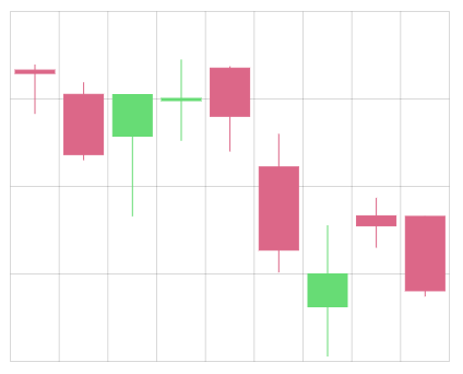 |
Displays a special kind of graph (candlestick).Requires four value fields: open, high, low, close. (more info) |
| ColumnSeries | IColumnSeriesDataFields | 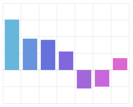 |
Displays columns, or bars. |
| ColumnSeries3D | IColumnSeries3DDataFields | 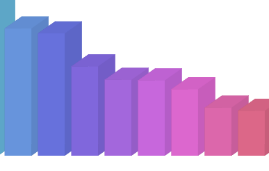 |
Displays 3D columns, or bars. |
| ConeSeries | IConeSeriesDataFields | 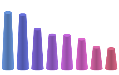 |
Displays cones or cylinders. |
| CurvedColumnSeries | ICurvedColumnSeriesDataFields | 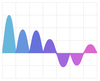 |
Displays columns as smoothed filled sines (more info). |
| LineSeries | ILineSeriesDataFields | 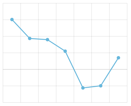 |
Displays a line graph.Can also be used to create an area graph. |
| StepLineSeries | IStepLineSeriesDataFields | 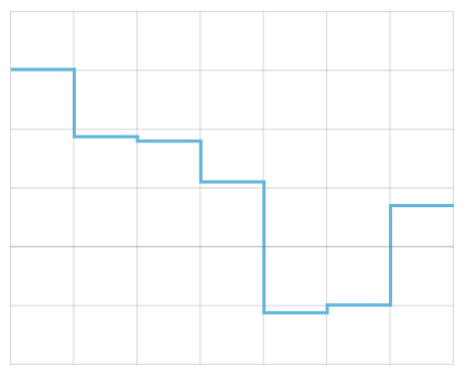 |
Displays a stepped line graph.MORE INFO Check this tutorial on configuring StepLineSeries. |
| OHLCSeries | IOHLCSeriesDataFields | 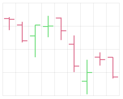 |
Displays a special kind of graph (OHLC).Requires four value fields: open, high, low, close. |
Mixing series
You can mix and match multiple series on the same chart.
Let's add a LineSeries on top of the ColumnSeries we already have.
let series = chart.series.push(new am4charts.ColumnSeries());
series.name = "Sales";
series.columns.template.tooltipText = "Series: {name}\nCategory: {categoryX}\nValue: {valueY}";
series.columns.template.fill = am4core.color("#104547");
series.dataFields.valueY = "litres";
series.dataFields.categoryX = "country";

let series2 = chart.series.push(new am4charts.LineSeries());
series2.name = "Units";
series2.stroke = am4core.color("#CDA2AB");
series2.strokeWidth = 3;
series2.dataFields.valueY = "units";
series2.dataFields.categoryX = "country";
var series = chart.series.push(new am4charts.ColumnSeries());
series.name = "Sales";
series.columns.template.tooltipText = "Series: {name}\nCategory: {categoryX}\nValue: {valueY}";
series.columns.template.fill = am4core.color("#104547"); // fill

var series2 = chart.series.push(new am4charts.LineSeries());
series2.name = "Units";
series2.stroke = am4core.color("#CDA2AB");
series2.strokeWidth = 3;
series2.dataFields.valueY = "units";
series2.dataFields.categoryX = "country";
{
  // ...
  "series": [{
    "type": "ColumnSeries",
    "name": "Sales",
    "dataFields": {
      "valueY": "litres",
      "categoryY": "country"
    },
    "columns": {
      "tooltipText": "Series: {name}\nCategory: {categoryX}\nValue: {valueY}",
      "fill": "#104547"
    }
  }, {
    "type": "LineSeries",
    "stroke": "#CDA2AB",
    "strokeWidth": 3,
    "dataFields": {
      "valueY": "units",
      "categoryY": "country"
    }
  }]
}
It's worth noting, that adding multiple ColumnSeries to the chart will automatically arrange them into nice clusters.
TIP It is possible to manipulate the order in which series are drawn using their zIndex properties. Refer to "Manipulating order" section in Series article for further info.
Enabling bullets
Bullets on series, especially Line series, can increase readability and overall visual appeal of the chart.
MORE INFO We do have a separate article on "Bullets". There's a lot of info and useful examples there. Make sure you have it in your reading list.
Stacking
Multiple series of the same type can be stacked together, but only if they are attached to the same axes.
For example several Line series can be stacked on one another. Similarly, Column series can be stacked to form "stacks".
Enabling stacks
Enabling stacking for series is easy: just set its stacked property to true. The chart will take care of everything else.
Basically, stacked = true means this in human language: "Try to hop on previous series back".
Naturally, this means that this setting has no effect on the first defined series, because, well, there's no previous series to it.
Here's a simple chart with three Column series; all stacked = true.
See the Pen amCharts V4: XY chart example (stacked 1) by amCharts (@amcharts) on CodePen.
100% stacks
There's no single setting to enable 100% stacks in amCharts 4. Enabling this stack type requires a two-setting combo. Let's explore them.
First of all, we will need to bind our series to one additional data field: "valueYShow". Basically, this data field means this: "When showing series, use value from this field rather than the one specified in "valueY"".
series.dataFields.valueY = "research";
series.dataFields.valueYShow = "totalPercent";
series.dataFields.valueY = "research";
series.dataFields.valueYShow = "totalPercent";
{
  // ...
  "series": [{
     // ...
    "dataFields": {
      // ...
      "valueY": "research",
      "valueYShow": "totalPercent"
    }
  }]
}
Now, if we had percent values in the data, we could just go ahead and use them. However, most probably, we don't, so we will need the to tell the chart to calculate them for us.
That's where Value axis' calculateTotals settings comes into play. Setting it to true (it's disabled by default) will instruct the chart to populate our data items with pre-calculated values, such us percent value of the data item in comparison to other data items in the same category.
valueAxis.calculateTotals = true;
valueAxis.calculateTotals = true;
{
  // ...
  "yAxes": [{
    // ...
    "calculateTotals": true
  }]
}
Why don't we turn this on by default? Doing this kind of calculations is a costly operation, especially on large data sets. Would be waste of computer resources and potential performance overhead to do them if they are not used.
OK, so now that we have our series use calculated field as it's display value, and we have chart calculating those values, we need to do some last touches.
Since Value axis is intelligent, and will try to optimize it's scale, we may end up with a chart that shows values that are not exactly 0 to 100. For that we'll need to use axis' min / max as well as strictMinMax settings to enforce an exact 0 to 100 scale:
valueAxis.calculateTotals = true;
valueAxis.min = 0;
valueAxis.max = 100;
valueAxis.strictMinMax = true;
valueAxis.calculateTotals = true;
valueAxis.min = 0;
valueAxis.max = 100;
valueAxis.strictMinMax = true;
{
  // ...
  "yAxes": [{
    // ...
    "calculateTotals": true,
    "min": 0,
    "max": 100,
    "strictMinMax": true
  }]
}
We also might want to add "%" to values on the our Value axis, so that users know those are percent they are looking at.
For this purpose we may use an adapter:
valueAxis.renderer.labels.template.adapter.add("text", function(text) {
  return text + "%";
});
valueAxis.renderer.labels.template.adapter.add("text", function(text) {
  return text + "%";
});
{
  // ...
  "yAxes": [{
    // ...
    "renderer": {
      "labels": {
        "text": function(text) {
          return text + "%";
        }
      }
    }
  }]
}
MORE INFO If you're not familiar with adapter concept, read up our "Adapters" article.
Let's see how it turned out:
See the Pen amCharts V4: XY chart example (stacked 2) by amCharts (@amcharts) on CodePen.
Note about stacked data
IMPORTANT Please note, that the chart does not support stacking of series with gaps in data.
This means that if you have data set directly on series, each stacked series must include equal number and category/date data points, or the stack will break.
Mixing stacked and non-stacked series
We can mix stacked and non-stacked series on the same chart.
As explained earlier, stacked = true means you need this series piggyback on top of the previous one. So, if you want some series not to participate in the stack, you need to ensure that it's stacked is not set to true, and that the series going after it does not have its stacked set to true.
Here's a version of the previous chart, with one non-stacked series:
See the Pen amCharts V4: XY chart example (stacked 3) by amCharts (@amcharts) on CodePen.
Multiple stacks
The above also enables us to collect multiple series into separate stacks.
Each time a series "breaks the stack" by not setting its stacked to true, a new stack will begin, with all subsequent series stacking up on the breaking series' back.
Line series with gaps
We'd also like to mention a special feature of a Line series - it's ability to break and form "gaps".
Gaps over "empty" data points
Normally, a Line series would "jump over" empty data items - data point that do not have a value for this series - connecting two adjacent data items that have value with a straight line. This allows having uninterrupted line series regardless of how erratic our source data is.
Here's an example of such data:
[{
  "date": new Date(2018, 3, 20),
  "value": 90
}, {
  "date": new Date(2018, 3, 21),
  "value": 102
}, {
  "date": new Date(2018, 3, 22)
}, {
  "date": new Date(2018, 3, 23),
  "value": 125
}, {
  "date": new Date(2018, 3, 24),
  "value": 55
}]
As you can see, there is data missing for April 22nd (months in Date constructor are zero-based).
A series, that uses value fields, would still be drawn in full, "jumping over" 22nd.
If we'd rather like the line to break there, we can set Line series' connect property to false.
Below, you will find an example that shows two series, both with gaps in their data. One has connect = false set. The other is not.
Observe, how the first breaks, while the other bridges the gaps:
See the Pen amCharts 4: Line series with gaps by amCharts (@amcharts) on CodePen.
Gaps over missing data points
In previous section we saw how a Line series can break over "empty" data points. Now, let's talk how it can also break over "missing" data points.
Let's reformat the data from the previous example:
[{
  "date": new Date(2018, 3, 20),
  "value": 90
}, {
  "date": new Date(2018, 3, 21),
  "value": 102
}, {
  "date": new Date(2018, 3, 23),
  "value": 125
}, {
  "date": new Date(2018, 3, 24),
  "value": 55
}]
Now, April 22nd is missing altogether.
If we set connect = false our line will still break on that date, even if there's no "breaking" data point there.
The feature (available since version 4.2.4) responsible for that is called autoGapCount, and it works like this: if the distance between two adjacent data points is bigger than baseInterval * autoGapCount and connect = false the line breaks.
The default for this setting is 1.1 which means that if the distance is at least 10% greater than the granularity of data, we consider it a gap.
Looking at the sample data above, we have daily granularity: distance between each data point is one day (24 hours). Now, since April 22nd is missing the distance between 21st and 23rd becomes two days (48 hours) which satisfies "gap" criteria (24 hours * 1.1 = 26.4 hours). Boom - a gap.
This allows fine-grained control of what to consider a gap in the data. Say we want a line to break only if there's a distance of three days between data points: we set autoGapCount = 3. Now, if there's distance of one or two days between two data points, they'll be connected, even if connect = false.
IMPORTANT Automatic gaps discussed in this section will work only with DateAxis. If you have ValueAxis as your X axis, the only way to insert gaps, is via empty data points, as discussed in previous section.
Complete example
OK, time to plop it all together: (notice how we've updated our data to accommodate for the second series we've just added)
// Import modules
import * as am4core from "@amcharts/amcharts4/core";
import * as am4charts from "@amcharts/amcharts4/charts";

// Create chart instance
let chart = am4core.create("chartdiv", am4charts.XYChart);

// Add data
chart.data = [{
  "country": "Lithuania",
  "litres": 501.9,
  "units": 250
}, {
  "country": "Czech Republic",
  "litres": 301.9,
  "units": 222
}, {
  "country": "Ireland",
  "litres": 201.1,
  "units": 170
}, {
  "country": "Germany",
  "litres": 165.8,
  "units": 122
}, {
  "country": "Australia",
  "litres": 139.9,
  "units": 99
}, {
  "country": "Austria",
  "litres": 128.3,
  "units": 85
}, {
  "country": "UK",
  "litres": 99,
  "units": 93
}, {
  "country": "Belgium",
  "litres": 60,
  "units": 50
}, {
  "country": "The Netherlands",
  "litres": 50,
  "units": 42
}];

// Create axes
let categoryAxis = chart.xAxes.push(new am4charts.CategoryAxis());
categoryAxis.dataFields.category = "country";
categoryAxis.title.text = "Countries";

let valueAxis = chart.yAxes.push(new am4charts.ValueAxis());
valueAxis.title.text = "Litres sold (M)";

// Create series
let series = chart.series.push(new am4charts.ColumnSeries());
series.dataFields.valueY = "litres";
series.dataFields.categoryX = "country";
series.name = "Sales";
series.columns.template.tooltipText = "Series: {name}\nCategory: {categoryX}\nValue: {valueY}";
series.columns.template.fill = am4core.color("#104547"); // fill

var series2 = chart.series.push(new am4charts.LineSeries());
series2.name = "Units";
series2.stroke = am4core.color("#CDA2AB");
series2.strokeWidth = 3;
series2.dataFields.valueY = "units";
series2.dataFields.categoryX = "country";
<script src="//cdn.amcharts.com/lib/4/core.js"></script>
<script src="//cdn.amcharts.com/lib/4/charts.js"></script>

<div id="chartdiv" style="width: 100%; height: 400px;"></div>

<script>
// Create chart instance
var chart = am4core.create("chartdiv", am4charts.XYChart);

// Add data
chart.data = [{
  "country": "Lithuania",
  "litres": 501.9,
  "units": 250
}, {
  "country": "Czech Republic",
  "litres": 301.9,
  "units": 222
}, {
  "country": "Ireland",
  "litres": 201.1,
  "units": 170
}, {
  "country": "Germany",
  "litres": 165.8,
  "units": 122
}, {
  "country": "Australia",
  "litres": 139.9,
  "units": 99
}, {
  "country": "Austria",
  "litres": 128.3,
  "units": 85
}, {
  "country": "UK",
  "litres": 99,
  "units": 93
}, {
  "country": "Belgium",
  "litres": 60,
  "units": 50
}, {
  "country": "The Netherlands",
  "litres": 50,
  "units": 42
}];

// Create axes
let categoryAxis = chart.xAxes.push(new am4charts.CategoryAxis());
categoryAxis.dataFields.category = "country";
categoryAxis.title.text = "Countries";

let valueAxis = chart.yAxes.push(new am4charts.ValueAxis());
valueAxis.title.text = "Litres sold (M)";

// Create series
var series = chart.series.push(new am4charts.ColumnSeries());
series.dataFields.valueY = "litres";
series.dataFields.categoryX = "country";
series.name = "Sales";
series.columns.template.tooltipText = "Series: {name}\nCategory: {categoryX}\nValue: {valueY}";
series.columns.template.fill = am4core.color("#00ff00"); // fill

var series2 = chart.series.push(new am4charts.LineSeries());
series2.name = "Units";
series2.stroke = am4core.color("#CDA2AB");
series2.strokeWidth = 3;
series2.dataFields.valueY = "units";
series2.dataFields.categoryX = "country";
</script>
<script src="//cdn.amcharts.com/lib/4/core.js"></script>
<script src="//cdn.amcharts.com/lib/4/charts.js"></script>

<div id="chartdiv" style="width: 100%; height: 400px;"></div>

<script>
// Create chart instance
var chart = am4core.createFromConfig({
  "data": [{
    "country": "Lithuania",
    "litres": 501.9,
    "units": 250
  }, {
    "country": "Czech Republic",
    "litres": 301.9,
    "units": 222
  }, {
    "country": "Ireland",
    "litres": 201.1,
    "units": 170
  }, {
    "country": "Germany",
    "litres": 165.8,
    "units": 122
  }, {
    "country": "Australia",
    "litres": 139.9,
    "units": 99
  }, {
    "country": "Austria",
    "litres": 128.3,
    "units": 85
  }, {
    "country": "UK",
    "litres": 99,
    "units": 93
  }, {
    "country": "Belgium",
    "litres": 60,
    "units": 50
  }, {
    "country": "The Netherlands",
    "litres": 50,
    "units": 42
  }],
  "xAxes": [{
    "type": "CategoryAxis",
    "dataFields": {
      "category": "country",
      "title": {
        "text": "Countries"
      }
    }
  }],
  "yAxes": [{
    "type": "ValueAxis",
    "title": {
      "text": "Litres sold (M)"
     }
  }],
  "series": [{
    "type": "ColumnSeries",
    "dataFields": {
      "valueY": "litres",
      "categoryX": "country"
    },
    "name": "Sales",
    "columns": {
      "tooltipText": "Series: {name}\nCategory: {categoryX}\nValue: {valueY}",
      "stroke": "#ff0000",
      "fill": "#00ff00"
    }
  }, {
    "type": "LineSeries",
    "stroke": "#CDA2AB",
    "strokeWidth": 3,
    "dataFields": {
      "valueY": "units",
      "categoryX": "country"
    },
    "name": "Units"
  }]
}, "chartdiv", am4charts.XYChart);
</script>
And see what it looks like:
See the Pen amCharts V4: XY chart example (column) by amCharts (@amcharts) on CodePen.
Additional controls
Legend
Now that we have several Series, it makes sense to display a legend to identify them.
It's easy, just instantiate Legend class and assign to chart's legend property:
chart.legend = new am4charts.Legend();
chart.legend = new am4charts.Legend();
{
  // ...
  "legend": {
    // We can skip "type" here since there's only
    // one type of legend available, so the chart
    // will be able to figure this out for itself.
  }
}
MORE INFO There's more to it than that. For more insights about it, check out dedicated "Legend" concepts article.
Cursor
A chart cursor is another control that can add interactivity to the chart, making it more usable, such as revealing tooltips for all series in the hovered category.
To add it, create an instance of XYCursor and assign to chart's cursor property:
chart.cursor = new am4charts.XYCursor();
chart.cursor= new am4charts.XYCursor();
{
  // ...
  "cursor": {
    "type": "XYCursor"
  }
}
MORE INFO For more information about chart cursors, visit our dedicated "Chart cursor" article.
Scrollbars
The more data points chart has, the more crammed up it gets.
At some point you may want to enable users to "zoom in" into particular sections of the chart.
That's where scrollbars come handy. They offer a familiar control enabling user to easily select part of the data range for closer examination.
A chart can have both horizontal and vertical scrollbars.
As with other chart controls, to add a scrollbar you instantiate a class (Scrollbar) and assign to chart's property: scrollbarX for horizontal scrollbar, and scrollbarY for vertical one.
Let's add both.
chart.scrollbarX = new am4core.Scrollbar();
chart.scrollbarY = new am4core.Scrollbar();
chart.scrollbarX = new am4core.Scrollbar();
chart.scrollbarY = new am4core.Scrollbar();
{
  // ...
  "scrollbarX": {
    "type": "Scrollbar"
  },
  "scrollbarY": {
    "type": "Scrollbar"
  }
}
Scrollbar with preview
We've shown you a basic scrollbar functionality so far.
There's a special case of XYChartScrollbar. It's an advanced version of a scrollbar, compatible with XYChart only, hence the name.
Besides usual scrollbar functionality, it can also display a preview of one or more chart series. To use it, simply use am4charts.XYChartScrollbar class to instantiate a scrollbar, as well as push() any of the series that you want to be displayed as a preview on it.
Let's add both.
let scrollbarX = new am4charts.XYChartScrollbar();
scrollbarX.series.push(series);
chart.scrollbarX = scrollbarX;
var scrollbarX = new am4charts.XYChartScrollbar();
scrollbarX.series.push(series);
chart.scrollbarX = scrollbarX;
{
  // ...
  "scrollbarX": {
    "type": "XYChartScrollbar",
    "series": ["s1"] // reference series by its id
  }
}
Want to have a this advanced Scrollbar but without actual series? Simply hide Scrollbar's container which holds the series:
scrollbarX.scrollbarChart.seriesContainer.hide();
scrollbarX.scrollbarChart.seriesContainer.hide();
{
  // ...
  "scrollbarX": {
    // ...
    "scrollbarChart": {
      "seriesContainer": {
        "opacity": 0
      }
    }
  }
}
Customizing scrollbars
Make sure you check out our "Customizing chart scrollbar" tutorial for ways to customize the scrollbar.
Themes
Earlier in this article we set specific colors directly to our series.
It's not overly convenient, is it? Much better approach is to use themes to automatically apply colors to chart elements.
amCharts 4 comes with a set of distinctive themes. You can use either them, or go an make your own.
Bets of all, you can apply several themes to the same chart. To spice up your chart with animations, you can apply "animated" theme, and to use colors for Material palette - use "material" theme at the same time.
Themes are not loaded automatically, which means you'll need to load them just like any other chart resource.
When they are loaded, you can use function am4core.useTheme(theme) to "turn on" the theme. Any chart instantiated after that, will have that theme or multiple themes applied.
am4core.useTheme(am4themes_animated);
am4core.useTheme(am4themes_kelly);
am4core.useTheme(am4themes_animated);
am4core.useTheme(am4themes_kelly);
Naturally, having themes applied negates the need to hardcode colors directly in your chart config. So we have removed respective lines from the live demo below.
MORE INFO To learn more about using themes, please refer to "Themes" article.
Updated demo
Here's how our chart from before looks now:
See the Pen amCharts V4: XY chart example (with additional controls) by amCharts (@amcharts) on CodePen.
Going 3D
Certain elements of the XYChart can come in a 3D flavor.
To utilize them, we'll need to drop XYChart in favor of another class: XYChart3D.
Once we do that, we can start adding a special 3D-enabled series, like ColumnSeries3D and ConeSeries.
To avoid cluttering up the article even more, we'll skip the code block and get you the live demo. Click on the JS tab for the code:
See the Pen amCharts V4: XY chart example (3D) by amCharts (@amcharts) on CodePen.
Advanced scenarios
Multiple axes
Earlier in this article we just plopped a LineSeries on top of ColumnSeries. Series automatically attaches to the the first vertical axis and first horizontal axis, unless told otherwise.
That chart worked because both series used values of roughly the same scale. However, if the values would differ dramatically, our chart would become crippled with series with larger values overtaking the one with small ones.
For such scenarios we need multiple axes.
Each series on XYChart has two properties: xAxis and yAxis.
We can use those to tell series axes we want them to be attached to.
Let's add both.
// First value axis
let valueAxis = chart.yAxes.push(new am4charts.ValueAxis());
valueAxis.title.text = "Litres sold (M)";

// Second value axis
let valueAxis2 = chart.yAxes.push(new am4charts.ValueAxis());
valueAxis2.title.text = "Units sold";
valueAxis2.renderer.opposite = true;

// First series
let series = chart.series.push(new am4charts.ColumnSeries());
series.dataFields.valueY = "litres";
series.dataFields.categoryX = "country";
series.name = "Sales";
series.tooltipText = "{name}: [bold]{valueY}[/]";

// Second series
let series2 = chart.series.push(new am4charts.LineSeries());
series2.dataFields.valueY = "units";
series2.dataFields.categoryX = "country";
series2.name = "Units";
series2.tooltipText = "{name}: [bold]{valueY}[/]";
series2.strokeWidth = 3;
series2.yAxis = valueAxis2;
// First value axis
var valueAxis = chart.yAxes.push(new am4core.ValueAxis());
valueAxis.title.text = "Litres sold (M)";

// Second value axis
var valueAxis2 = chart.yAxes.push(new am4charts.ValueAxis());
valueAxis2.title.text = "Units sold";
valueAxis2.renderer.opposite = true;

// First series
var series = chart.series.push(new am4charts.ColumnSeries());
series.dataFields.valueY = "litres";
series.dataFields.categoryX = "country";
series.name = "Sales";
series.tooltipText = "{name}: [bold]{valueY}[/]";

// Second series
var series2 = chart.series.push(new am4charts.LineSeries());
series2.dataFields.valueY = "units";
series2.dataFields.categoryX = "country";
series2.name = "Units";
series2.tooltipText = "{name}: [bold]{valueY}[/]";
series2.strokeWidth = 3;
series2.yAxis = valueAxis2;
{
  // ...
  "yAxes": [{
    "type": "ValueAxis",
    "title": {
      "text": "Litres sold (M)"
    }
  }, {
    "type": "ValueAxis",
    "id": "v2",
    "title": {
      "text": "Units sold"
    },
    "renderer": {
      "opposite": true
    }
  }],
  "series": [{
    "type": "ColumnSeries",
    "dataFields": {
      "valueY": "litres",
      "categoryY": "country"
    },
    "name": "Sales",
    "columns": {
      "tooltipText": "Series: {name}\nCategory: {categoryX}\nValue: {valueY}",
      "stroke": "#ff0000",
      "fill": "#00ff00"
    }
  }, {
    "type": "LineSeries",
    "stroke": "#CDA2AB",
    "strokeWidth": 3,
    "dataFields": {
      "valueY": "units",
      "categoryY": "country"
    },
    "name": "Units",
    "yAxis": "v2" // referring to ValueAxis by its id
  }]
}
Here's how it turned out. Even though we have updated our "Units" series data to be orders of magnitude larger, both series are displaying nicely, because they are bound to separate axes and therefore are using different value scales.
See the Pen amCharts V4: XY chart example (multiple axes) by amCharts (@amcharts) on CodePen.
Non-standard axis setups
XY chart supporting any number and combination of axis types, allows some creative uses.
For example, you could have three horizontal DateAxis each with a different LineSeries attached to them to display comparative timelines from different periods, superimposed over each other. E.g. show metric dynamics from different years.
Or you could have just two ValueAxis (vertical and horizontal) to turn it into scatter plot.
As an example, let us show how you can easily create a Heatmap chart by utilizing two CategoryAxis - one vertical and one horizontal.
See the Pen amCharts V4: XY chart example (heatmap) by amCharts (@amcharts) on CodePen.
The above demo, besides our regular suspects - series and axes - also introduces a concept of HeatLegend.
MORE INFO Learn more about HeatLegend in "Legend" article.
Smoothed lines
In amCharts 4, each Line series are straight or curved (smoothed). By default all lines are straight - connecting two data points with a straight line.
To smooth the lines out, we have two Line series settings: tensionX and tensionY.
A tension measures how much line is attracted to the data point horizontally (tensionX) ant vertically (tensionY).
Values can be either 0 - no tension at all, and 1 - maximum tension.
Default setting is 1 - maximum tension, resulting in straight lines.
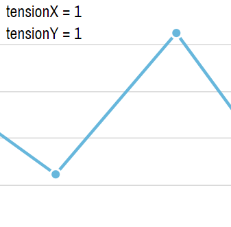
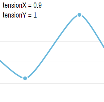
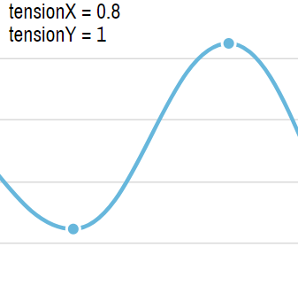
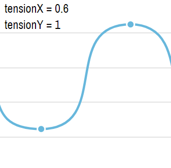
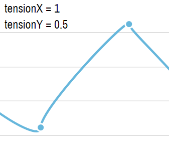
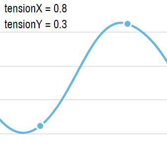
NOTE If tensionY is lower than default 1, the line may and probably will dip or spike below or above actual values, which may create the illusion of inflated values. Use with caution.
Alternate smoothing algorithm
So far we have looked at the default smoothing alogrithm, which can be modified with the tensionX and tensionY settings.
LineSeries supports two additional alternative algorithms, enabled via series' setting smoothing: "monotoneX", and "monotoneY".
These two settings do not support any additional properties - tensionX and tensionY will be ignored if set.
The upside of using these two is that it will ensure correct smoothing on irregularly spaced data items, as well as make the line not go beyond the actual value vertically, or horizontally.
Use monotoneX for horizontal series, and monotoneY for vertical ones.
series.smoothing = "monotoneX";
series.smoothing = "monotoneX";
{
  // ...
  "series": [{
    // ...
    "smoothing": "monotoneX"
  }]
}
See the Pen LineSeries with monotoneX smoothing by amCharts team (@amcharts) on CodePen.
Related tutorials
- Building a waterfall chart
- Managing width and spacing of Column Series
- Curved column series
- Taming Candlestick Series
- Stacked column series with rounded corners
- Taming the Step Line Series
- Controlling fill direction of a Line series
- Different column fill colors for positive and negative values
- Stacked Axes
- Creating Timeline Charts
- Configuring the zoom out button
- Auto-hide value axes
- Customizing chart scrollbar
- Plotting series from calculated values


