A Series in amCharts 4 universe means a collection of similar, logically grouped data points, comprising multi-value data element. Probably the most evident example of series is XYSeries - say a collection of bullets connected with a line (a line graph) or a cluster of columns (column graph). Collection of Pie Chart slices is another example of series. Map's objects are also represented by series. And so on.
Types of series
Each chart type can support only relevant series.
For example PieChart supports only PieSeries (a collection of flat pie slices), whilst PieChart3D expects you to use PieSeries3D. (a collection of 3D slices)
Some chart types may contain series of different types. For example XYChart can contain LineSeries, ColumnSeries, CandlestickSeries, etc. Its 3D derivative - XYChart3D - may additionally contain 3D series like ColumnSeries3D, ConeSeries, etc.
Purpose
Series have two main purposes:
- Setting appearance and behavior of a series of chart/map items;
- Binding individual items in series to source data.
Setting appearance
Each series will have a set of properties that when set will affect the appearance of individual items when drawn on the chart.
Some of those properties are simple, and some are set on template for specific series' components. More about the latter later.
Simple properties
Let's take LineSeries as an example. Predictably, it is used to draw a line graph.
Say, we want to set a line color and thickness. We'd set series' stroke and strokeWidth properties respectively:
let series = chart.series.push(new am4charts.LineSeries());
series.stroke = am4core.color("#ff0000"); // red
series.strokeWidth = 3; // 3px
var series = chart.series.push(new am4charts.LineSeries());
series.stroke = am4core.color("#ff0000"); // red
series.strokeWidth = 3; // 3px
{
  // ...
  "series": [{
    "type": "LineSeries",
    "stroke": "#ff0000",
    "strokeWidth": 3
  }]
}
Templates
A simple line graph does not need any additional components in it and hence no additional settings. Only those that affect the line itself.
But what if we have a ColumnSeries and want to set settings that are relevant to columns? That's where templates come in.
For columns, we have columns.template property. It holds a "template" object of type RoundedRectangle which we can use to set a "default" column appearance for our series.
let series = chart.series.push(new am4charts.ColumnSeries());
series.columns.template.stroke = am4core.color("#ff0000"); // red outline
series.columns.template.fill = am4core.color("#00ff00"); // green fill
var series = chart.series.push(new am4charts.ColumnSeries());
series.columns.template.stroke = am4core.color("#ff0000"); // red outline
series.columns.template.fill = am4core.color("#00ff00"); // green fill
{
  // ...
  "series": [{
    "type": "ColumnSeries",
    "columns": {
      "stroke": "#ff0000",
      "fill": "#00ff00"
    }
  }]
}
NOTE In JSON config there's no need to specify "template" wrapper. (more info)
Similarly, on PieSeries you'd use slices.template. You get the drift.
MORE INFO For more information about templates read our "List templates article.
Tooltip contents
An important series' setting is tooltipText. This is what you use to indicate contents of the tooltip that pops up on rollover of series' items.
Please note that tooltipText set directly on series will be used only if you are also have a chart cursor enabled. Otherwise, you might want to add that on respective sub-item templates:
let series = chart.series.push(new am4charts.ColumnSeries());
series.columns.template.tooltipText = "Series: {name}\nCategory: {categoryX}\nValue: {valueY}";
var series = chart.series.push(new am4charts.ColumnSeries());
series.columns.template.tooltipText = "Series: {name}\nCategory: {categoryX}\nValue: {valueY}";
{
  // ...
  "series": [{
    "type": "ColumnSeries",
    "columns": {
      "tooltipText": "Series: {name}\nCategory: {categoryX}\nValue: {valueY}"
    }
  }]
}
amCharts 4 provide powerful styling, data access and formatting meta codes to be specified there.
MORE INFO Please refer to "Formatters: Formatting text" section for more information and tooltip configuration examples.
Tooltip colors
Normally, series-related tooltips, such as Slice tooltips will automatically be colored (filled) with relate item color.
You can disable such behavior by setting tooltip.getFillFromObject = false on the series.
After that, you can set up the tooltip object the way you see fit. E.g. the below code will make all tooltips on a Pie chart series white with black text:
pieSeries.tooltip.getFillFromObject = false;
pieSeries.tooltip.background.fill = am4core.color("#fff");
pieSeries.tooltip.label.fill = am4core.color("#000");
pieSeries.tooltip.getFillFromObject = false;
pieSeries.tooltip.background.fill = am4core.color("#fff");
pieSeries.tooltip.label.fill = am4core.color("#000");
{
  // ...
  "series": [{
    "type": "PieSeries",
    // ...
    "tooltip": {
      "getFillFromObject": false,
      "background": {
        "fill": "#fff"
      },
      "label": {
        "fill": "#fff"
      }
    }
  }]
}
TIP Check class reference for Tooltip for more settings you can set on a Tooltip.
Relation to chart cursor
amCharts 4 has a powerful helper tool that you can enable - Cursor.
Enabling Cursor will make all series on the chart display a tooltip whenever you hover specific place with chart cursor.
MORE INFO Make sure you visit "Relation to series" section in our Cursor article, which will explain how to enable it.
Binding to data
It goes without saying that series would mean nothing without real data.
To bind series to chart's data we will always use series' dataFields property.
It's a simple object that binds specific logical field in series to a data field in data objects.
The key is data field, the value is the name of the key in data.
Depending on series type, it may need one or more fields defined.
For example LineSeries may happily display itself with just two fields: x and y values.
let series = chart.series.push(new am4charts.LineSeries());
series.dataFields.categoryX = "country";
series.dataFields.valueY = "visits";
var series = chart.series.push(new am4charts.LineSeries());
series.dataFields.categoryX = "country";
series.dataFields.valueY = "visits";
{
  // ...
  "series": [{
    "type": "LineSeries",
    "dataFields": {
      "categoryX": "country",
      "valueY": "visits"
    }
  }]
}
The above will use "country" key in data objects to bind each item's position on horizontal CategoryAxis, and "visits" key to determine item's value on vertical ValueAxis.
Some types of series will require more data fields. For example CandlestickSeries will require at least 5: open, high, low, close and category/value/date.
Please refer to the dataFields description of each series class for complete list of data fields available.
Please also refer to our "Chart Types" section, for in-depth tutorials on various chart types and related series.
Series-specific data
In amCharts 4, series is not limited to using global chart-wide data set. Each series can have own, totally independent data set.
In terms of binding to data, it works exactly the same, it's just you assign your series-specific data to data property on series, rather than chart.
E.g.:
series1.data = [
  // Data set 1
];
series2.data = [
  // Data set 2
];
series1.data = [
  // Data set 1
];
series2.data = [
  // Data set 2
];
{
  // ...
  "series": [{
    // ...
    "data": [
      // Data set 1
    ]
  }, {
    // ...
    "data": [
      // Data set 2
    ]
  }]
}
Here's an example of a simple chart with two series, using their own independent data sets:
See the Pen amCharts 4: Series-specific data by amCharts (@amcharts) on CodePen.
As you can see both series use different data sets, with non-matching data points.
Note about Series' data and Category axis
There's on caveat when using CategoryAxis in a chart that has its data set directly on series.
Category axis relies on data as well to get its categories from. If you move all chart's data to series, your axis is left without data which will result in an empty chart.
Axis can't draw data from series, so you will need to do one of the following:
- Set
chart.datato an array that holds objects with at least category data; - Set axis'
datato an array of objects with category data.
E.g.
categoryAxis.data = [{
  "category": "Marketing"
}, {
  "category": "Research"
}, {
  "category": "Development"
}];
categoryAxis.data = [{
  "category": "Marketing"
}, {
  "category": "Research"
}, {
  "category": "Development"
}];
{
  // ...
  "xAxes": [{
    "type": "CategoryAxis",
    // ...
    "data": [{
      "category": "Marketing"
    }, {
      "category": "Research"
    }, {
      "category": "Development"
    }]
  }]
}
Manipulating order
Normally series are drawn in the same order as they were added to the chart. Which means that if we add Line series and then Column series, the latter will be drawn on top of the former.
To manipulate such order, you don't necessarily need to change the order of series you add. It's enough to set zIndex of the series.
The higher the zIndex, the more on top series will be drawn.
let lineSeries = chart.series.push(new am4charts.LineSeries());
// ...
lineSeries.zIndex = 1;

let columnSeries = chart.series.push(new am4charts.ColumnSeries());
// ...
var lineSeries = chart.series.push(new am4charts.LineSeries());
// ...
lineSeries.zIndex = 1;

var columnSeries = chart.series.push(new am4charts.ColumnSeries());
// ...
{
  // ...
  "series": [{
    "type": "LineSeries",
    // ...
    "zIndex": 1
  }, {
    "type": "ColumnSeries",
    // ...
  }]
}
In above example, Line series will be drawn on top of Column series, because it has its zIndex set to 1 while Column series does not have one set, which defaults to zero.
Series' colors
Each series make use of color sets. On XY Charts and similar, each series is assigned a color which series' elements like columns, bullets, lines are colored with. On sliced charts like Pie chart each individual element of the series - slice - is colored individually.
Those colors can either come via theme or be set manually.
For more information about how that is done please refer to "Manually setting color sets" chapter in "Colors & Gradients" article.
Heat-maps
While there are no special series for building heat-maps, there is a concept name "Heat rules".
Each series, can have any of its properties manipulated based on its value and value's position in overall spectrum, by defining a Heat rule.
This is not limited to just colors. It can manipulate any property of the single elements based on value, including colors, size, radius, opacity, etc.
Defining a heat rule
There are no classes for heat rules. Those are simple objects that need to follow certain interface definition: IHeatRule.
Each Heat rule has to have a target to apply changes to (e.g. a bullet, a column, etc.), a property to apply changes to, as well as maximum and minimum value for the property.
Here's a typical rule that would vary column's fill color based on its value:
{
  "min": am4core.color("#f00"),
  "max": am4core.color("#0f0"),
  "property": "fill",
  "target": series.columns.template
}
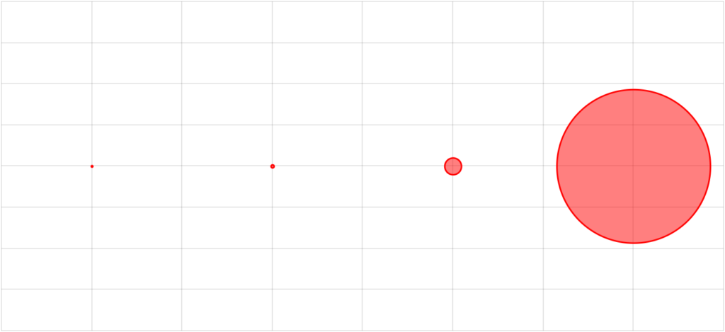
When Column series encounters a rule like that it knows that it needs to determine fill color for each of its column based on the column's value and that value's position between smallest and biggest value among that series' all data items.
Knowing specific column's value's position in relation to overall range of values, it can interpolate a color that is in the same place in the spectrum between min (red in our case) and max (green).
NOTE #1 If we don't want to use actual min and max values from the series, we can use heat rule's minValue and maxValue properties.
NOTE #2 By default, Series looks in each data item's value data field, which means it need to be defined in series' dataFields. We can also override which data field values are looked up in using Heat rule's dataField property, e.g. if we want to use valueX instead, we can set dataField = "valueX".
Assigning to series
To assign a Heat rule to a series, we simply push() it into series' heatRules list.
That's it. The series will make sure to apply all the rules when drawing its elements.
Heat-map examples
Now, let's try how it actually works.
Let's take a very basic chart with a Column series as a basis:
See the Pen amCharts V4: Heat rules (1) by amCharts (@amcharts) on CodePen.
Say, we want to make it so the higher the value of the data item, the redder the column gets.
We'll need to create a Heat rule for the fill property of the Column series' column template:
series.heatRules.push({
  "target": series.columns.template,
  "property": "fill",
  "min": am4core.color("#F5DBCB"),
  "max": am4core.color("#ED7B84"),
  "dataField": "valueY"
});
series.heatRules.push({
  "target": series.columns.template,
  "property": "fill",
  "min": am4core.color("#F5DBCB"),
  "max": am4core.color("#ED7B84"),
  "dataField": "valueY"
});
{
  // ...
  "series": [{
    "type": "ColumnSeries",
    "heatRules": [{
      "target": "columns.template",
      "property": "fill",
      "min": "#F5DBCB",
      "max": "#ED7B84",
      "dataField": "valueY"
    }]
  }]
}
NOTE Since we have already defined a data field for valueY, we don't need to define another for value. We can just go ahead and instruct the Heat rule to use valueY using rule's dataField property.
Here's how it turned out:
See the Pen amCharts V4: Heat rules (2) by amCharts (@amcharts) on CodePen.
MORE DEMOS We have more demos available using Heat rules. Here's one that alternates bullet radius based on value. And one that displays a a true heat map with alternating color fills and a Heat legend.
Logarithmic rules
As we already know, the value of the heat-ruled element - be it color, size, or some other property - is determined linearly on its proximity from the min and max values of the heat rule.
This works well when all values in series use a comparable scale.
However, if series contains several, or even one extreme value, it will affect the global scale and make the rest of the values be close to one end of the spectrum and thus show as they are equal.
In cases like that, we can use logarithmic heat rules, in which position in value range is determined using logarithmic scale which is non-linear.
Logarithmic rules are defined like any other heat rules, except they contain logarithmic key:
series.heatRules.push({
  "target": series.columns.template,
  "property": "fill",
  "min": am4core.color("#F5DBCB"),
  "max": am4core.color("#ED7B84"),
  "dataField": "valueY",
  "logarithmic": true
});
series.heatRules.push({
  "target": series.columns.template,
  "property": "fill",
  "min": am4core.color("#F5DBCB"),
  "max": am4core.color("#ED7B84"),
  "dataField": "valueY",
  "logarithmic": true
});
{
  // ...
  "series": [{
    "type": "ColumnSeries",
    "heatRules": [{
      "target": "columns.template",
      "property": "fill",
      "min": "#F5DBCB",
      "max": "#ED7B84",
      "dataField": "valueY",
      "logarithmic": true
    }]
  }]
}
Linear heat rule 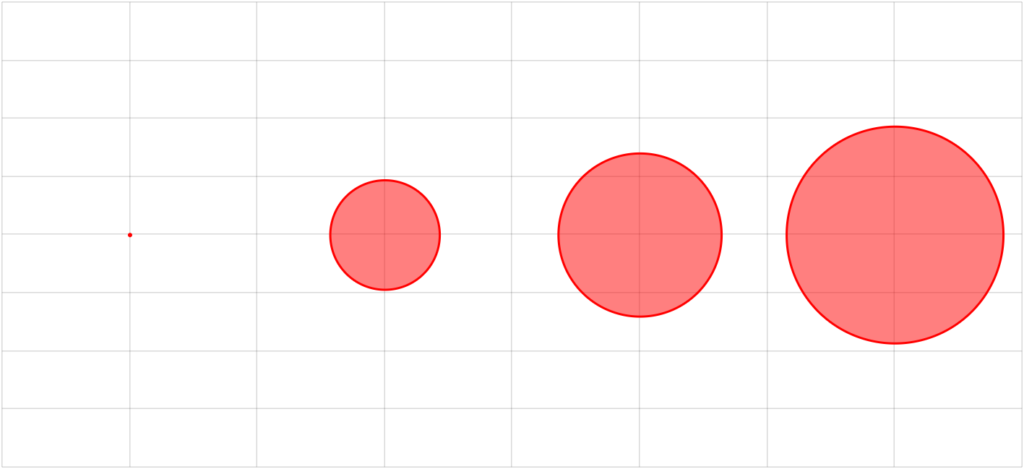
Logarithmic heat rule
As you can see above, the last value being drastically larger than the rest of the values, dwarf them, making differences between them hardly noticeable.
The logarithmic scale makes differences between values much more prominent.
Here's an example:
See the Pen amCharts 4: Logarithmic HeatRule by amCharts team (@amcharts) on CodePen.
IMPORTANT If you are using a heat legend you will need to enable logarithmic scale for it individually. See "Heat Legend" article for more details.
Pre-hiding series
Series on a chart can be toggled on and off either by Legend or via API functions hide() or show().
However, in some situations, you might want your chart to start with some of the series hidden.
For that simply set series' hidden property to true:
series.hidden = true;
series.hidden = true;
{
  // ...
  "series": [{
    // ...
  }, {
    // ...
  }, {
    // ...
    "hidden": true
  }]
}
See the Pen amCharts V4: Pre-hiding series by amCharts (@amcharts) on CodePen.
NOTE In some asynchronous setups, like in Angular applications, setting hidden = true might not work, because it happens after the chart and legend have initialized. If that is the case for you, call series' method hide() instead.
Events on series
As almost anything in amCharts 4, Series can have events attached to them.
SIDE READING For more concepts and usage of events read here.
However, simply attaching an event to a Series object won't be very useful. Say, we attach "hit" event to a ColumnSeries. Clicking on any of the elements of the series, like columns, will trigger our event handler. However, we won't know which particular column user clicked - event target will be Series itself.
The solution is to attach to a template of Series relative element, like a column, or a bullet.
Events on Column series
For Column series, we can attach events to a column template, which is accessible via columns.template property.
series.columns.template.events.on("hit", function(ev) {
  alert("Clicked on " + ev.target.dataItem.categoryX + ": " + ev.target.dataItem.valueY);
});
series.columns.template.events.on("hit", function(ev) {
  alert("Clicked on " + ev.target.dataItem.categoryX + ": " + ev.target.dataItem.valueY);
});
{
  // ...
  "series": [{
    // ...
  }, {
    // ...
  }, {
    // ...
    "columns": {
      "events": {
        "hit": function(ev) {
          alert("Clicked on " + ev.target.dataItem.categoryX + ": " + ev.target.dataItem.valueY);
        }
      }
    }
  }]
}
Try this:
See the Pen amCharts 4: attaching events on series by amCharts team (@amcharts) on CodePen.
Events on Line series
It works differently for Line series. Column series had distinctive elements - columns - we could attach events to. Line Series consists of a continuous line, so there is not specific element to catch events on.
The solution comes in the form of bullets.
Since there's a distinctive bullet attached to each data point, we can add events to it as well.
let bullet = series.bullets.push(new am4charts.CircleBullet());
bullet.events.on("hit", function(ev) {
  alert("Clicked on " + ev.target.dataItem.dateX + ": " + ev.target.dataItem.valueY);
});
var bullet = series.bullets.push(new am4charts.CircleBullet());
bullet.events.on("hit", function(ev) {
  alert("Clicked on " + ev.target.dataItem.dateX + ": " + ev.target.dataItem.valueY);
});
{
  // ...
  "series": [{
    // ...
  }, {
    // ...
  }, {
    // ...
    "bullets": {
      "type": "CircleBullet",
      "events": {
        "hit": function(ev) {
          alert("Clicked on " + ev.target.dataItem.dateX + ": " + ev.target.dataItem.valueY);
        }
      }
    }
  }]
}
See the Pen amCharts 4: events on bullets by amCharts team (@amcharts) on CodePen.
TIP Don't want bullets to physically be visible? Simply set fillOpacity to zero. They will retain their click events, but will be physically invisible.
Adding events post-init
So far we have shown how to add events to series' elements before chart init using "template" elements.
When actual elements - say a column - is created from a template, among its other properties events are copied as well.
However, if you would need to add event after chart/series is already initialized and individual elements (e.g. columns) are already created, adding the event handler to a template would not automatically mirror it on already existing ones.
In such cases - when you need to add events on initialized series - you would need to iterate through each individual element and add them directly. E.g.:
series.columns.each(function(column) {
  column.events.on("hit", myHitHandler);
});
series.columns.each(function(column) {
  column.events.on("hit", myHitHandler);
});
Data item locations
Each element in a Series, e.g. a Column or a Bullet, is represented by a "data item", which in turn is bound to a single data point in data array.
As we already saw in the "Binding to data" section, we attach each value of the series, like dateX or categoryX via its dataFields.
Normally, that value, or data item, is displayed in the middle of the related date cell (if we are using DateAxis) or category (for CategoryAxis setups). We can, however change via Series data item's locations property.
In a nutshell, it works similarly to dataFields, except it is set on a data item and instead of a field in data it indicates relative location this data item should be shown at. The value range is from 0 (zero) to 1 (one), with the former indicating start of the cell, and the latter the end.
By default, most of the data items will be displayed in the middle, which is indicated by 0.5.
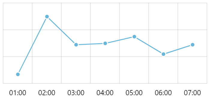
The above chart uses DateAxis. It's data items are positioned in the middle of each hour, even if their actual timestamps start at zero minutes. This is what default location of 0.5 does - it centers up the data item within specific axis cell - in this case hour.
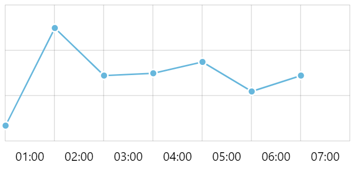
Say we wanted to make the data item start at precise hour start. That's were data item's locations would come in:
series.dataItems.template.locations.dateX = 0;
series.dataItems.template.locations.dateX = 0;
{
  // ...
  "series": [{
    // ...
    "dataItems": {
      "locations": {
        "dateX": 0
      }
    }
  }]
}
Now, if we'd to run such chart, we'd see how it "shifts" the whole series by moving its data items to the beginning of the cell (hour):
dateX is set to 0NOTE #1 The above examples use DateAxis. If we were to use CategoryAxis instead, our locations would need to use categoryX keyword as well.
NOTE #2 When positioning data item to start of the cell, it makes sense to also use axis' endLocation = 0 which ensures it skips the last cell which now remains empty as per screenshot above. For more information on axis start and end locations read here.
Here's complete working example:
See the Pen amCharts 4: positioning DateAxis labels on full period by amCharts team (@amcharts) on CodePen.
Need a more complex example? There you go.
Auxiliary usage
Sometimes, series can be used to feed configuration and data to some other chart controls.
The most obvious example is the XYChartScrollbar, which is a version of scrollbar that can display preview graphs in its body. It has a list property series which you can add your XYChart series to. The scrollbar will use both data and appearance settings to its won draw preview graphs. (more info)
On MapChart a control named SmallMap also has a series property which you can add multiple MapSeries. The control, which shows a small preview map in the corner, will use them to populate its contents.
Another example is HeatLegend. (more info) This control will display a gradiented scale (heat range) with value range mapped to color range. It can use a series to populate its data range and coloring properties.
Related content
- Dynamically adding and removing Series
- Creating trend lines
- Overriding series’ tooltip fill color
- Styling or removing tooltip shadow
- Different column fill colors for positive and negative values
- Using percent values in series
- Disabling XY series initial animations
- Multi-color XY heatmap
- Plugin: Bullets (creating advanced bullets like flags, pins, stars)
- Using "sticky" tooltips
- Plotting series from calculated values
- Using states on LineSeries