We can't imagine today's web without responsive features. amCharts 4 has a powerful responsive capabilities built into its core.
This tutorial will explain how you can enable, customize and use amCharts 4 responsive features.
How it works
The problem
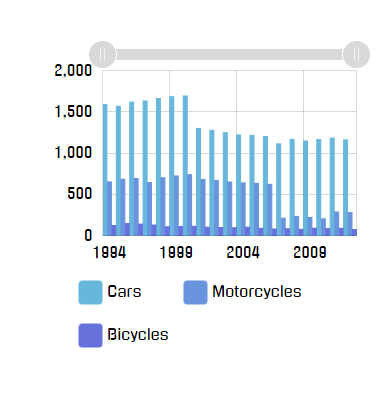
Imagine your everyday regularly-boring normal chart like this:

Looks good at full size - 900 pixels wide.
Now, let's imagine we'll need to cram it into less space, like 600 pixels:

Columns are kinda crammed together, but the chart is still passable.
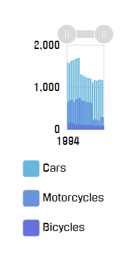
Let's go deeper: 400px.
The chart is now bordering of hardly comprehensible. Suddenly we are aware of wasted white space around the chart, and the legend that takes up whopping third of the available area.
Deeper? Alright: 200px.
OK, this is getting ridiculous, but let's try to go even deeper: 100px.
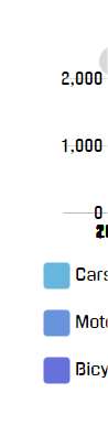
Congratulations! We now have a completely useless chart on our hands.
You may argue, that nobody in their right mind would make chart container that small, and you might be right.
However, we're living in a multi-platform world, where the designer of a website is not in complete control anymore. The web page that looks perfectly fine on desktop, might crumble down like in the above examples when viewed on a phone, that uses much lesser resolution.
Responsive solution
Responsive features in amCharts 4 allow overriding and dynamically changing certain settings or features of the chart based on the actual available space.
For example, we could have made our chart look better if we got rid of padding and legend when space is scarce. Axis labels could go inside plot area, further saving us space.
This dynamic transformation is controlled using Responsive Rules. We're just going to call them "Rules" from now on.
A Rule is basically an object that does two things:
- Checks if current chart parameters matches certain conditions, i.e. "chart's actual width is less than 400 pixels";
- Generates a "State" object which has to be applied if the Rule is relevant.
This allows us to create chart once, and make it automatically adapt to various conditions.
Enabling
Responsive settings in amCharts 4 are set via responsive property of the chart, which is an object of the type Responsive.
Since those are disabled by default, all we need to do in order to enable them is to set enabled = true:
chart.responsive.enabled = true;
chart.responsive.enabled = true;
{
  // ...
  "responsive": {
    "enabled": true
  }
}
That's it. Our chart is now responsive-aware. Let's see how we can use that.
Using default rules
Simply enabling responsive features will make an amCharts-curated set of default rules kick in.
Below table lists generic rules along the size break points when they kick in.
NOTE The effect of the multiple rules are cumulative, meaning that all "relevant" rules will be applied. E.g. for a chart that is 80px wide, both width <= 200 and width < 100 rules apply.
List of default rules
| Element | Breakpoint | Comment |
|---|---|---|
| Chart itself | width <= 200 / height <= 200 |
Horizontal / vertical padding reduced to 10px. Scrollbars are disabled. |
width <= 100 / height <= 100 |
Horizontal / vertical padding set to 0. | |
| Axes | width <= 200 / height <= 200 |
Horizontal / vertical axis labels are placed inside plot area. Grid is disabled. |
width <= 100 / height <= 100 |
Horizontal / vertical axis labels are disabled. | |
| XY Series | width <= 200 and height <= 200 |
Bullets are disabled. |
| Percent Series (Pie, Funnel, Pyramid) | width <= 200 or height <= 200 |
Labels and ticks are disabled. |
| Legend | width <= 200 |
Move legend to bottom. |
height <= 200 |
Move legend to right. | |
width <= 200 and height <= 200 |
Disable legend. |
Disabling default rules
If you don't want any default rules applied, simply set useDefault = false.
Adding custom rules
What is a Rule
chart.responsive object has a property rules which is a list of Rules. A Rule is an object that corresponds to the IResponsiveRule interface, which means it has to have at least two methods:
relevant(target)- it is called so the rule can do its own calculations to determine whether it is relevant for the current situation;state(target, stateId)- it is called when Responsive asks the Rule to generate a State that needs to be applied to the object if the Rule is currently relevant. (as determined byrelevant()call)
REQUIRED READING Responsive works by applying states to various objects of the chart. States is a concept of temporarily applying set of property values to an object. For more information, please read our "Sates" article.
Creating Rules
To create a new Rule, we create a new object, with two methods: relevant and state, then push() it into chart.responsive.rules:
chart.responsive.rules.push({
  relevant: function(target) {
    // Code that determines if rule is currently relevant
    // and returns true or false
    return false;
  },
  state: function(target, stateId) {
    // Code that creates a new SpriteState object to be
    // applied to target if Rule is "relevant"
    return;
  }
});
{
  // ...
  "responsive": {
    "enabled": true,
    "rules": [{
      relevant: function(target) {
        // Code that determines if rule is currently relevant
        // and returns true or false
        return false;
      },
      state: function(target, stateId) {
        // Code that creates a new SpriteState object to be
        // applied to target if Rule is "relevant"
        return;
      }
    }]
  }
}
Right now, the Rule above, does nothing. Let's try tackling issues with our chart above, one by one.
Base chart
Let's start with a base chart at 400 by 400 px:
See the Pen amCharts 4: Responsive (1) by amCharts (@amcharts) on CodePen.
Technically, it's still usable, however the space is not used efficiently.
Adding Rule relevancy check
First, we need to add code which checks whether the Rule is relevant under current chart conditions.
As we explained earlier, Rule's relevant method is responsible for just that.
Let's add a check whether chart is 400 pixel wide or less:
relevant: function(target) {
  if (target.pixelWidth <= 400) {
    return true;
  }
  return false;
}
relevant: function(target) {
  if (target.pixelWidth <= 400) {
    return true;
  }
  return false;
}
A relevant() method will receive a reference to object our responsive object is attached to - the chart.
We are using chart's pixelWidth property (which returns current chart in pixels) to check whether it is 400px wide or less.
Using pre-defined named breakpoints
Instead of specifying pixel values and defining functions, you can use built-in pre-defined breakpoints, accessible via am4core.ResponsiveBreakpoints static class.
You can use its static pixel values:
| Accessible via | Value |
|---|---|
am4core.ResponsiveBreakpoints.XXS |
100 |
am4core.ResponsiveBreakpoints.XS |
200 |
am4core.ResponsiveBreakpoints.S |
300 |
am4core.ResponsiveBreakpoints.M |
400 |
am4core.ResponsiveBreakpoints.L |
600 |
am4core.ResponsiveBreakpoints.XL |
800 |
am4core.ResponsiveBreakpoints.XXL |
1000 |
Or via "relevant"-compatible functions:
| Accessible via | Check |
|---|---|
am4core.ResponsiveBreakpoints.widthXXS |
width <= 100 |
am4core.ResponsiveBreakpoints.widthXS |
width <= 200 |
am4core.ResponsiveBreakpoints.widthS |
width <= 300 |
am4core.ResponsiveBreakpoints.widthM |
width <= 400 |
am4core.ResponsiveBreakpoints.widthL |
width <= 600 |
am4core.ResponsiveBreakpoints.widthXL |
width <= 800 |
am4core.ResponsiveBreakpoints.widthXXL |
width <= 1000 |
am4core.ResponsiveBreakpoints.heightXXS |
height <= 100 |
am4core.ResponsiveBreakpoints.heightXS |
height <= 200 |
am4core.ResponsiveBreakpoints.heightS |
height <= 300 |
am4core.ResponsiveBreakpoints.heightM |
height <= 400 |
am4core.ResponsiveBreakpoints.heightL |
height <= 600 |
am4core.ResponsiveBreakpoints.heightXL |
height <= 800 |
am4core.ResponsiveBreakpoints.heightXXL |
height <= 1000 |
am4core.ResponsiveBreakpoints.maybeXXS |
width <= 100 || height <= 100 |
am4core.ResponsiveBreakpoints.maybeXS |
width <= 200 || height <= 200 |
am4core.ResponsiveBreakpoints.maybeS |
width <= 300 || height <= 300 |
am4core.ResponsiveBreakpoints.maybeM |
width <= 400 || height <= 400 |
am4core.ResponsiveBreakpoints.maybeL |
width <= 600 || height <= 600 |
am4core.ResponsiveBreakpoints.maybeXL |
width <= 800 || height <= 800 |
am4core.ResponsiveBreakpoints.maybeXXL |
width <= 1000 || height <= 1000 |
am4core.ResponsiveBreakpoints.isXXS |
width <= 100 && height <= 100 |
am4core.ResponsiveBreakpoints.isXS |
width <= 200 && height <= 200 |
am4core.ResponsiveBreakpoints.isS |
width <= 300 && height <= 300 |
am4core.ResponsiveBreakpoints.isM |
width <= 400 && height <= 400 |
am4core.ResponsiveBreakpoints.isL |
width <= 600 && height <= 600 |
am4core.ResponsiveBreakpoints.isXL |
width <= 800 && height <= 800 |
am4core.ResponsiveBreakpoints.isXXL |
width <= 1000 && height <= 1000 |
The "relevant" function we had before can be simplified using breakpoints:
relevant: am4core.ResponsiveBreakpoints.widthS
relevant: am4core.ResponsiveBreakpoints.widthS
Defining a state to apply when the Rule is "relevant"
Since our chart IS 400px or less, responsive will try to call Rule's state() method expecting to receive a SpriteState object which it can then apply to chart.
For starters, let's try to shave off margins, that are way to generous at this size:
state: function(target, stateId) {
  if (target instanceof am4charts.Chart) {
    let state = target.states.create(stateId);
    state.properties.paddingTop = 0;
    state.properties.paddingRight = 15;
    state.properties.paddingBottom = 5;
    state.properties.paddingLeft = 15;
    return state;
  }
  return null;
}
state: function(target, stateId) {
  if (target instanceof am4charts.Chart) {
    var state = target.states.create(stateId);
    state.properties.paddingTop = 0;
    state.properties.paddingRight = 15;
    state.properties.paddingBottom = 5;
    state.properties.paddingLeft = 15;
    return state;
  }
  return null;
}
IMPORTANT At this point we need to explain something. Responsive Rule will be applied not just directly to the chart object, but also on its children, and other descendants. This is why we need to check what kind of object is this, so that properties are not being applied to all elements.
Let's see how our chart looks now:
See the Pen amCharts 4: Responsive (2) by amCharts (@amcharts) on CodePen.
Better already. But let's not stop there. Let's also make the following space-saving adjustments:
- Tweak the legend to fit into a single line;
- Put value axis labels inside plot area so they don't take up so much space on the left;
- Remove spacing between Scrollbar and plot area.
Using multiple rules
You can have more than one rule. The chart will check each rule if it's relevant() and will apply it as it is, in the same order as you have rules set.
Let's say we have three rules set:
- The first rule checks whether chart width is 400 pixels or less;
- The second rule checks whether the chart width is 300 pixels or less;
- The third rule checks if the width is 200 pixels or less.
And, we have a chart that is currently 300 pixels wide. What will happen is this:
- The first rule will be applied;
- The second rule will be applied;
- The third rule will not be applied.
This allows for very powerful combinations and setups to be created with rules overriding all or some of the settings set by other rules, and so on.
See the Pen amCharts 4: Responsive (3) by amCharts (@amcharts) on CodePen.
Additional examples
PieChart
The following demo adds a custom rule on a PieChart.
See the Pen amCharts 4: Custom responsive rule on PieChart by amCharts team (@amcharts) on CodePen.