This article serves as a central place for all Tooltip-related technical information, its usage, configuration, and common usage scenarios.
Enabling tooltips
To enable tooltip on some object, all we need to do is to make sure it has its tooltipText (or tooltipHTML) property set.
amCharts 4 will take care of all the rest: set up hover events and everything else needed to display a tooltip when element is hovered or tapped.
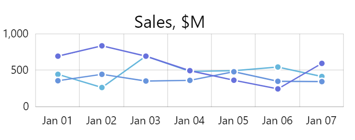
For example, let's add a title to our chart, and set up a tooltip do display additional information when it is hovered.
let title = chart.titles.create();
title.text = "Sales, $M";
title.fontSize = 25;
title.tooltipText = "Sales in millions of US$ during selected period";
var title = chart.titles.create();
title.text = "Sales, $M";
title.fontSize = 25;
title.tooltipText = "Sales in millions of US$ during selected period";
{
  // ...
  "titles": [{
    "text": "Sales, $M",
    "fontSize": 25,
    "tooltipText": "Sales in millions of US$ during selected period"
  }]
}
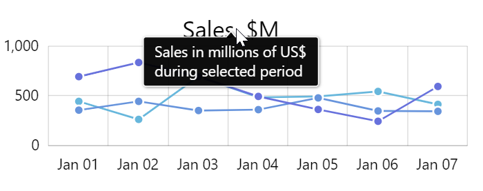
Now if we hover over such title, we'll see a tooltip:

In subsequent sections we'll see how setting tooltipText (or tooltipHTML) in different places affects actual tooltips, how to insert live data into them, and other topics.
Tooltip contents
As we saw in the previous section, we can set tooltipText (or tooltipHTML) to a string which will be shown in the tooltip itself.
Let's see how we can tweak this content, and even replace with live data.
Multi-line tooltips
By default, tooltip's width is only restricted by chart's width. This means, that it will be displayed in one straight line, unless we force new lines, or restrict available width in some other way.
Adding new lines
To force a new line in a particular place, all we need to do is add a new line symbol "\n" (or a <br> tag if we're using HTML for tooltips).
title.tooltipText = "Sales in millions of US$\nduring selected period";
title.tooltipText = "Sales in millions of US$\nduring selected period";
{
  // ...
  "titles": [{
    // ...
    "tooltipText": "Sales in millions of US$\nduring selected period"
  }]
}
Now, our line will break right after the "US$":
Restricting width and forcing auto-wrap
Another option available for us is to restrict with of the tooltip by setting its label's maxWidth and wrap options in pixel value.
Such tooltip will not grow beyond the set size but rather will auto-wrap its text to fit it.
chart.tooltip.label.maxWidth = 150;
chart.tooltip.label.wrap = true;
chart.tooltip.label.maxWidth = 150;
chart.tooltip.label.wrap = true;
{
  // ...
  "tooltip": {
    "label": {
      "maxWidth": 150,
      "wrap": true
    }
  }
}
NOTE In the above code we've jumped the gun and exposed you to modifying properties of a chart-wide Tooltip object. The object hierarchy is explained later in this article, in chartpter "Tooltip object".
Relation to data
Tooltips are much more capable than displaying static text values. Thanks to the text placeholders, they are able to display dynamic information: any property, calculated data, or raw values from its target object.
A placeholder is a name of the property or value enclosed in curly brackets.
How data binding works is explained in great detail in "Data placeholders" section of the "Formatting Strings" article. Let's just look at one quick example:
columnSeries.columns.template.tooltipText = "{name}: {categoryX}: {valueY}";
columnSeries.columns.template.tooltipText = "{name}: {categoryX}: {valueY}";
{
  // ...
  "series": [{
    // ...
    "columns": {
      "tooltipText": "{name}: {categoryX}: {valueY}";
    }
  }]
}
The above sets tooltipText to a ColumnSeries column template, which means it will be replicated to all actual columns.
The {name} will be replaced by series' name (since columns don't have a name), whereas {categoryX} and {valueY} will be replaced with the actual category and value of the particular column respectively.
MORE INFO This will be discussed in greater detail later down this article, in chapter related to Series.
Text versus HTML
As we already mentioned a number of times, tooltip contents can either be set via tooltipText or tooltipHTML.
Setting tooltipText will produce tooltips using SVG.
Setting tooltipHTML will use HTML to display tooltip contents.
Both have advantages and disadvantages. Let's take a quick look at them.
If you need to display mostly text with basic formatting options, tooltipText should be enough. It's faster, supported by all browsers, and provides moderate in-line formatting options.
If you need complex information in your tooltip - tables, images, CSS - you might consider tooltipHTML. It accepts any valid HTML, including full-fledged CSS, so you can do anything in there.
There's a catch though: HTML tooltips are not supported by older Internet Explorer browsers. Such tooltips will also not export to images when exporting your chart.
Ultimately, it's your decision, which is more important.
NOTE It's important to know that if both tooltipText and tooltipHTML are set, the latter will take precedence on browsers that support it, falling back to the former on older browsers. Setting both might be a good strategy if you want to universally support all browsers.
Tooltip object
Before we move forward, we need to take a look at how Tooltip objects are created and handled throughout the chart and its sub-elements.
Global tooltip
Basically, a chart has own tooltip object by default. It's accessible via chart's tooltip property, and it contains an object of type Tooltip.
Most of the objects on chart - like for instance the title element we already looked at earlier in this article - would use chart's tooltip object when needed, rather than creating own tooltip instance.
Basically, it works like this:
- An element with
tooltipTextset is hovered. - It takes
chart.tooltipand:
- sets its contents to owntooltipText;
- positions tooltip over itself;
- makes tooltip visible.
Series tooltip
Since most of the charts in amCharts 4 are "serial", they consist of "series".
Series have their own tooltip instance created automatically, and do not inherit one from the chart.
This design helps with the following:
- Tooltips for multiple series can be shown simultaneously.
- Tooltips can be styled and configured differently between each series and the rest of the chart.
Series' tooltip can be accessed via its tooltip property, e.g. series.tooltip.
Individual tooltips
By default each element on a chart does not have own tooltip object but rather inherits one from either chart or series, depending on where in chart hierarchy element is.
However, it can still have its own tooltip created and set for it manually by creating an instance of Tooltip and assigning it to element's tooltip property. E.g.:
button.tooltip = new am4core.Tooltip();
button.tooltipText = "This button will use own instance of Tooltip";
button.tooltip = new am4core.Tooltip();
button.tooltipText = "This button will use own instance of Tooltip";
{
  // ...
  "children": [{
    "type": "Button",
    "tooltipText": "This button will use own instance of Tooltip",
    "tooltip": {
      "type": "Tooltip",
      "forceCreate": true
    }
  }]
}
NOTE An individual tooltip is automatically created for the element which has always-on tooltip enabled for it.
Configuring appearance
As per chapter above, it's important to know which tooltip instance to modify when targeting tooltips for specific objects.
Do you need to modify tooltip of a global chart element, say an item on legend, or a zoom out button? You will need to modify chart.tooltip.
Need to modify tooltip displayed on a series column? You need series.tooltip.
Color inheritance
Fill
Tooltips that are displayed over specific element will "inherit" its color, or more precisely fill value.
This is why our tooltip for title in the example above came out as black - the title itself is black.
If we want to set our own color for the tooltip we need to first disable the inheritance, then set fill to tooltip's background.
The fill object tooltip is controlled by its getFillFromObject property, and it's true by default. To disable such inheritance, we need to set it to false.
chart.tooltip.getFillFromObject = false;
chart.tooltip.background.fill = am4core.color("#67b7dc");
chart.tooltip.getFillFromObject = false;
chart.tooltip.background.fill = am4core.color("#67b7dc");
{
  // ...
  "tooltip": {
    "getFillFromObject": false,
    "background": {
      "fill": "#67b7dc"
    }
  }
}
Border (stroke)
Border of the tooltip has a similar inheritance setting: getStrokeFromObject.
Unlike getFillFromObject is disabled (false) by default.
Another distinction is whereas getFillFromObject applies fill value of a target object to fill of its background, getStrokeFromObject forces target's stroke value to be applied to the stroke of tooltip's background.
This allows us to replicate target element's appearance, down to the borders.
Alternatively, we can make tooltip's borders indicate target color, while keeping fill color universal across all tooltips.
Configuring text
Text in a tooltip is represented by a single Label object, accessible via tooltip's label property.
Label offers a lot of layout and appearance options you can set for your tooltip contents, e.g.:
// Set text color
chart.tooltip.label.fill = am4core.color("#f00");

// Set text font size
chart.tooltip.label.fontSize = 20;

// Center-align
chart.tooltip.label.textAlign = "middle";
// Set text color
chart.tooltip.label.fill = am4core.color("#f00");

// Set text font size
chart.tooltip.label.fontSize = 20;

// Center-align
chart.tooltip.label.textAlign = "middle";
{
  // ...
  "tooltip": {
    // ...
    "label": {
      "fill": "#f00",
      "fontSize": 20,
      "textAlign": "middle"
    }
  }
}
Series tooltips
Probably the most common usage of tooltips is to display values of specific data items in series. This section will focus on series-related tooltips.
Just to reiterate: each series have its own tooltip instance and does not use chart's tooltip.
Charts without XYCursor
Majority of chart types in amCharts 4 are "serial charts": XYChart, PieChart, FunnelChart, TreeMap, even MapChart.
Out of all serial charts only XYChart can make use of the XYCursor, and it's not even on by default.
This section will focus on those charts that do not use cursor.
Let's take a look at two most common chart types/setups:
ColumnSeriesonXYChart
PieSeriesonPieChart
Columns on ColumnSeries and slices in PieSeries are elements, that we want tooltips to be displayed on.
This means that we will need to set tooltipText on templates of those respective elements.
Let's do ColumnSeries first:
columnSeries.columns.template.tooltipText = "{name}\n{dateX}: {valueY}";
columnSeries.columns.template.tooltipText = "{name}\n{dateX}: {valueY}";
{
  // ...
  "series": [{
    // ...
    "columns": {
      "tooltipText": "{name}\n{dateX}: {valueY}";
    }
  }]
}
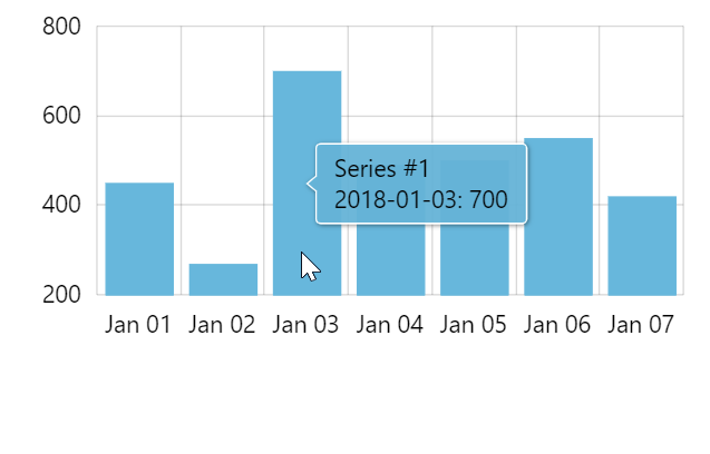
The above instructs the chart that whenever column of this series is hovered, a tooltip will be shown that would display:
- Series name.
- Formatted date the column is on (provided we are using
DateAxis). - Value.
Similarly with PieChart if we can set what is displayed on slice's hover using its template:
pieSeries.slices.template.tooltipText = "{category}: {value}";
pieSeries.slices.template.tooltipText = "{category}: {value}";
{
  // ...
  "series": [{
    // ...
    "slices": {
      "tooltipText": "{category}: {value}";
    }
  }]
}
NOTE Slices on PieSeries have some tooltipText set by default, so we don't necessarily need to set it ourselves, unless we want to modify what is displayed on hover.

ColumnSeries
PieSeries
Charts with XYCursor
How cursor shows tooltips
Now, everything changes when we enable an XYCursor on our chart.
There's a bit of a fuzzy logic involved in how cursor work, namely it will try to trigger a tooltip on all elements in currently hovered date or category, even without directly hovering over them.
This also means that if we have several series, it will display a tooltip for each of those.
A lot of tooltips might spell trouble if you have a lot of series with similar values: they would overlap.
Making cursor arrange tooltips
The solution is to set tooltipText not directly on series elements (in this case columns) but directly on series:
columnSeries.tooltipText = "{name}\n{dateX}: {valueY}";
columnSeries.tooltipText = "{name}\n{dateX}: {valueY}";
{
  // ...
  "series": [{
    // ...
    "tooltipText": "{name}\n{dateX}: {valueY}";
  }]
}
Now, when XYCursor sees there's a tooltip information set on series, it knows it needs to arrange those tooltips so that they do not overlap.
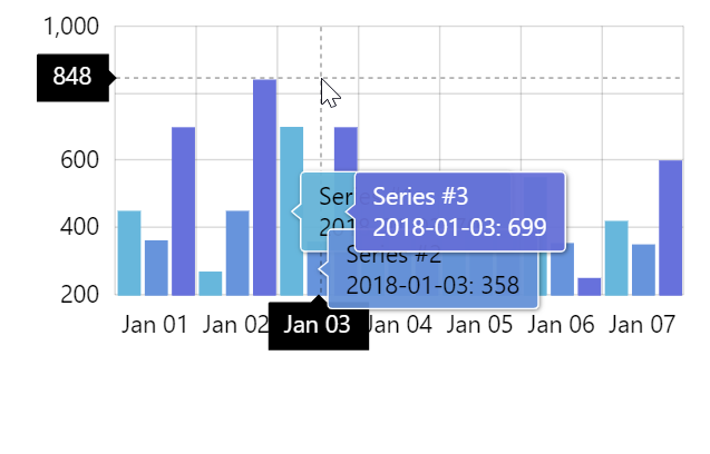
tooltipTextset on columns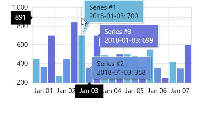
tooltipTextset on series
Limiting number of tooltips displayed
On some series-heavy charts, displaying tooltips for all series might still be too much, even if they do not overlap.
For such cases XYCursor has a very useful setting: maxTooltipDistance.
Basically, setting it will instruct cursor to show tooltip only for the closest data item and closest data items to it - ones that are closer than number of pixels set on maxTooltipDistance.
MORE INFO For more information and examples on how maxTooltipDistance works read here.
Positioning series tooltips
When tooltips are displayed on certain series items, that have width and height - like columns - tooltip is usually positioned in the center.
We can change that using element's tooltipX and tooltipY properties.
They accept both absolute (pixel) and relative (percent) values.
For example, the below will make tooltip be displayed at the top-right corner of the column:
series.columns.template.tooltipX = am4core.percent(100);
series.columns.template.tooltipY = am4core.percent(0);
series.columns.template.tooltipX = am4core.percent(100);
series.columns.template.tooltipY = am4core.percent(0);
{
  // ...
  "series": [{
    // ...
    "columns": {
      // ...
      "tooltipX": "100%",
      "tooltipY": "0%"
    }
  }]
}
tooltipX = am4core.percent(50)tooltipY = am4core.percent(50)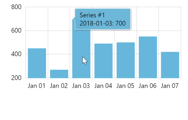
tooltipX = am4core.percent(0)tooltipY = am4core.percent(0)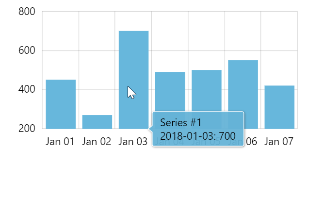
tooltipX = am4core.percent(100)tooltipY = am4core.percent(100)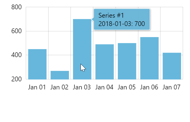
tooltipX = am4core.percent(100)tooltipY = am4core.percent(0)
IMPORTANT If you are using XYCursor on your chart, it will override your tooltip position settings in favor of it sown tooltip layout mechanism.
Tooltip orientation
By default tooltips point either to left or right - depending on their position within chart itself.
We can change that using tooltip's pointerOrientation property.
Available settings are listed in this table:
| Setting | Comment |
|---|---|
"horizontal" (default) | Show tooltip either to left or right of the target area, depending on the position within the chart. |
"vertical" | Show tooltip either above or below the target area, depending on the position within the chart. |
"left" | Show tooltip to the right of the target area, even if it does not fit into chart area. |
"right" | Show tooltip to the left of the target area, even if it does not fit into chart area. |
"up" | Show tooltip below the target area, even if it does not fit into chart area. |
"down" | Show tooltip above the target area, even if it does not fit into chart area. |
Binding tooltip properties to data
Just like about anything else, tooltip's colors (and other properties) may be bound using "property fields".
As an example, let's bind tooltip's border and text color to a field in data named "color".
series.tooltip.getFillFromObject = false;
series.tooltip.label.propertyFields.fill = "color";
series.tooltip.background.propertyFields.stroke = "color";
series.tooltip.getFillFromObject = false;
series.tooltip.label.propertyFields.fill = "color";
series.tooltip.background.propertyFields.stroke = "color";
{
  // ...
  "series": [{
    // ...
    "tooltip": {
      "getFillFromObject": false,
      "label": {
        "propertyFields": {
          "fill": "color"
        }
      },
      "background": {
        "propertyFields": {
          "stroke": "color"
        }
      }
    }
  }]
}
See the Pen amCharts 4: Inheriting tooltip colors from data by amCharts team (@amcharts) on CodePen.
Axis tooltips
Axis tooltips are described in a separate article: "Axis Tooltips".
Additional functionality
Always-on tooltips
It's possible to make the tooltip show on a particular element without the need to hover on it.
The property, repsonsible for it is showTooltipOn.
This is described in tutorial "Using sticky tooltips".
Accessibility
Accessibility features of amCharts 4 allow selecting various elements in chart using TAB key.
We might want to enable automatic tooltip display for For tooltip-element elements.
To do that, simply set element's hoverOnFocus to true:
series.columns.template.hoverOnFocus = true;
series.columns.template.hoverOnFocus = true;
{
  // ...
  "series": [{
    // ...
    "columns": {
      // ...
      "hoverOnFocus": true
    }
  }]
}
MORE INFO This feature is discussed in greater detail here.
Related tutorials
- Using “sticky” tooltips
- Styling or removing tooltip shadow
- Tooltips with rich HTML content
- Round tooltips
- Axis Tooltips
- Clickable links in tooltips
- Custom static multi-value tooltip
- Multi-series shared tooltip with colored bullets
Or check all tooltip-related tutorials.