Sunburst Diagram is a circular chart that is used to indicate hierarchical relational data. It resembles nested donut charts, with an exception that Sunburst does that in a hierarchical fashion, e.g. children slices comprise whole value of their parent slice.
Creating a Sunburst Diagram
To create a Sunburst Diagram you will only need just three things:
- A chart instance;
- Data for the chart;
- Defined data fields.
This is a minimum requirement for the chart. We'll go over each of those shortly.
Importing modules/scripts
Needless to say, before you can use modules/objects, you need to make sure all required modules (in TypeScript), or files (in JavaScript) are imported. Please refer to our Getting started articles for more details:
Sunburst Diagram comes in a form of a plugin. To start using it we will need to include both core (main module) and charts modules, as well as sunburst plugin.
import * as am4core from "@amcharts/amcharts4/core";
import * as am4charts from "@amcharts/amcharts4/charts";
import * as am4plugins from "@amcharts/amcharts4/plugins/sunburst";
<script src="//cdn.amcharts.com/lib/4/core.js"></script>
<script src="//cdn.amcharts.com/lib/4/charts.js"></script>
<script src="//cdn.amcharts.com/lib/4/plugins/sunburst.js"></script>
We'll be importing and referring these as am4core, am4charts, and am4plugins_sunburst in the course of this article, and overally in our demos and tutorials.
Creating chart instance
For that we're going to be using am4core.create() function. (or am4core.createFromConfig() if you are using JSON-based config approach)
let chart = am4core.create("chartdiv", am4plugins_sunburst.Sunburst);
var chart = am4core.create("chartdiv", am4plugins_sunburst.Sunburst );
var chart = am4core.createFromConfig({
  // ... chart config
}, "chartdiv", am4plugins_sunburst.Sunburst);
Data
Data structure
Sunburst Diagram, just like most charts, use an array of objects as the data.
Since the whole point of using Sunburst Diagram over simple PieChart is displaying relational hierarchical data, it makes sense, that chart's data will be multi-level.
More about that later. Let's start with a basic data example.
There's only one thing that Sunburst Diagram needs to know about each of its items - a numeric value.
Just like on a Pie chart, the value determines how much of a total chart space this particular item will take, by comparing its value to the values of other items.
For example a Sunburst Diagram with two items with values 60 and 40 will display two slices: one will take up 60% of the circumference of the chart, while the other one will take up the rest 40%.
Let's see take a very basic example of a 5-item Sunburst Diagram data:
[{
  "value": 190
}, {
  "value": 289
}, {
  "value": 635
}, {
  "value": 732
}, {
  "value": 835
}];
NOTE The actual fields do not necessarily have to be named "value". You can name them anything, and then just instruct the chart which fields to us, as we will see later in this article in a section about "data fields".
Item names in data
While we only need values to draw the chart, it would also be nice to name our items, so that it's not just plain nameless slices.
For that we can add names to our data as well:
[{
  "name": "First",
  "value": 190
}, {
  "name": "Second",
  "value": 289
}, {
  "name": "Third",
  "value": 635
}, {
  "name": "Fourth",
  "value": 732
}, {
  "name": "Fifth",
  "value": 835
}]
NOTE Again, actual name of the field does not matter, as we will need to use "data fields" to specify what type of data is in what field.
Multi-level data
As we might have already mentioned several times, Sunburst Diagram is not limited to a single level. Each item can have sub-items. Those can have sub-items of their own.
When an item has sub-items, let's call them children, the slice gets it's own child series of "mini-slices" that comprise and sub-divide the slice itself.
If an item has children, it has a field in data which will hold an array of items. E.g.:
[{
  "name": "First",
  "children": [
    { "name": "A1", "value": 100 },
    { "name": "A2", "value": 60 },
    { "name": "A3", "value": 30 }
  ]
}, {
  "name": "Second",
  "children": [
    { "name": "B1", "value": 135 },
    { "name": "B2", "value": 98 },
    { "name": "B3", "value": 56 }
  ]
}, {
  "name": "Third",
  "children": [
    { "name": "C1", "value": 335 },
    { "name": "C2", "value": 148 },
    { "name": "C3", "value": 126 },
    { "name": "C4", "value": 26 }
  ]
}, {
  "name": "Fourth",
  "children": [
    { "name": "D1", "value": 415 },
    { "name": "D2", "value": 148 },
    { "name": "D3", "value": 89 },
    { "name": "D4", "value": 64 },
    { "name": "D5", "value": 16 }
  ]
}, {
  "name": "Fifth",
  "children": [
    { "name": "E1", "value": 687 },
    { "name": "E2", "value": 148 }
  ]
}]
NOTE Once again, we're using "children" here, but it does not have to be named like that. We can have it named "jedi" and use "data fields" to specify that this field holds sub-items.
IMPORTANT If item has children, it does not have to have value set, because its value will automatically become the sum of the values of its children.
In-line data
We assign the data to the chart's data property:
chart.data = [{
  "value": 190
}, {
  "value": 289
}, {
  "value": 635
}, {
  "value": 732
}, {
  "value": 835
}];
chart.data = [{
  "value": 190
}, {
  "value": 289
}, {
  "value": 635
}, {
  "value": 732
}, {
  "value": 835
}];
{
  // ...
  "data": [{
    "value": 190
  }, {
    "value": 289
  }, {
    "value": 635
  }, {
    "value": 732
  }, {
    "value": 835
  }]
}
External data
We can also make the chart load external data using dataSource.
chart.dataSource.url = "chart_data.json";
chart.dataSource.url = "chart_data.json";
{
  // ...
  "dataSource": {
    "url": "chart_data.json"
  }
}
MORE INFO Please refer to our "External data" article, for more details.
Setting data fields
OK, so we mentioned "data fields" several times, already. Here's what they are.
Data fields are used to instruct the chart which fields in data hold specific information.
We specify data fields via chart's dataFields property, which is basically a key-value object. The key is a specific structured field, like sake a value or a name, while value is a string key of a field in data to look for in each data item.
Sunburst Diagram supports five types of data fields: (as defined by ISunburstDataFields)
"value"- numeric value of the item;"name"- name of the item;"children"- array of sub-items (children);"color"- a color to be used for the item fill.
All fields are optional, with one caveat: if item does not have children, it has to have a "value" data field set, because without it, the chart won't be able to determine its value and therefore its area.
Here's how dataFields would look like for the sample data we had above:
chart.dataFields.value = "value";
chart.dataFields.name = "name";
chart.dataFields.children = "children";
chart.dataFields.value = "value";
chart.dataFields.name = "name";
chart.dataFields.children = "children";
{
  // ...
  "dataFields": {
    "value": "value",
    "name": "name",
    "children": "children"
  }
}
And, we're done. Our chart is ready.
Data order
Important thing to know is that the Sunburst Diagram will respect the order of the items in data.
The first item will become the first slice, and so on.
That's the default behavior. If we're going to be sticking with it, the actual order of items in data is not important - the chart will sort them out for us.
Complete example
Since we've already established Sunburst Diagram only makes sense when visualizing multi-level hierarchical data, let's start off with exactly such example.
// Create the chart
let chart = am4core.create("chartdiv", am4plugins_sunburst.Sunburst);

// Add multi-level data
chart.data = [{
  name: "First",
  children: [
    { name: "A1", value: 100 },
    { name: "A2", value: 60 }
  ]
},
{
  name: "Second",
  children: [
    { name: "B1", value: 135 },
    { name: "B2", value: 98 }
  ]
},
{
  name: "Third",
  children: [
    {
      name: "C1",
      children: [
        { name: "EE1", value: 130 },
        { name: "EE2", value: 87 },
        { name: "EE3", value: 55 }
      ]
    },
    { name: "C2", value: 148 },
    {
      name: "C3", children: [
        { name: "CC1", value: 53 },
        { name: "CC2", value: 30 }
      ]
    },
    { name: "C4", value: 26 }
  ]
},
{
  name: "Fourth",
  children: [
    { name: "D1", value: 415 },
    { name: "D2", value: 148 },
    { name: "D3", value: 89 }
  ]
},
{
  name: "Fifth",
  children: [
    {
      name: "E1",
      children: [
        { name: "EE1", value: 33 },
        { name: "EE2", value: 40 },
        { name: "EE3", value: 89 }
      ]
    },
    {
      name: "E2",
      value: 148
    }
  ]
}];

// Define data fields
chart.dataFields.value = "value";
chart.dataFields.name = "name";
chart.dataFields.children = "children";
// Create the chart
var chart = am4core.create("chartdiv", am4plugins_sunburst.Sunburst);

// Add multi-level data
chart.data = [{
  name: "First",
  children: [
    { name: "A1", value: 100 },
    { name: "A2", value: 60 }
  ]
},
{
  name: "Second",
  children: [
    { name: "B1", value: 135 },
    { name: "B2", value: 98 }
  ]
},
{
  name: "Third",
  children: [
    {
      name: "C1",
      children: [
        { name: "EE1", value: 130 },
        { name: "EE2", value: 87 },
        { name: "EE3", value: 55 }
      ]
    },
    { name: "C2", value: 148 },
    {
      name: "C3", children: [
        { name: "CC1", value: 53 },
        { name: "CC2", value: 30 }
      ]
    },
    { name: "C4", value: 26 }
  ]
},
{
  name: "Fourth",
  children: [
    { name: "D1", value: 415 },
    { name: "D2", value: 148 },
    { name: "D3", value: 89 }
  ]
},
{
  name: "Fifth",
  children: [
    {
      name: "E1",
      children: [
        { name: "EE1", value: 33 },
        { name: "EE2", value: 40 },
        { name: "EE3", value: 89 }
      ]
    },
    {
      name: "E2",
      value: 148
    }
  ]
}];

// Define data fields
chart.dataFields.value = "value";
chart.dataFields.name = "name";
chart.dataFields.children = "children";
// Create the chart
var chart = am4core.createFromConfig({
  "data": [{
    name: "First",
    children: [
      { name: "A1", value: 100 },
      { name: "A2", value: 60 }
    ]
  },
  {
    name: "Second",
    children: [
      { name: "B1", value: 135 },
      { name: "B2", value: 98 }
    ]
  },
  {
    name: "Third",
    children: [
      {
        name: "C1",
        children: [
          { name: "EE1", value: 130 },
          { name: "EE2", value: 87 },
          { name: "EE3", value: 55 }
        ]
      },
      { name: "C2", value: 148 },
      {
        name: "C3", children: [
          { name: "CC1", value: 53 },
          { name: "CC2", value: 30 }
        ]
      },
      { name: "C4", value: 26 }
    ]
  },
  {
    name: "Fourth",
    children: [
      { name: "D1", value: 415 },
      { name: "D2", value: 148 },
      { name: "D3", value: 89 }
    ]
  },
  {
    name: "Fifth",
    children: [
      {
        name: "E1",
        children: [
          { name: "EE1", value: 33 },
          { name: "EE2", value: 40 },
          { name: "EE3", value: 89 }
        ]
      },
      {
        name: "E2",
        value: 148
      }
    ]
  }],

  "dataFields": {
    "value": "value",
    "name": "name",
    "children": "children"
  }
}, "chartdiv", am4plugins_sunburst.Sunburst);
See the Pen amCharts 4: Sunburst Diagram by amCharts team (@amcharts) on CodePen.
Configuring
Now that we have basic chart working, let's see how we can use bend it to our specific needs.
Level series templates
Sunburst Diagram in it's heart is a serial chart. It creates a series for each level of data.
It differs from other serial-based charts like XY and Pie in that we don't have to create series - they are created automatically by the chart.
However, if we want to configure those series, we'll need to create one for each chart drill-down level we want to configure.
Sunburst Diagram holds such level-specific series in its property seriesTemplates.
It is a DictionaryTemplate so we can create level-specific series templates using its create(level) method. Or, simply create new instances of SunburstSeries and set for a specific key.
NOTE "Levels" in Sunburst Diagram are counted from zero (0). The top-most (0) series contains top items from your data array. Level 1 contains their children. And so on.
IMPORTANTPlease note that this is completely optional. We need to create level series only if we want to configure them. Otherwise, the chart will create them for us using default settings.
So, if we'd like to configure our first level items, we'd need to create a series template for level "0":
let level0 = chart.seriesTemplates.create("0");
var level0 = chart.seriesTemplates.create("0");
{
  // ...
  "seriesTemplates": {
    "0": {
      // ...
    }
  }
}
What we get in level0 is a full-fledged SunburstSeries object, which we can use to configure appearance and behavior of the items in that series, that is in that particular level.
Moving forward, in this article we'll be using those series templates to configure item appearance and behavior in the chart.
Altering item colors
Automatically-assigned colors
By default the chart will automatically assign a color for each new top-level item (slice) from the currently active theme.
Sub-items (children) automatically inherit color from their parent.
Normally this is enough to generate a good looking Sunburst Diagram with distinctive slices.
However, some of the themes, such as default one, may have colors lists that do not make the contrast between color steps prominent enough.
For such situations you may instruct the chart to skip every X-th color in the list using chart's colors.step property:
chart.colors.step = 2;
chart.colors.step = 2;
{
  // ...
  "colors": {
    "step ": 2
  }
}
See the Pen amCharts 4: Sunburst Diagram by amCharts team (@amcharts) on CodePen.
Colors via data
We mentioned colors briefly when we were discussing "data fields" earlier in this article.
Basically, if we're not fine with colors being automatically assigned to our TreeMap items, we can hard-code them in data and bind via "color" data field:
chart.dataFields.color = "color";
chart.dataFields.color = "color";
{
  // ...
  "dataFields": {
    // ...
    "color": "color"
  }
}
See the Pen amCharts 4: Sunburst Diagram by amCharts team (@amcharts) on CodePen.
Modifying appearance
Slice templates
We already know that to modify appearance of the items in a level, we need to create a series template for that level.
Once we have a series object for specific layer we can configure its various parts.
A series object on a Sunburst Diagram has a type of SunburstSeries, which in turn is basically a PieSeries.
MORE INFO We are not going to go in-depth about configuring the appearance of series here. Please visit the "Configuring appearance" section of the Pie Chart article. Since SunburstSeries extends PieSeries, exact same configuration principles apply to both.
Let's just have a quick look how it works here, in a Sunburst Chart.
To make our chart nicer, let's make each subsequent level a bit lighter (by setting fill opacity less and less with each step).
let level1 = chart.seriesTemplates.create("1");
level1.slices.template.fillOpacity = 0.75;

let level2 = chart.seriesTemplates.create("2");
level2.slices.template.fillOpacity = 0.5;
var level1 = chart.seriesTemplates.create("1");
level1.slices.template.fillOpacity = 0.75;

var level2 = chart.seriesTemplates.create("2");
level2.slices.template.fillOpacity = 0.5;
{
  // ...
  "seriesTemplates": {
    "1": {
      "slices": {
        "fillOpacity": 0.75
      }
    },
    "2": {
      "slices": {
        "fillOpacity": 0.5
      }
    }
  }
}
Let's see how that affected our chart.
See the Pen amCharts 4: Sunburst Diagram by amCharts team (@amcharts) on CodePen.
Configuring labels
The Sunburst Diagram comes with pre-defined labels for each slice. Let's explore how we can change their content, orientation, and appearance.
If appearance of the slices is configured via slices.template of the Sunburst series level template, their labels are similarly configured via labels, e.g.: level1.labels.template.
Label content
If we'd like to change what is displayed in it we will need to modify label.text property of it:
let level1 = chart.seriesTemplates.create("1");
level1.labels.template.text = "{category}: {value.value}";
var level1 = chart.seriesTemplates.create("1");
level1.labels.template.text = "{category}: {value.value}";
{
  // ...
  "seriesTemplates": {
    "1": {
      "labels": {
        "text": "{category}: {value.value}"
      }
    }
  }
}
Let's make our Sunburst Diagram more compact by displaying only categories:
See the Pen amCharts 4: Sunburst Diagram by amCharts team (@amcharts) on CodePen.
Disabling labels
Want to get rid of the labels altogether? Just set disabled = false on their respective templates.
let level1 = chart.seriesTemplates.create("1");
level1.labels.template.disabled = true;
var level1 = chart.seriesTemplates.create("1");
level1.labels.template.disabled = true;
{
  // ...
  "seriesTemplates": {
    "1": {
      "labels": {
        "disabled": true
      }
    }
  }
}
Labels outside slices
By default, labels for Sunburst chart are displayed inside each slice.
Should we need to move them outside of the series, we can use label template's inside setting (which is set to true by default).
Please also note that we may also need to do two additional step to accommodate this setup:
- Set color for labels.
- Adjust chart's
radiusto fit labels.
level1.labels.template.inside = false;
level1.labels.template.fill = am4core.color("#000");
level1.labels.template.inside = false;
level1.labels.template.fill = am4core.color("#000");
{
  // ...
  "seriesTemplates": {
    "1": {
      "labels": {
        "inside": false,
        "fill": "#000"
      }
    }
  }
}
Here's a working example:
See the Pen amCharts 4: Sunburst Diagram (outside labels) by amCharts team (@amcharts) on CodePen.
Inner radius
Want your chart to have a hole inside?
Just like you would do it with a PieChart, you can use innerRadius setting for it:
chart.radius = am4core.percent(10);
chart.radius = am4core.percent(10);
{
  // ...
  "innerRadius": "10%"
}
Legend
A Sunburst Chart, like some other chart types can automatically generate a Legend. And, it's just as easy: you just need to assign a new instance of a Legend to chart's legend property:
chart.legend = new am4charts.Legend();
chart.legend = new am4charts.Legend();
{
  // ...
  "legend": {}
}
Please note, that Sunburst legend will automatically display items for slices from all levels, so it can get a bit messy:
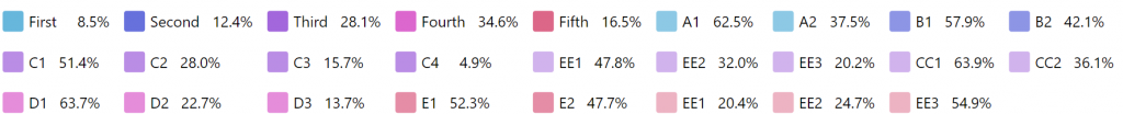
To avoid that, we can use hiddenInLegend setting on level-based series templates, to hide them from legend.
let level1 = chart.seriesTemplates.create("1");
level1.slices.template.fillOpacity = 0.75;
level1.hiddenInLegend = true;

let level2 = chart.seriesTemplates.create("2");
level2.slices.template.fillOpacity = 0.5;
level2.hiddenInLegend = true;
var level1 = chart.seriesTemplates.create("1");
level1.slices.template.fillOpacity = 0.75;
level1.hiddenInLegend = true;

var level2 = chart.seriesTemplates.create("2");
level2.slices.template.fillOpacity = 0.5;
level2.hiddenInLegend = true;
{
  // ...
  "seriesTemplates": {
    "1": {
      "slices": {
        "fillOpacity": 0.75
      },
      "hiddenInLegend": true
    },
    "2": {
      "slices": {
        "fillOpacity": 0.5
      },
      "hiddenInLegend": true
    }
  }
}
See the Pen amCharts 4: Sunburst Diagram by amCharts team (@amcharts) on CodePen.
More info
As we mentioned numerous times already in this article, Sunburst Diagram is essentially a wrapper for a Pie Chart.
For more information how you can configure slices, labels, tooltips, and other properties of the chart, visit out "Anatomy of a Pie Chart" guide.