In the course of this tutorial, we'll explain how, and build an actual working Pie chart.
Creating a Pie chart
Before we can do anything, we need to create a Pie chart object, which in this case an instance of a PieChart class.
A Pie chart, at the very least needs the following things:
- Chart instance;
- Data;
- At least one Series.
This tutorial will walk through all of these.
Importing modules/scripts
Needless to say, before you can do anything, you need to make sure all required modules (in TypeScript), or files (in JavaScript) are imported. Please refer to our Getting started articles for more details:
For a Pie chart, we'll need to import core (main module) and charts modules.
import * as am4core from "@amcharts/amcharts4/core";
import * as am4charts from "@amcharts/amcharts4/charts";
<script src="//cdn.amcharts.com/lib/4/core.js"></script>
<script src="//cdn.amcharts.com/lib/4/charts.js"></script>
We'll be importing and referring these as am4core and am4charts in the course of this article, and overally in our demos and tutorials.
Creating chart instance
For that we're going to be using am4core.create() function. (or am4core.createFromConfig() if you are using JSON-based config approach)
let chart = am4core.create("chartdiv", am4charts.PieChart);
var chart = am4core.create("chartdiv", am4charts.PieChart);
var chart = am4core.createFromConfig({
  // ... chart config
}, "chartdiv", am4charts.PieChart);
NOTE There's a special comment on JSON-based setup down this article. Read on.
Data
Just like for most chart types, the data for a Pie chart is an array of objects. Each of those objects will represent a Slice and must at least contain one numeric value (Slice value) and a category (Slice title).
In-line data
We assign the data to the data to chart's data property:
chart.data = [{
  "country": "Lithuania",
  "litres": 501.9
}, {
  "country": "Czech Republic",
  "litres": 301.9
}, {
  "country": "Ireland",
  "litres": 201.1
}, {
  "country": "Germany",
  "litres": 165.8
}, {
  "country": "Australia",
  "litres": 139.9
}, {
  "country": "Austria",
  "litres": 128.3
}, {
  "country": "UK",
  "litres": 99
}, {
  "country": "Belgium",
  "litres": 60
}, {
  "country": "The Netherlands",
  "litres": 50
}];
{
  // ...
  "data": [{
    "country": "Lithuania",
    "litres": 501.9
  }, {
    "country": "Czech Republic",
    "litres": 301.9
  }, {
    "country": "Ireland",
    "litres": 201.1
  }, {
    "country": "Germany",
    "litres": 165.8
  }, {
    "country": "Australia",
    "litres": 139.9
  }, {
    "country": "Austria",
    "litres": 128.3
  }, {
    "country": "UK",
    "litres": 99
  }, {
    "country": "Belgium",
    "litres": 60
  }, {
    "country": "The Netherlands",
    "litres": 50
  }]
}
External data
We can also make the chart load external data using dataSource.
chart.dataSource.url = "pie_chart_data.json";
chart.dataSource.url = "pie_chart_data.json";
{
  // ...
  "dataSource": {
    "url": "pie_chart_data.json"
  }
}
Please refer to our "External data" article, for more details.
Slice series
In amCharts 4 universe, Pie chart is a serial chart.
Creating a series
A series of Slices is represented by an instance of PieSeries class.
In most serial charts, Pie chart included, all Series are included in a List accessible via chart's series property.
To create a new Series, we just going to create a new instance of PieSeries and push it into chart.series:
let pieSeries = chart.series.push(new am4charts.PieSeries());
var pieSeries = chart.series.push(new am4charts.PieSeries());
{
  // ...
  "series": [{
    "type": "PieSeries",
    // Series settings
  }]
}
Setting up series
Now that we have a Series, we need to set it up.
At the very least, we need to specify the fields in data, this Series will get its values from. (remember a PieSeries needs a numeric value and a string title/category for each Slice)
That's where Series property dataFields comes into play:
pieSeries.dataFields.value = "litres";
pieSeries.dataFields.category = "country";
pieSeries.dataFields.value = "litres";
pieSeries.dataFields.category = "country";
{
  // ...
  "series": [{
    "type": "PieSeries",
    "dataFields": {
      "value": "litres",
      "category": "country"
    }
  }]
}
As you can see, Slice's numeric value is represented by a data field "value", while string title with a "category".
NOTE Check out dedicated "Series" article has more information about concepts of Series.
Putting it all together
Now that we have all the required elements, let's put it all together:
// Import modules
import * as am4core from "@amcharts/amcharts4/core";
import * as am4charts from "@amcharts/amcharts4/charts";

// Create chart instance
let chart = am4core.create("chartdiv", am4charts.PieChart);

// Add data
chart.data = [{
  "country": "Lithuania",
  "litres": 501.9
}, {
  "country": "Czech Republic",
  "litres": 301.9
}, {
  "country": "Ireland",
  "litres": 201.1
}, {
  "country": "Germany",
  "litres": 165.8
}, {
  "country": "Australia",
  "litres": 139.9
}, {
  "country": "Austria",
  "litres": 128.3
}, {
  "country": "UK",
  "litres": 99
}, {
  "country": "Belgium",
  "litres": 60
}, {
  "country": "The Netherlands",
  "litres": 50
}];

// Add and configure Series
let pieSeries = chart.series.push(new am4charts.PieSeries());
pieSeries.dataFields.value = "litres";
pieSeries.dataFields.category = "country";
<script src="//cdn.amcharts.com/lib/4/core.js"></script>
<script src="//cdn.amcharts.com/lib/4/charts.js"></script>

<div id="chartdiv" style="width: 100%; height: 400px;"></div>

<script>
// Create chart instance
var chart = am4core.create("chartdiv", am4charts.PieChart);

// Add data
chart.data = [{
  "country": "Lithuania",
  "litres": 501.9
}, {
  "country": "Czech Republic",
  "litres": 301.9
}, {
  "country": "Ireland",
  "litres": 201.1
}, {
  "country": "Germany",
  "litres": 165.8
}, {
  "country": "Australia",
  "litres": 139.9
}, {
  "country": "Austria",
  "litres": 128.3
}, {
  "country": "UK",
  "litres": 99
}, {
  "country": "Belgium",
  "litres": 60
}, {
  "country": "The Netherlands",
  "litres": 50
}];

// Add and configure Series
var pieSeries = chart.series.push(new am4charts.PieSeries());
pieSeries.dataFields.value = "litres";
pieSeries.dataFields.category = "country";
</script>
<script src="//cdn.amcharts.com/lib/4/core.js"></script>
<script src="//cdn.amcharts.com/lib/4/charts.js"></script>

<div id="chartdiv" style="width: 100%; height: 400px;"></div>

<script>
// Create chart instance
var chart = am4core.createFromConfig({

  // Add data
  "data": [{
    "country": "Lithuania",
    "litres": 501.9
  }, {
    "country": "Czech Republic",
    "litres": 301.9
  }, {
    "country": "Ireland",
    "litres": 201.1
  }, {
    "country": "Germany",
    "litres": 165.8
  }, {
    "country": "Australia",
    "litres": 139.9
  }, {
    "country": "Austria",
    "litres": 128.3
  }, {
    "country": "UK",
    "litres": 99
  }, {
    "country": "Belgium",
    "litres": 60
  }, {
    "country": "The Netherlands",
    "litres": 50
  }],

  // Create and configure Series
  "series": [{
    "type": "PieSeries",
    "dataFields": {
      "value": "litres",
      "category": "country"
    }
  }]
}, "chartdiv", am4charts.PieChart);
</script>
Here's a live version of the chart we've just created: (implemented in JavaScript)
See the Pen amCharts V4: Simple Pie chart by amCharts (@amcharts) on CodePen.
Taking it further
Configuring appearance
There are so much more settings we can apply to chart, Series and the slices.
For example, we can make Pie chart into a Donut chart by setting chart's innerRadius property:
chart.innerRadius = am4core.percent(40);
chart.innerRadius = am4core.percent(40);
{
  // ...
  "innerRadius": "40%"
}
While we're at it, let's make each slice have white outline borders. To do that, we'll need to access PieSeries' slices property, or more precisely its template property.
PieSerie's slices.template holds a dummy object of the Slice class, which will be used as a template (hence the name) when creating actual Slices. It has all the same properties as the Slice class (because it is an instance of the Slice class, duh). Anything you set on a template will make it onto actual slices.
OK, so let's add a dark border around each slice to make them more prominent:
pieSeries.slices.template.stroke = am4core.color("#4a2abb");
pieSeries.slices.template.strokeWidth = 2;
pieSeries.slices.template.strokeOpacity = 1;
pieSeries.slices.template.stroke = am4core.color("#4a2abb");
pieSeries.slices.template.strokeWidth = 2;
pieSeries.slices.template.strokeOpacity = 1;
{
  // ...
  "series": [{
    "type": "PieSeries",
    "dataFields": {
      "value": "litres",
      "category": "country"
    },
    "slices": {
      "stroke": "#4a2abb",
      "strokeWidth": 2,
      "strokeOpacity": 1
    }
  }]
}
And voilà!
See the Pen amCharts V4: Simple Pie chart with Legend by amCharts (@amcharts) on CodePen.
Biding slice appearance to data
You can also bind virtually any property of the slice to a field in data using what we call "property fields".
Read more about property fields, or if you're short on time, property fields is basically an object defining which property (key) should draw its value in data.
Suppose we have a "color" key in our data:
[{
  "country": "Lithuania",
  "litres": 501,
  "color": am4core.color("#ED1C24")
}, {
  "country": "Czechia",
  "litres": 301,
  "color": am4core.color("#235789")
}, {
  "country": "Ireland",
  "litres": 201,
  "color": am4core.color("#F1D302")
}, {
  "country": "Germany",
  "litres": 165,
  "color": am4core.color("#020100")
}]
Now we can use propertyFields of the slice template to bind its fill property a "color" field in data:
pieSeries.slices.template.propertyFields.fill = "color";
pieSeries.slices.template.propertyFields.fill = "color";
{
  // ...
  "series": [{
    "type": "PieSeries",
    // ...
    "slices": {
      "propertyFields": {
        "fill": "color"
      }
    }
  }]
}
Let's see how this looks on a live chart:
See the Pen amCharts 4: Binding slice colors to data by amCharts team (@amcharts) on CodePen.
Disabling various elements
It's possible to disable various elements like ticks, labels and rollover tooltips.
To disable the former, use templates of the respectively named ticks and labels list templates:
pieSeries.labels.template.disabled = true;
pieSeries.ticks.template.disabled = true;
pieSeries.labels.template.disabled = true;
pieSeries.ticks.template.disabled = true;
{
  // ...
  "series": {
    // ...
    "ticks": {
      "disabled": true
    },
    "labels": {
      "disabled": true
    }
  }
}
NOTE You can use those same templates to also configure labels and ticks, like for example set fill to change color.
To disable the tooltip which appears on slice hover, simply reset tooltipText on its template:
pieSeries.slices.template.tooltipText = "";
pieSeries.slices.template.tooltipText = "";
{
  // ...
  "series": {
    // ...
    "slices": {
      "tooltipText": ""
    }
  }
}
Here's a working example with all of the above:
See the Pen amCharts V4: Disabling Pie chart elements by amCharts (@amcharts) on CodePen.
Controlling appearance via states
In short, states is a powerful amCharts 4 concept allowing application of property values to elements when certain actions happen.
Like, for example, an element is hovered.
Pie series' slices has already three states pre-created for us:
"default"state, which is applied when slice is in its initial position."hover"state, which is applied when you hover or touch the slice."active"state, which is applied when you click or tap the slice so it pulls out.
Each of those states, apply values to certain slice properties to modify its appearance.
For example, "hover" state, when applied, sets slice's scale to 1.1 making it grow slightly.
When you click a slice and "active" state is applied, it sets slice's shiftRadius property, which makes slice look pulled out.
To modify how slices behave in each of those scenarios, you need to modify the respective states' properties values.
For example, if we don't want the slice to grow on hover, we'd do this:
let hs = pieSeries.slices.template.states.getKey("hover");
hs.properties.scale = 1;
var hs = pieSeries.slices.template.states.getKey("hover");
hs.properties.scale = 1;
{
  // ...
  "series": {
    // ...
    "slices": {
      "states": {
        "hover": {
          "properties": {
            "scale": 1
          }
        }
      }
    }
  }
}
Similarly, if we don't want slice to pull out on click, we'd need to modify "active" state:
let as = pieSeries.slices.template.states.getKey("active");
as.properties.shiftRadius = 0;
var as = pieSeries.slices.template.states.getKey("active");
as.properties.shiftRadius = 0;
{
  // ...
  "series": {
    // ...
    "slices": {
      "states": {
        "active": {
          "properties": {
            "shiftRadius": 1
          }
        }
      }
    }
  }
}
We can also, modify any of the slices' properties that way just as well.
For example, if we want to disable growing on hover, but would rather modify fill opacity of the slice, we can do this:
pieSeries.slices.template.fillOpacity = 1;

let hs = pieSeries.slices.template.states.getKey("hover");
hs.properties.scale = 1;
hs.properties.fillOpacity = 0.5;
pieSeries.slices.template.fillOpacity = 1;

var hs = pieSeries.slices.template.states.getKey("hover");
hs.properties.scale = 1;
hs.properties.fillOpacity = 0.5;
{
  // ...
  "series": {
    // ...
    "slices": {
      "fillOpacity": 1,
      "states": {
        "hover": {
          "properties": {
            "scale": 1,
            "fillOpacity": 0.5
          }
        }
      }
    }
  }
}
IMPORTANT Notice, how we set fillOpacity on slice template as well. This is required, so that slice knows that it needs to return to this particular fill opacity when is no longer hovered.
See the Pen amCharts V4: Pie chart states by amCharts (@amcharts) on CodePen.
MORE INFO For more information about states read our dedicated "States" article.
One more thing before you go. There's also a specially-named theme: "hoverActive". It is not created by default, so you would need to create it. If created, it will be applied in those situations when an "active" slice is hovered.
Adding a legend
Even if it's not required, adding a legend might improve user experience. It can provide visual reference for the user, as well as allow toggling certain Slices.
To add a legend, we simply create an instance of Legend class and assign it to chart's legend property. It's as simple as that.
chart.legend = new am4charts.Legend();
chart.legend = new am4charts.Legend();
{
  // ...
  "legend": {
    "type": "Legend"
  }
}
NOTE Refer to the "Legend" article for more details.
Setting themes
amCharts 4 makes it easy to apply themes to am4charts. Let's make our chart more lively by enabling "Animated" theme.
To do so, we'll need to remember to import the theme itself as well as set the system to use it.
// Import modules
import * as am4core from "@amcharts/amcharts4/core";
import * as am4charts from "@amcharts/amcharts4/charts";
import am4themes_animated from "@amcharts/amcharts4/themes/animated";

// Set theme
am4core.useTheme(am4themes_animated);

// Create chart instance
let chart = am4core.create("chartdiv", am4charts.PieChart);

// ...
<script src="//cdn.amcharts.com/lib/4/core.js"></script>
<script src="//cdn.amcharts.com/lib/4/charts.js"></script>
<script src="//cdn.amcharts.com/lib/4/themes/animated.js"></script>

<div id="chartdiv" style="width: 100%; height: 400px;"></div>

<script>
// Set theme
am4core.useTheme(am4themes_animated);

// Create chart instance
var chart = am4core.create("chartdiv", am4charts.PieChart);

// ...
</script>
<script src="//cdn.amcharts.com/lib/4/core.js"></script>
<script src="//cdn.amcharts.com/lib/4/charts.js"></script>
<script src="//cdn.amcharts.com/lib/4/themes/animated.js"></script>

<div id="chartdiv" style="width: 100%; height: 400px;"></div>

<script>
// Set theme
am4core.useTheme(am4themes_animated);

// Create chart instance
var chart = am4core.createFromConfig({
  // ...
}, "chartdiv", am4charts.PieChart);
</script>
See the Pen amCharts V4: Simple Pie chart (animated) by amCharts (@amcharts) on CodePen.
(click RERUN or legend items to see how much more nicer interactions feel like now)
NOTE Refer to the "Using themes" article for more details.
Nested donut charts
A Pie chart can have more than one PieSeries. To create nested Pie/Donut charts, we simply add multiple PieSeries. (making sure they have their dataFields configured properly to point at correct properties in the data)
We're not going to bloat this article with a code example. We're just going to slam you with a live demo:
See the Pen amCharts V4: Nested Pie chart with Legend by amCharts (@amcharts) on CodePen.
Modifying labels, legend, tooltip
By default Pie chart displays all values - in slice labels, rollover tooltips, legend - as percent.
If you'd rather like to display them as absolute values, or otherwise modify default information, you will need to adjust various settings across your chart.
REQUIRED READING The further info in this chapter relies heavily on the concept of binding text placeholder to data. Make sure you read about Text placeholders before proceeding.
Changing slice label content
Slice label content is regulated by a sample template object of the Pie series, accessible by pieSeries.labels.template.
So, if we'd like to change what is displayed in it we will need to modify label.text property of it:
pieSeries.labels.template.text = "{category}: {value.value}";
pieSeries.labels.template.text = "{category}: {value.value}";
{
  // ...
  "series": [{
    // ...
    "labels": {
      "text": "{category}: {value.value}"
    }
  }]
}
Changing tooltip content
What goes into tooltip when you hover a Pie slice is regulated by slice template's tooltipText property.
If you'd like to change it, that's the property you set:
pieSeries.slices.template.tooltipText = "{category}: {value.value}";
pieSeries.slices.template.tooltipText = "{category}: {value.value}";
{
  // ...
  "series": [{
    // ...
    "slices": {
      "tooltipText": "{category}: {value.value}"
    }
  }]
}
Changing legend value
Finally, if you'd like to set what value is displayed in the legend, you'll need to set text for its value labels template:
chart.legend.valueLabels.template.text = "{value.value}";
chart.legend.valueLabels.template.text = "{value.value}";
{
  // ...
  "legend": {
    "valueLabels": {
      "text": "{value.value}"
    }
  }
}
Chart radius
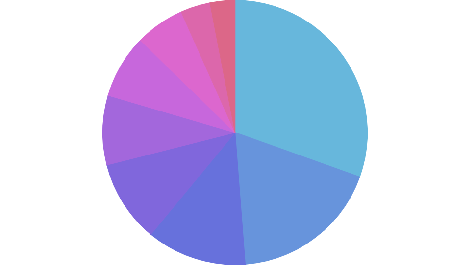
Normally, a Pie chart will take up 80% of the chart container's width or height - whichever is smaller.
The extra 20% are for accommodating possible labels and slice pull outs.
Like anything else it is changeable. For that we have chart's radius property.
It can be either fixed pixel value, or relative value in percents (relative to the space available to the chart).
Say, we have labels disabled and would want our chart reclaim the available space instead. We'd just need to set radius to 100% percent:
chart.radius = am4core.percent(100);
chart.radius = am4core.percent(100);
{
  // ...
  "radius": "100%"
}
radius = am4core.percent(100)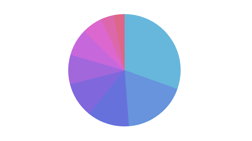
Default (80%) 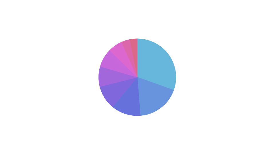
radius = am4core.percent(50)
3D Pie chart
A 3D Pie in amCharts 4 is a separate chart type represented by a class PieChart3D. It is almost identical to PieChart, save for a few extra properties that deal with the 3D appearance.
To oversimplify, to convert any regular Pie chart to a 3D Pie chart, slap a "3D" to any class and/or module:
| Regular Pie chart | 3D Pie chart |
|---|---|
am4charts.PieChart | am4charts.PieChart3D |
am4charts.PieSeries | am4charts.PieSeries3D |
am4charts.Legend | am4charts.Legend (Legend is not 3D; it's shared across multiple chart types) |
See the Pen amCharts V4: 3D Pie chart by amCharts (@amcharts) on CodePen.
Grouping small slices
With the help if SliceGrouper plugin, you can make Pie Chart automatically group small slices into "Other" group.
Follow the link above for more information.
Related content
You might also benefit from looking at the following Pie chart related tutorials:
- Labels Inside Pie Chart Slices
- Curved Pie Chart Labels
- Pre-hiding Pie Chart Slices
- Pie chart with pre-pulled slice(s)
- Showing placeholder for empty Pie chart
- Manipulating mouse cursor style
- One pulled slice per Pie chart
- Variable-radius Pie Slices
- Creating Pie Series Animations
- Hiding Small Pie Slices
- Sum label inside a donut chart
- Clustered Pie Charts
- PieChart with too many slices
- Dealing with PieChart labels that don't fit


