Axes, among other things, in collaboration with Chart Cursor, have a way to indicate particular position on it, in form of an "axis tooltip".
This article will look at various aspects of Axis Tooltips.
What are axis tooltips
As you have already noticed in the number of examples that use Cursor, each of the Cursor's lines end up with a tooltip on each axis, indicating said line's precise location on that axis.
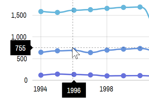
By default, axis balloons (those black blobs in the image above) will display whatever label would be displayed on axis, if it axis wanted to display a label in that place.
For a Category axis, it will always be the category that Cursor is currently within. For Date and Value axis, we may get some intermediate number, as the Cursor will get more granular.
E.g. even if we have labels each 200 units on a Value axis, the Cursor moving along it will display precise number it is pointing to, i.e. 351.
There are a few ways to influence what is displayed in the axis tooltip, and how it is formatted.
Enabling axis tooltips
We already mentioned chart Cursor.
The only way to enable axis tooltips is to enable chart cursor.
Creating a chart cursor is super easy. You just instantiate an object of a cursor type that is relevant to the chart type, then assign it to chart's cursor property.
For an XY chart, that's XYCursor. For a Radar chart it's RadarCursor.
chart.cursor = new am4charts.XYCursor();
chart.cursor = new am4charts.XYCursor();
{
  // ...
  "cursor": {
    // No need to set `type` here - the chart already
    // knows what type of cursor it needs.
  }
}
Here's a working example to get you started:
See the Pen amCharts V4: Axis tooltips (1) by amCharts (@amcharts) on CodePen.
MORE INFO For more information about chart Cursor visit dedicated article "Chart Cursor".
Modifying tooltip appearance
Appearance of the axis-specific tooltip can be modified through that axis' tooltip property, which holds its own instance of Tooltip element.
Take a look to examine Tooltip properties in class reference we linked above.
As an exercise, we're going to mod Category axis tooltip by changing its color, removing outline, cutting off it's stem pointer and throwing in a drop shadow filter for a good measure.
Here's how the code looks like:
let axisTooltip = categoryAxis.tooltip;
axisTooltip.background.fill = am4core.color("#07BEB8");
axisTooltip.background.strokeWidth = 0;
axisTooltip.background.cornerRadius = 3;
axisTooltip.background.pointerLength = 0;
axisTooltip.dy = 5;

let dropShadow = new am4core.DropShadowFilter();
dropShadow.dy = 1;
dropShadow.dx = 1;
dropShadow.opacity = 0.5;
axisTooltip.filters.push(dropShadow);
var axisTooltip = categoryAxis.tooltip;
axisTooltip.background.fill = am4core.color("#07BEB8");
axisTooltip.background.strokeWidth = 0;
axisTooltip.background.cornerRadius = 3;
axisTooltip.background.pointerLength = 0;
axisTooltip.dy = 5;

var dropShadow = new am4core.DropShadowFilter();
dropShadow.dy = 1;
dropShadow.dx = 1;
dropShadow.opacity = 0.5;
axisTooltip.filters.push(dropShadow);
{
  // ...
  "xAxes": {
    // ...
    "tooltip": {
      "background": {
        "fill": "#07BEB8",
        "strokeWidth": 0,
        "cornerRadius": 3,
        "pointerLength": 0
      },
      "dy": 5
    }
  }
}
NOTE the dy setting, which means "adjust vertical position of this element by X pixels", is there to compensate for the disabled stem pointer, so that tooltip aligns nicely with axis labels.
See the Pen amCharts V4: Axis tooltips (1) by amCharts (@amcharts) on CodePen.
Value format on DateAxis
Normally, axis tooltip contents will try to replicate the content and format of the actual axis labels.
Specifically for Date axis, you can override this format using axis' tooltipDateFormat setting:
dateAxis.tooltipDateFormat = "yyyy-MM-dd";
dateAxis.tooltipDateFormat = "yyyy-MM-dd";
{
  // ...
  "xAxes": [{
    "type": "DateAxis",
    // ...
    "tooltipDateFormat": "yyyy-MM-dd"
  }]
}
Controlling tooltip content
Furthermore, you can modify contents of the Tooltip through the use of Adapters.
dateAxis.adapter.add("getTooltipText", (text) => {
 return ">>> " + text + " <<<";
});
dateAxis.adapter.add("getTooltipText", (text) => {
 return ">>> " + text + " <<<";
});
{
  // ...
  "xAxes": [{
    "type": "DateAxis",
    // ...
    "adapter": {
      "getTooltipText": function(text) {
        return ">>> " + text + " <<<";
      }
    }
  }]
}
See the Pen amCharts V4: Axis tooltips (4) by amCharts (@amcharts) on CodePen.
MORE INFO Make sure you read our "Adapters" article for knowledge about this powerful concept.
Disabling tooltip
To disable Cursor tooltip for a particular axis, we once again are going to be using axis' setting: cursorTooltipEnabled.
It's a boolean setting, available in all axis types.
So, if we'd like to disable tooltip on a vertical Value axis from our example, we'd do this:
valueAxis.cursorTooltipEnabled = false;
valueAxis.cursorTooltipEnabled = false;
{
  // ...
  "yAxes": {
    // ...
    "cursorTooltipEnabled": false
  }
}
Number precision on ValueAxis
Normally, the number shown in a ValueAxis tooltip will have the precision applied to reflect the scale and grid increment of the axis itself.
For example, if you have grid lines at 0, 0.5, and 1, the intermediate position number will be in 0.1 increments: 0, 0.1, 0.2, etc.
If we would like our intermediate values to get more granular, we can use ValueAxis setting extraTooltipPrecision.
For example if we set it to 1 (one), we will add one extra decimal point to the precision of the numbers, so we will be able to have values like 0, 0.12, 0.25 etc.