Radar chart is used to display directional or circular visual representation of a 2-dimensional data.
Think of it as a "circular XY chart", because the two charts are not that different. If you've gone through our "Anatomy of an XY chart" article, you'll feel right at home here.
Creating a Radar chart
To create a Radar chart, which is an instance of a RadarChart class, we'll need at least the following chart elements:
- Chart instance;
- Data;
- At least two axes - radial (that spans from the center of the radar circle) and circular (that goes around the outer perimeter of the radar circle);
- At least one series.
Let's look at each of those one-by-one.
Importing modules/scripts
Needless to say, before you can use modules/objects, you need to make sure all required modules (in TypeScript), or files (in JavaScript) are imported. Please refer to our Getting started articles for more details:
For a XY chart, we'll need to import core (main module) and charts modules.
import * as am4core from "@amcharts/amcharts4/core";
import * as am4charts from "@amcharts/amcharts4/charts";
<script src="//cdn.amcharts.com/lib/4/core.js"></script>
<script src="//cdn.amcharts.com/lib/4/charts.js"></script>
We'll be importing and referring these as am4core and am4charts in the course of this article, and overally in our demos and tutorials.
Creating chart instance
For that we're going to be using am4core.create() function. (or am4core.createFromConfig() if you are using JSON-based config approach)
let chart = am4core.create("chartdiv", am4charts.RadarChart);
var chart = am4core.create("chartdiv", am4charts.RadarChart);
var chart = am4core.createFromConfig({
  // ... chart config
}, "chartdiv", am4charts.RadarChart);
Data
Even though Radar chart is circular, its data is represented by two dimensions: circular position and radial position.
In XY chart, these would be equivalents of X and Y axes respectively.
NOTE To prove the point, let's take exactly the same data, as we used for our XY chart article.
In-line data
We assign the data to the data to chart's data property:
chart.data = [{
  "country": "Lithuania",
  "litres": 501
}, {
  "country": "Czech Republic",
  "litres": 301
}, {
  "country": "Ireland",
  "litres": 266
}, {
  "country": "Germany",
  "litres": 165
}, {
  "country": "Australia",
  "litres": 139
}, {
  "country": "Austria",
  "litres": 336
}, {
  "country": "UK",
  "litres": 290
}, {
  "country": "Belgium",
  "litres": 325
}, {
  "country": "The Netherlands",
  "litres": 40
}];
{
  // ...
  "data": [{
    "country": "Lithuania",
    "litres": 501
  }, {
    "country": "Czech Republic",
    "litres": 301
  }, {
    "country": "Ireland",
    "litres": 266
  }, {
    "country": "Germany",
    "litres": 165
  }, {
    "country": "Australia",
    "litres": 139
  }, {
    "country": "Austria",
    "litres": 336
  }, {
    "country": "UK",
    "litres": 290
  }, {
    "country": "Belgium",
    "litres": 325
  }, {
    "country": "The Netherlands",
    "litres": 40
  }]
}
External data
We can also make the chart load external data using dataSource.
chart.dataSource.url = "chart_data.json";
chart.dataSource.url = "chart_data.json";
{
  // ...
  "dataSource": {
    "url": "chart_data.json"
  }
}
MORE INFO Please refer to our "External data" article, for more details.
Axes
We already mentioned we will need at least two axes - circular and radial - to depict our 2-dimensional data.
The data can have different measurement units. For example with can have a scatter plot that has each data point defined by two numeric values.
Or, we can have a stock price that has a value plotted over dates.
Or, we have a average wind speed defined for each compass direction.
Every scenario has its requirements.
The simplest Radar chart would probably have a circular CategoryAxis and a radial ValueAxis. But, it can really be any combination, as we will see during the course of this article.
MORE INFO We do have a dedicated article on "Axes". Pop in there for deeper detail.
Creating axes
Each Radar chart has two list properties: xAxes and yAxes.
xAxes holds a list of circular axes. You know, because they start off horizontally, and go to the right before thet start curving downwards to form the circle.
yAxes holds radial axes. They start at the center of the chart and outside in a straight line, hence "y".
When you create an axis of particular type, you push() it into appropriate list.
Let's say, building on previous date example, we want to plot data that are string-based names (countries) positioned circularly around the while chart, and numeric values (liters) vertically.
We'll need to create an instance of CategoryAxis and push it into xAxes, as well as instance of ValueAxis for pushing into yAxes.
let categoryAxis = chart.xAxes.push(new am4charts.CategoryAxis());
categoryAxis.dataFields.category = "country";
let valueAxis = chart.yAxes.push(new am4charts.ValueAxis());
var categoryAxis = chart.xAxes.push(new am4charts.CategoryAxis());
categoryAxis.dataFields.category = "country";
var valueAxis = chart.yAxes.push(new am4charts.ValueAxis());
{
  // ...
  "xAxes": [{
    "type": "CategoryAxis",
    "dataFields": {
      "category": "country"
    }
  }],
  "yAxes": [{
    "type": "ValueAxis"
  }]
}
Notice, the dataFields in CategoryAxis definition. This type of axis is special in such way, that it needs to access data (so that it can extract a list of categories). The dataFields instructs which property in data objects holds category names.
More about axes
There's so much more to axes than that. You can configure its appearance down to a bolt, including grid, cursor tooltips, gaps, labels, and so much more. But this is a topic to a dedicated concept article about Axes.
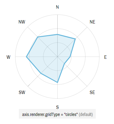
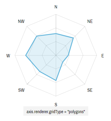
Circular vs linear grid
Grid lines on a Radar chart are circular by default. Meaning they are circles.
You can make them straight using radial (Y) axis renderer's gridType property.
Available values are "circles" (default) and "polygons".
Radar chart axis types
A Radar chart can use any combination of the following axis types:
| Axis class | Comment |
|---|---|
| CategoryAxis | Displays equally divided string-based increments - categories.
Requires Category labels are displayed as they are in data. |
| DateAxis | Used to position items on a date/time scale.
Will format labels according to its |
| ValueAxis | Used to position items based on their numeric value.
Will format labels according to its |
Series
For the Radar chart to be useful it needs to have at least one series. It can contain any number of series of different types - the chart will handle that gracefully.
MORE INFO We do have a dedicated "Series" article that goes into concept of series in greater detail. We suggest you take a look there before proceeding with this article. We'll touch basic aspects that relate to Radar chart here.
Creating series
A series is represented by a series class. Depending on what we need to show, and what data we have we may choose one series-related class or another.
As in most other chart types, Radar chart's series are held in a List accessible via series property.
To create a new Series, we just create an instance of series push() it into chart's series list.
Let's try creating a series for a simple line graph, which in Radar chart happens to be represented by RadarSeries class.
let series = chart.series.push(new am4charts.RadarSeries());
var series = chart.series.push(new am4charts.RadarSeries());
{
  // ...
  "series": [{
    "type": "RadarSeries",
    // Series settings
  }]
}
Binding series to data
The most and foremost requirement when configuring series, is to specify on where it should get its data from.
Series' property dataFields is used for exactly that. (more about series' data fields)
Again, building up on our data example further up this article, we know that our column series should get categories from "category" field to be used on horizontal (x) axis, and numeric value from "litres" to be used on vertical (y) axis.
series.dataFields.valueY = "litres";
series.dataFields.categoryX = "country";
series.dataFields.valueY = "litres";
series.dataFields.categoryX = "country";
{
  // ...
  "series": [{
    "type": "RadarSeries",
    "dataFields": {
      "valueY": "litres",
      "categoryX": "country"
    }
  }]
}
IMPORTANT Different series types and different date require different data fields.
Let's say if we had a Date axis instead of Category axis. We'd need to set dateX instead of categoryX.
Configuring series
Now that we have series bound to data, we can use their properties to configure series appearance and related properties.
For example, we can set series' name, so that it can be nicely represented in Legend and tooltips.
Or, we can specify series visual settings - some via direct properties, some via templates.
All of the above is discussed in Series article. We'll just drop a small example here for those itching to get going:
let series = chart.series.push(new am4charts.RadarSeries());
series.name = "Sales";
series.dataFields.valueY = "litres";
series.dataFields.categoryX = "country";
var series = chart.series.push(new am4charts.RadarSeries());
series.name = "Sales";
series.dataFields.valueY = "litres";
series.dataFields.categoryX = "country";
{
  // ...
  "series": [{
    "type": "RadarSeries",
    "name": "Sales",
    "dataFields": {
      "valueY": "litres",
      "categoryX": "country"
    }
  }]
}
Basic example
Now that we have axes and a series set up, let's take a moment to produce a complete very basic example:
/* Create chart instance */
let chart = am4core.create("chartdiv", am4charts.RadarChart);

/* Add data */
chart.data = [{
  "country": "Lithuania",
  "litres": 501
}, {
  "country": "Czech Republic",
  "litres": 301
}, {
  "country": "Ireland",
  "litres": 266
}, {
  "country": "Germany",
  "litres": 165
}, {
  "country": "Australia",
  "litres": 139
}, {
  "country": "Austria",
  "litres": 336
}, {
  "country": "UK",
  "litres": 290
}, {
  "country": "Belgium",
  "litres": 325
}, {
  "country": "The Netherlands",
  "litres": 40
}];

/* Create axes */
let categoryAxis = chart.xAxes.push(new am4charts.CategoryAxis());
categoryAxis.dataFields.category = "country";

let valueAxis = chart.yAxes.push(new am4charts.ValueAxis());

/* Create and configure series */
let series = chart.series.push(new am4charts.RadarSeries());
series.dataFields.valueY = "litres";
series.dataFields.categoryX = "country";
series.name = "Sales";
series.strokeWidth = 3;
/* Create chart instance */
var chart = am4core.create("chartdiv", am4charts.RadarChart);

/* Add data */
chart.data = [{
  "country": "Lithuania",
  "litres": 501
}, {
  "country": "Czech Republic",
  "litres": 301
}, {
  "country": "Ireland",
  "litres": 266
}, {
  "country": "Germany",
  "litres": 165
}, {
  "country": "Australia",
  "litres": 139
}, {
  "country": "Austria",
  "litres": 336
}, {
  "country": "UK",
  "litres": 290
}, {
  "country": "Belgium",
  "litres": 325
}, {
  "country": "The Netherlands",
  "litres": 40
}];

/* Create axes */
var categoryAxis = chart.xAxes.push(new am4charts.CategoryAxis());
categoryAxis.dataFields.category = "country";

var valueAxis = chart.yAxes.push(new am4charts.ValueAxis());

/* Create and configure series */
var series = chart.series.push(new am4charts.RadarSeries());
series.dataFields.valueY = "litres";
series.dataFields.categoryX = "country";
series.name = "Sales";
series.strokeWidth = 3;
var chart = am4core.createFromConfig("chartdiv", {
  "data": [{
    "country": "Lithuania",
    "litres": 501
  }, {
    "country": "Czech Republic",
    "litres": 301
  }, {
    "country": "Ireland",
    "litres": 266
  }, {
    "country": "Germany",
    "litres": 165
  }, {
    "country": "Australia",
    "litres": 139
  }, {
    "country": "Austria",
    "litres": 336
  }, {
    "country": "UK",
    "litres": 290
  }, {
    "country": "Belgium",
    "litres": 325
  }, {
    "country": "The Netherlands",
    "litres": 40
  }],
  "xAxes": [{
    "type": "CategoryAxis",
    "dataFields": {
      "category": "country"
    }
  }],
  "yAxes": [{
    "type": "ValueAxis",
  }],
  "series": [{
    "type": "RadarSeries",
    "name": "Sales",
    "dataFields": {
      "valueY": "litres",
      "categoryX": "country"
    }
  }]
});
And here's a live example of the above:
See the Pen amCharts V4: Radar chart (1) by amCharts (@amcharts) on CodePen.
Radar chart series
Radar chart supports the following series classes:
| Series class | Data fields | Comment |
|---|---|---|
| RadarColumnSeries | IRadarColumnSeriesDataFields | Displays columns, or bars. |
| RadarSeries | IRadarSeriesDataFields | Displays line or area (filled) graph. |
Configuring column series
We can also use tooltipText to specify what is displayed when user hovers over series. (more info)
NOTE There's a caveat about setting tooltipText. Setting it directly on series will work only if you are also using chart cursor. Otherwise, you should set it on series' elements templates, such as columns.template.
There's an example in the very next section, you'll see how it's used in a minute.
Mixing series
You can mix and match multiple series on the same chart.
Let's add a RadarColumnSeries behind the RadarSeries we already have.
let series = chart.series.push(new am4charts.RadarSeries());
series.dataFields.valueY = "litres";
series.dataFields.categoryX = "country";
series.name = "Sales";
series.strokeWidth = 3;
series.zIndex = 2;

let series2 = chart.series.push(new am4charts.RadarColumnSeries());
series2.dataFields.valueY = "units";
series2.dataFields.categoryX = "country";
series2.name = "Units";
series2.strokeWidth = 0;
series2.columns.template.fill = am4core.color("#CDA2AB");
series2.columns.template.tooltipText = "Series: {name}\nCategory: {categoryX}\nValue: {valueY}";
var series = chart.series.push(new am4charts.RadarSeries());
series.dataFields.valueY = "litres";
series.dataFields.categoryX = "country";
series.name = "Sales";
series.strokeWidth = 3;
series.zIndex = 2;

var series2 = chart.series.push(new am4charts.RadarColumnSeries());
series2.dataFields.valueY = "units";
series2.dataFields.categoryX = "country";
series2.name = "Units";
series2.strokeWidth = 0;
series2.columns.template.fill = am4core.color("#CDA2AB");
series2.columns.template.tooltipText = "Series: {name}\nCategory: {categoryX}\nValue: {valueY}";
{
  // ...
  "series": [{
    "type": "RadarSeries",
    "name": "Sales",
    "strokeWidth": 3,
    "zIndex": 2,
    "dataFields": {
      "valueY": "litres",
      "categoryX": "country"
    }
  }, {
    "type": "RadarColumnSeries",
    "name": "Units",
    "dataFields": {
      "valueY": "units",
      "categoryX": "country"
    },
    "columns": {
      "tooltipText": "Series: {name}\nCategory: {categoryX}\nValue: {valueY}",
      "fill": "#CDA2AB"
    }
  }]
}
NOTE Adding multiple RadarColumnSeries to the chart will automatically arrange them into nice clusters.
NOTE Notice the zIndex setting we added to our Radar series? Chart will automatically arrange order of series as they are added. Using zIndex is a way to modify this order. Default is 0, so even if we added our Radar series before Radar column series, the former is displayed above, since it has higher zIndex.
Complete example
// Import modules
import * as am4core from "@amcharts/amcharts4/core";
import * as am4charts from "@amcharts/amcharts4/charts";

/* Create chart instance */
let chart = am4core.create("chartdiv", am4charts.RadarChart);

/* Add data */
chart.data = [{
  "country": "Lithuania",
  "litres": 501,
  "units": 250
}, {
  "country": "Czech Republic",
  "litres": 301,
  "units": 222
}, {
  "country": "Ireland",
  "litres": 266,
  "units": 179
}, {
  "country": "Germany",
  "litres": 165,
  "units": 298
}, {
  "country": "Australia",
  "litres": 139,
  "units": 299
}, {
  "country": "Austria",
  "litres": 336,
  "units": 185
}, {
  "country": "UK",
  "litres": 290,
  "units": 150
}, {
  "country": "Belgium",
  "litres": 325,
  "units": 382
}, {
  "country": "The Netherlands",
  "litres": 40,
  "units": 172
}];

/* Create axes */
let categoryAxis = chart.xAxes.push(new am4charts.CategoryAxis());
categoryAxis.dataFields.category = "country";

let valueAxis = chart.yAxes.push(new am4charts.ValueAxis());

/* Create and configure series */
let series = chart.series.push(new am4charts.RadarSeries());
series.dataFields.valueY = "litres";
series.dataFields.categoryX = "country";
series.name = "Sales";
series.strokeWidth = 3;
series.zIndex = 2;

let series2 = chart.series.push(new am4charts.RadarColumnSeries());
series2.dataFields.valueY = "units";
series2.dataFields.categoryX = "country";
series2.name = "Units";
series2.strokeWidth = 0;
series2.columns.template.fill = am4core.color("#CDA2AB");
series2.columns.template.tooltipText = "Series: {name}\nCategory: {categoryX}\nValue: {valueY}";
<script src="//cdn.amcharts.com/lib/4/core.js"></script>
<script src="//cdn.amcharts.com/lib/4/charts.js"></script>

<div id="chartdiv" style="width: 100%; height: 400px;"></div>

<script>
/* Create chart instance */
var chart = am4core.create("chartdiv", am4charts.RadarChart);

/* Add data */
chart.data = [{
  "country": "Lithuania",
  "litres": 501,
  "units": 250
}, {
  "country": "Czech Republic",
  "litres": 301,
  "units": 222
}, {
  "country": "Ireland",
  "litres": 266,
  "units": 179
}, {
  "country": "Germany",
  "litres": 165,
  "units": 298
}, {
  "country": "Australia",
  "litres": 139,
  "units": 299
}, {
  "country": "Austria",
  "litres": 336,
  "units": 185
}, {
  "country": "UK",
  "litres": 290,
  "units": 150
}, {
  "country": "Belgium",
  "litres": 325,
  "units": 382
}, {
  "country": "The Netherlands",
  "litres": 40,
  "units": 172
}];

/* Create axes */
var categoryAxis = chart.xAxes.push(new am4charts.CategoryAxis());
categoryAxis.dataFields.category = "country";

var valueAxis = chart.yAxes.push(new am4charts.ValueAxis());

/* Create and configure series */
var series = chart.series.push(new am4charts.RadarSeries());
series.dataFields.valueY = "litres";
series.dataFields.categoryX = "country";
series.name = "Sales";
series.strokeWidth = 3;
series.zIndex = 2;

var series2 = chart.series.push(new am4charts.RadarColumnSeries());
series2.dataFields.valueY = "units";
series2.dataFields.categoryX = "country";
series2.name = "Units";
series2.strokeWidth = 0;
series2.columns.template.fill = am4core.color("#CDA2AB");
series2.columns.template.tooltipText = "Series: {name}\nCategory: {categoryX}\nValue: {valueY}";
</script>
<script src="//cdn.amcharts.com/lib/4/core.js"></script>
<script src="//cdn.amcharts.com/lib/4/charts.js"></script>

<div id="chartdiv" style="width: 100%; height: 400px;"></div>

<script>
// Create chart instance
var chart = am4core.createFromConfig({
  "data": [{
    "country": "Lithuania",
    "litres": 501,
    "units": 250
  }, {
    "country": "Czech Republic",
    "litres": 301,
    "units": 222
  }, {
    "country": "Ireland",
    "litres": 266,
    "units": 179
  }, {
    "country": "Germany",
    "litres": 165,
    "units": 298
  }, {
    "country": "Australia",
    "litres": 139,
    "units": 299
  }, {
    "country": "Austria",
    "litres": 336,
    "units": 185
  }, {
    "country": "UK",
    "litres": 290,
    "units": 150
  }, {
    "country": "Belgium",
    "litres": 325,
    "units": 382
  }, {
    "country": "The Netherlands",
    "litres": 40,
    "units": 172
  }],
  "xAxes": [{
    "type": "CategoryAxis",
    "dataFields": {
      "category": "country"
    }
  }],
  "yAxes": [{
    "type": "ValueAxis",
  }],
  "series": [{
    "type": "RadarSeries",
    "name": "Sales",
    "strokeWidth": 3,
    "zIndex": 2,
    "dataFields": {
      "valueY": "litres",
      "categoryX": "country"
    }
  }, {
    "type": "RadarColumnSeries",
    "name": "Units",
    "dataFields": {
      "valueY": "units",
      "categoryX": "country"
    },
    "columns": {
      "tooltipText": "Series: {name}\nCategory: {categoryX}\nValue: {valueY}",
      "fill": "#CDA2AB"
    }
  }]
}, "chartdiv", am4charts.RadarChart);
</script>
Let's see how it turned out:
See the Pen amCharts V4: Radar chart (2) by amCharts (@amcharts) on CodePen.
Taking it further
Misc. axis configurations
So far we have examined a classic radar chart which uses pre-defined categories (with a circular Category axis).
Since Radar chart, just like XY chart, supports any number or combination of axes, we're not limited to just categories. For example we can have Value axes for both radial and circular dimensions, so we can depict a nice round scatter plot:
See the Pen amCharts V4: Radar chart (Scatter plot) by amCharts (@amcharts) on CodePen.
NOTE A curious note about this particular example. Notice, how data is set for each series individually, not directly on the chart. This is very useful for scatter plots where there are a lot of data points, and you do not want to mix them from multiple series into a single array of data.
Stacked radar columns
Just like with XY's series, Radar's series can be stacked upon one another as well.
To make series stack up on each other, simply set their stack property to true.
let series1 = chart.series.push(new am4charts.RadarColumnSeries());
// ...
series1.stacked = true;

let series2 = chart.series.push(new am4charts.RadarColumnSeries());
// ...
series2.stacked = true;
var series1 = chart.series.push(new am4charts.RadarColumnSeries());
// ...
series1.stacked = true;

var series2 = chart.series.push(new am4charts.RadarColumnSeries());
// ...
series2.stacked = true;
{
  // ...
  "series": [{
    "type": "RadarColumnSeries",
    // ...
    "stacked": true
  }, {
    "type": "RadarColumnSeries",
    // ...
    "stacked": true
  }]
}
See the Pen amCharts V4: Radar chart (4) by amCharts (@amcharts) on CodePen.
Switched axes
What if we want our stacks of Radar columns not to span from center outwards, but rather wrap around the center, like gauges?
It's as easy as switching places between our Category and Value axes:
See the Pen amCharts V4: Radar chart (5) by amCharts (@amcharts) on CodePen.
IMPORTANT Please note that Series' dataFields depend on which dimension we're drawing values for. So if we switch xAxis and yAxis places, we need to update dataFields accordingly, e.g. from categoryX to categoryY (because our Category axis is now a Y-axis), and from valueY to valueX (because Value axis is now inside xAxes).
EXAMPLES Here are a couple examples that showcase this type of charts: Example #1 and Example #2.
Angled radar charts
In amCharts 4 a Radar chart does not necessarily have to be a round circle.
It can be a semi-circle, a quarter-circle, or any configuration with custom start and end angles.
To set a start angle for your chart we (predictably) use its startAngle property. For end angle - endAngle.
Angles are set in degrees - from 0 to 360 - with an axis pointing from circle's center directly right being 0 degrees. (or 360 because of the full circle)
To make it even cooler, we can use chart's innerRadius to, well, give it some inner radius. It will make our Radar chart look like bent XY chart. I bet your marketing will freak out. Inner radius can be set in fixed pixel, or relatively to chart's overall radius, in Percent.
E.g.:
chart.startAngle = -170;
chart.endAngle = -10;
chart.innerRadius = am4core.percent(50);
chart.startAngle = -170;
chart.endAngle = -10;
chart.innerRadius = am4core.percent(50);
{
  // ...
  "startAngle": -170,
  "endAngle": -10,
  "innerRadius": "50%"
}
See the Pen amCharts V4: Radar chart (5) by amCharts (@amcharts) on CodePen.
Additional controls
Legend
Now that we have several Series, it makes sense to display a legend to identify them.
It's easy, just instantiate Legend class and assign to chart's legend property:
chart.legend = new am4charts.Legend();
chart.legend = new am4charts.Legend();
{
  // ...
  "legend": {
    // We can skip "type" here since there's only
    // one type of legend available, so the chart
    // will be able to figure this out for itself.
  }
}
MORE INFO There's more to it than that. For more insights about it, check out dedicated "Legend" concepts article.
Cursor
A chart cursor is another control that can add interactivity to the chart, making it more usable, such as revealing tooltips for all series in the hovered category.
To add it, create an instance of RadarCursor and assign to chart's cursor property:
chart.cursor = new am4charts.RadarCursor();
chart.cursor= new am4charts.RadarCursor();
{
  // ...
  "cursor": {
    "type": "RadarCursor"
  }
}
MORE INFO For more information about chart cursors, visit our dedicated "Chart cursor" article.
Themes
Earlier in this article we set specific colors directly to our series.
It's not overly convenient, is it? Much better approach is to use themes to automatically apply colors to chart elements.
amCharts 4 comes with a set of distinctive themes. You can use either them, or go an make your own.
Bets of all, you can apply several themes to the same chart. To spice up your chart with animations, you can apply "animated" theme, and to use colors for Material palette - use "material" theme at the same time.
Themes are not loaded automatically, which means you'll need to load them just like any other chart resource.
When they are loaded, you can use function am4core.useTheme(theme) to "turn on" the theme. Any chart instantiated after that, will have that theme or multiple themes applied.
am4core.useTheme(am4themes_animated);
am4core.useTheme(am4themes_kelly);
am4core.useTheme(am4themes_animated);
am4core.useTheme(am4themes_kelly);
Naturally, having themes applied negates the need to hardcode colors directly in your chart config. So we have removed respective lines from the live demo below.
MORE INFO To learn more about using themes, please refer to "Themes" article.
Updated demo
Here's how our chart from before looks now:
See the Pen amCharts V4: Radar chart (3) by amCharts (@amcharts) on CodePen.


