Date axis (DateAxis) is quite similar to the Value axis, except instead of numeric scale, it uses date and time scale.
Basically, if you have a series that is bound to a date/time values in data (via its own dataFields), you will need a Date axis to plot it on.
Just like Value axis, a Date axis will automatically select its scale based on the actual scope of date/time values in data.
It will also ensure that each data point is placed at exactly the position it has its date/time set on.
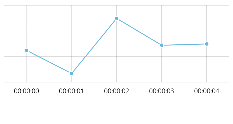
To demonstrate it all, let's refactor our demo from before to use days plotted on a Date axis, instead of categories.
let dateAxis = chart.xAxes.push(new am4charts.DateAxis());
var dateAxis = chart.xAxes.push(new am4charts.DateAxis());
{
  // ...
  "xAxes": [{
    "type": "DateAxis"
  }]
}
IMPORTANT In order for series to be correctly plotted on a Date axis, it needs to set up proper dataFields, such as dateX or dateY.
MORE INFO Please refer to our "Series" article for more information about series' data fields.
Let's take a look at the updated example:
See the Pen amCharts V4: Date axis (1) by amCharts (@amcharts) on CodePen.
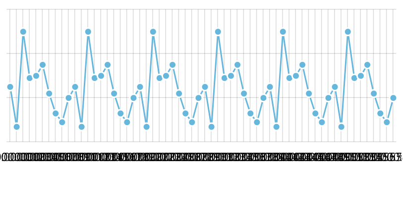
Natural time scale
As we briefly mentioned before, a Date axis will try to maintain a natural scale, even if data points come at irregular intervals.
Let's try to move one of our data points a few days away from the other ones, to create a gap:
See the Pen amCharts V4: Date axis (2) by amCharts (@amcharts) on CodePen.
As you can see, the last column moved away, creating "empty" entries in the Date axis, for the days the there is no data points for.
Data granularity
A date/time-based data can come at different intervals. For example, we could have just one entry per year, or we can have a data point every millisecond.
Date axis will do turn on its wits to determine the granularity by examining your actual data. So, if you have data points with a minute between them, the axis will determine the best granularity to use is a minute.
Data granularity affects how axis grid is drawn, and how labels are formatted. E.g. if you have a data point each day, it makes sense to display a grid line and a date label for each data point.
MORE INFO We will have a more detailed look at formatting of axis labels further down this article, in section "Label formatting".
Manually specifying data granularity
In some rare cases, when you have data coming in at irregular intervals, or where precise timestamp is important, even if your data points are logged only occasionally, you might need to explicitly specify the granularity of data for your Date axis to use.
In those cases you will use Date axis' setting baseInterval.
NOTE In fact, if you know the granularity of your data beforehand, it is encouraged to set baseInterval so that Date axis does not have to waste precious resources in trying to figure it out from your data.
It comes in a form of an object like this:
{
  "timeUnit": "minute",
  "count": 5
}
A "timeUnit" identifies base time unit (second, minute, hour, day, etc.).
A "count" specifies how many "timeUnit" each data item comes at. Count parameter can be skipped, in which case Date axis will assume 1.
The above snippet actually serves as a hint to Date axis: "my data has a data point every 5 minutes".
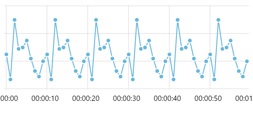
Let's see what happens to our chart if we revert to data point per minute, rather than data point per day.
See the Pen amCharts V4: Date axis (3) by amCharts (@amcharts) on CodePen.
As you can see the chart automatically adjusted to our new minute-based data.
Let's say we need to emphasize that we have a second-based data, even though we just have one data point per minute.
dateAxis.baseInterval = {
  "timeUnit": "second",
  "count": 1
}
dateAxis.baseInterval = {
  "timeUnit": "second",
  "count": 1
}
{
  // ...
  "xAxes": [{
    "type": "DateAxis",
    "baseInterval": {
      "timeUnit": "second",
      "count": 1
    }
  }]
}
See the Pen amCharts V4: Date axis (4) by amCharts (@amcharts) on CodePen.
As you can see, we still have the same 3 columns, however they're now much smaller. This happens because we have instructed our Date axis that we need second-grade granularity. This means that every minute is now divvied up into 60 seconds, so our column now takes 1/60th of the width, allotted for the whole minute.
Notice, how labels are changed to accommodate seconds as well.
Axis grid granularity
How DateAxis manages its own granularity of grid and labels
Now that we explored options for setting granularity for data, let's take a look at how it relates to granularity of the actual grid lines/labels of the axis.
Spoiler alert: granularity of grid on DateAxis is not always the same as granularity of data. Let us explain this notion.
Let's say granularity of our data is a second - we have a data point each second. If we have 5 data items in our data, we might get 5 grid lines with corresponding labels - one for each data point.
So far granularity of data corresponds to granularity of grid lines - there's one for every second.
But what happens when we start adding data items? Say, we add the whole minute worth (60) of data items. If the granularity of grid would remain at the same setting as data itself, we'd end up with 60 grid lines and labels so crammed together, that the chart would look outright ugly, if not unusable:
To avoid that, DateAxis automatically starts reducing granularity of its grid in order to end up with fewer grid lines and labels:
It's the same chart, except the second one is much more readable. The grid/label placed every 10 seconds still conveys the scale/progression of time nicely, while the previous one was a complete blur.
It's worth noting that axis granularity is completely dynamic. If we would zoom in this chart to span, just a few seconds, the DateAxis would automatically revert to granular grid placement, suitable for a number of data items in the selected scope.

Controlling automatic granularity of axis grid
There are two main aspects that can be used to control axis grid count, and in turn its granularity:
- Minimum distance between grid lines, as set on axis' renderer's
minGridDistancesetting. - Preset list of available intervals to use for the grid, controlled by
DateAxis' settinggridIntervals.
The first one is basically a setting meaning "minimum number of pixels to allow between two grid lines". If grid lines would be closer than the value of this setting, the axis increases its granularity until the point it would not violate this setting.
MORE INFO We are not going to get into how minGridDistance setting works here, since it is described in great detail here. Make sure you take a look at it.
Instead let's look at other aspect: gridIntervals setting.
In a nutshell it holds a list of granularity options that DateAxis can place grid at. E.g. 1 millisecond, 5 milliseconds, 10 milliseconds, etc.
The DateAxis when choosing granularity for its grid chooses the smallest increment that would result in a number of grid lines that would not violate minGridDistance described above.
Here's the default list:
[
  { timeUnit: "millisecond", count: 1 },
  { timeUnit: "millisecond", count: 5 },
  { timeUnit: "millisecond", count: 10 },
  { timeUnit: "millisecond", count: 50 },
  { timeUnit: "millisecond", count: 100 },
  { timeUnit: "millisecond", count: 500 },
  { timeUnit: "second", count: 1 },
  { timeUnit: "second", count: 5 },
  { timeUnit: "second", count: 10 },
  { timeUnit: "second", count: 30 },
  { timeUnit: "minute", count: 1 },
  { timeUnit: "minute", count: 5 },
  { timeUnit: "minute", count: 10 },
  { timeUnit: "minute", count: 15 },
  { timeUnit: "minute", count: 30 },
  { timeUnit: "hour", count: 1 },
  { timeUnit: "hour", count: 3 },
  { timeUnit: "hour", count: 6 },
  { timeUnit: "hour", count: 12 },
  { timeUnit: "day", count: 1 },
  { timeUnit: "day", count: 2 },
  { timeUnit: "day", count: 3 },
  { timeUnit: "day", count: 4 },
  { timeUnit: "day", count: 5 },
  { timeUnit: "week", count: 1 },
  { timeUnit: "month", count: 1 },
  { timeUnit: "month", count: 2 },
  { timeUnit: "month", count: 3 },
  { timeUnit: "month", count: 6 },
  { timeUnit: "year", count: 1 },
  { timeUnit: "year", count: 2 },
  { timeUnit: "year", count: 5 },
  { timeUnit: "year", count: 10 },
  { timeUnit: "year", count: 50 },
  { timeUnit: "year", count: 100 },
  { timeUnit: "year", count: 200 },
  { timeUnit: "year", count: 500 },
  { timeUnit: "year", count: 1000 },
  { timeUnit: "year", count: 2000 },
  { timeUnit: "year", count: 5000 },
  { timeUnit: "year", count: 10000 },
  { timeUnit: "year", count: 100000 }
]
Say, we want our grid to be place only on every 1 or 20 seconds. We can do that by overwriting the default array above with our own:
dateAxis.gridIntervals.setAll([
  { timeUnit: "second", count: 1 },
  { timeUnit: "second", count: 20 }
]);
dateAxis.gridIntervals.setAll([
  { timeUnit: "second", count: 1 },
  { timeUnit: "second", count: 20 }
]);
{
  // ...
  "xAxes": {
    // ...
    "gridIntervals": [
      { timeUnit: "second", count: 1 },
      { timeUnit: "second", count: 20 }
    ]
  }
}
NOTE Note that gridIntervals is not a JavaSript array, but rather advanced object List, hence the use of the setAll() method to set its data.
When we add the above code to our test chart, we can see that now the grid is placed every 20 seconds, instead every 10 seconds:

Make sure you read the next section in this tutorial about formatting date and time. When
IMPORTANT Make sure you read the next section in this tutorial about formatting date and time. When axis grid granularity changes significantly, e.g. from second granularity we go to minutes, then to hours, and so on, it also changes date/time format used for its labels. The next question will show how you control that as well.
Before we move on, here's a live chart we used to test gridIntervals setting on:
See the Pen amCharts 4: Using gridIntervals on DateAxis by amCharts team (@amcharts) on CodePen.
Formatting date and time
Normally, date and time across the chart is formatted using chart's DateFormatter, or more precisely, using format that is in its dateFormat property. More about that here.
That is not the case with Date axis.
The reason for this is that one format is not enough for a Date axis. You might need one format if your axis is displaying increments in days, and wholly different one for displaying time in seconds.
Furthermore, units displayed on Date axis may change dynamically, based on zoom, so formats must change just as well.
For example, your chart might be displaying year worth of daily data. At full zoom, Date axis will show only months:
January, February, March, etc.
Now, say you zoom in into February, so now your chart displays only 28 days, and reverts to showing only days:
1, 2, 3, etc.
Obviously, single format will not do in this case, hence Date axis having separate formats for each possible granularity of increments.
Those are set via Date axis' dateFormats and periodChangeDateFormats properties. More about the latter a bit later.
Setting date formats
As we mentioned earlier, a Date axis has a property dateFormats which is a dictionary associating each possible time unit like minute and day to a particular format.
It's a dictionary (which is an advanced object) which allows setting formats for each possible way to display date and time.
To set a time for specific time granularity, we use dateFormats.setKey(period, format) syntax.
For example, let's make our day-based labels, instead of default "Apr 20" and "Apr 21" display full month name, day and an appropriate ordinal. E.g. "April 20th", "April 21st", etc.
Looking at "Formatting date and time" article, we see that format option for the above would be "MMMM dt".
dateAxis.dateFormats.setKey("day", "MMMM dt");
dateAxis.dateFormats.setKey("day", "MMMM dt");
{
  // ...
  "xAxes": [{
    "type": "DateAxis",
    "dateFormats": {
      "day": "MMMM dt"
    }
  }]
}
See the Pen amCharts V4: Formatting date axis labels by amCharts (@amcharts) on CodePen.
List of available time units
| Period | Format in default locale | Example | Format in us_EN | Example |
|---|---|---|---|---|
"millisecond" |
"mm:ss SSS" |
25:00 500 | "mm:ss SSS" |
25:00 500 |
"second" |
"HH:mm:ss" |
15:20:30 | "hh:mm:ss a" |
03:20:30 pm |
"minute" |
"HH:mm" |
15:20 | "hh:mm a" |
03:20 pm |
"hour" |
"HH:mm" |
15:20 | "hh:mm a" |
03:20 pm |
"day" |
"MMM dd" |
Jan 09 | "MMM dd" |
Jan 09 |
"week" |
"ww" |
05 | "ww" |
05 |
"month" |
"MMM" |
Jan | "MMM" |
Jan |
"year" |
"yyyy" |
2019 | "yyyy" |
2019 |
Period change format
Wait, we're not quite done here, yet.
Let's try a similar chart that instead of several days, spans several months.
See the Pen amCharts 4: Formatting date axis labels by amCharts team (@amcharts) on CodePen.
What the...? Our chart had its dateFormats set for "day" to "MMMM dt". All labels seem to follow it except on: May 01.
Is it a bug? No. Let's look into what is going on.
Depending on the actual range and other settings, Date axis is using some base time unit for its increments.
In out case those are days.
It lists days using dateFormats and its "day" setting, until it comes to an end of the larger period - in this case month. When that happens, the first label in the larger period (month) is not formatted according to dateFormats but rather to periodChangeDateFormats.
While the rest of the labels were using dateFormats which we modified, the May 01 label looked into periodChangeDateFormats which we didn't touch, and came out using different format.
So, if you want your period change labels to look identical, you need to set it twice:
dateAxis.dateFormats.setKey("day", "MMMM dt");
dateAxis.periodChangeDateFormats.setKey("day", "MMMM dt");
dateAxis.dateFormats.setKey("day", "MMMM dt");
dateAxis.periodChangeDateFormats.setKey("day", "MMMM dt");
{
  // ...
  "xAxes": [{
    "type": "DateAxis",
    "dateFormats": {
      "day": "MMMM dt"
    },
    "periodChangeDateFormats": {
      "day": "MMMM dt"
    }
  }]
}
See the Pen amCharts 4: Formatting date axis labels by amCharts team (@amcharts) on CodePen.
Why do we need two separate sets of formats anyway?
Good question!
Suppose we display a couple of years worth of daily data. Since there's no place to display 300+ labels for each day, our chart goes into "month" mode.
Our monthly labels would like something like this:

A bit misleading, huh?
That's why period change uses different format:

Now, since our first label in the year (January) uses different format we know precisely where and what year starts.
We can even modify it to show only year, since user will automatically assume January for the first month anyway. And, for extra clarity, let's make yearly labels bold.
dateAxis.periodChangeDateFormats.setKey("month", "[bold]yyyy[/]");
dateAxis.periodChangeDateFormats.setKey("month", "[bold]yyyy[/]");
{
  // ...
  "xAxes": [{
    "type": "DateAxis",
    "periodChangeDateFormats": {
      "month": "[bold]yyyy[/]"
    }
  }]
}

See the Pen amCharts 4: Formatting date axis labels by amCharts team (@amcharts) on CodePen.
Here's another example of using dateFormats and periodChangeDateFormats to distinctively format axis labels:
See the Pen amCharts 4: configuring date format on DateAxis by amCharts team (@amcharts) on CodePen.
Removing empty time units
Sometimes you won't want to display seconds, minutes, hours, days, or whatever your baseInterval is without data. For example in a stock option, you won't have any data over the weekends, because, well, there's no trading going on.
In that case you can go ahead and remove empty time units using axis' skipEmptyPeriods setting.
dateAxis.skipEmptyPeriods = true;
dateAxis.skipEmptyPeriods = true;
{
  // ...
  "xAxes": [{
    "type": "DateAxis",
    // ...
    "skipEmptyPeriods": true
  }]
}
See the Pen amCharts V4: Date axis (5) by amCharts (@amcharts) on CodePen.
Dynamic data item grouping
Prerequisites
Grouping will also work on any XYSeries such as ColumnSeries, LineSeries, CandlestickSeries, etc. that have DateAxis as their base axis and ValueAxis as their other axis.
All other setups are not supported.
Data item grouping will also not work with DateAxis setting skipEmptyPeriods set to true.
What is grouping?
Suppose you have a 10 years worth of daily data to plot. That's about 3.6K data items right there.
Plotting all of those thousands of data points on a chart that's, say, 1000 pixels wide is not only useless (user would not be able to see all those points) but also poses performance issue (more objects, slower chart).
Dynamic grouping feature tackles this issue by automatically grouping data items into larger periods, using some configurable aggregate value.
E.g. when fully zoomed out, we don't show a column for each individual day, but rather one column per month, which results in 120 columns, which is fast, and also very readable to user viewing the chart.
Should the user zoom in on particular time period, the chart will automatically increase granularity to best accommodate the selected date/time range.
E.g. zoom to a few years, and the chart revers to columns with aggregate values for each week. Zoom in even further, and we're back to days.
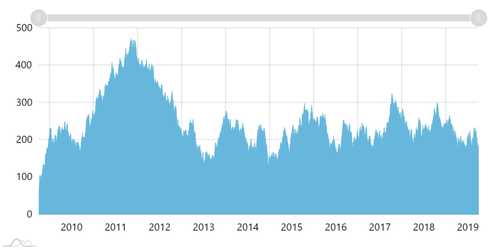
No grouping. One column per day. Columns overlapping. 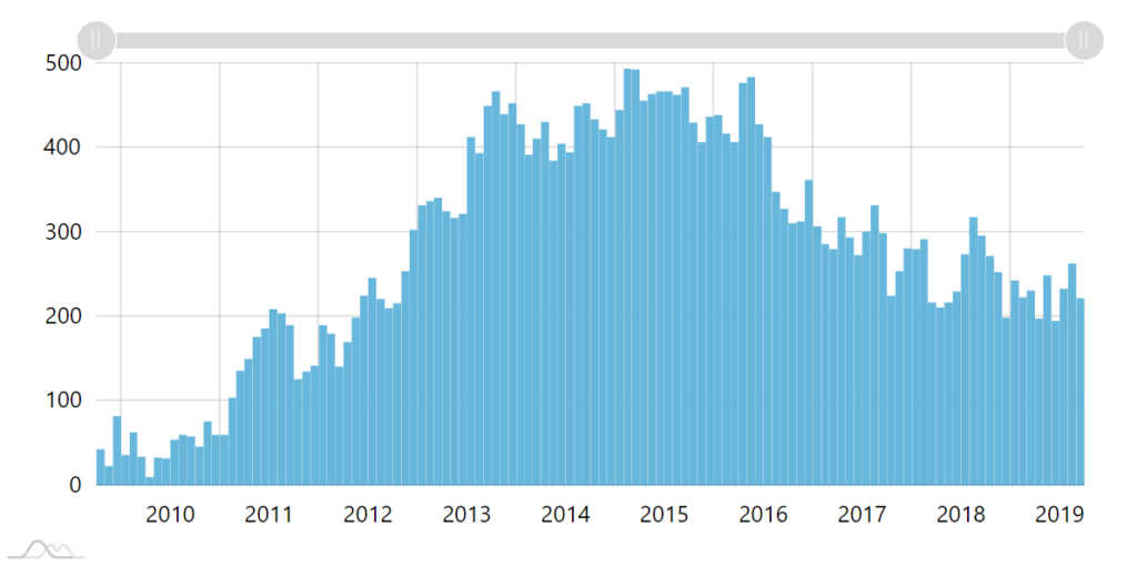
Grouping enabled. Once column per month is shown. 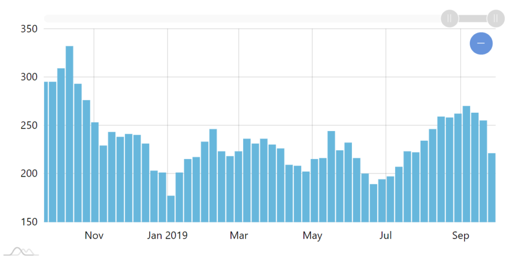
Zooming in automatically goes to week view. 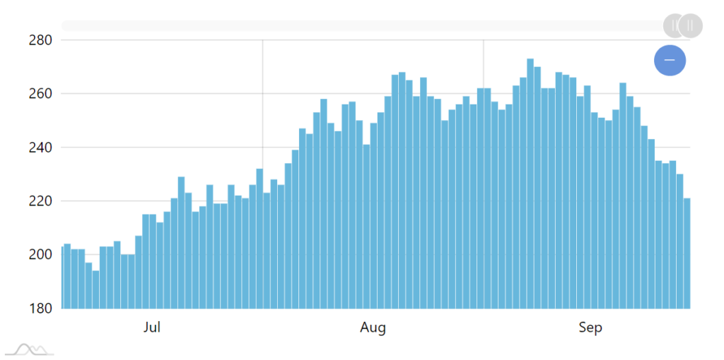
Further zoom in reveals individual day columns.
This approach allows not only dramatically improving performance, but also makes the data more readable, providing "bird's eye view" on global data, but revealing detail when focused on specific time.
Enabling grouping
Enabling grouping is easy: just set groupData = true on your DateAxis.
dateAxis.groupData = true;
dateAxis.groupData = true;
{
  // ...
  "xAxes": [{
    "type": "DateAxis",
    // ...
    "groupData": true
  }]
}
The chart will take care of the rest: grouping data as well as monitoring zoom and updating data granularity dynamically.
If you're happy with default behavior, you're all set at this point. If you'd like to tweak it, read on.
Group count
Grouping works like this:
- Check how many data items is there in the selected period.
- If there are more than 200, group them into the next available period.
- Still more than 200? Go to point #1.
To put it into perspective, say you have 10 years of daily data in the chart. That's ~3650 data items: obviously more than 200, hence grouping kicks in:
- 3650 days is more than 200, let's go to weeks.
- 521 weeks is still more than 200, let's go on further and group to months.
- 120 months is under 200, let's display monthly data items.
Obviously, 200 is just a default, which you can change easily by setting axis' groupCount property:
dateAxis.groupCount = 500;
dateAxis.groupCount = 500;
{
  // ...
  "xAxes": [{
    "type": "DateAxis",
    // ...
    "groupCount": 500
  }]
}
Using groupCount we can easily control when grouping kicks in. Think of it as "maximum number of data items we allow to be displayed at a time".
The next section will explain what are those periods that chart groups data items into, and how we can modify them.
Group intervals
You already know that grouping works by selecting a proper interval to group data items into. The selection happens checking which the most granular interval is that would accommodate our maximum data items setting - groupCount.
Those are defined in DateAxis' groupIntervals setting, with the defaults as follows:
[
  { timeUnit: "millisecond", count: 1 },
  { timeUnit: "millisecond", count: 10 },
  { timeUnit: "millisecond", count: 100 },
  { timeUnit: "second", count: 1 },
  { timeUnit: "second", count: 10 },
  { timeUnit: "minute", count: 1 },
  { timeUnit: "minute", count: 10 },
  { timeUnit: "hour", count: 1 },
  { timeUnit: "day", count: 1 },
  { timeUnit: "week", count: 1 },
  { timeUnit: "month", count: 1 },
  { timeUnit: "year", count: 1 }
]
As you can see the intervals can be not just a single whole time unit like minute or month, but also numbered increments.
E.g. if we have half an hour worth of data items each second (1800 data items) the grouping will kick in and will group our data items in 10-second blocks resulting in aggregate 180 data items.
Changing these group thresholds is as easy as updating or completely overwriting array stored in groupIntervals property.
NOTE Value stored in groupIntervals is not a JavaScript Array. It's an object of type List, so you can't overwrite it with an array - it will result in error. Rather use its setAll() method.
dateAxis.groupIntervals.setAll([
  { timeUnit: "month", count: 1 },
  { timeUnit: "year", count: 1 },
  { timeUnit: "year", count: 10 }
]);
dateAxis.groupIntervals.setAll([
  { timeUnit: "month", count: 1 },
  { timeUnit: "year", count: 1 },
  { timeUnit: "year", count: 10 }
]);
{
  // ...
  "xAxes": [{
    "type": "DateAxis",
    // ...
    "groupIntervals": [
      { timeUnit: "month", count: 1 },
      { timeUnit: "year", count: 1 },
      { timeUnit: "year", count: 10 }
    ]
  }]
}
The above will tell the chart to group data items to months, years, or centuries, but not to weeks or any other time unit.
Forcing specific interval
By default, chart will choose granularity of the groups based on the items available in groupIntervals (as we saw in previous chapter) and the base granularity of the data itself.
However, if we'd like to force specific interval to be used without dynamic switching, we can use axis' groupInterval property:
dateAxis.groupInterval = { timeUnit: "hour", count: 1 };
dateAxis.groupInterval = { timeUnit: "hour", count: 1 };
{
  // ...
  "xAxes": [{
    "type": "DateAxis",
    // ...
    "groupInterval": { timeUnit: "hour", count: 1 }
  }]
}
NOTE For the groupInterval to work correctly, it needs to be among the ones listed in groupIntervals, as described here.
Aggregate values
So far we've covered how and when grouping occurs. We've mentioned that grouped data items use "aggregated" values.
But what exactly is that value?
Let's say we have four data items within specific period. Let's also say their values are as follows : 10, 12, 15, 9.
Each series defines its values via its dataFields. E.g. our ColumnSeries says that its Y value can be found in data's "value" key:
series.dataFields.valueY = "value";
series.dataFields.valueY = "value";
{
  // ...
  "series": [{
    // ...
    "dataFields": {
      // ...
      "valueY": "value"
    }
  }]
}
It's pretty straightforward when the chart is displaying an individual column for each of those fourth data items: there are four columns with values 10, 12, 15, 9.
However, when all those data items are grouped, it should result in a single value for just one column.
That's where series' setting groupFields comes in.
It's basically a way to tell which data field should use which value as its aggregate value.
Let's take a closer look: 10 is first, so it is called an "open" value; 9 is last, so its "close" and since it also happens to be smallest of the values in the set it's also "min"; 15 is the biggest, so it is "max".
Besides those four that refer to actual values, there are auto-calculated values like "average" and "sum".
For valueY the default is "close" which means that the value of the last data item will be used as a representative (aggregated) value of the collective data item.
We can change that by modifying series' groupFields:
series.groupFields.valueY = "sum";
series.groupFields.valueY = "sum";
{
  // ...
  "series": [{
    // ...
    "groupFields": {
      "valueY": "sum"
    }
  }]
}
The above indicates that instead of "close" value to be used when calculating aggregated data item, a sum of all values comprising the group should be used.
Different data fields have different defaults, though. The below table lists all of them.
| Data field | Default |
|---|---|
valueX | "close" |
valueY | "close" |
openValueX | "open" |
openValueY | "open" |
lowValueX | "low" |
lowValueY | "low" |
highValueX | "high" |
highValueY | "high" |
Custom aggregate functions
You can use adapters to apply your own logic to calculating group values.
For more information refer to tutorial "Using custom functions for data item grouping".
Grouping example
See the Pen amCharts 4: Dynamic data item grouping by amCharts team (@amcharts) on CodePen.