This tutorial will show how you can use axis ranges to organize its labels into a groups.
What is axis range?
If you're not familiar with axis ranges, we strongly suggest you take a look at the dedicated "Axis ranges" article. We're going to be using some of the know how from the above article.
In a nutshell, an axis range is an object that defines start and end position on an axis. If it's a DateAxis those are two dates. Similarly, on a CategoryAxis these are two categories.
Besides defining a range, it also brings visual elements, like ability to fill that particular range with a color, display a grid line, or a label.
We're going to be using the latter for the purpose of this tutorial.
Target functionality
Let's say we have a chart with a DateAxis and year-worth of monthly of data, and would like to group the month labels into quarters.
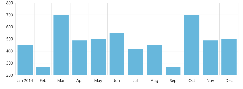
Default look 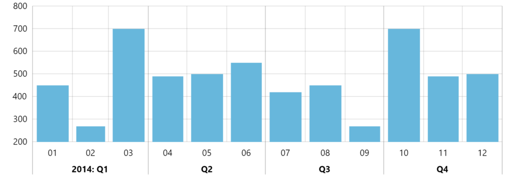
Target functionality
Creating groups
OK, so now that we know what we know, we may start.
Let's do that step-by-step.
Changing label format
This topic is a bit out of scope of this tutorial, but we thought we'd include it anyway. Sometimes, when displaying grouped labels, some of the information might become redundant.
Let's display only month number, instead of it's name.
MORE INFO Controlling label formatting of a DateAxis is described in great detail here. We're going to provide final code here, but if you need more gritty details, head over to the link above.
dateAxis.dateFormats.setKey("month", "MM");
dateAxis.periodChangeDateFormats.setKey("month", "MM");
dateAxis.dateFormats.setKey("month", "MM");
dateAxis.periodChangeDateFormats.setKey("month", "MM");
{
  // ...
  "xAxes": [{
    "type": "DateAxis",
    // ...
    "dateFormats": {
      "month": "MM"
    },
    "periodChangeDateFormats": {
      "month": "MM"
    }
  }]
}
NOTE #1 Since DateAxis uses different formats for "period start" label, which in our case is year start, we need to define those custom formats in two places.
NOTE #2 Our sample chart uses monthly data. Yours might be different. Make sure you are modifying correct period format. No seriously, you need to read this.
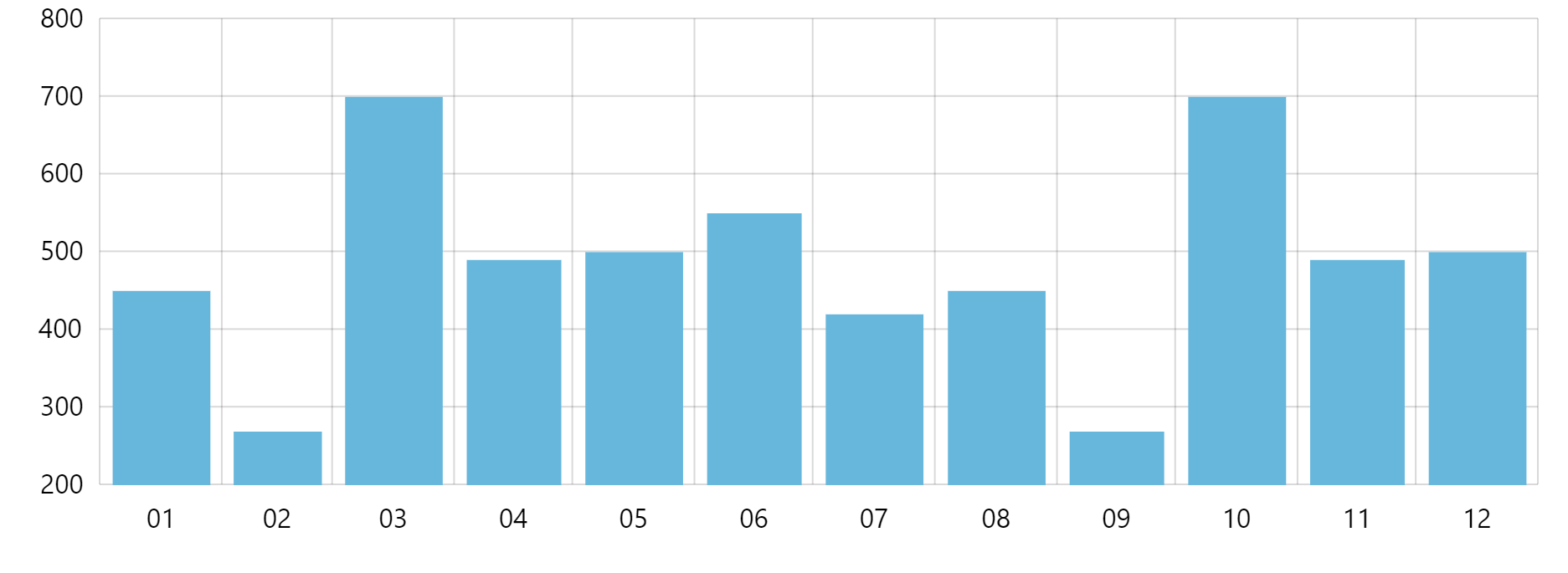
Should we run our chart now, we'd get consistent numeric labels:
Adding divider lines
Creating a grid line
Now, let's divvy up those quarters by adding divider lines.
As we mentioned earlier in this tutorial, an axis range comes with some visual elements. For the purpose of this chapter, we'll use it's ability to display a grid and tick.
So, we're going to be creating an axis range at specific date/time.
The code to create a grid/tick line at specific date/time would be something like this:
let range = dateAxis.axisRanges.create();
range.date = new Date(2014, 0, 1);
range.grid.strokeOpacity = 0.2;
range.tick.disabled = false;
range.tick.strokeOpacity = 0.3;
range.tick.length = 60;
var range = dateAxis.axisRanges.create();
range.date = new Date(2014, 0, 1);
range.grid.strokeOpacity = 0.2;
range.tick.disabled = false;
range.tick.strokeOpacity = 0.3;
range.tick.length = 60;
{
  // ...
  "xAxes": [{
    "type": "DateAxis",
    // ...
    "axisRanges": [{
      "date": new Date(2014, 0, 1),
      "grid": {
        "strokeOpacity": 0.2
      },
      "tick": {
        "disabled": false,
        "strokeOpacity": 0.3,
        "length": 60
      }
    }]
  }]
}
As you can see from the code above, the grid line element of the range is accessible via grid property. It's an object of type Grid. Since grid element is enabled by default, we do not have to enable it.
Similarly, tick element is accessible via tick property of the range. It's an object of type AxisTick. Differently than grid, ticks are disabled by default, hence the need to explicitly re-enable them.
Adding multiple grid lines
Since we are going to be adding a lot of grid lines, and do not want to repeat above code, we can create a "cookie cutter" function for the task:
function createRangeGrid(date) {
  let range = dateAxis.axisRanges.create();
  range.date = date;
  range.grid.strokeOpacity = 0.2;
  range.tick.disabled = false;
  range.tick.strokeOpacity = 0.3;
  range.tick.length = 60;
}

createRangeGrid(new Date(2014, 0, 1));
createRangeGrid(new Date(2014, 3, 1));
createRangeGrid(new Date(2014, 6, 1));
createRangeGrid(new Date(2014, 9, 1));
createRangeGrid(new Date(2015, 0, 1));
function createRangeGrid(date) {
  var range = dateAxis.axisRanges.create();
  range.date = date;
  range.grid.strokeOpacity = 0.2;
  range.tick.disabled = false;
  range.tick.strokeOpacity = 0.3;
  range.tick.length = 60;
}

createRangeGrid(new Date(2014, 0, 1));
createRangeGrid(new Date(2014, 3, 1));
createRangeGrid(new Date(2014, 6, 1));
createRangeGrid(new Date(2014, 9, 1));
createRangeGrid(new Date(2015, 0, 1));
NOTE The above is not applicable for JSON-based functions.
Please note that a grid line is added at precisely the date/time of the range's date property.
Let's see what we'd get if we ran our chart now:

Getting there!
Adding labels
On to the final task: adding quarter labels.
As with grid lines, for labels, we're going to be adding axis ranges.
Unlike grid lines, we want a label to be centered in the middle of the quarter, so our range will have both start and end dates, represented by its properties date and endDate respectively.
We also do not want to display grid lines for "label ranges", so we'll be disabling that.
Predictably, the label element of the range is accessible via label property. It's an object of type AxisLabel.
Let's add one:
let range = dateAxis.axisRanges.create();
range.date = new Date(2014, 0, 1);
range.endDate = new Date(2014, 2, 31) ;
range.label.text = "2014: Q1";
range.label.paddingTop = 40;
range.label.location = 0.5;
range.label.horizontalCenter = "middle";
range.label.fontWeight = "bolder";
range.grid.disabled = true;
var range = dateAxis.axisRanges.create();
range.date = new Date(2014, 0, 1);
range.endDate = new Date(2014, 2, 31) ;
range.label.text = "2014: Q1";
range.label.paddingTop = 40;
range.label.location = 0.5;
range.label.horizontalCenter = "middle";
range.label.fontWeight = "bolder";
range.grid.disabled = true;
{
  // ...
  "xAxes": [{
    "type": "DateAxis",
    // ...
    "axisRanges": [{
      "date": new Date(2014, 0, 1),
      "endDate": new Date(2014, 2, 31),
      "grid": {
        "disabled": true
      },
      "label": {
        "text": "2014: Q1",
        "paddingTop": 40,
        "location": 0.5,
        "horizontalCenter": "middle",
        "fontWeight": "bolder"
      }
    }]
  }]
}
Positioning of labels explained
The above code contains a lot of label configuration options. Most of those relate to positioning the label properly:
locationindicates where label should be placed relatively to the range.0.5means smack middle.horizontalCenterindicated which part of the label is considered to be a center."middle"means middle of the label, so it does not start at the middle of the range (location = 0.5), but rather it's middle is placed in the middle of the range.paddingTopensures that the quarter label is shifted down and does not overlap with the actual axis labels.
Adding multiple group labels
As with grid before, we're going to be adding a lot of labels, so it makes sense to create a cookie cutter function for those as well:
function createRange(from, to, label) {
  let range = dateAxis.axisRanges.create();
  range.date = from;
  range.endDate = to;
  range.label.text = label;
  range.label.paddingTop = 40;
  range.label.location = 0.5;
  range.label.horizontalCenter = "middle";
  range.label.fontWeight = "bolder";
  range.grid.disabled = true;
}

createRange(new Date(2014, 0, 1), new Date(2014, 2, 31), "2014: Q1");
createRange(new Date(2014, 3, 1), new Date(2014, 5, 31), "Q2");
createRange(new Date(2014, 6, 1), new Date(2014, 8, 31), "Q3");
createRange(new Date(2014, 9, 1), new Date(2014, 11, 31), "Q4");
function createRange(from, to, label) {
  var range = dateAxis.axisRanges.create();
  range.date = from;
  range.endDate = to;
  range.label.text = label;
  range.label.paddingTop = 40;
  range.label.location = 0.5;
  range.label.horizontalCenter = "middle";
  range.label.fontWeight = "bolder";
  range.grid.disabled = true;
}

createRange(new Date(2014, 0, 1), new Date(2014, 2, 31), "2014: Q1");
createRange(new Date(2014, 3, 1), new Date(2014, 5, 31), "Q2");
createRange(new Date(2014, 6, 1), new Date(2014, 8, 31), "Q3");
createRange(new Date(2014, 9, 1), new Date(2014, 11, 31), "Q4");
Run the code node, and we have a our target looks:

Example
Here's a complete working example of the above:
See the Pen amCharts 4: Grouping axis labels by amCharts team (@amcharts) on CodePen.
Using with CategoryAxis
So far we have been working with the DateAxis. It would work much in the same way on a CategoryAxis, with two notable differences:
- Instead of
dateandendDatewe'd be usingcategoryandendCategoryproperties. - We may need to use range's
locationsproperty to indicate where specifically within startcategorythe range starts, and where inendCategoryit ends. More about it here.
More examples
Multi-level grouping
See the Pen amCharts 4: Multi-level grouping of axis items using ranges by amCharts team (@amcharts) on CodePen.