While the name says TimeLine, this chart type is a much more. Think of it as an XYChart that can be bent and twisted into any shape. Yes, you read it right: any... custom... shape. Sigh... yes, Tommy, even the shape you drew on your neighbor's wall back and giggled at in 3rd grade. (More capabilities at a glance in our TimeLine Chart page)
It can be used to depict linear data in a space-saving, non-boring way. The following sections will get you acquainted with this unique chart type.
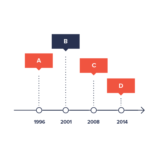
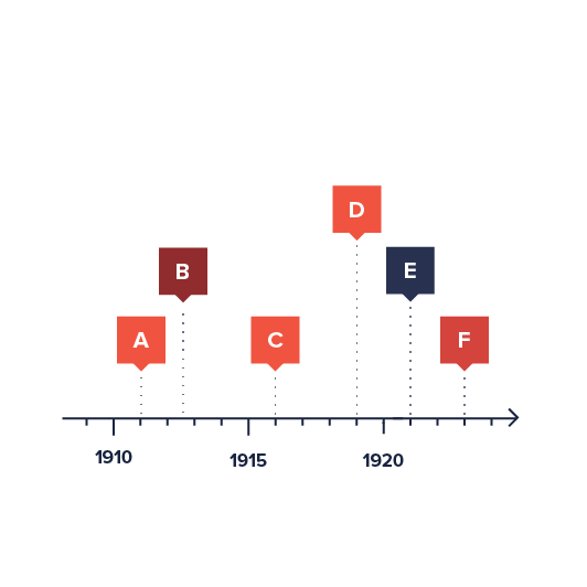
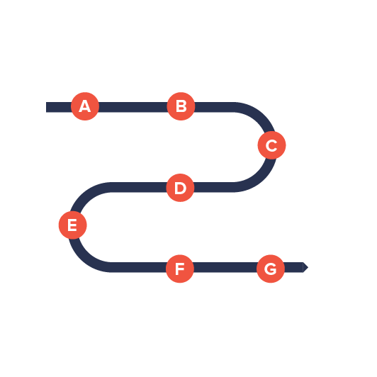
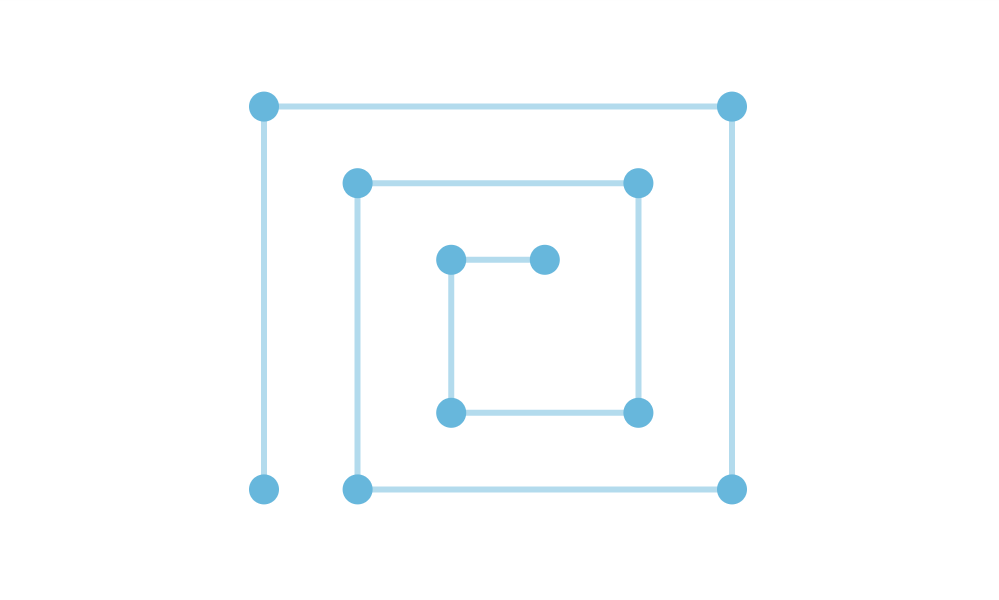
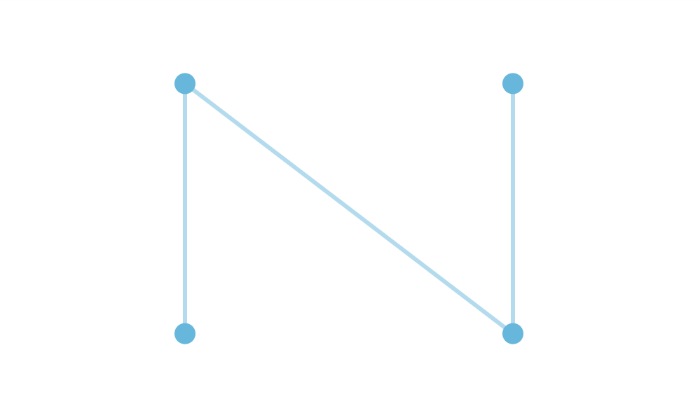
Below are a few of super-basic examples from our friends at Data Viz Project:
However, as we will see during the course of this article, it can be much much more.
What's in a name?
Let's start with untangling some terminology here first.
For now there are two names in play: "TimeLine Chart" and "CurveChart".
TimeLine is the name of the plugin/product, which, technically, is a collection of related chart types.
CurveChart is an actual chart type. Basically, it's a "version of an XYChart, twisted into a custom shape".
IMPORTANT Since it's the main basic underlying chart type, for the sake of clarity, we'll be referring to the chart as CurveChart throughout this article, except when referring to other derivative chart types like SerpentineChart and SpiralChart, that are discussed later.
There might be other chart types coming to the TimeLine plugin in the future. When/if that happens, this article will be updated accordingly.
Relation to XYChart
We mention XYChart a lot for a reason. While being a different chart, using different classes, and not supporting the whole 100% of the features of an XYChart the CurveChart is almost identical ideologically and functionally.
You use the same data, you define and configure series and axes in absolutely the same way, even some controls like Cursor are used similarly in both charts.
The reason we stress this is that, chances are good, you are already familiar with the XYChart - our most popular chart type - so you will find most of the stuff familiar.
We'll also provide references to XYChart for some topics, that we think are not necessary to be repeated here, because they are identical.
Creating a CurveChart
To create a CurveChart you will only need just four things:
- Chart instance.
- Data.
- At least two axes - "vertical" (Y) and "horizontal" (X).
- At least one series.
This is a minimum requirement for the chart. We'll go over each of those shortly.
NOTE The reason we have "vertical" and "horizontal" axis in quotes is that with CurveChart being able to take any shape, those are quite relative.
Version info
While TimeLine is a plugin to amCharts 4, it is a totally separate package/product, maintaining it's own versioning, which does not coincide with amCharts 4 versions.
That said, you will need at least version 4.5.16 of the core amCharts 4 package in order to run TimeLine plugin.
Importing modules/scripts
Needless to say, before you can use modules/objects, you need to make sure all required modules (in TypeScript), or files (in JavaScript) are imported. Please refer to our Getting started articles for more details:
Timeline comes in a form of a plugin. To start using it we will need to include both core (main module) and charts modules, as well as timeline plugin.
import * as am4core from "@amcharts/amcharts4/core";
import * as am4charts from "@amcharts/amcharts4/charts";
import * as am4plugins_timeline from "@amcharts/amcharts4/plugins/timeline";
<script src="//cdn.amcharts.com/lib/4/core.js"></script>
<script src="//cdn.amcharts.com/lib/4/charts.js"></script>
<script src="//cdn.amcharts.com/lib/4/plugins/timeline.js"></script>
We'll be importing and referring these as am4core, am4charts, and am4plugins_timeline in the course of this article, and overall in our demos and tutorials.
Creating chart instance
For that we're going to be using am4core.create() function. (or am4core.createFromConfig() if you are using JSON-based config approach)
let chart = am4core.create("chartdiv", am4plugins_timeline.CurveChart);
var chart = am4core.create("chartdiv", am4plugins_timeline.CurveChart);
var chart = am4core.createFromConfig({
  // ... chart config
}, "chartdiv", am4plugins_timeline.CurveChart);
Data
As we already mentioned a number of times, most of the stuff in CurveChart carries over from XYChart. Data is no exception.
Just like in XYChart, the data for a CurveChart is an array of objects. Each of those objects will represent a data item and must at least two values, because CurveChart plots data in two dimensions: X and Y, although in CurveChart those two are purely relative.
CurveChart supports any kind of dimensional data. It can be string-based categories, numeric values, dates, etc. You can mix and match any of those.
In-line data
We assign the data to the data to chart's data property:
chart.data = [{
  "country": "Lithuania",
  "value": 501
}, {
  "country": "Czechia",
  "value": 301
}, {
  "country": "Ireland",
  "value": 201
}, {
  "country": "Germany",
  "value": 165
}, {
  "country": "Australia",
  "value": 139
}, {
  "country": "Austria",
  "value": 128
}, {
  "country": "UK",
  "value": 99
}, {
  "country": "Belgium",
  "value": 60
}, {
  "country": "The Netherlands",
  "value": 50
}];
{
  // ...
  "data": [{
    "country": "Lithuania",
    "value": 501
  }, {
    "country": "Czechia",
    "value": 301
  }, {
    "country": "Ireland",
    "value": 201
  }, {
    "country": "Germany",
    "value": 165
  }, {
    "country": "Australia",
    "value": 139
  }, {
    "country": "Austria",
    "value": 128
  }, {
    "country": "UK",
    "value": 99
  }, {
    "country": "Belgium",
    "value": 60
  }, {
    "country": "The Netherlands",
    "value": 50
  }]
}
External data
We can also make the chart load external data using dataSource.
chart.dataSource.url = "chart_data.json";
chart.dataSource.url = "chart_data.json";
{
  // ...
  "dataSource": {
    "url": "chart_data.json"
  }
}
MORE INFO Please refer to our "External data" article, for more details.
Series
Creating series
Just like in XYChart you can add one or more series to CurveChart.
You do that by pushing a series object into chart's series list, e.g.:
let series = chart.series.push(new am4charts.CurveColumnSeries());
var series = chart.series.push(new am4charts.CurveColumnSeries());
{
  // ...
  "series": [{
    "type": "CurveColumnSeries",
    // Series settings
  }]
}
What differs from XYChart is names and available options of series types. We'll list all of the available series types a bit later.
Binding series to data
The most and foremost requirement when configuring series, is to specify on where it should get its data from.
Series' property dataFields is used for exactly that. (more about series' data fields)
Again, building up on our data example further up this article, we know that our column series should get categories from "category" field to be used on horizontal (X) axis, and numeric value from "value" to be used on vertical (Y) axis.
series.dataFields.valueY = "value";
series.dataFields.categoryX = "country";
series.dataFields.valueY = "value";
series.dataFields.categoryX = "country";
{
  // ...
  "series": [{
    "type": "CurveColumnSeries",
    "dataFields": {
      "valueY": "value",
      "categoryY": "country"
    }
  }]
}
IMPORTANT Different series types and different data require different data fields.
Let's say if we had a DateAxis instead of CategoryAxis. We'd need to set dateX instead of categoryX.
Available series types
| Series class | XY class quivalent | Example | Comment |
|---|---|---|---|
CurveColumnSeries | ColumnSeries | Displays columns, or bars. | |
CurveLineSeries | LineSeries | Displays a line graph.Can also be used to create an area graph. | |
CurveStepLineSeries | StepLineSeries | Displays a stepped line graph. Check this tutorial on configuring StepLineSeries. |
Configuring series
While each series will work without any additional configuration, you can fully customize its look and behavior.
We're not going to get into much detail here, since CurveChart series are configured identically to equivalent XYChart series.
Here are a few examples.
Configuring fill and outline of the CurveColumnSeries' columns:
series.columns.template.fillOpacity = 0.5;
series.columns.template.strokeWidth = 2;
series.columns.template.fillOpacity = 0.5;
series.columns.template.strokeWidth = 2;
{
  // ...
  "series": [{
    "type": "CurveColumnSeries",
    // ...
    "columns": {
      "fillOpacity": 0.5,
      "strokeWidth": 2
    }
  }]
}
Or, line width of the CurveLineSeries:
series.strokeWidth = 3;
series.strokeWidth = 3;
{
  // ...
  "series": [{
    "type": "CurveLineSeries",
    // ...
    "strokeWidth": 3
  }]
}
MORE INFO For more details, examples, and information on configuring series visit "Configuring series" section of the XYChart article, as well as dedicated "Series" article.
Axes
For CurveChart to work, it needs at least two axes: one X (horizontal) and one Y (vertical) axis.
As we mentioned earlier, X and Y are symbolic, because CurveChart can take any shape and thus axes can head into any direction.
Data can take many shapes, so we have different axes for different requirements.
For example, taking the sample data we have shown earlier in this article, a country is a "category", and "value" is numeric value.
If we'd like to build a simple column chart, we'd probably go for a CategoryAxis horizontally, and ValueAxis vertically.
That is just a basic example. In reality you can use any type of axis on both X and Y. As long as data is compatible with it, you're all set.
NOTE You can have more than two axes. Please refer for lower sections of this article for more info about such usage.
Creating axes
Each XY chart has two list properties: xAxes and yAxes.
When you create an axis of particular type, you push() it into appropriate list.
Let's say, building on previous date example, we want to plot data that are string-based names (countries) horizontally, and numeric values (liters) vertically.
We'll need to create an instance of CategoryAxis and push it into xAxes, as well as instance of ValueAxis for pushing into yAxes.
let categoryAxis = chart.xAxes.push(new am4charts.CategoryAxis());
categoryAxis.dataFields.category = "country";
let valueAxis = chart.yAxes.push(new am4charts.ValueAxis());
var categoryAxis = chart.xAxes.push(new am4charts.CategoryAxis());
categoryAxis.dataFields.category = "country";
var valueAxis = chart.yAxes.push(new am4charts.ValueAxis());
{
  // ...
  "xAxes": [{
    "type": "CategoryAxis",
    "dataFields": {
      "category": "country"
    }
  }],
  "yAxes": [{
    "type": "ValueAxis"
  }]
}
So far so good.
Notice, the dataFields in CategoryAxis definition. This type of axis is special in such way, that it needs to access data (so that it can extract a list of categories). The dataFields instructs which property in data objects holds category names.
More about axes
There's so much more to axes than that. You can configure its appearance down to a bolt, including grid, cursor tooltips, gaps, labels, and so much more. But this is a topic to a dedicated concept article about Axes.
Axis types
CurveChart supports and uses exactly same series as XYChart.
It can use any combination of the following axis types:
| Axis class | Comment |
|---|---|
CategoryAxis | Displays equally divided string-based increments - categories. Requires dataFields.category to be set so that it can extract actual category names from data. Category labels are displayed as they are in data. |
DateAxis | Used to position items on a date/time scale. Will format labels according to its DataFormatter. (more about formatters) |
DurationAxis | The values on this axis is treated as time duration. This is different than date or time, since grid/labels do not point to specific date/time but rather are placed at increment of time. Will format labels according to its DurationFormatter. (more about formatters) |
ValueAxis | Used to position items based on their numeric value. Will format labels according to its NumberFormatter. (more about formatters) |
Setting axis shape
Now, this where it gets all interesting.
So far, in this tutorial we haven't wandered off far from classic XYChart. If we ran the code now we'd get something very similar to what we would get if we'd run it on an XYChart.
What sets CurveChart apart, is that we can bend it into any shape we like.
Read on to the next chapter for the juicy details.
Setting shape of the chart
IMPORTANT While technically you can use curve of any complexity for your chart, there might be some situations where some elements of the chart are not renderer correctly. It's impossible to account for everything, and think of all the contingencies, so you might need to tinker with both your curve design and axis configuration to get a perfect result.
The shape of the CurveChart is controlled via its X axis.
Regardless of its type, whichever X (horizontal) axis the chart has, its shape will be chart's shape.
Let's see how the shape is controlled and fine tuned.
Control points
What are control points?
As we already mentioned, the shape of the chart is controlled via curvature of its X axis.
The curvature is set via array of control points, connected by a smooth curve.
Graphically it looks something like this:
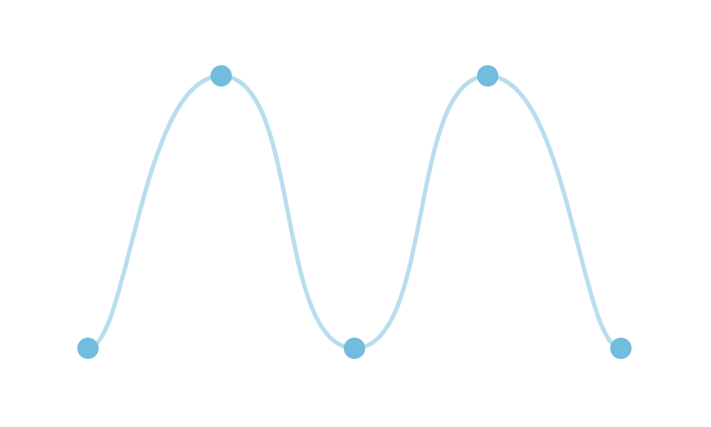
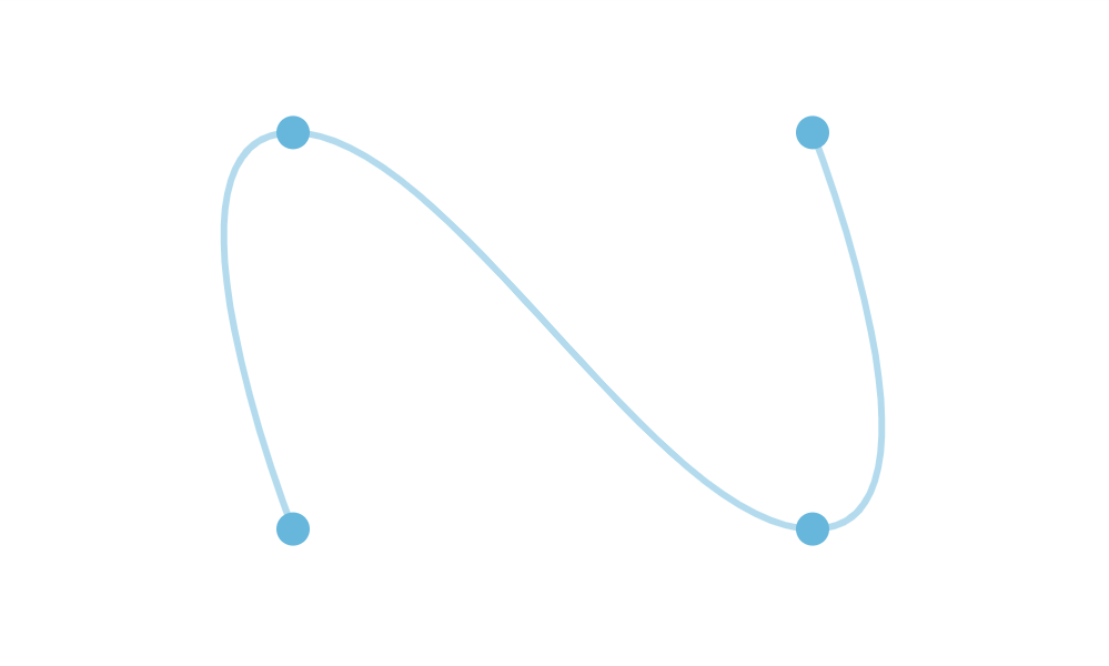
Each shape, however we put it is controlled by a few control points, connected by a straight or curved line.
How the curve is bent between the points is controlled by its "tension" setting, more about it later in this article.
How to set control points?
Each point is expressed by its X/Y coordinate in form of the object, e.g.:
{
  "x": 100,
  "y": 100
}
Each shape is expressed by an array of such objects, e.g.:
[
  { x: -400, y: 0 },
  { x: -250, y: 0 },
  { x: 0, y: 60 },
  { x: 250, y: 0 },
  { x: 400, y: 0 }
]
And this array is set to X axis renderer's points property:
categoryAxis.renderer.points = [
  { x: -400, y: 0 },
  { x: -250, y: 0 },
  { x: 0, y: 60 },
  { x: 250, y: 0 },
  { x: 400, y: 0 }
];
categoryAxis.renderer.points = [
  { x: -400, y: 0 },
  { x: -250, y: 0 },
  { x: 0, y: 60 },
  { x: 250, y: 0 },
  { x: 400, y: 0 }
];
{
  // ...
  "xAxes": [{
    "type": "CategoryAxis",
    // ...
    "renderer": {
      // ...
      "points": [
        { x: -400, y: 0 },
        { x: -250, y: 0 },
        { x: 0, y: 60 },
        { x: 250, y: 0 },
        { x: 400, y: 0 }
      ]
    }]
  }
}
Auto-scale
While the points technically represent X and Y pixel coordinates, the chart will try to adjust them to fit the size of the container better.
This means that if you have your shape control points from, say, -100 to 100, and a chart container that's 400 pixels wide, those coordinates will be adjusted accordingly.
NOTE When auto-scaling, the chart will take both height and with of the chart into account. This means that the shape will be auto-adjusted to always fit into container both vertically and horizontally, while maintaining original aspect ratio.
To disable auto-scale, simply set axis renderer's autoScale to false:
categoryAxis.renderer.autoScale = false;
categoryAxis.renderer.autoScale = false;
{
  // ...
  "xAxes": [{
    "type": "CategoryAxis",
    // ...
    "renderer": {
      // ...
      "autoScale": false
    }]
  }
}
Auto-center
The chart will try to automatically center your custom-curve chart to the middle of the chart container.
If for some reason, you would rather it not to, simply use autoCenter property of the axis renderer:
categoryAxis.renderer.autoCenter = false;
categoryAxis.renderer.autoCenter = false;
{
  // ...
  "xAxes": [{
    "type": "CategoryAxis",
    // ...
    "renderer": {
      // ...
      "autoCenter": false
    }]
  }
}
Curve tension
The tension of the curve defines how strongly it is "pulled" between each two control points.
The value ranges from 0 (zero) and 1 (one), with the former meaning totally lose, and the latter maximum strength, resulting in completely straight lines.
There are two tension settings - tensionX and tensionY - that control respectively horizontal and vertical pull strength.
On a CurveChart those are set on a special polyspline object of the axis' renderer:
categoryAxis.renderer.polyspline.tensionX = 0.8;
categoryAxis.renderer.polyspline.tensionY = 0.8;
categoryAxis.renderer.polyspline.tensionX = 0.8;
categoryAxis.renderer.polyspline.tensionY = 0.8;
{
  // ...
  "xAxes": [{
    "type": "CategoryAxis",
    // ...
    "renderer": {
      // ...
      "polyspline": {
        "tensionX": 0.8,
        "tensionY": 0.8
      }
    }]
  }
}
tensionX = 1(default)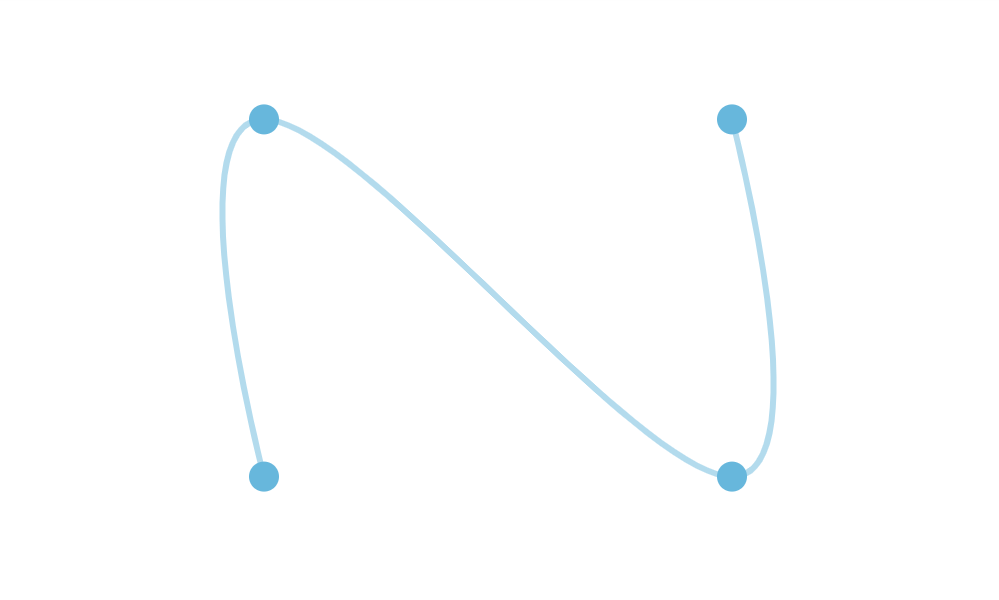
tensionX = 0.8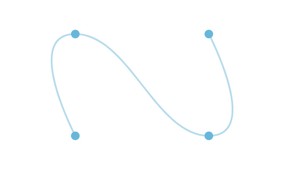
tensionX = 0.6
MORE INFO For more information and theory how tension works, please check "Smoothed lines" chapter of the XYChart article.
Here's how tension affects real chart:
tensionX = 1(default)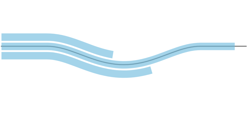
tensionX = 0.8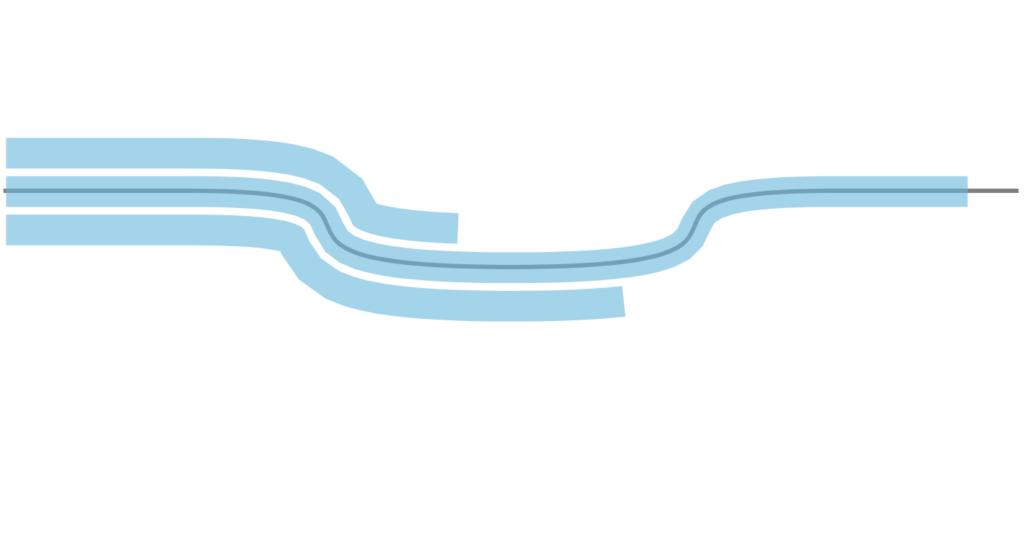
tensionX = 0.6
IMPORTANT If you have a complex curve with a lot of points (tens or hundreds), do not set any tensions settings. Whenever a chart tries to plot a smooth curve between very closely-spaced points, it results in a visual anomaly.
Using several and points with tension settings may not produce the perfect curve that you're aiming for. Later in this article we'll look at how we can create completely custom shapes.
Axis radii
OK, now that we know about creating curves for the chart to follow, let's talk about other dimensions: chart's thickness.
So far we have been looking at the curve as a line. However, a chart is not a line, it has height/thickness.
And axis radii is a way to controlling it.
For the shape we have been using our X axis.
To control chart height, we will be using its Y axis.
For that its renderer has two settings: radius and innerRadius.
Both of them use absolute values in pixels, and can be negative and positive.
radius indicates number of pixels from control curve / X axis "outwards" to the "top" of the Y axis.
Similarly innerRadius indicates distance "inwards" to the "bottom" of the Y axis.
The following schema indicates it better:
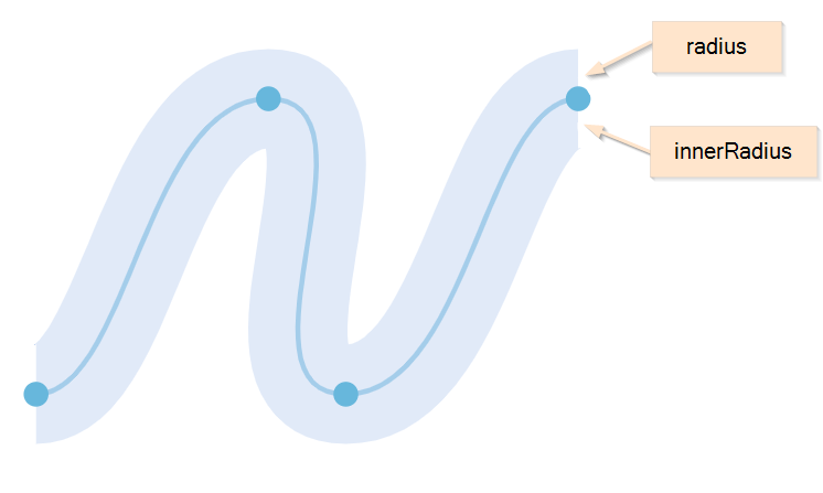
To put it in other words: using radius and innerRadius is a way to control both position and height/width of the (twisted) plot area.
Default values are 80 for radius and -80 for innerRadius. This means that, the plot area will be 160px high/wide, with X axis going straight through its middle.
Should we want the chart to start at the X axis, like in normal XYChart, we could set innerRadius = 0.
valueAxis.renderer.radius = 200;
valueAxis.renderer.innerRadius = 0;
valueAxis.renderer.radius = 200;
valueAxis.renderer.innerRadius = 0;
{
  // ...
  "yAxes": [{
    "type": "ValueAxis",
    // ...
    "renderer": {
      // ...
      "renderer": {
        "radius": 200,
        "innerRadius": 0
      }
    }]
  }
}
Here's how radius settings affect the real chart:
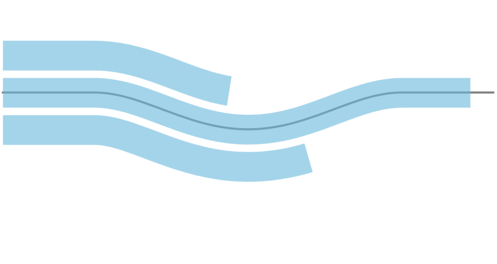
radius = 80innerRadius = -80(default)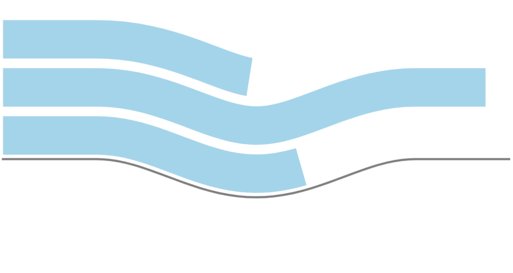
radius = 200innerRadius = 0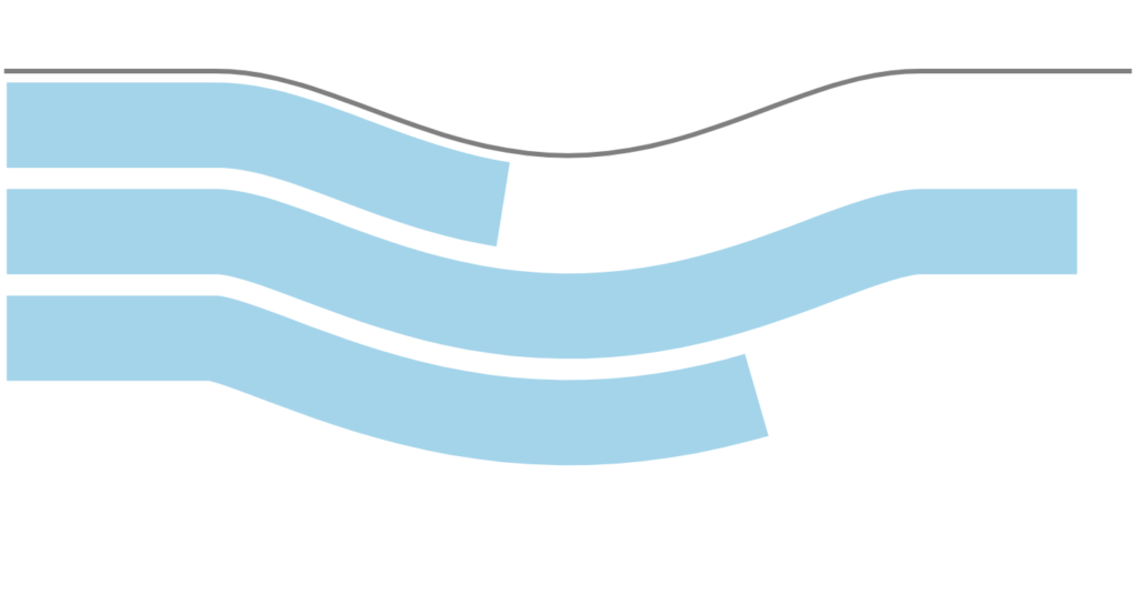
radius = 0innerRadius = -200
Using SVG paths
Creating custom SVG path in an editor
You can use any graphical editor, that is capable of saving vector-based information in an SVG format.
For the purpose of this tutorial, let's use Inkscape - an excellent open-source vector graphics editor.
To create a path, follow these three steps:
- Create a path in editor.
- Save as SVG, open it in any text editor, and look for the
<path>element. Then grab whatever in it'sdattribute - it's the SVG path.
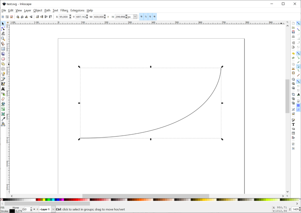
Create an SVG file with target curve of our chart 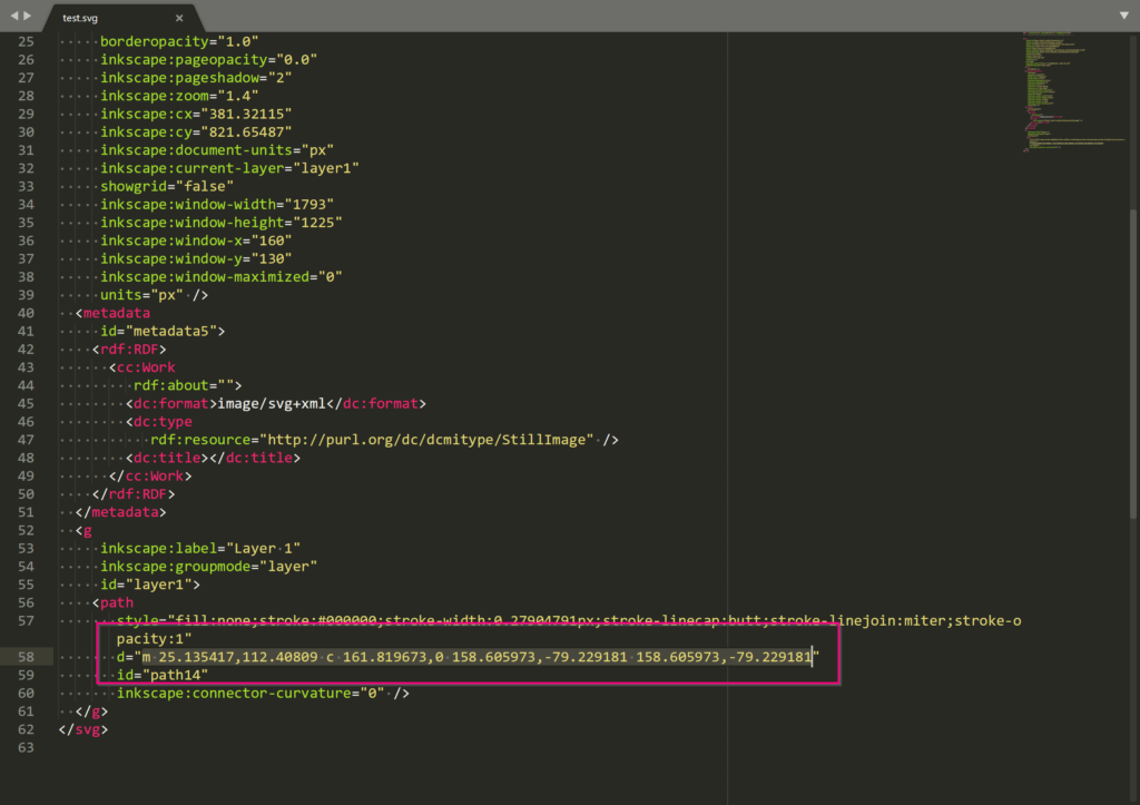
Open the file in editor and graph path data
Using existing SVG file
You can use existing SVG as well.
Like in previous step, open them in a text editor, and look for <path> elements.
Converting path to curve points
Finally, we need to convert an SVG path, into a curve points we've discussed earlier in this article.
For that, simply use this pre-made tool.
Paste your path data into the first text area. Click submit button. Grab converted point data from the second text area.
See the Pen amCharts 4: SVG path converter to points by amCharts team (@amcharts) on CodePen.
IMPORTANT The above tool will generate points that are close to each other. For such setups to work properly we recommend no using any "tension" settings to avoid any visual glitches.
Why can't we use SVG path instead of points?
The tool above uses some methods that are not available in all browsers.
As a developer, you have a choice of using different browsers to create point data once.
But you don't want to enforce that on your users, hence converting it to point data, which will work in all browsers now, or in the future.
Full example
// Create chart instance
let chart = am4core.create("chartdiv", am4plugins_timeline.CurveChart);

// Add data
chart.data = [{
  "country": "Lithuania",
  "value": 501
}, {
  "country": "Czechia",
  "value": 301
}, {
  "country": "Ireland",
  "value": 201
}, {
  "country": "Germany",
  "value": 165
}, {
  "country": "Australia",
  "value": 139
}, {
  "country": "Austria",
  "value": 128
}, {
  "country": "UK",
  "value": 99
}, {
  "country": "Belgium",
  "value": 60
}, {
  "country": "Netherlands",
  "value": 50
}];

// Create category (X) axis
let categoryAxis = chart.xAxes.push(new am4charts.CategoryAxis());
categoryAxis.dataFields.category = "country";
categoryAxis.renderer.grid.template.disabled = true;
categoryAxis.renderer.polyspline.tensionX = 0.8
categoryAxis.renderer.minGridDistance = 30;
categoryAxis.renderer.points = [
  { x: -400, y: 0 },
  { x: -250, y: 0 },
  { x: 0, y: 60 },
  { x: 250, y: 0 },
  { x: 400, y: 0 }
];

// Create value (Y) axis
let valueAxis = chart.yAxes.push(new am4charts.ValueAxis());
valueAxis.renderer.radius = 100;
valueAxis.renderer.innerRadius = 0;
valueAxis.renderer.grid.template.disabled = true;

// Create series
let series = chart.series.push(new am4plugins_timeline.CurveColumnSeries());
series.dataFields.valueY = "value";
series.dataFields.categoryX = "country";
series.columns.template.fillOpacity = 0.5;
series.columns.template.strokeWidth = 2;

// Add some white space around the chart
chart.padding(40, 40, 40, 40);
// Create chart instance
var chart = am4core.create("chartdiv", am4plugins_timeline.CurveChart);

// Add data
chart.data = [{
  "country": "Lithuania",
  "value": 501
}, {
  "country": "Czechia",
  "value": 301
}, {
  "country": "Ireland",
  "value": 201
}, {
  "country": "Germany",
  "value": 165
}, {
  "country": "Australia",
  "value": 139
}, {
  "country": "Austria",
  "value": 128
}, {
  "country": "UK",
  "value": 99
}, {
  "country": "Belgium",
  "value": 60
}, {
  "country": "Netherlands",
  "value": 50
}];

// Create category (X) axis
var categoryAxis = chart.xAxes.push(new am4charts.CategoryAxis());
categoryAxis.dataFields.category = "country";
categoryAxis.renderer.grid.template.disabled = true;
categoryAxis.renderer.polyspline.tensionX = 0.8
categoryAxis.renderer.minGridDistance = 30;
categoryAxis.renderer.points = [
  { x: -400, y: 0 },
  { x: -250, y: 0 },
  { x: 0, y: 60 },
  { x: 250, y: 0 },
  { x: 400, y: 0 }
];

// Create value (Y) axis
var valueAxis = chart.yAxes.push(new am4charts.ValueAxis());
valueAxis.renderer.radius = 100;
valueAxis.renderer.innerRadius = 0;
valueAxis.renderer.grid.template.disabled = true;

// Create series
var series = chart.series.push(new am4plugins_timeline.CurveColumnSeries());
series.dataFields.valueY = "value";
series.dataFields.categoryX = "country";
series.columns.template.fillOpacity = 0.5;
series.columns.template.strokeWidth = 2;

// Add some white space around the chart
chart.padding(40, 40, 40, 40);
// Create chart instance
var chart = am4core.createFromConfig({

  // Add data
  "data": [{
    "country": "Lithuania",
    "value": 501
  }, {
    "country": "Czechia",
    "value": 301
  }, {
    "country": "Ireland",
    "value": 201
  }, {
    "country": "Germany",
    "value": 165
  }, {
    "country": "Australia",
    "value": 139
  }, {
    "country": "Austria",
    "value": 128
  }, {
    "country": "UK",
    "value": 99
  }, {
    "country": "Belgium",
    "value": 60
  }, {
    "country": "Netherlands",
    "value": 50
  }],

  // Create category (X) axis
  "xAxes": [{
    "type": "CategoryAxis",
    "dataFields": {
      "category": "country"
    },
    "renderer": {
      "minGridDistance": 30,
      "grid": {
        "disabled": true
      },
      "polyspline": {
        "tensionX": 0.8
      },
      "points": [
        { x: -400, y: 0 },
        { x: -250, y: 0 },
        { x: 0, y: 60 },
        { x: 250, y: 0 },
        { x: 400, y: 0 }
      ]
    }
  }],

  // Create value (Y) axis
  "yAxes": [{
    "type": "ValueAxis",
    "renderer": {
      "radius": 100,
      "innerRadius": 0,
      "grid": {
        "disabled": true
      }
    }
  }],

  // Create series
  "series": [{
    "type": "CurveColumnSeries",
    "dataFields": {
      "valueY": "value",
      "categoryX": "country"
    },
    "columns": {
      "fillOpacity": 0.5,
      "strokeWidth": 2
    }
  }],

  // Add some white space around the chart
  "paddingTop": 40,
  "paddingRight": 40,
  "paddingBottom": 40,
  "paddingLeft": 40
}, "chartdiv", am4plugins_timeline.CurveChart);
And here it is live:
See the Pen amCharts 4: Curve chart by amCharts team (@amcharts) on CodePen.
P.S. Yes, we know those horizontal labels don't look good. This is why we created a separate tutorial on how to make them follow axis' curve here.
Complimentary chart types
Timeline plugin comes with a few complimentary chart types, that allows easy creation of the configurable Curve charts, without defining actual points or playing with tension settings.
Serpentine
Serpentine chart (SerpentineChart) is a wrapper for CurveChart which automatically generates horizontal or vertical waved curves, based on certain parameters. It sort of looks like a mountain road, hence the name.
It's configured exactly the same way as CurveChart we already learned, except we use SerpentineChart class which brings a few additional options to the table.
Serpentine chart options
Let's take a look at the few unique options available for SerpentineChart.
| Option | Default | Comment |
|---|---|---|
levelCount | 3 | Number of "levels" the chart will have. E.g. 3 (three) means there will be three straight lines of chart with two curved turns connecting them. |
orientation | "vertical" | Indicates the direction the "road" will weave in:"vertical" (default) will make the chart start at the top and go down."horizontal" will start at the left and got to right. |
yAxisRadius | 25% | This setting will be automatically applied to all Y axes' radius. |
yAxisInnerRadius | -25% | This setting will be automatically applied to all Y axes' innerRadius. |
Serpentine code example
let chart = am4core.create("chartdiv", am4plugins_timeline.SerpentineChart);
chart.orientation = "vertical";
chart.levelCount = 4;
chart.yAxisRadius = am4core.percent(50);
chart.yAxisInnerRadius = 0;
var chart = am4core.create("chartdiv", am4plugins_timeline.SerpentineChart);
chart.orientation = "vertical";
chart.levelCount = 4;
chart.yAxisRadius = am4core.percent(50);
chart.yAxisInnerRadius = 0;
var chart = am4core.createFromConfig({
  // ...
  "orientation": "vertical",
  "levelCount": 4,
  "yAxisRadius": "50%",
  "yAxisInnerRadius": 0
}, "chartdiv", am4plugins_timeline.SerpentineChart);
If you look at the code of the below example, you'll see that there are no controls points defined: SerpentineChart took care of that for us.
See the Pen amCharts 4: Curve chart by amCharts team (@amcharts) on CodePen.
Spiral
SpiralChart is another helpful wrapper for CurveChart. Based on parameters it automatically wraps the chart into a spiral, without the need to define control points for that shape.
Serpentine chart options
Let's see what options are available for the SpiralChart.
| Option | Default | Comment |
|---|---|---|
| 0 | An angle the spiral will end at. |
| 25% | Inner radius of the the spiral. |
inversed | false | Normally the spiral will start at the center. Set this to true to start at the outer end. |
levelCount | 3 | Number of rings the spiral will consist of. |
startAngle | 0 | An angle the spiral will start at. |
yAxisInnerRadius | -35% | This setting will be automatically applied to all Y axes' innerRadius. |
yAxisRadius | 35% | This setting will be automatically applied to all Y axes' radius. |
Spiral code example
let chart = am4core.create("chartdiv", am4plugins_timeline.SpiralChart);
chart.levelCount = 3;
chart.inversed = true;
chart.endAngle = -135;
var chart = am4core.create("chartdiv", am4plugins_timeline.SpiralChart);
chart.levelCount = 3;
chart.inversed = true;
chart.endAngle = -135;
var chart = am4core.createFromConfig({
  // ...
  "levelCount": 3,
  "inversed": true,
  "endAngle": -135
}, "chartdiv", am4plugins_timeline.SpiralChart);
See the Pen amCharts 4: Spiral chart by amCharts team (@amcharts) on CodePen.
Bullets and event markers
TODO Information is being prepared.
Other chart controls
Cursor
As most things in CurveChart cursor works exactly the same way as in XYChart, except instead of XYCursor we are using CurveCursor:
chart.cursor = new am4plugins_timeline.CurveCursor();
chart.cursor = new am4plugins_timeline.CurveCursor();
{
  // ...
  "cursor": {
    "type": "CurveCursor"
  }
}
MORE INFO For more info about using cursor, read here.
Legend
Same goes for the legend, except we don't need any special class at all here:
chart.legend = new am4charts.Legend();
chart.legend = new am4charts.Legend();
{
  // ...
  "legend": {
    "type": "Legend"
  }
}
MORE INFO For more info about using legend, read here.
Scrollbars
MORE INFO For more info on using scrollbars, read here.