Axes are vital part of most XY and some other chart types, providing a measure of scale or grouping to the otherwise arbitrary visual data.
This article will look at different kinds of axes, how they can be used and configured to suit your needs.
Instantiating axes
In amCharts 4, most of the chart types that require axes need two of those. In most cases the chart will have two properties: xAxes and yAxes.
Both of those are lists, since charts support any number of axes, of any type and combination.
Creating an axis
Like with most list-based properties, we create an axis by using create() method, specifying the type of axis we want to create.
For example, to create a vertical Value axis, and horizontal Category axis, we'd do something like this:
let valueAxis = chart.yAxes.push(new am4charts.ValueAxis());
let categoryAxis = chart.xAxes.push(new am4charts.CategoryAxis());
var valueAxis = chart.yAxes.push(new am4charts.ValueAxis());
var categoryAxis = chart.xAxes.push(new am4charts.CategoryAxis());
{
  // ...
  "yAxes": [{
    "type": "ValueAxis"
  }],
  "xAxes": [{
    "type": "CategoryAxis"
  }]
}
Orientation and position
The orientation (vertical or horizontal) is determined in which list it is assigned/created. Axes assigned to xAxes list, will be horizontal (or will start off horizontally then will curve in case of circular charts like Radar). Axes in yAxes will be vertical.
Horizontal axes are drawn at the bottom, and vertical ones on the left by default. To move the axis to the opposite side (top and right respectively), use axis' renderer's setting opposite.
let valueAxis = chart.yAxes.push(new am4charts.ValueAxis());
valueAxis.renderer.opposite = true;
let categoryAxis = chart.xAxes.push(new am4charts.CategoryAxis());
categoryAxis.renderer.opposite = true;
var valueAxis = chart.yAxes.push(new am4charts.ValueAxis());
valueAxis.renderer.opposite = true;
var categoryAxis = chart.xAxes.push(new am4charts.charts.CategoryAxis());
categoryAxis.renderer.opposite = true;
{
  // ...
  "yAxes": [{
    "type": "ValueAxis",
    "renderer": {
      "opposite": true
    }
  }],
  "xAxes": [{
    "type": "CategoryAxis",
    "renderer": {
      "opposite": true
    }
  }]
}
The above will move our Value axis to the right, and Category axis to the top of the chart.
Axis renderers
In amCharts 4, actual axis type is separated from its rendering. This allows us to retain uniform, consistent axis types across, seemingly different chart types.
For example an XY chart can have a straight horizontal Category axis, while Radar chart can have a circular Category axis.
That's where axis renderers come in.
When you create a horizontal Category axis in an XY chart, it will automatically use AxisRenderX. For a circular Radar axis, it will automatically use AxisRendererCircular.
Axis' renderer is always accessible via axis' renderer property.
Depending on renderer, it may have different settings that will affect behavior and appearance of the actual drawn axis. This is why most of the appearance settings are usually set not directly via axis' properties, but rather via its renderer's properties, as you already saw in previous chapter about axis' positions. (yes the opposite setting)
Types of axes
There are three main types of axes in amCharts 4: Value, Date, and Category. Let's examine each one in detail.
| Axis type | Axis class | Comment |
|---|---|---|
| Value axis | ValueAxis | Used to position data items on a numeric scale. |
| Category axis | CategoryAxis | Used to position data items on text-based categories. |
| Date axis | DateAxis | Used to position data items on on a date/time scale. |
| Duration axis | DurationAxis | Used to position data items on a numeric scale, formatted as time duration. |
Configuring Axes
As we already mentioned at the beginning of this article, most of the "logic-related" settings are set directly on the axis (axis.*), while most of the settings that affect appearance are set on axis' renderer. (axis.renderer.*)
Generic settings
Since most of the settings are related to appearance, there are not that many generic settings we can set directly on axis itself.
Some of those are relative to specific axis types (like for instance baseInterval from Date axis).
Some are universal. Like for instance title. A title is an instance of Label which you can use to set text and also format it like any other label. Using it will enable a title drawn alongside the axis.
valueAxis.title.text = "Turnover ($M)";
valueAxis.title.fontWeight = "bold";
valueAxis.title.text = "Turnover ($M)";
valueAxis.title.fontWeight = "bold";
{
  // ...
  "yAxes": [{
    "type": "ValueAxis",
    "title": {
      "text": "Turnover ($M)",
      "fontWeight": "bold"
    }
  }]
}

MORE INFO Look up each individual axis class in our Class Reference for a complete list of available settings.
Appearance
As you already know, most appearance-related settings are set through axis' renderer.
You can look up specific renderer in our Class Reference for available settings.
For example vertical axis on an XY chart uses AxisRendererX.
Grid, labels, and ticks
Grid are lines perpendicular to the axis. They are usually are placed at certain value intervals, determined by the axis itself, based on a lot of criteria.
Grid lines are usually accompanied with ticks and labels.
As you correctly have already guessed, we'll use axis renderer to change the appearance of any of those three.
Grid
Grid items (lines) are located in a list in renderer's property grid.
As with any list you can modify it's "template" to set how grid elements look like. (more on list templates)
As an exercise let's change Value axis' grid color and thickness:
valueAxis.renderer.grid.template.strokeOpacity = 1;
valueAxis.renderer.grid.template.stroke = am4core.color("#A0CA92");
valueAxis.renderer.grid.template.strokeWidth = 2;
valueAxis.renderer.grid.template.strokeOpacity = 1;
valueAxis.renderer.grid.template.stroke = am4core.color("#A0CA92");
valueAxis.renderer.grid.template.strokeWidth = 2;
{
  // ...
  "yAxes": [{
    "type": "ValueAxis",
    "renderer": {
      "grid": {
        "strokeOpacity": 1,
        "stroke": "#A0CA92",
        "strokeWidth": 2
      }
    }
  }]
}
See the Pen amCharts V4: Value axis (10) by amCharts (@amcharts) on CodePen.
MORE INFO Since grid consists of Grid elements, refer to its class reference for all available settings.
Zero line
If you have a Value axis that spans range of values from negative to positive, the chart will display a special grid line that goes at zero (a zero line).
It's not affected by renderer.grid settings, but it can be configured separately, using renderer.baseGrid property.
Since it's a single line, there are not template - you set properties to it directly.
E.g. to disable zero-line you'd do something like this:
valueAxis.renderer.baseGrid.disabled = true;
valueAxis.renderer.baseGrid.disabled = true;
{
  // ...
  "yAxes": [{
    "type": "ValueAxis",
    "renderer": {
      "baseGrid": {
        "disabled": true
      }
    }
  }]
}
Labels
Just like grid, labels are configured via a list property in axis' renderer. In this case it's labels.
Let's change the color to labels as well, as well as make them bigger.
valueAxis.renderer.labels.template.fill = am4core.color("#A0CA92");
valueAxis.renderer.labels.template.fontSize = 20;
valueAxis.renderer.labels.template.fill = am4core.color("#A0CA92");
valueAxis.renderer.labels.template.fontSize = 20;
{
  // ...
  "yAxes": [{
    "type": "ValueAxis",
    "renderer": {
      // ...
      "labels": {
        "fill": "#A0CA92",
        "fontSize": 20
      }
    }
  }]
}
See the Pen amCharts V4: Value axis (11) by amCharts (@amcharts) on CodePen.
MORE INFO Again, labels are objects of type AxisLabel. Refer to relative class reference for available configuration options.
Ticks
Ticks are tiny "spikes" that go between label and axis, and generally look like the extension of the grid lines.
Configure ticks by accessing template of the renderer's ticks property. (more on list templates)
By default, ticks are disabled. Let's enable them, and make them same thickness as grid line, but darker in color:
valueAxis.renderer.ticks.template.disabled = false;
valueAxis.renderer.ticks.template.strokeOpacity = 1;
valueAxis.renderer.ticks.template.stroke = am4core.color("#495C43");
valueAxis.renderer.ticks.template.strokeWidth = 2;
valueAxis.renderer.ticks.template.length = 10;
valueAxis.renderer.ticks.template.disabled = false;
valueAxis.renderer.ticks.template.strokeOpacity = 1;
valueAxis.renderer.ticks.template.stroke = am4core.color("#495C43");
valueAxis.renderer.ticks.template.strokeWidth = 2;
valueAxis.renderer.ticks.template.length = 10;
{
  // ...
  "yAxes": [{
    "type": "ValueAxis",
    "renderer": {
      // ...
      "ticks": {
        "disabled": false,
        "strokeOpacity": 1,
        "stroke": "#495C43",
        "strokeWidth": 2,
        "length": 10
      }
    }
  }]
}
See the Pen amCharts V4: Value axis (12) by amCharts (@amcharts) on CodePen.
The axis line
By default, the line of the axis itself is hidden - the grid is most often doing a good job of lining the plot area.
If, however, you'd like to re-enable, or highlight the axis line, you the renderer has property line in it, which holds the axis line object.
To make it visible, set its strokeOpacity to a non-zero value (it's currently at 0 to make it invisible).
Since it's a line, we can do any kind of appearance manipulation as well, like set thickness (strokeWidth), color (stroke), add filters and even events, you name it.
categoryAxis.renderer.line.strokeOpacity = 1;
categoryAxis.renderer.line.strokeWidth = 2;
categoryAxis.renderer.line.stroke = am4core.color("#3787ac");
categoryAxis.renderer.line.strokeOpacity = 1;
categoryAxis.renderer.line.strokeWidth = 2;
categoryAxis.renderer.line.stroke = am4core.color("#3787ac");
{
  // ...
  "xAxes": [{
    "type": "CategoryAxis",
    "renderer": {
      // ...
      "line": {
        "strokeOpacity": 1,
        "strokeWidth": 2,
        "stroke": "#3787ac"
      }
    }
  }]
}
See the Pen amCharts V4: Axis lines by amCharts (@amcharts) on CodePen.
Positioning grid and labels
Axis (or more like its renderer) will try to position its elements - grid, labels and ticks - as best as it can.
For example, Category axis will try to place all three in the middle of the category. This might not work well, if you have, say, column series and do not want to the grid lines to go straight through the middle of the column.
That's where location property come into play. Grid, labels, and ticks all have that property, so you can precisely control their position.
The location property accepts values from 0 to 1. The value expresses relative position within axis cell / category.
0 means start, 0.5 - middle, and 1 - end. You can have any value in-between, although placing grid at one third of the category probably does not make a lot of sense, although, it's certainly possible, if you feel like that's your cup of tea.
Knowing this, let's try to "fix" our example further, so that grid on category axis marks start of the cell, while labels remain in the middle.
categoryAxis.renderer.grid.template.location = 0;
categoryAxis.renderer.grid.template.location = 0;
{
  // ...
  "xAxes": [{
    "type": "CategoryAxis",
    "renderer": {
      // ...
      "grid": {
        "location": 0
      }
    }
  }]
}
See the Pen amCharts V4: Axis element positioning by amCharts (@amcharts) on CodePen.
MORE INFO For more information on positioning axis elements, check our "Positioning Axis Elements" article.
Labels on Date axis
Positioning of labels on a Date axis deserves special mention, because it follows a certain fuzzy logic.
Basically it goes like this:
- If the distance between two adjacent labels/grid lines is full period (hour, day, month, tear, etc.) we show the label in the middle of that period, because, well it represents the full period.
- If the distance between two adjacent labels/grid lines is more than a full period, say two days, we show the label at the start of the period, because it would be very misinformative to show it in the middle of the time span that represents several days.
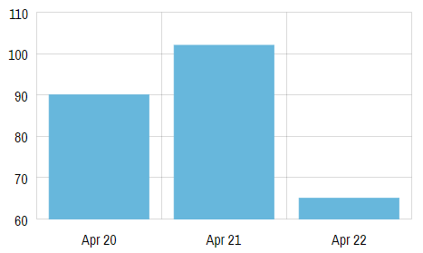
To put this in the perspective, the following example shows labels every single day. Since the each space between each grid line is just one day, we can safely show the label in the middle, because that label represents the whole of the period.
Now, let's take a look at the chart with more labels, which start not fitting and therefore some of them have to be skipped.
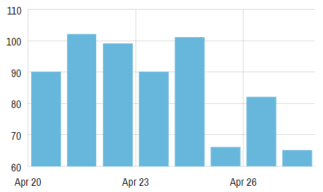
There are 3 days between each grid line/label. It would not make sense showing "Apr 20" label in the middle of the range that spans from 20 to 22.
NOTE The positioning of labels on DateAxis using location is subject to certain fuzzy logic. Please read here.
Disabling certain elements
Occasionally you might want to disable certain elements, like grid, labels, or ticks.
This is supereasily done setting disabled property on a related template. E.g. to disable grid on a category axis, we'd do something like this:
categoryAxis.renderer.grid.template.disabled = true;
categoryAxis.renderer.grid.template.disabled = true;
{
  // ...
  "xAxes": [{
    "type": "CategoryAxis",
    "renderer": {
      // ...
      "grid": {
        "disabled": true
      }
    }
  }]
}
The same goes for labels (axis.renderer.labels.template.disabled = true) and ticks (axis.renderer.ticks.template.disabled = true).
Label formatting
On Category axis, labels are displayed as they come from data - no further formatting is applied.
For Value axis and Date axis the situation is different.
Before a label (value or date/time) is displayed, they are passed through the relative formatter.
Each chart in amCharts 4 has a Number formatter (accesible via numberFormater property) and a Date formatter (accessible via dateFormatter).
Formatters define how a number or a date should be displayed.
MORE INFO Please refer to dedicated "Formatters" article for in-depth details about how formatters work and are configured.
Normally, an axis, when formatting its labels will use chart's default formatter. If you want your axis to use different formats, you can create a separate formatter instance and assign it to axis' numberFormatter or dateFormatter properties.
Let's look at how the two are used.
Numeric labels
Numeric labels are used on a Value axis. Please refer to "Formatting labels" section in our dedicated Value axis guide for more details.
Date/time labels
Date/time labels work following special set of formatting rules set on Date axis' dateFormats and periodChangeDateFormats settings. For more information check our "Formatting date and time" in our separate Date axis article.
Other label formatting options
There's so much more to axis label formatting. Make sure you take a look at the following articles and tutorials for additional tips:
Axis tooltips
So far we have been creating fairly static charts. In real life we most certainly have a chart cursor added to our charts, for instant interactivity.
A chart cursor is a useful control which displays crosshair-like lines that, among other things, indicate cursor's precise location within any axis.
Enabling axis tooltips is as easy as adding a Cursor to your chart.
MORE INFO Both Chart cursor and Axis tooltips are discussed in separate articles (linked). Make sure to check them both out.
Additional axis features
Breaks
In some chapters in this tutorial we were dealing with issues where some extraordinary high values in the series were messing up the generic perception of the data and its dynamics.
In amCharts 4 there's an excellent way to deal with such issue - axis breaks.
An axis break is basically a way to tell the axis to remove a certain range from its scale. And it's not limited to values. You can remove a range of dates (say weekends) on a Date axis, or good chunk of values from Value axis.
Let's try adding an axis break on one of our previous examples:
let axisBreak = valueAxis.axisBreaks.create();
axisBreak.startValue = 300;
axisBreak.endValue = 1200;
axisBreak.breakSize = 0.05;
var axisBreak = valueAxis.axisBreaks.create();
axisBreak.startValue = 300;
axisBreak.endValue = 1200;
axisBreak.breakSize = 0.05;
{
  // ...
  "yAxes": [{
    "type": "ValueAxis",
    // ...
    "axisBreaks": [{
      "startValue": 300,
      "endValue": 1200,
      "breakSize": 0.05
    }]
  }]
}
What the code above basically means is this: create an axis break that removes value range from 300 to 1200 from axis scale and replace it with a gap that is 0.05 width of the removed values, or 45 units.
A break on a Value axis is an object of type ValueAxisBreak.
Let's see how it turned out:
See the Pen amCharts V4: Axis breaks by amCharts (@amcharts) on CodePen.
Now, to make this even more cooler, let's add some events handlers to the axis break so that it is stretched out to reveal real axis scale on hover. We'll do it by animating breakSize property to 1 and back to 0.05.
axisBreak.events.on("over", () => {
  axisBreak.animate(
    [{ property: "breakSize", to: 1 }, { property: "opacity", to: 0.1 }],
    1500,
    am4core.ease.sinOut
  );
});
axisBreak.events.on("out", () => {
  axisBreak.animate(
    [{ property: "breakSize", to: 0.05 }, { property: "opacity", to: 1 }],
    1000,
    am4core.ease.quadOut
  );
});
{
  // ...
  "yAxes": [{
    "type": "ValueAxis",
    // ...
    "axisBreaks": [{
      "startValue": 300,
      "endValue": 1200,
      "breakSize": 0.05,
      "events": {
        "over": function(ev) {
          var axisBreak = ev.target;
          axisBreak.animate(
            [{ property: "breakSize", to: 1 }, { property: "opacity", to: 0.1 }],
            1500,
            am4core.ease.sinOut
          );
        },
        "out": function(ev) {
          var axisBreak = ev.target;
          axisBreak.animate(
            [{ property: "breakSize", to: 0.05 }, { property: "opacity", to: 1 }],
            1000,
            am4core.ease.quadOut
          );
        }
      }
    }]
  }]
}
Try running the demo below, and hovering your mouse cursor over the break now:
See the Pen amCharts V4: Axis breaks (2) by amCharts (@amcharts) on CodePen.
If we wanted to add a break on a Date axis, we'd have to deal with DateAxisBreak objects, that have different set of properties, e.g. startDate and endDate.
Similarly, for Category axis, we'd use CategoryAxisBreak and startCategory / endCategory.
Ranges
An axis range is a way to define a specific range on an axis, then use that range to override some visual properties of the series to its parts that fall into range, or put visual guides to a particular position or a stretch of the axis.
Axis ranges can be used for two things:
- Modify visual properties of part of the series, that falls into specific range, e.g. color parts of the Line series that fall below zero value in red;
- Mark specific values or ranges of values on an axis with a straight line and optionally labels, a.k.a. "guides".
MORE INFO It's a pretty wide topic as it is, it deserves a separate article. Make sure you visit and read "Axis ranges" article for more details and live examples.
Zooming
Each axis in amCharts 4 can become "zoomable", meaning that user can zoom in and out, to change the scale dynamically, effectively changing which pat of series is displayed.
To turn on zooming simply create and add a Scrollbar instance.
To add a horizontal scrollbar, you'd assign Scrollbar instance to chart's scrollbarX property. Similarly to add vertical scrollbar, you'd use scrollbarY.
chart.scrollbarX = new am4core.Scrollbar();
chart.scrollbarY = new am4core.Scrollbar();
chart.scrollbarX = new am4core.Scrollbar();
chart.scrollbarY = new am4core.Scrollbar();
{
  // ...
  "scrollbarX": {
    "type": "Scrollbar"
  },
  "scrollbarY": {
    "type": "Scrollbar"
  },
}
The above will create both horizontal and vertical scrollbars, that can be used to zoom the axes. Go ahead - try it out:
See the Pen amCharts V4: Value axis (scrollbars) by amCharts (@amcharts) on CodePen.
NOTE Turning on a scrollbar will turn zooming on for all axes with the same orientation. E.g. if you have two vertical value axes (yAxes), and add a vertical scrollbar (scrollbarY), both axes will be zoomed when scrollbar is used.