Value axis (ValueAxis) is used to depict a simple numeric value.
Numeric scale
In the most common serial chart scenario, you would have a vertical Value axis, and either a Category or Date axis, for horizontal dimension. In such chart each point (an elbow on a line series, or a column in a column series) is represented by a numeric value, and an some other value, either category or a date.
Some chart types, like Scatter/Bubble, will have data points represented by two numeric values: X (horizontal) and Y (vertical) value. In such charts we will have two Value axes: horizontal and vertical.
Normally, a Value axis will automatically choose its scale (minimum and maximum value, as well as intermediate grid/value positions) based on the actual range of numeric values in currently displayed data. Furthermore, it will automatically try to intelligently adjust its scale so that its scale is represented by "pretty" numbers, while maintaining the best possible appearance of related series.
For example, if we have a line series with three values: 3.5, 6, and 6.5. The actual range of values is from 3.5 to 6.5.
Naturally, a value axis starting with 3.5 and ending with 6.5, with intermediate numbers at some odd fractional increments would look awkward to say the least.
That's why the algorithm behind Value axis will intelligently try to adjust its scale to start at 3 and end at 7, with intermediate grid/label every 1, resulting in grid lines/labels at 3, 4, 5, 6, and 7.
See the Pen amCharts V4: Value axis (1) by amCharts (@amcharts) on CodePen.
Adjusting scale
Now that we know how Value axis' scales work, let's look at how we can adjust it to our needs.
Default behavior for the Value axis is designed to provide best results "out-of-the-box". However, in some cases you might need to adjust it for better results for your specific requirements, or usage scenario.
Normally, Value axis will not start at zero, but will start at a value just before the smallest value in currently displayed data. This helps make the difference in values as prominent as possible. For example, if we had some very large numbers with only a little fluctuation between them (i.e. 900, 920, 915). Starting the scale at zero would make the columns for all three look almost identical, which would provide false impression to the user viewing the chart. Here's a demo how it would look like, just to illustrate the point:
See the Pen amCharts V4: Value axis (2) by amCharts (@amcharts) on CodePen.
Not particularly useful, is it?
Here's how the same chart looks like with default settings: (letting Value axis determine best possible starting value by itself)
See the Pen amCharts V4: Value axis (3) by amCharts (@amcharts) on CodePen.
Much better.
However, if you know what's best for your users, and how to best depict your data, you can adjust the scale using Value axis' min property (to set the starting value) and max (to set the ending value).
So, if I'd want my value axis scale to go from, say, 500 to 1500, I'd go with something like this:
let valueAxis = chart.yAxes.push(new am4charts.ValueAxis());
valueAxis.min = 500;
valueAxis.max = 1500;
var valueAxis = chart.yAxes.push(new am4charts.ValueAxis());
valueAxis.min = 500;
valueAxis.max = 1500;
{
  // ...
  "yAxes": [{
    "type": "ValueAxis",
    "min": 500,
    "max": 1500
  }]
}
NOTE Even though you explicitly specify min and/or max, Value axis might "disobey" and adjust these settings to result in better intermediate value increments for the available space. Here's how our chart looks like with the above setting:
See the Pen amCharts V4: Value axis (4) by amCharts (@amcharts) on CodePen.
Notice, how the chart adjusted the values, because it thought it would result in better looking scale.
To "force" the start/end values for the scale to literally follow your min/max settings, use strictMinMax setting.
So, if I'd want my value axis scale to go from, say, 500 to 1500, I'd go with something like this:
let valueAxis = chart.yAxes.push(new am4charts.ValueAxis());
valueAxis.min = 500;
valueAxis.max = 1500;
valueAxis.strictMinMax = true;
var valueAxis = chart.yAxes.push(new am4charts.ValueAxis());
valueAxis.min = 500;
valueAxis.max = 1500;
valueAxis.strictMinMax = true;
{
  // ...
  "yAxes": [{
    "type": "ValueAxis",
    "min": 500,
    "max": 1500,
    "strictMinMax": true
  }]
}
Let's see how we do now:
See the Pen amCharts V4: Value axis (5) by amCharts (@amcharts) on CodePen.
Notice, how the scale is now precisely follows our settings, albeit does not look too good, because the first label and last are not there. This is because Value axis has determined that for this specific value range, the most optimal step size is 200, hence labels 500 and 1500 are not present. That brings us to the next mini-section on Value axis.
Relatively expanding the scale
Setting minimum and maximum values explicitly might work but it's not very universal.
What if my values change?
What if I want the scale to always go a bit further than the bare minimum required to fit all of the data points in it?
That's where Value axis' extraMin and extraMax properties come in.
These settings are used to relatively "expand" current minimum or maximum value range of the axis.
This is useful in the situations where we might want to "pad" actual series in the chart from getting too close to the edge.
The values for these settings are relative to the current unmodified range of the axis values.
E.g. setting extraMin = 0.2 on an axis that is currently displaying values from 100 to 200 will force the range to 80 to 200.
// Pad values by 20%
valueAxis.extraMin = 0.2;
valueAxis.extraMax = 0.2;
// Pad values by 20%
valueAxis.extraMin = 0.2;
valueAxis.extraMax = 0.2;
{
  // ...
  "yAxes": [{
    // ...
    // Pad values by 20%
    "extraMin": 0.2,
    "extraMax": 0.2
  }]
}
IMPORTANT extraMin and extraMax are not compatible with strictMinMax setting set to true.
Adjusting value steps
Like with the actual scale, Value axis will do its best to determine the most optimal step size for the value range it needs to encompass. It depends on a number of criteria, like value range, available space, etc.
The single most important setting, determining number of grid/labels, and thus the actual step is the minimum allowed distance between two grid lines. It is determined by axis' renderer's property: minGridDistance.
It ensures that chart maintains a minimum distance (in pixels) between each grid line, so that they do not become too crammed or too spread out.
Reducing the minGridDistance will result in more grid lines / labels and thus a more granular value axis step. Let's try using it to trick a chart to use increments in 100s, rather than 200s.
valueAxis.renderer.minGridDistance = 20;
valueAxis.renderer.minGridDistance = 20;
{
  // ...
  "yAxes": [{
    // ...
    "renderer": {
      "minGridDistance": 20
    }
  }]
}
Yup, that did it:
See the Pen amCharts V4: Value axis (6) by amCharts (@amcharts) on CodePen.
Multiple value axes
We already mentioned that amCharts 4 supports any number of axes. This might come really useful when you have to plot, say, two series with very distinctive values, or even units.
In such case, you can create to separate Value axes, then bind each respective series to them.
MORE INFO We're not going to get into multiple value axes here. This particular topic is described in great detail, with examples to code with it in the article "Anatomy of XY Chart".
Synchronizing grid
IMPORTANT Syncing might not work if you are not using "animated" theme. If that is the case, try adding showOnInit = true on your axes to fix it.
IMPORTANT Synchronized axes will not work properly with the scrollbars. E.g. with you are syncing vertical axes, do not add vertical scrollbar.
As of version 4.8.1 it's possible to synchronize grid of several ValueAxis. Synchronizing means that grid lines for several axes are shown in exactly the same place, and keep such synchronization across zooms.
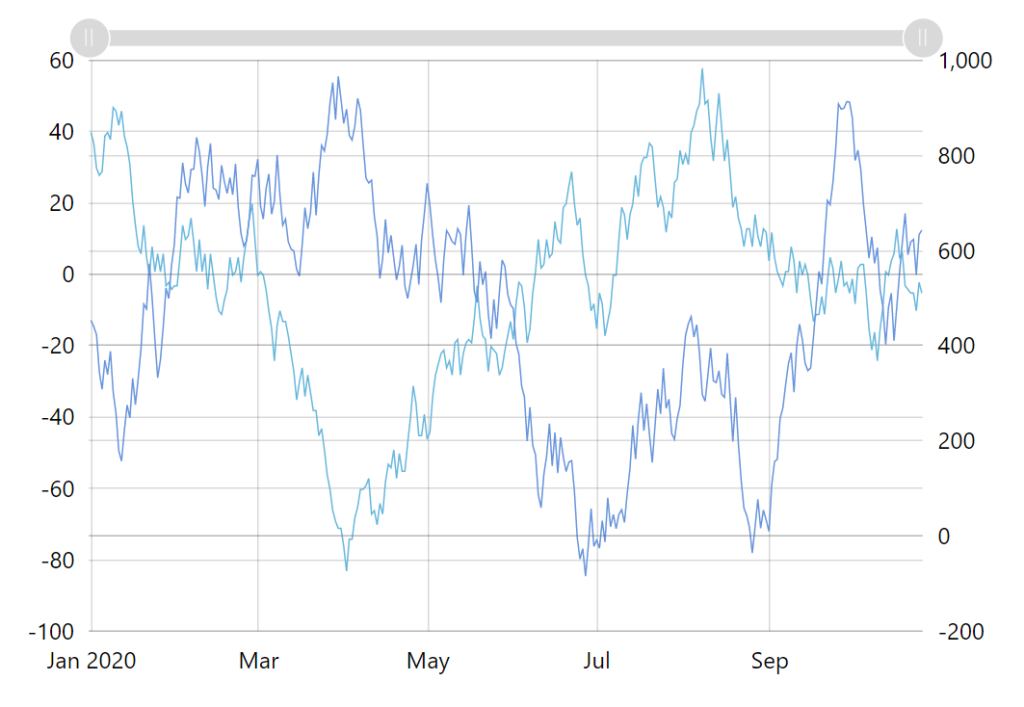
Unsynchronized grid 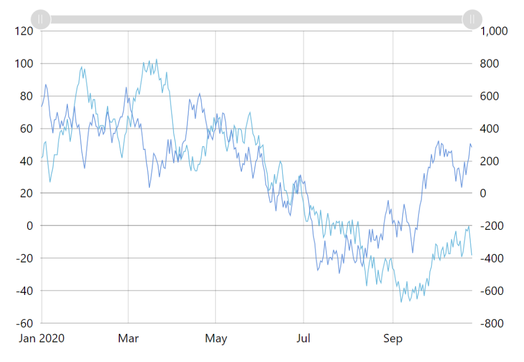
Synchronized grid
It works by instructing a ValueAxis to synchronize its grid with some other axis. You do that by setting syncWithAxis property.
let valueAxis1 = chart.yAxes.push(new am4charts.ValueAxis());

let valueAxis2 = chart.yAxes.push(new am4charts.ValueAxis());
valueAxis2.syncWithAxis = valueAxis1;
var valueAxis1 = chart.yAxes.push(new am4charts.ValueAxis());

var valueAxis2 = chart.yAxes.push(new am4charts.ValueAxis());
valueAxis2.syncWithAxis = valueAxis1;
{
  // ...
  "yAxes": [{
    "type": "ValueAxis",
    "id": "va1",
    // ...
  }, {
    "type": "ValueAxis",
    "id": "va2",
    "syncWithAxis": "va1",
    // ...
  }]
}
NOTE Synchronization is a one-way street. There's a "main" axis, which follows it's own grid/scale building logic, and there are "synced" axes that have their syncWithAxis set to the "main" axis. While "main" axis remains unchanged, "synced" axes will always adjust their grid to match one from the "main" axis.
See the Pen amCharts 4: Synchronizing grid of several ValueAxis by amCharts team (@amcharts) on CodePen.
Logarithmic scale
Multiple value axes work well when you have distinctive series with different scales of data.
But what about if data varies greatly within single series? Say you have several data points in the 100s, with one data point sticking out at 1000. Naturally, the scale of the value axis will be in 1000 so that it can accommodate all values.
This will make one column stick out, while all others will look like equally sized gnomes next to it:
See the Pen amCharts V4: Value axis (7) by amCharts (@amcharts) on CodePen.
In this case, using Value axis with a logarithmic scale might help. Such value axis will not use value scale with equal increments. Instead, each increment will be orders of magnitude larger than the previous one, making the series with large gap between values, usable.
To turn this feature on, simply set logarithmic = true on your Value axis:
valueAxis.logarithmic = true;
valueAxis.logarithmic = true;
{
  // ...
  "yAxes": [{
    // ...
    "logarithmic": true
  }]
}
See the Pen amCharts V4: Value axis (8) by amCharts (@amcharts) on CodePen.
Formatting labels
Setting label format
When Value axis wants to display a label, it throws the raw value into its Number formatter (either own or inherited from chart) and uses returned formatted string as a label.
Let's say we want to force the values to all have two decimal digits, regardless of actual value.
We can set number format for the whole chart, which will extend to the axis as well:
chart.numberFormatter.numberFormat = "#.00";
chart.numberFormatter.numberFormat = "#.00";
{
  // ...
  "numberFormatter": {
    "numberFormat": "#.00"
  }
}
Or, if I don't want my axis settings to affect the whole chart, I can create a local formatter for the axis:
valueAxis.numberFormatter = new am4core.NumberFormatter();
valueAxis.numberFormatter.numberFormat = "#.00";
valueAxis.numberFormatter = new am4core.NumberFormatter();
valueAxis.numberFormatter.numberFormat = "#.00";
{
  // ...
  "yAxes": [{
    "type": "ValueAxis",
    "numberFormatter": {
      "type": "NumberFormatter",
      "numberFormat": "#.00"
    }
  }]
}
Adjusting label precision
As we saw in the section above, we can set label format. The example defined a fixed number of decimals ("#.00") using zero in format.
This ensures that no matter what, labels will have two decimals, even integers, e.g.: 1.00, 1.50, 2.00, etc.
But what if we don't yet know the scope of our values, and therefore granularity/precision of our labels? Two digits might be too much, or too few.
If we don't set active decimals, they will depend on actual precision of each number, e.g.: 1, 1.5, 2.
This is why ValueAxis will try to automatically format all numbers using the same number of decimals as the most granular label currently displayed, e.g.: 1.0, 1.5, 2.0.
It is the default behavior since version 4.9.14.
If you'd like to disable such auto-formatting, you can do so by setting axis' adjustLabelPrecision to false:
valueAxis.adjustLabelPrecision = false;
valueAxis.adjustLabelPrecision = false;
{
  // ...
  "yAxes": [{
    // ...
    "adjustLabelPrecision": false
  }]
}