In its nature, Duration axis is very similar to a Value axis. Both axis types use absolute numeric values for its scale.
The difference is that on Duration axis, numbers are treated like time units and the increments (intermediate grid lines and labels) are placed at time units, not at ones, tens, hundreds, etc.
For example we have a data, that illustrates how many seconds of a process each stage took:
[{
  "stage": "I",
  "duration": 780
}, {
  "stage": "II",
  "duration": 600
}, {
  "stage": "III",
  "duration": 1800
}, {
  "stage": "IV",
  "duration": 1250
}, {
  "stage": "V",
  "duration": 500
}]
We could display this on a value axis, which would show how seconds, treating those as numbers:
See the Pen amCharts 4: Duration axis (1) by amCharts (@amcharts) on CodePen.
That's all fine and dandy - the columns represent visual representation of the duration of each stage.
However from the user's standpoint it's not very useful: quick, what's a 2000 seconds?
That's where Duration axis comes in.
We replace ValueAxis with a DurationAxis, tell our numbers are seconds and watch the magic happen:
let yAxis = chart.yAxes.push(new am4charts.DurationAxis());
yAxis.baseUnit = "second";
yAxis.title.text = "Duration";
var yAxis = chart.yAxes.push(new am4charts.DurationAxis());
yAxis.baseUnit = "second";
yAxis.title.text = "Duration";
{
  // ...
  "yAxes": [{
    "type": "DurationAxis",
    "baseUnit": "second",
    "title": {
      "text": "Duration"
    }
  }]
}
See the Pen amCharts 4: Duration axis (2) by amCharts (@amcharts) on CodePen.
As you can see, now our seconds are being resolved to minutes. It's now much easier for our users to understand how long each process took, not just how much longer it was in comparison to other processes.
Granularity and format of duration labels
Duration axis, knowing what time unit your numbers mean (baseUnit), is clever enough to automatically choose format for the labels.
In our above example, none of the numbers were above an hour, so it was showing labels, formatted as minutes.
Would our numbers be higher, spanning, more than an hour, axis would automatically switch to hourly format.
Let's see what happens when we bump our number of seconds up:
See the Pen amCharts 4: Duration axis (3) by amCharts (@amcharts) on CodePen.
Yup. Now the format was adjusted to incorporate hours.
The increments are now placed at each hour, which represents scale nicely.
Forcing duration format
What if you don't want Duration axis going all clever on us, because we know better?
We can force Duration axis to use particular format by setting formatDuration explicitly on the chart's or axis' durationFormatter.
chart.durationFormatter.durationFormat = "hh 'hours' mm 'minutes' ss 'seconds'";
chart.durationFormatter.durationFormat = "hh 'hours' mm 'minutes' ss 'seconds'";
{
  // ...
  "durationFormatter": {
    "durationFormat": "hh 'hours' mm 'minutes' ss 'seconds'"
  }
}
See the Pen amCharts 4: Duration axis (5) by amCharts (@amcharts) on CodePen.
MORE INFO Make sure you visit our article about "Formatting Duration" for all the codes and guidance on duration formats.
Setting duration format in tooltips
It's not related to axis, but we want to touch this topic here anyway.
Our axis knows that it is a Duration axis, and knows it needs to format its labels as durations.
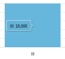
Our series, on the other hand, does not know that. It treats our time units as regular numbers, so it will display them in its tooltip formatted as such:

That's not exactly what we wanted, is it?
This is why we'll need to explicitly force duration dormatter on our placeholders in tooltipText:
series.columns.template.tooltipText = "{categoryX}: {valueY.formatDuration()}";
series.columns.template.tooltipText = "{categoryX}: {valueY.formatDuration()}";
{
  // ...
  "series": [{
    // ...
    "columns": {
      "tooltipText": "{categoryX}: {valueY.formatDuration()}"
    }
  }]
}
See the Pen amCharts 4: Duration axis (4) by amCharts (@amcharts) on CodePen.
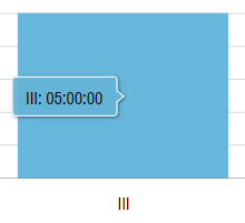
Alright, now our 18000 seconds are formatted as 5 hours:
