Chord diagram is a special chart type, used to indicate one-level quantitative relations between multiple items, organized in a circular diagram. (wiki)

This article will explain how you can create and configure various Chord diagrams using amCharts 4.
NOTE Chord diagram is very similar to Sankey diagram - both in functionality and configuration. If you are familiar with one chart type, you should feel right at home with the other.
Elements of the diagram
Before we begin, let's establish some terminology.
A diagram consists of two types of elements:
- Nodes - static blocks with a name, represented by objects of type
ChordNode; - Links - a connection that carries certain value from one Node to another, represented by objects of type
ChordLink.
A value of a Node is a sum of incoming or outgoing Link values, connected to it.
Creating a Chord diagram
Chord diagrams, similarly to Sankey diagram, is probably the easiest chart type to create. To create one you will only need two things:
- A chart instance;
- Data for the chart.
Importing modules/scripts
Needless to say, before you can use modules/objects, you need to make sure all required modules (in TypeScript), or files (in JavaScript) are imported. Please refer to our Getting started articles for more details:
For a Sankey diagram, we'll need to import core (main module) and charts modules.
import * as am4core from "@amcharts/amcharts4/core";
import * as am4charts from "@amcharts/amcharts4/charts";
<script src="//cdn.amcharts.com/lib/4/core.js"></script>
<script src="//cdn.amcharts.com/lib/4/charts.js"></script>
We'll be importing and referring these as am4core and am4charts in the course of this article, and overally in our demos and tutorials.
Creating chart instance
For that we're going to be using am4core.create() function. (or am4core.createFromConfig() if you are using JSON-based config approach)
let chart = am4core.create("chartdiv", am4charts.ChordDiagram);
var chart = am4core.create("chartdiv", am4charts.ChordDiagram);
var chart = am4core.createFromConfig({
  // ... chart config
}, "chartdiv", am4charts.ChordDiagram);
Data
Chord diagram, just like most charts, use an array of objects as the data.
In-line data
We assign the data to chart's data property:
chart.data = [
  { "from": "A", "to": "D", "value": 10 },
  { "from": "B", "to": "D", "value": 8 },
  { "from": "B", "to": "E", "value": 4 },
  { "from": "B", "to": "C", "value": 2 },
  { "from": "C", "to": "E", "value": 14 },
  { "from": "E", "to": "D", "value": 8 },
  { "from": "C", "to": "A", "value": 4 },
  { "from": "G", "to": "A", "value": 7 },
  { "from": "D", "to": "B", "value": 1 }
];
{
  // ...
  "data": [
    { "from": "A", "to": "D", "value": 10 },
    { "from": "B", "to": "D", "value": 8 },
    { "from": "B", "to": "E", "value": 4 },
    { "from": "B", "to": "C", "value": 2 },
    { "from": "C", "to": "E", "value": 14 },
    { "from": "E", "to": "D", "value": 8 },
    { "from": "C", "to": "A", "value": 4 },
    { "from": "G", "to": "A", "value": 7 },
    { "from": "D", "to": "B", "value": 1 }
  ]
}
External data
We can also make the chart load external data using dataSource.
chart.dataSource.url = "chart_data.json";
chart.dataSource.url = "chart_data.json";
{
  // ...
  "dataSource": {
    "url": "chart_data.json"
  }
}
MORE INFO Please refer to our "External data" article, for more details.
Setting data fields
IMPORTANT Data in Chord diagram does not carry any information about Nodes. It only contains data about Links.
Each Link has to have at least two fields and at most three fields:
- Value; (mandatory field)
- One or two of the following:
- Source Node name;
- Destination Node name.
Which field in data is carrying which value is defined by chart's dataFields property, which is a simple object. The key of the object represents named field (like Link value), and the value is a string pointing to a key in data point to look for the value in.
Chord diagrams support four types of data fields:
"value"- numeric value of the Link;"fromName"- name of the source Node (the starting point of the Link);"toName"- name of the destination Node (the end point of the Link);"color"- a color for the source Node (optional, we'll explore this a bit later into the article).
Here's how dataFields would look like for the sample data we had above:
chart.dataFields.fromName = "from";
chart.dataFields.toName = "to";
chart.dataFields.value = "value";
chart.dataFields.fromName = "from";
chart.dataFields.toName = "to";
chart.dataFields.value = "value";
{
  // ...
  "dataFields": {
    "fromName": "from",
    "toName": "to",
    "value": "value"
  }
}
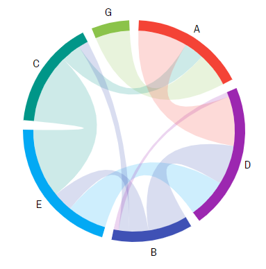
And, we're done. Our chart is ready.
Before we proceed, once again, there is no data for Nodes. Both their names and their values are derived from the information contained in the data for Links.
Data order
The order in which Link data items are defined in your data is important!
The actual Links will be drawn in exactly the same order as they are defined in data.
When preparing your data, make sure items are arranged in such a way, so there are as little crisscrossing as possible.
That said, you may instruct the chart to re-order the Nodes based on their name or sum value. For that there's a chart's sortBy property with available values of "none" (default), "name", and "value".
Complete example
let chart = am4core.create("chartdiv", am4charts.ChordDiagram);
chart.data = [
  { "from": "A", "to": "D", "value": 10 },
  { "from": "B", "to": "D", "value": 8 },
  { "from": "B", "to": "E", "value": 4 },
  { "from": "B", "to": "C", "value": 2 },
  { "from": "C", "to": "E", "value": 14 },
  { "from": "E", "to": "D", "value": 8 },
  { "from": "C", "to": "A", "value": 4 },
  { "from": "G", "to": "A", "value": 7 },
  { "from": "D", "to": "B", "value": 1 }
];

chart.dataFields.fromName = "from";
chart.dataFields.toName = "to";
chart.dataFields.value = "value";
am4core.useTheme(am4themes_animated);

var chart = am4core.create("chartdiv", am4charts.ChordDiagram);
chart.data = [
  { "from": "A", "to": "D", "value": 10 },
  { "from": "B", "to": "D", "value": 8 },
  { "from": "B", "to": "E", "value": 4 },
  { "from": "B", "to": "C", "value": 2 },
  { "from": "C", "to": "E", "value": 14 },
  { "from": "E", "to": "D", "value": 8 },
  { "from": "C", "to": "A", "value": 4 },
  { "from": "G", "to": "A", "value": 7 },
  { "from": "D", "to": "B", "value": 1 }
];

chart.dataFields.fromName = "from";
chart.dataFields.toName = "to";
chart.dataFields.value = "value";
var chart am4core.createFromConfig({
  "data": [
    { "from": "A", "to": "D", "value": 10 },
    { "from": "B", "to": "D", "value": 8 },
    { "from": "B", "to": "E", "value": 4 },
    { "from": "B", "to": "C", "value": 2 },
    { "from": "C", "to": "E", "value": 14 },
    { "from": "E", "to": "D", "value": 8 },
    { "from": "C", "to": "A", "value": 4 },
    { "from": "G", "to": "A", "value": 7 },
    { "from": "D", "to": "B", "value": 1 }
  ],
  "dataFields": {
    "fromName": "from",
    "toName": "to",
    "value": "value"
  }
}, "chartdiv", am4charts.ChordDiagram);
See the Pen amCharts 4: Chord Diagram (1) by amCharts (@amcharts) on CodePen.
Configuring Nodes
Node width
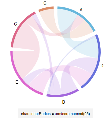
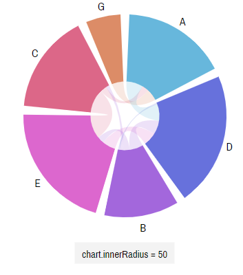
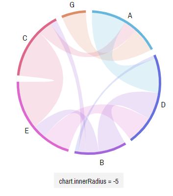
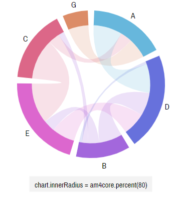
Nodes are colored strips going around the circumference of the diagram. By default, the are 15 pixel width.
To change the width of the node, we can use chart's innerRadius setting. The setting can either be a fixed number (pixels) or relative (Percent).
IMPORTANT If innerRadius is set to a positive numeric pixel value, it is counted from the center of the circle. If it is set as negative value, it is counted inwards from the outer edge of the circle. (as defined by chart's radius setting) Relative values (Percent) are always calculated from the center of the circle outwards.
Node appearance
By default nodes will be displayed in a classical way: a narrow colored strip with its name next to it.
The colors will be chosen automatically, out of the currently active theme color list. A new color for each subsequent node.
It's up to you to change the appearance of the Nodes as you see fit.
All Nodes in the diagram are contained in the property nodes, which is a collection with templates. (read here about list templates)
The collection contains property template which contains a sample instance of ChordNode. Whatever properties you set on that template object, will end up being transferred on each actual node created by the chart.
Please note that each node is a collection of sub-elements, such as the strip and label, accessible via template's slice and label properties respectively.
Configuring appearance of the Node's strip part
We already mentioned that we can access strip via slice property. It is an object of type Slice. Take a look at the class reference of the class, to see what options we have available.
For example, we can use its stroke and strokeWidth to control outline color and its width.
Or we can make its corners rounded by utilizing cornerRadius and innerCornerRadius properties.
let slice = chart.nodes.template.slice;
slice.stroke = am4core.color("#000");
slice.strokeOpacity = 0.5;
slice.strokeWidth = 1;
slice.cornerRadius = 8;
slice.innerCornerRadius = 0;
var slice = chart.nodes.template.slice;
slice.stroke = am4core.color("#000");
slice.strokeOpacity = 0.5;
slice.strokeWidth = 1;
slice.cornerRadius = 8;
slice.innerCornerRadius = 0;
{
  // ...
  "nodes": {
    // ...
    "slice": {
      "stroke": "#000",
      "strokeOpacity": 0.5,
      "strokeWidth": 1,
      "cornerRadius": 8,
      "innerCornerRadius": 0
    }
  }
}
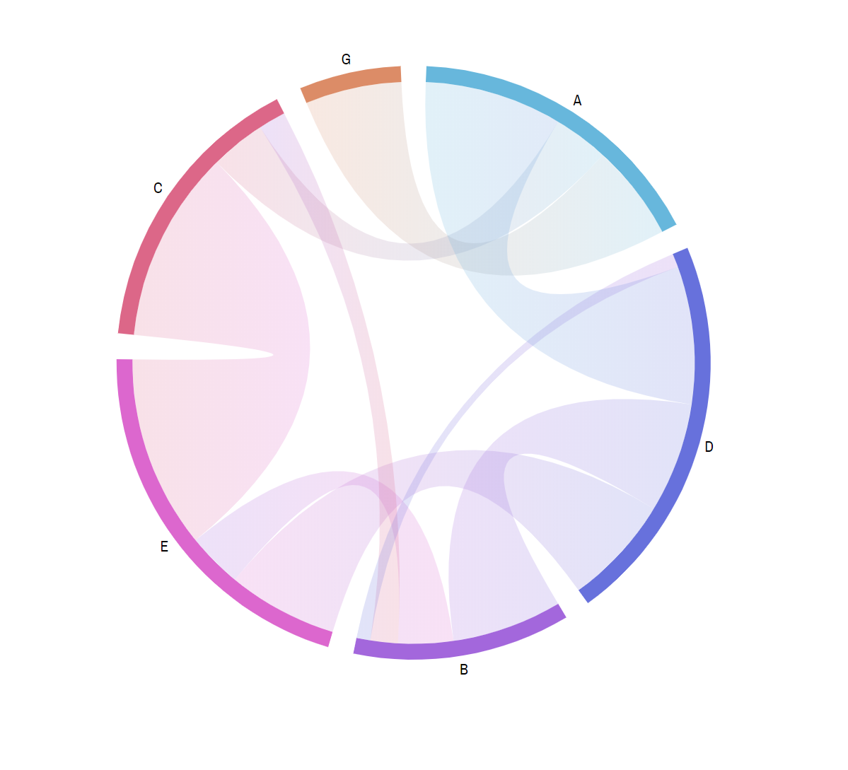
See the Pen amCharts 4: Chord Diagram (2) by amCharts (@amcharts) on CodePen.
As you can see, we have added a gray outline as well as made outer corners rounded for our Node's strip parts.
Configuring Node's labels
If we need to change the appearance of the labels, we can do so by configuring Node template's label property, which holds an object of type AxisLabelCircular, which is a special kind of Label, that can intelligently position itself around the circles.
That said, it's still a Label in it's heart. Which means that we can do a lot of cool (and nasty) things to bend it to our liking, like changing appearance as well as adding text formatting and binding to data.
Let's go ahead and make labels bigger but lighter in color:
let label = chart.nodes.template.label;
label.fontSize = 20;
label.fill = am4core.color("#555");
var label = chart.nodes.template.label;
label.fontSize = 20;
label.fill = am4core.color("#555");
{
  // ...
  "nodes": {
    // ...
    "label": {
      "fontSize": 20,
      "fill": "#555"
    }
  }
}
See the Pen amCharts 4: Chord Diagram (3) by amCharts (@amcharts) on CodePen.
Disabling strips or labels
Don't need the strips or labels? Simply set disabled = true on their respective templates:
chart.nodes.template.slice.disabled = true;
chart.nodes.template.label.disabled = true;
chart.nodes.template.slice.disabled = true;
chart.nodes.template.label.disabled = true;
{
  // ...
  "nodes": {
    // ...
    "slice": {
      "disabled": true
    },
    "label": {
      "disabled": true
    }
  }
}
Disabling toggling or dragging of Nodes
By default Nodes in Chord diagram can be toggled on and off by clicking/tapping them. They can also be dragged around the perimeter of the diagram circle.
To disable toggling simple set clickable = false on Node template. To disable the latter, set draggable = false.
nodeTemplate.clickable = false;
nodeTemplate.draggable = false;
nodeTemplate.clickable = false;
nodeTemplate.draggable = false;
{
  // ...
  "nodes": {
    // ...
    "clickable": false,
    "draggable": false
  }
}
Configuring Links
The Links can configured in much the same way.
All of the links are contained in links property. And their default properties set on links.template object which is an instance of ChordLink.
Basic configuration
There are quite a few settings you can set on a Link. For example, we can change default fillOpacity to make them more transparent or opaque:
let link = chart.links.template;
link.fillOpacity = 0.6;
var link = chart.links.template;
link.fillOpacity = 0.6;
{
  // ...
  "links": {
    "fillOpacity": 0.6
  }
}
Let's see how it turned out:
See the Pen amCharts 4: Chord Diagram (4) by amCharts (@amcharts) on CodePen.
Color mode
By default, a Line is filled with the same color as the Node it is originated from. We can change that using another Link's setting: colorMode.
It supports three options: "fromNode" (default), "solid" and "gradient".
The default setting ("fromNode") will automatically color link to the same color as it's originating Node.
If we want to specify a color for the link manually, we will need to set it's colorMode to "solid". This way we'll be able to use propertyFields.fill to retrieve color for the link from data, just like we describe it in the subsequent chapters of this tutorial.
Adding gradients
If set colorMode to "gradient", a Link will not be colored in one consistent color, but rather progress smoothly from the source Node's color to the on of the destination Node's.
let link = chart.links.template;
link.colorMode = "gradient";
link.fillOpacity = 0.5;
var link = chart.links.template;
link.colorMode = "gradient";
link.fillOpacity = 0.5;
{
  // ...
  "links": {
    "colorMode": "gradient",
    "fillOpacity": 0.5
  }
}
NOTE Use gradient mode sparingly. It may look nice in some setup, but might be weird in another. A gradient is applied vertically, so it works quite well for horizontal Links, but will look awkward for Links that start then loop back.
See the Pen amCharts 4: Chord Diagram (5) by amCharts (@amcharts) on CodePen.
Using thin lines
In some situations, where we don't necessarily want to visually convey the weight of our Links, we might just display think lines instead.
For that we have a special Chord Diagram's setting: nonRibbon.
Setting it to true will make all of the Links as thin lines.
And, we can still configure the the appearance of those lines using Link's middleLine property:
chart.nonRibbon = true;

let link = chart.links.template;
link.middleLine.strokeWidth = 3;
link.middleLine.strokeOpacity = 0.4;
chart.nonRibbon = true;

var link = chart.links.template;
link.middleLine.strokeWidth = 3;
link.middleLine.strokeOpacity = 0.4;
{
  // ...
  "nonRibbon": true,
  "links": {
    "middleLine": {
      "strokeWidth": 3,
      "strokeOpacity": 0.4
    }
  }
}
See the Pen amCharts 4: Chord Diagram (6) by amCharts (@amcharts) on CodePen.
NOTE Setting nonRibbon = true will also make all Nodes equal size.
Binding appearance to data
Like with any other chart, every property of every item in Chord diagram - Nodes or Links - can be configured individually via data.
Node color via "color" data field
In first section, we've shown that Chord diagram's dataFields can contain fourth data field: "color". However, we didn't get around to demonstrate or explain it. Let's fix that.
A "color" data field means: "Apply this color to the originating (source) Node".
IMPORTANT Please note, that only first application of node color will be used, meaning that the rest will be ignored. This applies to any setting of color, be it via "color" data field as an originating node, or as a node which "inherits" color via the link. So, to ensure absolutely custom coloring for each nore, we suggest adding "empty" nodes (just "from", with no "to" fields) at the beginning of your data as shown below.
OK, let's see how this might look code-wise:
chart.data = [
  // Define colors
  { "from": "A", "nodeColor": "#93B5C6" },
  { "from": "B", "nodeColor": "#DDEDAA" },
  { "from": "C", "nodeColor": "#F0CF65" },
  { "from": "D", "nodeColor": "#BD4F6C" },
  { "from": "E", "nodeColor": "#D7816A" },
  { "from": "G", "nodeColor": "#BEC5AD" },

  // Actual data
  { "from": "A", "to": "D", "value": 10 },
  { "from": "B", "to": "D", "value": 8 },
  { "from": "B", "to": "E", "value": 4 },
  { "from": "B", "to": "C", "value": 2 },
  { "from": "C", "to": "E", "value": 14 },
  { "from": "E", "to": "D", "value": 8 },
  { "from": "C", "to": "A", "value": 4 },
  { "from": "G", "to": "A", "value": 7 },
  { "from": "D", "to": "B", "value": 1 }
];

chart.dataFields.fromName = "from";
chart.dataFields.toName = "to";
chart.dataFields.value = "value";
chart.dataFields.color = "nodeColor";
{
  // ...
  "data": [
    // Define colors
    { "from": "A", "nodeColor": "#93B5C6" },
    { "from": "B", "nodeColor": "#DDEDAA" },
    { "from": "C", "nodeColor": "#F0CF65" },
    { "from": "D", "nodeColor": "#BD4F6C" },
    { "from": "E", "nodeColor": "#D7816A" },
    { "from": "G", "nodeColor": "#BEC5AD" },

    // Actual data
    { "from": "A", "to": "D", "value": 10 },
    { "from": "B", "to": "D", "value": 8 },
    { "from": "B", "to": "E", "value": 4 },
    { "from": "B", "to": "C", "value": 2 },
    { "from": "C", "to": "E", "value": 14 },
    { "from": "E", "to": "D", "value": 8 },
    { "from": "C", "to": "A", "value": 4 },
    { "from": "G", "to": "A", "value": 7 },
    { "from": "D", "to": "B", "value": 1 }
  ],
  "dataFields": {
    "fromName": "from",
    "toName": "to",
    "value": "value",
    "color": "nodeColor"
  }
}
See the Pen amCharts 4: Chord Diagram (7) by amCharts (@amcharts) on CodePen.
Other properties via property fields
Other properties do not have a dedicated data field, such as "color" does. For the rest of the property folks there's a good old propertyFields in Node or Link to set values to any of their properties with individual values from the data.
It allows binding any property of any object to any property in data.
So, for example, if we want to tie Link's fill color, or fillOpacity with the appropriate properties in data, we'd add that into Link's propertyFields:
let link = chart.links.template;
link.colorMode = "solid";
link.fillOpacity = 0.1;
link.propertyFields.fill = "linkColor";
link.propertyFields.fillOpacity = "linkOpacity";
var link = chart.links.template;
link.colorMode = "solid";
link.fillOpacity = 0.1;
link.propertyFields.fill = "linkColor";
link.propertyFields.fillOpacity = "linkOpacity";
{
  // ...
  "links": {
    "colorMode": "solid",
    "fillOpacity": 0.1,
    "propertyFields": {
      "fill": "linkColor",
      "fillOpacity": "linkOpacity"
    }
  }
}
Let's make sure our data is complemented with appropriate fields like "linkColor", and "linkOpacity", then run this example:
See the Pen amCharts 4: Chord Diagram (8) by amCharts (@amcharts) on CodePen.
Other topics
Adding bullets to Node
Guess what? Node IS a Container which means that we can add anything to them, including bullets, but, of course, not limited to.
Creating a bullet in a Node is as simple as calling its createChild() method.
As a matter of exercise, let's add a CircleBullet. If you remember from our "Bullets" article, a simple Bullet is just a container. A CircleBullet is a Bullet with an instance of Circle pre-added and pre-positioned into it.
Also, to make things even more interesting, let's make the bullet size variable, based on data.
/* Get node */
var node = chart.nodes.template;
node.label.disabled = true;

/* Add and configure bullet */
var bullet = node.createChild(am4charts.CircleBullet);
bullet.circle.stroke = am4core.color("#fff");
bullet.circle.strokeWidth = 2;
bullet.circle.radius = 30;
bullet.circle.propertyFields.radius = "size";

/* Add a node name as a label into bullet */
var label = bullet.createChild(am4core.Label);
label.text = "{fromName}";
label.horizontalCenter = "middle";
label.verticalCenter = "middle";
label.fill = am4core.color("#fff");
{
  // ...
  "nodes": {
    "label": {
      "disabled": true
    },
    "children": [{
      "type": "CircleBullet",
      "circle": {
        "stroke": "#fff",
        "strokeWidth": 2,
        "radius": 30,
        "propertyFields": {
          "radius": "size"
        },
        "children": [{
          "type": "Label",
          "text": "{fromName}",
          "horizontalCenter": "middle",
          "verticalCenter": "middle",
          "fill": "#fff"
        }]
      }
    }]
  }
}
Let's see how it turned out:
See the Pen amCharts 4: Chord Diagram (9) by amCharts (@amcharts) on CodePen.
Using themes
As with any other chart type, Chord diagram can have one or more themes applied to it.
If you haven't done so already, make sure you read our article about "Themes". It has a lot of background information on how to use and apply themes.
Each theme brings in it's own list of matching colors. Since each Node is being assigned a new color from that list, switching themes will make your diagram look differently: