Sliced charts are used to illustrate some stepped process. With each steps the total initial value is gradually reduced or increased to make the impact of the step more prominent, than it would be possible with other relational types, like, say, Pie chart.
In amCharts 4, Sliced chart is used to display series like Funnels, Pyramids, or Stacked Pictorials. We'll cover all of those in the course of this article.
Creating a Sliced chart
Before we can do anything, we need to create a Sliced chart object, which in this case an instance of a SlicedChart class.
A Sliced chart, at the very least needs the following things:
- Chart instance;
- Data;
- At least one Series.
This tutorial will walk through all of these.
Importing modules/scripts
Needless to say, before you can do anything, you need to make sure all required modules (in TypeScript), or files (in JavaScript) are imported. Please refer to our Getting started articles for more details:
For a Pie chart, we'll need to import core (main module) and charts modules.
import * as am4core from "@amcharts/amcharts4/core";
import * as am4charts from "@amcharts/amcharts4/charts";
<script src="//cdn.amcharts.com/lib/4/core.js"></script>
<script src="//cdn.amcharts.com/lib/4/charts.js"></script>
We'll be importing and referring these as am4core and am4charts in the course of this article, and overally in our demos and tutorials.
Creating chart instance
For that we're going to be using am4core.create() function. (or am4core.createFromConfig() if you are using JSON-based config approach)
let chart = am4core.create("chartdiv", am4charts.SlicedChart);
var chart = am4core.create("chartdiv", am4charts.SlicedChart);
var chart = am4core.createFromConfig({
  // ... chart config
}, "chartdiv", am4charts.SlicedChart);
NOTE There's a special comment on JSON-based setup down this article. Read on.
Data
Just like for most chart types, the data for a Sliced chart is an array of objects. Each of those objects will represent a Slice and must at least contain one numeric value (Slice value) and a category (Slice title).
In-line data
We assign the data to the data to chart's data property:
chart.data = [{
  "name": "Stage #1",
  "value": 600
}, {
  "name": "Stage #2",
  "value": 300
}, {
  "name": "Stage #3",
  "value": 200
}, {
  "name": "Stage #4",
  "value": 180
}, {
  "name": "Stage #5",
  "value": 50
}, {
  "name": "Stage #6",
  "value": 20
}, {
  "name": "Stage #7",
  "value": 10
}];
{
  // ...
  "data": [{
    "name": "Stage #1",
    "value": 600
  }, {
    "name": "Stage #2",
    "value": 300
  }, {
    "name": "Stage #3",
    "value": 200
  }, {
    "name": "Stage #4",
    "value": 180
  }, {
    "name": "Stage #5",
    "value": 50
  }, {
    "name": "Stage #6",
    "value": 20
  }, {
    "name": "Stage #7",
    "value": 10
  }]
}
External data
We can also make the chart load external data using dataSource.
chart.dataSource.url = "funnel_chart_data.json";
chart.dataSource.url = "funnel_chart_data.json";
{
  // ...
  "dataSource": {
    "url": "funnel_chart_data.json"
  }
}
Please refer to our "External data" article, for more details.
Funnel series
In Sliced chart, Funnel series acts like the base series class.
It is used to display stacks of square or trapezoid elements - slices - that represent value dynamics with each step/stage of some process.
Furthermore, Funnel series is used as a base for other Sliced series, like Pyramid and Pictorial Stacked. We'll get to those later in this article.
Creating series
Each slice in a Sliced chart is an element of type FunnelSlice. They are all collected in a Series of type FunnelSeries.
In most serial charts, Sliced chart included, all Series are included in a List accessible via chart's series property.
To create a new Series, we just going to create a new instance of FunnelSeries and push it into chart.series:
let series = chart.series.push(new am4charts.FunnelSeries());
var series = chart.series.push(new am4charts.FunnelSeries());
{
  // ...
  "series": [{
    "type": "FunnelSeries",
    // Series settings
  }]
}
Hooking series to data
Before Series can be of any use, we need to hook it to chart's data.
For that we, like in any Series on any chart type, we have a property dataFields, which is an object indicating which of our Serie's data values are located in which field in data.
This is more clearer with an example:
series.dataFields.value = "value";
series.dataFields.category = "name";
series.dataFields.value = "value";
series.dataFields.category = "name";
{
  // ...
  "series": [{
    "type": "FunnelSeries",
    "dataFields": {
      "value": "value",
      "category": "name"
    }
  }]
}
Basically, what this means is that whenever creating slices, the series will look for slice's value in property "value" of the data item object, and will use "name" to look up category of the slice.
Working example
Now that we have the bare minimum to create a Funnel chart - a chart instance, data, and a single series - let's whip up the complete example:
// Import modules
import * as am4core from "@amcharts/amcharts4/core";
import * as am4charts from "@amcharts/amcharts4/charts";

// Create chart instance
let chart = am4core.create("chartdiv", am4charts.SlicedChart);

// Add data
chart.data = [{
  "name": "Stage #1",
  "value": 600
}, {
  "name": "Stage #2",
  "value": 300
}, {
  "name": "Stage #3",
  "value": 200
}, {
  "name": "Stage #4",
  "value": 180
}, {
  "name": "Stage #5",
  "value": 50
}, {
  "name": "Stage #6",
  "value": 20
}, {
  "name": "Stage #7",
  "value": 10
}];

// Add and configure Series
let pieSeries = chart.series.push(new am4charts.FunnelSeries());
pieSeries.dataFields.value = "value";
pieSeries.dataFields.category = "name";
<script src="//cdn.amcharts.com/lib/4/core.js"></script>
<script src="//cdn.amcharts.com/lib/4/charts.js"></script>

<div id="chartdiv" style="width: 100%; height: 400px;"></div>

<script>
// Create chart instance
var chart = am4core.create("chartdiv", am4charts.SlicedChart);

// Add data
chart.data = [{
  "name": "Stage #1",
  "value": 600
}, {
  "name": "Stage #2",
  "value": 300
}, {
  "name": "Stage #3",
  "value": 200
}, {
  "name": "Stage #4",
  "value": 180
}, {
  "name": "Stage #5",
  "value": 50
}, {
  "name": "Stage #6",
  "value": 20
}, {
  "name": "Stage #7",
  "value": 10
}];

// Add and configure Series
var pieSeries = chart.series.push(new am4charts.FunnelSeries());
pieSeries.dataFields.value = "value";
pieSeries.dataFields.category = "name";
</script>
<script src="//cdn.amcharts.com/lib/4/core.js"></script>
<script src="//cdn.amcharts.com/lib/4/charts.js"></script>

<div id="chartdiv" style="width: 100%; height: 400px;"></div>

<script>
// Create chart instance
var chart = am4core.createFromConfig({

  // Add data
  "data": [{
    "name": "Stage #1",
    "value": 600
  }, {
    "name": "Stage #2",
    "value": 300
  }, {
    "name": "Stage #3",
    "value": 200
  }, {
    "name": "Stage #4",
    "value": 180
  }, {
    "name": "Stage #5",
    "value": 50
  }, {
    "name": "Stage #6",
    "value": 20
  }, {
    "name": "Stage #7",
    "value": 10
  }],

  // Create and configure Series
  "series": [{
    "type": "FunnelSeries",
    "dataFields": {
      "value": "value",
      "category": "name"
    }
  }]
}, "chartdiv", am4charts.SlicedChart);
</script>
Here's a live version of the chart we've just created:
See the Pen amCharts 4: Funnel chart (1) by amCharts (@amcharts) on CodePen.
Configuring series appearance
Like element from any kind of series, Funnel slice is configured via list templates.
REQUIRED READING If you are not yet familiar with the concept of list templates, read about it now.
The Funnel series houses all its slices in a list accessible via slices property. The list, in turn, has template property which is a "sample" instance of FunnelSlice which we can configure.
Anything we set on the template, will be replicated on the actual slices of the series.
Configuring shape of the slice
As you can see in the above example, the slices are perfect rectangles.
To add some oomph to the the chart appearance we can make them into trapezoids, so that instead of just looking like stacked bricks, they all narrow (or widen) towards the width of the next slice.
For that we do have bottomRatio property.
It accepts a numeric value which indicates how close the width of the bottom edge of the slice is to the with of the slice and the width of the next slice.
0 (zero) means it is close to own slice width, resulting in perfect rectangle.
1 (one) means it is exactly the width of the next slice.
0.5 means it will be half-way between the width of the original slice and the next one.
Let's see how setting it affects the shape in our chart:
series.bottomRatio = 0.5;
series.bottomRatio = 0.5;
{
  // ...
  "series": [{
    "type": "FunnelSeries",
    // ...
    "bottomRatio": 0.5
  }]
}
See the Pen amCharts 4: Funnel chart (2) by amCharts (@amcharts) on CodePen.
NOTE Please note that from the data-viz standpoint the most correct setting is 0 (zero). The area of the trapezoid will not represent the value as precisely as perfect rectangle does.
Setting slice appearance
Since you already know that series.slices.template holds a "template" FunnelSlice you can use it to configure all other appearance settings as well.
Like, for example, if you'd like to make slices semi-transparent, you'd set fillOpacity.
Or, if you'd like to give them some colored outline, you'd use stroke and strokeWidth.
Furthermore, if you'r like them to have gradiented fills, you may use gradients as fill or event set up a fillModifier.
MORE INFO For more information about colors, gradients, and fill modifiers make sure to check out "Colors & Gradients" article.
Let's see spice up our chart with a bit of gradient magic.
let fillModifier = new am4core.LinearGradientModifier();
fillModifier.brightnesses = [-0.5, 1, -0.5];
fillModifier.offsets = [0, 0.5, 1];
series.slices.template.fillModifier = fillModifier;
var fillModifier = new am4core.LinearGradientModifier();
fillModifier.brightnesses = [-0.5, 1, -0.5];
fillModifier.offsets = [0, 0.5, 1];
series.slices.template.fillModifier = fillModifier;
{
  // ...
  "series": [{
    "type": "FunnelSeries",
    // ...
    "slices": {
      "fillModifier": {
        "type": "LinearGradientModifier",
        "brightnesses": [-0.5, 1, -0.5],
        "offsets": [0, 0.5, 1]
      }
    }
  }]
}
See the Pen amCharts 4: Funnel chart (3) by amCharts (@amcharts) on CodePen.
Slice labels and ticks
You probably already noticed how each slice has a label displayed over it.
They may look OK on larger slices, but on smaller ones, they tend to obstruct the view.
Let's see what we can tame them.
Putting labels next to the slice
Funnel series has a handy setting alignLabels, which is a boolean value with a default of false (labels are not aligned in any way).
Let's see what happens when we set it to true:
series.alignLabels = true;
series.alignLabels = true;
{
  // ...
  "series": [{
    "type": "FunnelSeries",
    // ...
    "alignLabels": true
  }]
}
See the Pen amCharts 4: Funnel chart (4) by amCharts (@amcharts) on CodePen.
Want to move labels to the right? Set labelsOpposite to false:
series.alignLabels = true;
series.labelsOpposite = false;
series.alignLabels = true;
series.labelsOpposite = false;
{
  // ...
  "series": [{
    "type": "FunnelSeries",
    // ...
    "alignLabels": true,
    "labelsOpposite": false
  }]
}
Disabling labels
To disable labels (and ticks) altogether, we simply have to set disabled = true on both labels and ticks templates:
series.labels.template.disabled = true;
series.ticks.template.disabled = true;
series.labels.template.disabled = true;
series.ticks.template.disabled = true;
{
  // ...
  "series": [{
    "type": "FunnelSeries",
    // ...
    "labels": {
      "disabled": true
    },
    "ticks": {
      "disabled": true
    }
  }]
}
Modifying label contents
By default slice labels display their category and percent value.
To change that, we need to change text property of our Serie's label template.
Please note, that label text accepts all kinds of formatting and data binding placeholders. For more information about that, read our "Formatting Strings" article.
Let's update our labels to show category and absolute value, instead of percent. Let's make the value bold, for a good measure:
series.labels.template.text = "{category}: [bold]{value}[/]";
series.labels.template.text = "{category}: [bold]{value}[/]";
{
  // ...
  "series": [{
    "type": "FunnelSeries",
    // ...
    "labels": {
      "text ": "{category}: [bold]{value}[/]"
    }
  }]
}
See the Pen amCharts 4: Funnel chart (4) by amCharts (@amcharts) on CodePen.
Setting where tick is pointing to
By default, the tick will be shown from the label to the edge of the slice.
We can change that using tick template's locationX and locationY properties.
Both are relative values, indicating relation to slice's width and height respectively.
0 (zero) indicates left edge (or top), while 1 (one) indicated right side (or bottom).
0.5 will put it in the middle of the slice. 1.2 will make tick point slight to the right outside of the slice, and so on.
The default for locationX is 1 hence our ticks pointing to right edge of the slice.
If we'd like the tick to point to the middle of the slice we'd set locationX = 0.5:
series.ticks.template.locationX = 0.5;
series.ticks.template.locationX = 0.5;
{
  // ...
  "series": [{
    "type": "FunnelSeries",
    // ...
    "ticks": {
      "locationX": 0.5
    }
  }]
}
See the Pen amCharts 4: Funnel chart (5) by amCharts (@amcharts) on CodePen.
Slice tooltip content
What goes into tooltip when you hover a slice is regulated by slice template's tooltipText property.
If you'd like to change it, that's the property you set:
series.slices.template.tooltipText = "{category}: {value.value}";
series.slices.template.tooltipText = "{category}: {value.value}";
{
  // ...
  "series": [{
    // ...
    "slices": {
      "tooltipText": "{category}: {value.value}"
    }
  }]
}
Slice links
See those light-colored fills between slices? Those are "slice links" and are just as configurable as any other element.
Just like regular Funnel slices, those are conveniently instances of FunnelSlice, so anything we can set on actual slices, we can set on links as well.
Changing appearance of the links
To configure them, we modify the template on the series' sliceLinks list.
For example, we might want to change the height and opacity of the links:
series.sliceLinks.template.height = 30;
series.sliceLinks.template.fillOpacity = 0.2
series.sliceLinks.template.height = 30;
series.sliceLinks.template.fillOpacity = 0.2
{
  // ...
  "series": [{
    "type": "FunnelSeries",
    // ...
    "sliceLinks": {
      "height": 30,
      "fillOpcity": 0.2
    }
  }]
}
See the Pen amCharts 4: Funnel chart (6) by amCharts (@amcharts) on CodePen.
Disabling links altogether
To disable links, simply set their height to zero:
series.sliceLinks.template.height = 0;
series.sliceLinks.template.height = 0;
{
  // ...
  "series": [{
    "type": "FunnelSeries",
    // ...
    "sliceLinks": {
      "height": 0
    }
  }]
}
See the Pen amCharts 4: Funnel chart (7) by amCharts (@amcharts) on CodePen.
Vertical vs. horizontal
Up until now we have been using Funnel series positioned vertically.
Sliced chart allows turning its series on their sides as well.
The Series' property, responsible for the direction is orientation. There are two available options - "vertical" (default) and "horizontal".
Let's see what happens if we try turning our series on its side:
series.orientation = "horizontal";
series.orientation = "horizontal";
{
  // ...
  "series": [{
    "type": "FunnelSeries",
    // ...
    "orientation": "horizontal"
  }]
}
See the Pen amCharts 4: Funnel chart (8) by amCharts (@amcharts) on CodePen.
Pyramid series
Time to explore other uses for Sliced chart.
Let's bring out a pharaohs in us and build a pyramid.
As we were creating funnels using FunnelSeries, we'll create pyramids using PyramidSeries.
In its essence Pyramid series is not that different from Funnel series - both consist out of stacked trapezoids.
The big difference is shape. A pyramid does not have the flexibility of differently-shaped slices. It will always retain the same diagonal shape.
It does not have links either.
Other than that, everything you learned about funnel configuration is good for pyramids as well. After all Pyramid series' slices are FunnelSlice elements.
We won't get into much detail, just outline a few pyramid-specific options.
Creating a pyramid
Creating and setting up a Pyramid series is identical to Funnel series, we're just going to be using a different class: PyramidSeries:
let series = chart.series.push(new am4charts.PyramidSeries());
series.dataFields.value = "value";
series.dataFields.category = "name";
var series = chart.series.push(new am4charts.PyramidSeries());
series.dataFields.value = "value";
series.dataFields.category = "name";
{
  // ...
  "series": [{
    "type": "PyramidSeries",
    "dataFields": {
      "value": "value",
      "category": "name"
    }
  }]
}
See the Pen amCharts 4: Pyramid chart (1) by amCharts (@amcharts) on CodePen.
Slice sizing methods
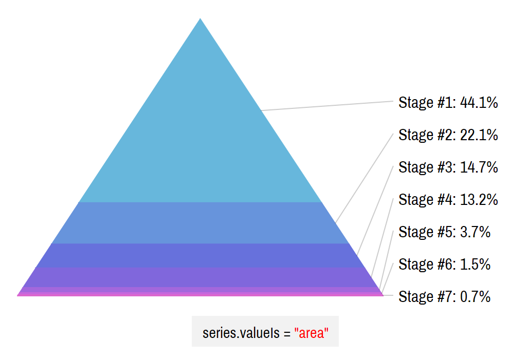
By default, the value of the Pyramid slice is represented by the actual area of the slice.
From the data visualization standpoint, this is a correct behavior.
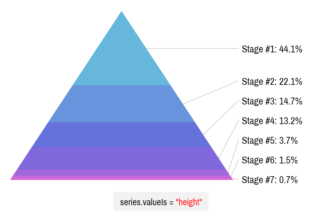
If, however, you would rather value to be represented by height of the slice, you can use PyramidSeries property valueIs. The options for valueIs are "area" (default) and "height".
So, if we're not afraid to anger the gods of data-viz, we can do this:
series.valueIs = "height";
series.valueIs = "height";
{
  // ...
  "series": [{
    "type": "PyramidSeries",
    // ...
    "valueIs": "height"
  }]
}
Let's see how out pyramid changes:
See the Pen amCharts 4: Pyramid chart (2) by amCharts (@amcharts) on CodePen.
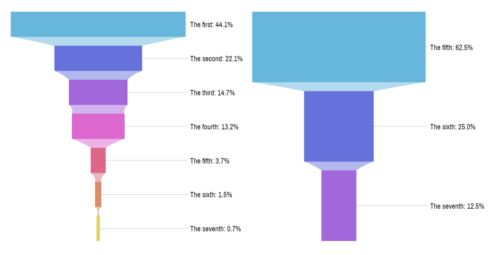
The change is subtle, but visible:
The first slice has nearly half of the total value of the whole chart. The chart on the left depicts that beautifully.
The second chart positions slices by height. Even though the first slice has half of the values, it doesn't look that way.
Top and bottom width
A pyramid is usually a pointy triangular thing with its tip pointing up.
That can be configured, though.
Pyramid series have two properties - topWidth and bottomWidth - that allow setting how wide the top and bottom of our chart is.
It can be set to either absolute pixel value, or in Percent.
By default the topWidth is set to 0 (zero), hence it being pointy at the top. The default bottomWidth is 100%, so it takes the whole width available.
Want to flip the pyramid vertically? Set topWidth to 100% and bottomWidth to zero.
Want to have a blunt pyramid, set topWidth to something non-zero:
series.topWidth = am4core.percent(100);
series.bottomWidth = am4core.percent(40);
series.topWidth = am4core.percent(100);
series.bottomWidth = am4core.percent(40);
{
  // ...
  "series": [{
    "type": "PyramidSeries",
    // ...
    "topWidth": "100%",
    "bottomWidth": "40%"
  }]
}
See the Pen amCharts 4: Pyramid chart (3) by amCharts (@amcharts) on CodePen.
Pictorial series
OK, we've gotten to a point where we can go really crazy with our charts - Pictorial Stacked series.
In a nutshell Pictorial series is just a straight Pyramid series with some cool mask applied on it.
Pictorial series as represented by PictorialStackedSeries class is a collection of FunnelSlice objects. Just like Pyramid series.
Function-wise, there's no much difference, except that Pictorial series knows how to apply the mask on itself.
Creating Pictorial series
This type of series is created and set up in exactly the same way as the previous two - Funnel and Pyramid series - except we have a separate class - PictorialStackedSeries for it.
let series = chart.series.push(new am4charts.PictorialStackedSeries());
series.dataFields.value = "value";
series.dataFields.category = "name";
var series = chart.series.push(new am4charts.PictorialStackedSeries());
series.dataFields.value = "value";
series.dataFields.category = "name";
{
  // ...
  "series": [{
    "type": "PictorialStackedSeries",
    "dataFields": {
      "value": "value",
      "category": "name"
    }
  }]
}
A basic pictorial chart is nothing much to look at:
See the Pen amCharts 4: Pictorial Stacked chart (1) by amCharts (@amcharts) on CodePen.
That is correct. The chart is pretty much empty.
It is because our series is missing one vital component - an SVG mask.
Applying the SVG mask
Like we just saw, our Pictorial series does not make much sense without a mask.
A mask is an SVG path string that gives the series an actual shape.
MORE INFO An SVG path is series of codes, describing geometrical shapes. For more information about it visit this Mozilla article.
We're going to show how to procure SVG paths later. For now let's start with the one we already have ready. Below is an SVG path that defines shape of a man:
M53.5,476c0,14,6.833,21,20.5,21s20.5-7,20.5-21V287h21v189c0,14,6.834,21,20.5,21 c13.667,0,20.5-7,20.5-21V154h10v116c0,7.334,2.5,12.667,7.5,16s10.167,3.333,15.5,0s8-8.667,8-16V145c0-13.334-4.5-23.667-13.5-31 s-21.5-11-37.5-11h-82c-15.333,0-27.833,3.333-37.5,10s-14.5,17-14.5,31v133c0,6,2.667,10.333,8,13s10.5,2.667,15.5,0s7.5-7,7.5-13 V154h10V476 M61.5,42.5c0,11.667,4.167,21.667,12.5,30S92.333,85,104,85s21.667-4.167,30-12.5S146.5,54,146.5,42 c0-11.335-4.167-21.168-12.5-29.5C125.667,4.167,115.667,0,104,0S82.333,4.167,74,12.5S61.5,30.833,61.5,42.5z
Let's see how we can apply it.
A Pictorial series has a property - maskSprite, which holds a Sprite element, that will be used as a mask. Normally, we can't use just any Sprite. We need one that has it's path element set.
That's where we need to use our SVG path:
var man = "M53.5,476c0,14,6.833,21,20.5,21s20.5-7,20.5-21V287h21v189c0,14,6.834,21,20.5,21 c13.667,0,20.5-7,20.5-21V154h10v116c0,7.334,2.5,12.667,7.5,16s10.167,3.333,15.5,0s8-8.667,8-16V145c0-13.334-4.5-23.667-13.5-31 s-21.5-11-37.5-11h-82c-15.333,0-27.833,3.333-37.5,10s-14.5,17-14.5,31v133c0,6,2.667,10.333,8,13s10.5,2.667,15.5,0s7.5-7,7.5-13 V154h10V476 M61.5,42.5c0,11.667,4.167,21.667,12.5,30S92.333,85,104,85s21.667-4.167,30-12.5S146.5,54,146.5,42 c0-11.335-4.167-21.168-12.5-29.5C125.667,4.167,115.667,0,104,0S82.333,4.167,74,12.5S61.5,30.833,61.5,42.5z"

var series = chart.series.push(new am4charts.PictorialStackedSeries());
// ...
series.maskSprite.path = man;
{
  // ...
  "series": [{
    "type": "PictorialStackedSeries",
    // ...
    "maskSprite": {
      "path": man
    }
  }]
}
Suddenly, our blank useless chart becomes a beautiful pictogram:
See the Pen amCharts 4: Pictorial Stacked chart (2) by amCharts (@amcharts) on CodePen.
GOOD TO KNOW The beautiful thing about Pictorial series is that we absolutely don't have to care about actual size of the SVG path. The series will intelligently adjust and size it to fit exactly into place, allotted for the Series.
Creating paths for masks
There is a number of ways to get SVG paths.
You may create one using some vector editing program, like Inkscape, and export SVG.
There are also some online SVG path editing tools - just a Google away.
Another option is to extract a path from a ready-made SVG.
There are plenty of websites with royalty-free icons out there. Our personal favorite is iconfinder.com.
Suppose, we'd like to display our Pictorial in the shape of a bottle. We run a search on iconfinder.com for "bottle", selecting free category as well as vector option (we do need SVG) and find this suitable candidate:

Now, when I download it and open in some editor, we find this SVG code:
<?xml version="1.0"?>
<svg id="Layer_1" style="enable-background:new 1 -1 100 100;" version="1.1" viewBox="1 -1 100 100" xml:space="preserve" xmlns="http://www.w3.org/2000/svg" xmlns:xlink="http://www.w3.org/1999/xlink">
    <title />
    <g>
        <path d="M59.5,2.8c0-1.1-0.9-2-2-2h-13c-1.1,0-2,0.9-2,2v8h17V2.8z" />
        <path d="M63.3,34.8L59.5,33V14.2h-17V33l-3.8,1.6c-3.3,1.4-5.4,4.7-5.4,8.2v45.4c0,5,4,9,9,9h17.3c5,0,9-4,9-9V43   C68.7,39.5,66.5,36.1,63.3,34.8z" />
    </g>
</svg>
Contained in the <path> tags is what we need.
The upper path is for the bottle cap. We don't need that. We'll grab the lower one, and apply to our chart:
let series = chart.series.push(new am4charts.PictorialStackedSeries());
// ...
series.maskSprite.path = "M63.3,34.8L59.5,33V14.2h-17V33l-3.8,1.6c-3.3,1.4-5.4,4.7-5.4,8.2v45.4c0,5,4,9,9,9h17.3c5,0,9-4,9-9V43   C68.7,39.5,66.5,36.1,63.3,34.8z";
var series = chart.series.push(new am4charts.PictorialStackedSeries());
// ...
series.maskSprite.path = "M63.3,34.8L59.5,33V14.2h-17V33l-3.8,1.6c-3.3,1.4-5.4,4.7-5.4,8.2v45.4c0,5,4,9,9,9h17.3c5,0,9-4,9-9V43   C68.7,39.5,66.5,36.1,63.3,34.8z";
{
  // ...
  "series": [{
    "type": "PictorialStackedSeries",
    // ...
    "maskSprite": {
      "path": "M63.3,34.8L59.5,33V14.2h-17V33l-3.8,1.6c-3.3,1.4-5.4,4.7-5.4,8.2v45.4c0,5,4,9,9,9h17.3c5,0,9-4,9-9V43   C68.7,39.5,66.5,36.1,63.3,34.8z"
    }
  }]
}
And voilà:
See the Pen amCharts 4: Pictorial Stacked chart (3) by amCharts (@amcharts) on CodePen.
Partially filled shapes
Sometimes you may want to fill only part of the path. Like, for example, the bottle example up above. Who fills a bottle to the brim?
It's possible to set where in the path our slices will start and will end.
To do that we have startLocation and endLocation properties on a Pictorial series.
Both are numeric values in the range from 0 (zero) to 1 (one). The number indicates relative position within the mask.
Zero means the very top (or left for horizontal series), and one means bottom/right.
To set how the rest of the shape gets filled, use series' slicesContainer.background.
series.startLocation = 0.2;
series.endLocation = 0.8;
series.slicesContainer.background.fill = am4core.color("#eee");
series.startLocation = 0.2;
series.endLocation = 0.8;
series.slicesContainer.background.fill = am4core.color("#eee");
{
  // ...
  "series": [{
    "type": "PictorialStackedSeries",
    // ...
    "startLocation": 0.2,
    "endLocation": 0.8,
    "slicesContainer": {
      "background": {
        "fill": "#eee"
      }
    }
  }]
}
The above will make our series to start at 20% and end at 80%. The rest of the shape will be filled in gray.
Let's see how it works in real life chart:
See the Pen amCharts 4: Specifying start and end location of the pictorial series by amCharts team (@amcharts) on CodePen.
Rotating pictorial series
Just like Funnel and Pyramid series, Pictorial series can also be rotated using its orientation property.
Horizontal orientation might suit flat shapes better:
See the Pen amCharts 4: Pictorial Stacked chart (4) by amCharts (@amcharts) on CodePen.
Combining several series
All series-based charts in amCharts 4 support multiple series.
Sliced charts are no exception.
You can have several series on the same chart. And, you can mix and match the types as you see fit.
Just create several series of any type, and the chart will do the rest:
See the Pen amCharts 4: Sliced chart with multiple series by amCharts (@amcharts) on CodePen.
Please note that if you include a legend into such multi-series chart, it will show slices for each and every slice of all series.
In situations where categories are replicated across series, that could be confusing.
The solution is to disable legend entries for all but one series by setting their hiddenInLegend property to true as well as syncing hide/show of the slices using events.
Here's a working example:
See the Pen amCharts 4: Sliced chart with multiple series and legend sync by amCharts team (@amcharts) on CodePen.
Additional controls
Adding a legend
Even if it's not required, adding a legend might improve user experience. It can provide visual reference for the user, as well as allow toggling certain Slices.
To add a legend, we simply create an instance of Legend class and assign it to chart's legend property. It's as simple as that.
chart.legend = new am4charts.Legend();
chart.legend = new am4charts.Legend();
{
  // ...
  "legend": {
    "type": "Legend"
  }
}
NOTE Refer to the "Legend" article for more details.
See the Pen amCharts 4: Funnel chart (9) by amCharts (@amcharts) on CodePen.
Changing legend value
Finally, if you'd like to set what value is displayed in the legend, you'll need to set text for its value labels template:
chart.legend.valueLabels.template.text = "{value.value}";
chart.legend.valueLabels.template.text = "{value.value}";
{
  // ...
  "legend": {
    "valueLabels": {
      "text": "{value.value}"
    }
  }
}