Cursor is a crosshaired lines you see on the chart when hovering the plot area. It helps to gauge precise position on value scale, helps display tooltips for multiple series at a time, can be used as a zoom tool, as well as provides interactivity to the charts.
This article will explain how chart cursors are created, configured, as well as their relationship with other chart elements like axes and series.
Cursor basics
Creating cursor
Creating a chart cursor is super easy. You just instantiate an object of a cursor type that is relevant to the chart type, then assign it to chart's cursor property.
For an XY chart, that's XYCursor. For a Radar chart it's RadarCursor.
chart.cursor = new am4charts.XYCursor();
chart.cursor = new am4charts.XYCursor();
{
  // ...
  "cursor": {
    // No need to set `type` here - the chart already
    // knows what type of cursor it needs.
  }
}
Let's take a simple XY chart with three Line series, and add a cursor there:
See the Pen amCharts V4: Cursor (1) by amCharts (@amcharts) on CodePen.
Now, when you hover the plot area, you see two lines - horizontal and vertical going to each Axis, with Tooltips indicating cursor vertical and horizontal position.
Adding a Cursor also automatically enables zooming. Try holding mouse button or touch down and moving it around. It will zoom the chart.
That's the default look and behavior of the chart Cursor.
Subsequent sections will show how to modify cursor's appearance and behavior to suit your particular needs.
Configuring cursor
NOTE This section deals with cursor appearance only. Behavioral modifications are discussed in greater details in subsequent sections.
By default, Cursor looks like two crossed black dashed lines. Some theme, might modify this look. You can do it, too.
Just like any other object in amCharts 4, Cursor is an object with own properties you can modify to change its appearance.
For a full selection of properties available, take a look at the class reference entry for XYCursor and RadarCursor.
Let's just look at a few here.
Changing basic appearance settings
Suppose, we don't like that cursor line is dashed. We also not crazy about it being black, and so thin, and so prominent. Yes, we're awfully nitpicky, but that's not a problem, because it's all doable easily.
Examining XYCursor's class reference, like we suggested a minute ago, we see that it has two separate properties - lineX and lineY - that hold actual line objects for vertical line and horizontal line respectively.
NOTE No, we didn't make the mistake about indicating that lineX is a vertical line. It indicates that it's the cursor line that goes to the horizontal (X) axis, hence the "X".
We can use those to configure the look of Cursor's lines, to apply our changes:
chart.cursor.lineX.stroke = am4core.color("#8F3985");
chart.cursor.lineX.strokeWidth = 4;
chart.cursor.lineX.strokeOpacity = 0.2;
chart.cursor.lineX.strokeDasharray = "";

chart.cursor.lineY.stroke = am4core.color("#8F3985");
chart.cursor.lineY.strokeWidth = 4;
chart.cursor.lineY.strokeOpacity = 0.2;
chart.cursor.lineY.strokeDasharray = "";
{
  // ...
  "cursor": {
    "lineX": {
      "stroke": "#8F3985",
      "strokeWidth": 4,
      "strokeOpacity": 0.2,
      "strokeDasharray": ""
    },
    "lineY": {
      "stroke": "#8F3985",
      "strokeWidth": 4,
      "strokeOpacity": 0.2,
      "strokeDasharray": ""
    }
  }
}
See the Pen amCharts V4: Cursor (2) by amCharts (@amcharts) on CodePen.
Beautiful!
NOTE A little note about dashArray property. This property indicates the lines on an element should be mad dotted/dashed according to a particular rule. A Cursor has that already set by default to make the lines look dashed. In above the example we have just reset it to an empty string to disable all dashing rules, so that lines are drawn solid.
Disabling cursor lines
In case you don't want one or both Cursor's lines to show, you can use their respective universal disabled property.
Let's try disabling horizontal line: (lineY)
chart.cursor.lineY.disabled = true;
chart.cursor.lineY.disabled = true;
{
  // ...
  "cursor": {
    // ...
    "lineY": {
      "disabled": true
    }
  }
}
See the Pen amCharts V4: Cursor (3) by amCharts (@amcharts) on CodePen.
Enabling "full-width" cursor lines
Cursor is not limited to a thin, or fixed-width lines either.
On Date and Category axis, it can also display a full-width fill instead of a line.
For that we have cursor's fullWidthLineX and fillWidthLineY settings, that accept boolean true/false values, with false being default. As you probably already guessed, fullWidthLineX enables vertical full-width Cursor line, while fullWidthLineY enables horizontal.
Please note, that it's usually not enough to enable those settings. At the very least, the Cursor needs to know which particular axis to use to manage it's "full width" line. For that we'll also need to set Cursor's xAxis and yAxis respectively.
We will also want to configure fill* settings.
Something like this:
chart.cursor.xAxis = categoryAxis;
chart.cursor.fullWidthLineX = true;
chart.cursor.lineX.strokeWidth = 0;
chart.cursor.lineX.fill = am4core.color("#8F3985");
chart.cursor.lineX.fillOpacity = 0.1;
chart.cursor.xAxis = categoryAxis;
chart.cursor.fullWidthLineX = true;
chart.cursor.lineX.strokeWidth = 0;
chart.cursor.lineX.fill = am4core.color("#8F3985");
chart.cursor.lineX.fillOpacity = 0.1;
{
  // ...
  "cursor": {
    // ...
    "xAxis": "a1", // referring to an Axis by its "id"
    "fullWidthLineX": true,
    "lineX": {
      "strokeWidth": 0,
      "fill": "#8F3985",
      "fillOpacity": 0.1
    }
  }
}
See the Pen amCharts V4: Cursor (4) by amCharts (@amcharts) on CodePen.
IMPORTANT Full-width lines will not work on a Value axis as it does not have particular defined "units", like Date axis or Category axis do.
Cursor behavior
Cursor, besides indicating position, has a lot of other functional purposes. This section will discuss them in greater detail.
Zooming & panning
Cursor can be used to zoom in, pan (move current selection) the chart, or select ranges on a chart.
By default, Cursor is used to select a horizontal range to zoom in chart to.
Try dragging cursor in the below chart. Once you press your button and start moving you'll see it starting to select a range. Once you release mouse button, the chart will zoom in to show the selected range.
See the Pen amCharts V4: Cursor (5) by amCharts (@amcharts) on CodePen.
This behavior can be changed in a lot of ways, using Cursor's property behavior.
Here's a full list of available options:
| Setting | Purpose | Sample |
|---|---|---|
"zoomX" (default) |
Zooms all horizontal axes |  |
"zoomY" |
Zooms all vertical axes |  |
"zoomXY" |
Zooms both horizontal and vertical axes See note about |
 |
"panX" |
Pans the chart (moves zoomed selection) horizontally |  |
"panY" |
Pans the chart (moves zoomed selection) vertically |  |
"panXY" |
Pans the chart both horizontally and vertically | 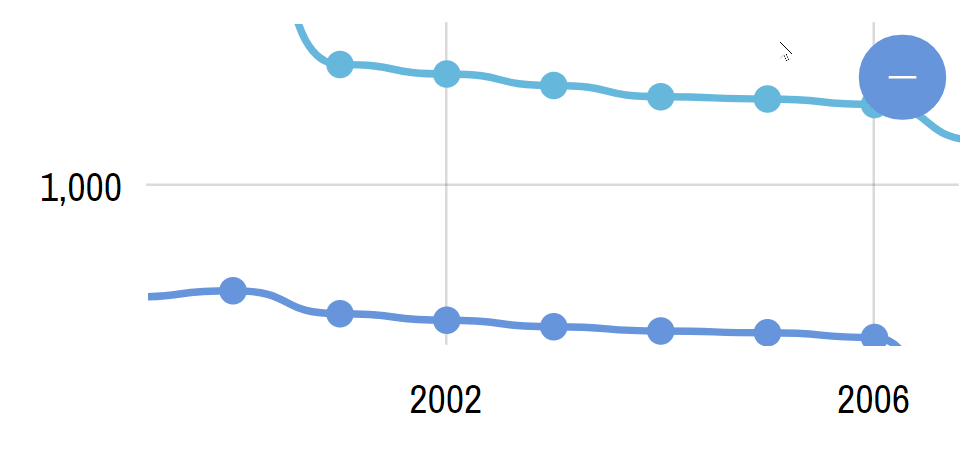 |
"selectX" |
Selects horizontal range |  |
"selectY" |
Selects vertical range |  |
"selectXY" |
Selects both horizontal and vertical range |  |
"none" |
Does nothing |  |
NOTE It's not possible to mix different types of behavior, i.e. zoom horizontally and pan vertically. It would be super disorienting to the user and result in bad UX.
More on zooming
If Cursor behavior is set to zooming (zoomX, zoomY, zoomXY) the whole chart will be zoomed in when selecting ranges.
Please note that all respective axes will be zoomed in the zoom direction. For example, if you have set Cursor behavior to zoomY and you have two vertical axes, both of them will be zoomed.
There is no way to attach zoom to just one axis.
MORE INFO Zooming can also be done using chart's Scrollbars. Please refer to "Scrollbars" section in our article about XY Chart.
zoomXY behavior and DateAxis
The zoomXY behavior will function differently if one of the chart axes is DateAxis. It will zoom the DateAxis but will adjust the opposing ValueAxis to fit all values within selected range.
To disable this you can use this workaround: disable selectionextremeschangedevent on all series in the chart:
series.events.off(
  "selectionextremeschanged",
  valueAxis.handleSelectionExtremesChange,
  valueAxis,
  false
);
series.events.off(
  "selectionextremeschanged",
  valueAxis.handleSelectionExtremesChange,
  valueAxis,
  false
);
{
  // ...
  "series": [{
    // ...
    "callback": function() {
      this.events.off(
        "selectionextremeschanged",
        this.yAxis.handleSelectionExtremesChange,
        this.yAxis,
        false
      );
    }
  }]
}
More on panning
Panning is moving current selection in one direction or the other. Naturally, panning will not work if the chart is fully zoomed out.
The chart can be zoomed in (before panning) using Scrollbar and/or programatically via API.
There's one Cursor setting that affects pan behavior: maxPanOut.
If it's set to zero, the Cursor will not be allowed to pan beyond actual range of data.
However, if you set it to a relative value, say 0.15, Cursor will allow the user to drag selection beyond data range, then will gently snap back to the data range when released. The value is relative, meaning that 0.15 will allow user to drag 15% beyond actual range.
NOTE It's a nice UX effect, so we have it set to 0.1 by default.
More on selection
Selection, on its own, does not make a lot of sense. However, when combined with specific events, it can be turned into a powerful tool.
The two events in question are Cursor's selectstarted (indicates that user started selection) and selectended (indicating user is done selecting).
Handler function for those events will receive Cursor's object, which we can then use to determine current selection ranges using Cursor's xRange and yRange properties, that hold currently selected horizontal and vertical ranges respectively.
MORE INFO More info on even handling in our "Event Listeners" article.
Below example shows how we can use Cursor's events to check the selection on the Category axis, with help of its method getPositionLabel(location), which converts start/end values returned by xRange to actual categories.
IMPORTANT Cursor's position and axis' position might not match if the chart is zoomed in. Please read "Accounting for zoom" section of the cursor tracking tutorial for more information and details. The code below uses toAxisPosition() method to convert the two position values.
chart.cursor.behavior = "selectX";
chart.cursor.events.on("selectended", function(ev) {<br />  let range = ev.target.xRange;<br />  if (range) {
    let axis = ev.target.chart.xAxes.getIndex(0);
    let from = axis.getPositionLabel(axis.toAxisPosition(range.start));
    let to = axis.getPositionLabel(axis.toAxisPosition(range.end));
    alert("Selected from " + from + " to " + to);<br />  }
});
chart.cursor.behavior = "selectX";
chart.cursor.events.on("selectended", function(ev) {<br />  var range = ev.target.xRange;<br />  if (range) {
    var axis = ev.target.chart.xAxes.getIndex(0);
    var from = axis.getPositionLabel(axis.toAxisPosition(range.start));
    var to = axis.getPositionLabel(axis.toAxisPosition(range.end));
    alert("Selected from " + from + " to " + to);<br />  }
});
{
  // ...
  "cursor": {
    // ...
    "behavior": "selectX",
    "events": {
      "selectended": function(ev) {
        var range = ev.target.xRange;<br />        if (range) {
          var axis = ev.target.chart.xAxes.getIndex(0);
          var from = axis.getPositionLabel(axis.toAxisPosition(range.start));
          var to = axis.getPositionLabel(axis.toAxisPosition(range.end));
          alert("Selected from " + from + " to " + to);<br />        }
      }
    }
  }
}
And here's a working example of the the above. Try selecting a range on it:
See the Pen amCharts V4: Cursor (6) by amCharts (@amcharts) on CodePen.
Relation to series
Series tooltips
An added bonus to using Cursor is that it can simultaneously interact with multiple chart elements, such as display tooltips for all series in the same position.
To enable such usage all you have to do is to set tooltipText (or tooltipHTML) for each series you want tooltips displayed on.
let series1 = chart.series.push(new am4charts.LineSeries());
// ...
series1.tooltipText = "{categoryX}: [bold]{valueY}[/]";

let series2 = chart.series.push(new am4charts.LineSeries());
// ...
series2.tooltipText = "{categoryX}: [bold]{valueY}[/]";

let series3 = chart.series.push(new am4charts.LineSeries());
// ...
series3.tooltipText = "{categoryX}: [bold]{valueY}[/]";
var series1 = chart.series.push(new am4charts.LineSeries());
// ...
series1.tooltipText = "{categoryX}: [bold]{valueY}[/]";

var series2 = chart.series.push(new am4charts.LineSeries());
// ...
series2.tooltipText = "{categoryX}: [bold]{valueY}[/]";

var series3 = chart.series.push(new am4charts.LineSeries());
// ...
series3.tooltipText = "{categoryX}: [bold]{valueY}[/]";
{
  // ...
  "series": [{
    "type": "LineSeries",
    // ...
    "tooltipText": "{categoryX}: [bold]{valueY}[/]"
  }, {
    "type": "LineSeries",
    // ...
    "tooltipText": "{categoryX}: [bold]{valueY}[/]"
  }, {
    "type": "LineSeries",
    // ...
    "tooltipText": "{categoryX}: [bold]{valueY}[/]"
  }]
}
Here's how it looks like live: (hover over chart)
See the Pen amCharts V4: Cursor (7) by amCharts (@amcharts) on CodePen.
IMPORTANT Series tooltips will not work in an chart setups where both X and Y axes are a ValueAxis. The only way around it is to use snapToSeries as described in this section.
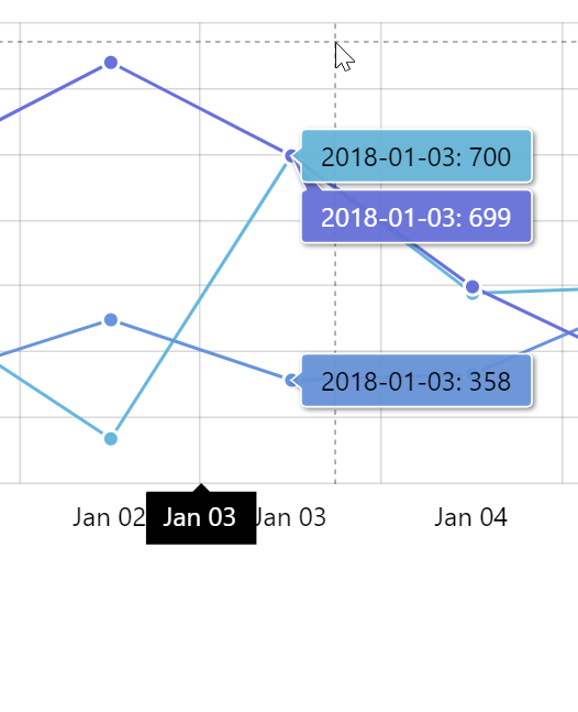
Limiting number of series tooltips
Cursor will display tooltips for all series in the same date/category by default. This might not be the best approach for a chart with a lot of series, as it might get a bit cluttery.
With Cursor's maxTooltipDistance property, you can instruct the chart to display only closest tooltips to the actual location of the mouse cursor or the location of the tap on screen.
Setting this property to any number disables display of all tooltips but the closest data item as well as those that are within set number of pixels from that target data item.
For example, if we set it to 20, cursor will show tooltip for the closest data item. If there are other data items within 20 pixel radius from it, it will show tooltips for those as well.
chart.cursor.maxTooltipDistance = 20;
chart.cursor.maxTooltipDistance = 20;
{
  // ...
  "cursor": {
    // ...
    "maxTooltipDistance": 20
  }
}
See the Pen amCharts 4: Cursor (maxTooltopDistance) by amCharts team (@amcharts) on CodePen.
NOTE If two data items are using the same value, they may display toltips for both of them even if maxTooltipDistance is set to zero. To ensure that there's absolutely just one tooltip displayed use -1.
Snapping to data items
You can also make Cursor "snap" to actual data items of the series by setting its snapToSeries property to either a Series reference or an array of Series references.
chart.cursor.snapToSeries = [series1, series2, series3];
chart.cursor.snapToSeries = [series1, series2, series3];
{
  // ...
  "cursor": {
    // ...
    "snapToSeries": ["s1", "s2", "s3"]
  }
}
Now, the cursor will not follow mouse cursor but rather snap to the neares data point out of all the series set in snapToSeries.
Try it here:
See the Pen amCharts V4: Cursor (7) by amCharts team (@amcharts) on CodePen.
Series bullets
Tooltips is not the only thing how Cursor can affect series. It can also trigger "hover" state for series' bullets in Cursor's current location.
MORE INFO If you're not familiar with "states" concept in amCharts 4, now is a good time to catch up by reading "States" article.
To enable it, all you have to do is to add "hover" state to series' bullets.
So, if I wanted bullets of the Cursor's location to grow, I'd have to add scale property to each bullet's "hover" state.
let bullet1 = series1.bullets.push(new am4charts.CircleBullet());
let bullet1hover = bullet1.states.create("hover");
bullet1hover.properties.scale = 1.3;

let bullet2 = series2.bullets.push(new am4charts.CircleBullet());
let bullet2hover = bullet2.states.create("hover");
bullet2hover.properties.scale = 1.3;

let bullet3 = series3.bullets.push(new am4charts.CircleBullet());
let bullet3hover = bullet3.states.create("hover");
bullet3hover.properties.scale = 1.3;
var bullet1 = series1.bullets.push(new am4charts.CircleBullet());
var bullet1hover = bullet1.states.create("hover");
bullet1hover.properties.scale = 1.3;

var bullet2 = series2.bullets.push(new am4charts.CircleBullet());
var bullet2hover = bullet2.states.create("hover");
bullet2hover.properties.scale = 1.3;

var bullet3 = series3.bullets.push(new am4charts.CircleBullet());
var bullet3hover = bullet3.states.create("hover");
bullet3hover.properties.scale = 1.3;
{
  // ...
  "series": [{
    "type": "LineSeries",
    // ...
    "bullets": [{
      "type": "CircleBullet",
      "states": {
        "hover": {
          "properties": {
            "scale": 1.3
          }
        }
      }
    }]
  }, {
    "type": "LineSeries",
    // ...
    "bullets": [{
      "type": "CircleBullet",
      "states": {
        "hover": {
          "properties": {
            "scale": 1.3
          }
        }
      }
    }]
  }, {
    "type": "LineSeries",
    // ...
    "bullets": [{
      "type": "CircleBullet",
      "states": {
        "hover": {
          "properties": {
            "scale": 1.3
          }
        }
      }
    }]
  }]
}
Here's how this looks:
See the Pen amCharts V4: Cursor (8) by amCharts (@amcharts) on CodePen.
Axis tooltips
As you have already noticed in the number of examples before, each of the Cursor's lines end up with a tooltip on each axis, indicating said line's precise location on that axis.
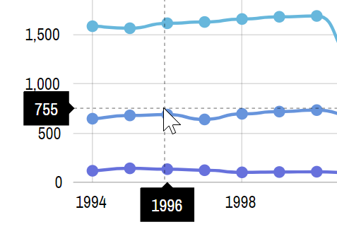
There's a lot of ways to configure those tooltips to make them useful and look according to your liking.
MORE INFO Axis tooltips (as enabled by Cursor) are discussed in great detail in a separate article: "Axis Tooltips". Make sure to check it out.
Relation to legend
Cursor, being a busy bee, can have an impact on yet another chart control - Legend.
With a little bit of setup we can make the Legend dynamically show values (or other information) under Cursor next to related series items in Legend.
In short, you can set up your series to apply different labels in their Legend items using series' legendSettings.itemLabelText and legendSettings.itemValueText properties:
series1.legendSettings.itemValueText = "{valueY}";
series1.legendSettings.itemValueText = "{valueY}";
{
  // ...
  "series": {
    "type": "LineSeries",
    // ...
    "legendSettings": {
      // ...
      "itemValueText": "{valueY}"
    }
  }
}
MORE INFO For further info, details, and examples, hop over to "Legend: Interacting with cursor" article.
See the Pen amCharts V4: Legend (labels 4) by amCharts (@amcharts) on CodePen.
Location on axis
By default the cursor-initiated axis tooltip will snap to the middle of the category/date/cell on a related axis.
That snap position can be controlled using axis' renderer's tooltipLocation property.
It accepts values from 0 (zero) to 1 (one), with zero meaning beginning of the cell, 1 - end, and 0.5 being default middle.
E.g., the below code will make cursor stick to the beginning of the date cell:
dateAxis.renderer.tooltipLocation = 0;
dateAxis.renderer.tooltipLocation = 0;
{
  // ...
  "xAxes": [{
    // ...
    "renderer": {
      "tooltipLocation": 0
    }
  }]
}
tooltipLocation = 0
tooltipLocation = 0.5(default)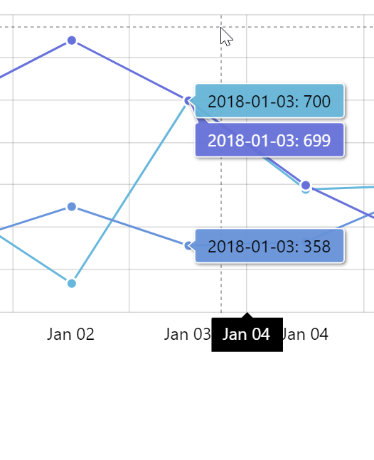
tooltipLocation = 1