There are a lot of options in positioning and spacing axis elements - grid, labels, ticks - in amCharts 4.
Prerequisites
If you haven't done so already, we strongly recommend starting off with our "Axes" article, which teaches the basics of Axis management, and also touches this topic briefly.
Positioning
Axis elements are not restricted to pre-set locations anymore. You can literally put them at any place within axis.
Let's explore how it can be done.
Setting "location"
Each axis, regardless of its type, is divided into some logical increments - cells.
For a Category axis, that would be category. For a Date axis - a date increment related to your data, say a day.
IMPORTANT location property is ignored on Value axis. It does not have a well defined "chunks", so each grid/label will be displayed at exactly the place of the value it is representing. Refer to "Fine-tuning label positions" section of this article for more options on controlling label positions.
As you may already know if you have been working with axes, all appearance-related settings are set on an axis' "renderer", accessible via renderer property. (more about renderers)
Visual elements of the axis are stored in renderer's properties as template lists, e.g.: axis.renderer.grid.template has a template object for axis grid elements. A template for labels is stored in axis.renderer.labels.template. Similarly, ticks can be configured via axis.renderer.ticks.template.
Each of those templates have a location property, which will be the centerpiece of this section.
location is a relative value, defining elements position withing particular cell.
The range of location values is from 0 to 1.
0 means start of the cell, while 1 means end of the cell. Any value in-between will mean relative position withing cell. E.g. 0.5 will position element directly in the middle of the cell.
Technically, you could go beyond the 0-1 range in both directions, to place elements outside cell. However, in practice, such requirement is hard to imagine.
OK, so now that we know theoretical concept of "location", let's put it to practice.
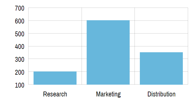
By default, grid elements are placed in the middle of the cell (location = 0.5), which does not work very well for Column series:
See the Pen amCharts V4: Axis element locations (1) by amCharts (@amcharts) on CodePen.
Let's move grid lines to the beginning of the cell (location = 0) so they are not directly behind our columns:
categoryAxis.renderer.grid.template.location = 0;
categoryAxis.renderer.grid.template.location = 0;
{
  // ...
  "xAxes": {
    // ...
    "renderer": {
      "grid": {
        "location": 0
      }
    }
  }
}
See the Pen amCharts V4: Axis element locations (2) by amCharts (@amcharts) on CodePen.
Now that's better!
Similarly, if we wanted to change position of the labels to cell start, we'd use axis.renderer.labels.template.location. Or, for ticks: axis.renderer.ticks.template.location.
"location" and DateAxis
There's one thing you should know about DateAxis and location of their labels.
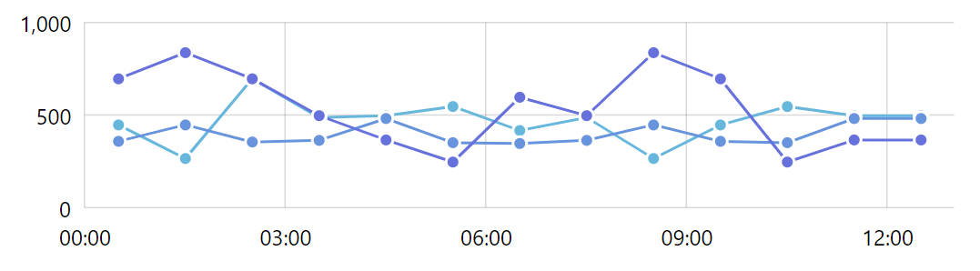
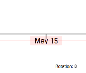
When the chart is wide enough for DateAxis to display a grid line / label on every baseInterval, it will want to center the labels.
For example, if we have a chart with hourly data, and the chart can't fit grid lines for every hour, it will display it in increments:
But once we zoom in, and the chart can fit labels for each hour:
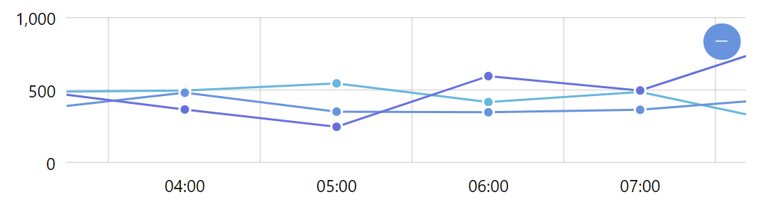
This is not a bug, and is done intentionally. Since now the label represents full period so it makes sense to center it.
If you would still like to put the label back on grid line, we can use its location setting.
There is a catch, though. Since location default is 0 (zero), and we set it to zero as well, the DateAxis will not be able to distinguish from user-set zero from default zero, and will assume that it's OK to go through with the fuzzy logic described above.
The workaround is to set it to a value that is very close to zero, say, 0.0001.
dateAxis.renderer.labels.template.location = 0.0001;
dateAxis.renderer.labels.template.location = 0.0001;
{
  // ...
  "xAxes": {
    // ...
    "renderer": {
      "labels": {
        "location": 0.0001
      }
    }
  }
}
See the Pen amCharts 4: positioning DateAxis labels on full period by amCharts team (@amcharts) on CodePen.
Labels inside chart
In our constant quest to save screen estate, we might consider moving axis labels inside plot area.
This is easily done by setting renderer's inside property:
dateAxis.renderer.inside = true;
dateAxis.renderer.inside = true;
{
  // ...
  "xAxes": {
    // ...
    "renderer": {
      "inside": true
    }
  }
}
See the Pen amCharts V4: Axis labels inside by amCharts (@amcharts) on CodePen.
Fine-tuning label positions
amCharts 4 lets you fine-tune position of any element, including axis labels, by using their "delta position" properties: dx and dy.
If set, position of the element will be adjusted horizontally (dx) or vertically (dy) by a set number of pixels.
Positive number will move the element to right/down, while negative number will move it left/up.
Let's put labels of the Value axis from the previous example inside, and adjust their position so they don't overlap with axis grid lines:
valueAxis.renderer.inside = true;
valueAxis.renderer.maxLabelPosition = 0.99;
valueAxis.renderer.labels.template.dy = -20;
valueAxis.renderer.inside = true;
valueAxis.renderer.maxLabelPosition = 0.99;
valueAxis.renderer.labels.template.dy = -20;
{
  // ...
  "yAxes": {
    // ...
    "renderer": {
      "inside": true,
      "maxLabelPosition": 0.99,
      "labels": {
        "dy": -20
      }
    }
  }
}
See the Pen amCharts V4: Fine-tuning label position by amCharts (@amcharts) on CodePen.
NOTE The maxLabelPosition property is explained later in this article, in section "Start and end labels". Spoiler alert: it hides the last label of the axis, because we don't want it sticking out of the chart.
IMPORTANT With some axis renderers, like AxisCircularRenderer used in Radar charts, dx and dy propreties are used to position the labels so any user-set values will be overwritten. For those situations, use label's radius instead.
Controlling spacing
When drawing grid lines and related labels, axis will go out of its way to ensure it's not too overcrowded with those elements.
For example, Category axis might decided to skip every second category. A Value axis might display grid lines at bigger increments, and so on.
Here's what happens with a simple chart with quite a few categories:
See the Pen amCharts V4: Axis element locations (3) by amCharts (@amcharts) on CodePen.
Setting the density of the the grid/labels
Actual behavior depends on available space. But it's all governed by a single axis renderer's property: minGridDistance.
In human language it means this: "Whatever happens DO NOT place two grid lines closer than X pixels. I'm serious, man!".
Default settings depend on orientation. For example horizontal axis renderers (AxisRendererX) has a default of 120. Vertical axis renderer (AxisRendererY): 40.
Increasing these numbers will mean likely sparser grid lines and related labels. Decreasing will probably result in denser grid/labels.
Let's try to trick our example from before to display more labels:
categoryAxis.renderer.minGridDistance = 30;
categoryAxis.renderer.minGridDistance = 30;
{
  // ...
  "xAxes": {
    // ...
    "renderer": {
      "minGridDistance":30
    }
  }
}
See the Pen amCharts V4: Axis element locations (4) by amCharts (@amcharts) on CodePen.
None of the grid/labels missing? Good!
IMPORTANT Please note that minGridDistance is a setting for renderer, not grid template.
Effect on Value axis' increments
minGridDistance affects Value axis (and by extension Date axis) in a unique way.
Since this settings puts a restriction on how close two grid lines can be, naturally, this will affect number of grid lines.
This works in tandem Axis' algorithm that strives to present axis scale (start and end values) as well as increments in nice round numbers.
For example, if we have value ranges from 100 to 600 in our data, but minGridDistance setting allows to only display 3 grid lines. We may end up with a scale from 0 to 1000 with a grid line at 500 in-between.
But, if we space and minGridDistance setting allows for many more grid lines, we might end up with an axis that scales from 100 to 600 with a grid line every 100.
In short, minGridDistance might affect the actual scale of the Value axis.
Let's put this to test.
In the below chart, we've set minGridDistance = 60. You'll see how that affects scale of the axis, making it go from 0 to 1000. That is because, lacking permission display grid lines at smaller increments, axis reverts to increments of 500, hence the scale: (live example)
minGridDistance = 60Now let's try decreasing the number to 40 and see how the axis reverts to 200 increments, and scale of 0 to 800: (live example)
minGridDistance = 40Let's go one step further, make those labels even more denser at 20: (live example)
minGridDistance = 20Controlling axis and cell lengths
Setting where axis starts and ends
Normally axis will try to display whole cells.
That means that series that display their data point in the middle of the cell, like Line series, will start and end some distance from the edge of the plot area:
See the Pen amCharts V4: Axis start position (1) by amCharts (@amcharts) on CodePen.
Date and Category axes (and possible other axis types in the future) has some means to control that in the form of two properties: startLocation and endLocation.
What they mean is you can specify exactly how much of the first and last cell you want to be visible.
dateAxis.startLocation = 0.5;
dateAxis.endLocation = 0.5;
dateAxis.startLocation = 0.5;
dateAxis.endLocation = 0.5;
{
  // ...
  "xAxes": {
    // ...
    "startLocation": 0.5,
    "endLocation": 0.5
  }
}
The above will mean that half of the first and half of the last cell is shown, making our Line series extend right to the edge of the plot area:
See the Pen amCharts V4: Axis start position (2) by amCharts (@amcharts) on CodePen.
NOTE You can use intermediate values as well. E.g. startLocation = 0.4 and endLocation = 0.6 will make Line series go almost to the edge but still leave 10% of "padding".
You can also use negative numbers and numbers bigger than 1 to increase and decrease padding of the axis.
For example the following will give some additional space on both ends of the axis:
categoryAxis.startLocation = -0.3;
categoryAxis.endLocation = 1.3;
categoryAxis.startLocation = -0.3;
categoryAxis.endLocation = 1.3;
{
  // ...
  "xAxes": {
    // ...
    "startLocation": -0.3,
    "endLocation": 1.3
  }
}
See the Pen amCharts 4: Padding category axis by amCharts team (@amcharts) on CodePen.
Controlling size of the cell
As we explained earlier, each axis is divided into cells.
On quantitative axis types, like Date axis or Value axis, cells are not important. Whereas on Category axis cells are very well defined.
Each category is a cell. Basically, a cell takes up the whole width allotted to a category.
Cell size affects its contents as well. For example, columns from Column series will be as wide as a cell. If we have several clustered columns, the cell will be divvied up equally for each of the columns:
See the Pen amCharts 4: Sizing cells (1) by amCharts (@amcharts) on CodePen.
You see how clusters of columns and individual columns are spaced out equally. This is because clusters use the whole width of the cell (category).
We can control where cell actually starts and ends.
For that we have renderer's properties cellStartLocation and cellEndLocation.
categoryAxis.renderer.cellStartLocation = 0.3;
categoryAxis.renderer.cellEndLocation = 0.7;
categoryAxis.renderer.cellStartLocation = 0.3;
categoryAxis.renderer.cellEndLocation = 0.7;
{
  // ...
  "xAxes": {
    // ...
    "renderer": {
      "cellStartLocation": 0.3,
      "cellEndLocation": 0.7
    }
  }
}
The above instructs our axis renderer to use only 40% of the whole axis cell: starting at 30% (0.3) and ending at 70% (0.7).
See the Pen amCharts 4: Sizing cells (2) by amCharts (@amcharts) on CodePen.
MORE INFO For more info, code and demos about controlling column with and spacing check out "Managing width and spacing of Column Series" tutorial.
Start and end labels
In some cases, OK in a lot of cases, axis labels might be so close to the end of the axis, they'd go outside.
Normally that's not bad per se. You don't want your labels to be cut off, do you?
See the Pen amCharts V4: Axis label control (1) by amCharts (@amcharts) on CodePen.
However, sometimes, especially in crammed spaces, you don't have any padding around your plot area, and do not want labels to be cut off in the middle.
In those situations, disabling labels close to the start and end of the axis is a viable solution.
This can be done automatically by axis renderer. All you have to do is to tell renderer how close the labels has to be to the end of the axis to be deemed unworthy for being shown.
For that we have two renderer's properties: minLabelPosition and maxLabelPosition.
Both of those settings can have ranges from 0 to 1 that are relative to the whole width of the axis. 0 signifies start of the axis, 1 - the end, 0.5 - middle, etc.
Setting the above properties will indicate the threshold along the axis' length beyond which no label should be drawn.
For example minLabelPosition = 0.05 will disable all labels in the first 5% length of the axis. Similarly, maxLabelPosition = 0.95 will disable labels in the last 5% along axis length.
Let's try to apply this to remove first and last label from the above example:
dateAxis.renderer.minLabelPosition = 0.05;
dateAxis.renderer.maxLabelPosition = 0.95;
dateAxis.renderer.minLabelPosition = 0.05;
dateAxis.renderer.maxLabelPosition = 0.95;
{
  // ...
  "xAxes": {
    // ...
    "renderer": {
      "minLabelPosition": 0.05,
      "maxLabelPosition": 0.95
    }
  }
}
See the Pen amCharts V4: Axis label control (2) by amCharts (@amcharts) on CodePen.
Label rotation
Sometimes, when you have a lot of labels, but don't want to thing them out using grid/label spacing settings, you may turn to other solution - label rotation.
Placing labels vertically or at some angle will enable us to cram much more labels into the same horizontal space.
Let's take this example:
See the Pen amCharts V4: Axis label rotation (1) by amCharts (@amcharts) on CodePen.
We've intentionally lowered the minGridDistance setting so that we see all labels.
We do see all the labels, however, now they overlap. Not cool.
To rotate them we're going to user renderer.labels.template, just like we used to adjust label position in previous sections.
The setting for rotation, which works on virtually all elements on amCharts 4 by the way, is predictably rotation. It's a number in degrees (0-360) with zero being the vertical angle going up from the center.
Say we want to make our labels vertical. Setting their rotation = 90 will do the trick:
dateAxis.renderer.labels.template.rotation = 90;
dateAxis.renderer.labels.template.rotation = 90;
{
  // ...
  "xAxes": {
    // ...
    "renderer": {
      // ...
      "labels": {
        "rotation": 90
      }
    }
  }
}
TIP 0 to 360 is a full cycle. So if you want those labels to be flipped, just add 180. E.g. setting rotation = 270 will make labels vertical but facing the other way.
Now, let's see how this looks:
See the Pen amCharts V4: Axis label rotation (2) by amCharts (@amcharts) on CodePen.
OK, we do have our labels rotated, but their positioning seems to be off. They're plopped directly on the axis, which is, again, not particularly cool.
This is happening because every element has its vertical and horizontal center. Controlled by verticalCenter and horizontalCenter properties respectively.
Available vertical center values are: "top" (default), "middle", and "bottom".
For horizontal center the choices are down to: "left", "middle" (default), and "right".
Since Axis renderer places its labels in some particular spot, which in our case is directly below the grid, its center will always be there. We can just change what is the center of the label - it will be rotated using that center as an anchor point.
So, when we rotate a label, who's horizontal center is in the middle, we do get a label that now is partially overlapping the axis itself.
Here's how the rotation works with out default centering options:

verticalCenter = "top"horizontalCenter = "middle"Clearly, not all centering options will work for all rotation settings.
Let's see how changing verticalCenter will affect our rotation:
verticalCenter = "middle"horizontalCenter = "middle"Seems like changing just that won't work for our 90 rotation.
How about changing horizontalCenter as well?

verticalCenter = "middle"horizontalCenter = "left"Alright, looks like we found a setting that might work just well for our vertically positioned labels:
dateAxis.renderer.labels.template.rotation = 90;
dateAxis.renderer.labels.template.verticalCenter = "middle";
dateAxis.renderer.labels.template.horizontalCenter = "left";
dateAxis.renderer.labels.template.rotation = 90;
dateAxis.renderer.labels.template.verticalCenter = "middle";
dateAxis.renderer.labels.template.horizontalCenter = "left";
{
  // ...
  "xAxes": {
    // ...
    "renderer": {
      // ...
      "labels": {
        "rotation": 90,
        "verticalCenter": "middle",
        "horizontalCenter": "left"
      }
    }
  }
}
See the Pen amCharts V4: Axis label rotation (3) by amCharts (@amcharts) on CodePen.
You may experiment with the combination of the above three settings to suit your particular situation best, just like we did here.
Axis elements over series
Normally, all axis elements like grid and ticks are positioned behind all the chart's series.
With the above property, we can override this behavior for each individual, or all elements.
For example, if we'd like the grid to be displayed over series, we could do this:
valueAxis.renderer.grid.template.above = true;
valueAxis.renderer.grid.template.above = true;
{
  // ...
  "xAxes": {
    // ...
    "renderer": {
      // ...
      "grid": {
        // ...
        "above": true
      }
    }
  }
}

Default behavior 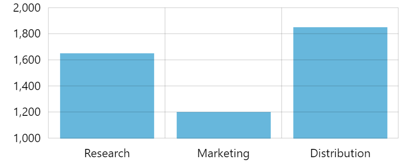
above = true
See the Pen amCharts 4: Axis grid/labels over series by amCharts team (@amcharts) on CodePen.
Label wrapping, truncation, and rotation
Long labels on the axis can be made to wrap or truncate. "Wrapping, truncating, and auto-rotating axis labels" tutorial will explain how.