Sometimes chart elements are self-descriptive, like Pie chart slices with labels, or a Line chart with one line series. Other times, user might need some visual clues to make sense of the information. That's where legend comes in.
This article walks through all the kinds of legends available in amCharts 4, and ways to configure and use them.
Classic legend
A classic legend is a collection of items representing some chart data elements such as series or slices.
It usually contains a marker (on an XY chart marker usually tries to reflect the shape of related series), a title, and (optionally) a value.
Creating
In most situations, to create a legend you only need to assign an instance of Legend to chart's legend property:
chart.legend = new am4charts.Legend();
chart.legend = new am4charts.Legend();
{
  // ...
  "legend": {
    // No need to specify "type". The chart will assume "Legend"
  }
}
NOTE Legend is a universal control, suitable for most chart types, so it is included in all chart modules. So, it's accessible as charts.Legend, map.Legend, etc.
Positioning
By default, the chart will try to place the legend at the bottom.
You can change legend's position using it's position property. Available options are: "left", "right", "top", "bottom" (default), and "absolute".
NOTE Legend placement is important, as with all positions, except "absolute", the size of the legend will affect the space left for the actual chart.
Absolute positioning (position = "absolute") allows placing legend anywhere, in relation to chart's container, event outside its bounds.
Absolutely positioned legend needs its x and y coordinates to be set. Those can exceed chart width/height, or be negative to place the legend outside chart's container.
Such (absolutely positioned) legends do not affect the size of the chart.
MORE INFO Check out "Non-standard legend alignment" for more options about legend placement.
Sizing
The position of legend also affects its default sizing.
Sizing horizontal legend
Top/bottom-positioned legends will automatically grow to accommodate all of its items. This means that actual size of the chart will depend on a number of items in legend.
If we want to limit the height of the legend, we can use its maxHeight property. If we do so, it would make sense to also make it scrollable:
chart.legend.maxHeight = 150;
chart.legend.scrollable = true;
chart.legend.maxHeight = 150;
chart.legend.scrollable = true;
{
  // ...
  "legend": {
    // ...
    "maxHeight": 150,
    "scrollable": true
  }
}
Sizing vertical legend
Vertical legends (position is set to either "left" or "right") take full height of the chart, and have their maxWidth set to a default 220 pixels.
This basically means that legend will try to be as narrow as possible to accommodate width of all of its contents, but will not grow larger than its maxWidth setting.
We can easily change the default maximum width of the legend by changing its maxWidth:
chart.legend.maxWidth = 300;
chart.legend.maxWidth = 300;
{
  // ...
  "legend": {
    // ...
    "maxWidth": 300
  }
}
What happens if the legend does not fit into maxWidth? In such case its labels are truncated:

In case we don't want to limit width of the legend? Just set it to undefined or a very large number:
chart.legend.maxWidth = undefined;
chart.legend.maxWidth = undefined;
{
  // ...
  "legend": {
    // ...
    "maxWidth": 9999
  }
}
Legend markers
Default markers
By default, the legend, when drawing markers, will try to mirror the look of the relative elements. For example if the legend item is a LineSeries styled as a red thick line with round bullets, the legend will draw a chunk of a line with a bullet, exactly as in series itself.
If you'd rather like to use default square markers, simply set useDefaultMarker to true.
Customizing markers
As we saw in the previous chapter, marker's look depend on the series it is representing. If we don't want those to mirror series look, we can opt out by setting useDefaultMarker = true.
But what if we want to display something completely different - neither resembling series look, nor default square?
Luckily, amCharts 4 Legend allows us to do anything.
The Legend's item itself is a Container which means you can place absolutely anything in it.
The default look places a RoundedRectangle in it. If all we want is to tweak some settings of the rectangle, we can do so by modifying the already existing element in the marker's template:
chart.legend = new am4charts.Legend();
chart.legend.useDefaultMarker = true;
let marker = chart.legend.markers.template.children.getIndex(0);
marker.cornerRadius(12, 12, 12, 12);
marker.strokeWidth = 2;
marker.strokeOpacity = 1;
marker.stroke = am4core.color("#ccc");
chart.legend = new am4charts.Legend();
chart.legend.useDefaultMarker = true;
var marker = chart.legend.markers.template.children.getIndex(0);
marker.cornerRadius(12, 12, 12, 12);
marker.strokeWidth = 2;
marker.strokeOpacity = 1;
marker.stroke = am4core.color("#ccc");
{
  // ...
  "legend": {
    "useDefaultMarker": true,
    "markers": {
      "children": [{
        "cornerRadiusTopLeft": 12,
        "cornerRadiusTopRight": 12,
        "cornerRadiusBottomRight": 12,
        "cornerRadiusBottomLeft": 12,
        "strokeWidth": 2,
        "strokeOpacity": 1,
        "stroke": "#ccc"
      }]
    }
  }
}
And voilà, we turned default squares into circles with grey outline:
See the Pen amCharts V4: Legend (markers) by amCharts (@amcharts) on CodePen.
NOTE Please note that outline (stroke) is disabled by default, hence us needing to set strokeOpacity = 1.
Using marker templates
In the previous example we accessed elements within marker template children list.
We can set properties directly to template as well.
let markerTemplate = chart.legend.markers.template;
markerTemplate.width = 40;
markerTemplate.height = 40;
var markerTemplate = chart.legend.markers.template;
markerTemplate.width = 40;
markerTemplate.height = 40;
{
  // ...
  "legend": {
    "useDefaultMarker": true,
    "markers": {
      "width": 40,
      "height": 40
    }
  }
}
See the Pen amCharts V4: Legend (markers 2) by amCharts (@amcharts) on CodePen.
Creating new markers
Suppose, we want to go even further - somewhere rectangle's properties can't accommodate.
We're in luck, because, as we already mentioned, Legend marker is a container, so we can add anything there. And we're not limited to a single thing. For all we care, we can add the whole chart and his dog there.
Let's explore how this works in reality.
We're going to use a simple SVG image of a dollar sign as a marker. Something that looks like this: (except maybe smaller)

Below is the SVG and its Base64 representation (for use in an URL):
<?xml version="1.0"?>
<svg height="21px" version="1.1" viewBox="0 0 21 21" width="21px" xmlns="http://www.w3.org/2000/svg" xmlns:xlink="http://www.w3.org/1999/xlink">
  <title />
  <desc />
  <defs />
  <g fill="none" fill-rule="evenodd" id="Business-Icon" stroke="none" stroke-width="1" transform="translate(-277.000000, -227.000000)">
    <g id="Coin" transform="translate(275.000000, 225.000000)">
      <rect height="25" id="Rectangle-49" width="25" x="0" y="0" />
      <g id="Group-34" transform="translate(2.000000, 2.000000)">
        <path d="M10.5,21 C4.70101013,21 0,16.2989899 0,10.5 C0,4.70101013 4.70101013,0 10.5,0 C16.2989899,0 21,4.70101013 21,10.5 C21,16.2989899 16.2989899,21 10.5,21 Z M10.5,18 C14.6421356,18 18,14.6421356 18,10.5 C18,6.35786438 14.6421356,3 10.5,3 C6.35786438,3 3,6.35786438 3,10.5 C3,14.6421356 6.35786438,18 10.5,18 Z" fill="#3B5AFB" fill-rule="nonzero" id="Combined-Shape" />
        <path d="M10.5,17 C6.91014913,17 4,14.0898509 4,10.5 C4,6.91014913 6.91014913,4 10.5,4 C14.0898509,4 17,6.91014913 17,10.5 C17,14.0898509 14.0898509,17 10.5,17 Z M11,8 L11,7.5 C11,7.22385763 10.7761424,7 10.5,7 C10.2238576,7 10,7.22385763 10,7.5 L10,8 L9.5139452,8 C8.68551807,8 8.0139452,8.67157288 8.0139452,9.5 L8.0139452,10.0007567 C8.0139452,10.8291838 8.68551807,11.5007567 9.5139452,11.5007567 L11.5000049,11.5007567 C11.7761473,11.5007567 12.0000049,11.7246143 12.0000049,12.0007567 L12.0000049,12.5 C12.0000049,12.7761424 11.7761473,13 11.5000049,13 L9.01225525,13 C8.9916704,12.749839 8.78597816,12.549668 8.52914442,12.541857 C8.25312966,12.5334627 8.02257057,12.750412 8.01417627,13.0264268 L8.00023597,13.4848008 C7.99166064,13.7667682 8.21790708,14 8.5000049,14 L10,14 L10,14.4912415 C10,14.7673838 10.2238576,14.9912415 10.5,14.9912415 C10.7761424,14.9912415 11,14.7673838 11,14.4912415 L11,14 L11.5000049,14 C12.328432,14 13.0000049,13.3284271 13.0000049,12.5 L13.0000049,12.0007567 C13.0000049,11.1723296 12.328432,10.5007567 11.5000049,10.5007567 L9.5139452,10.5007567 C9.23780282,10.5007567 9.0139452,10.2768991 9.0139452,10.0007567 L9.0139452,9.5 C9.0139452,9.22385763 9.23780282,9 9.5139452,9 L11.9679559,9 C12.0222203,9.21744733 12.2188481,9.37854004 12.453101,9.37854004 C12.7292434,9.37854004 12.953101,9.15468241 12.953101,8.87854004 L12.953101,8.5 C12.953101,8.22385763 12.7292434,8 12.453101,8 L11,8 Z" fill="#44D5E9" id="Combined-Shape" />
      </g>
    </g>
  </g>
</svg>
data:image/svg+xml;base64,PD94bWwgdmVyc2lvbj0iMS4wIiA/PjxzdmcgaGVpZ2h0PSIyMXB4IiB2ZXJzaW9uPSIxLjEiIHZpZXdCb3g9IjAgMCAyMSAyMSIgd2lkdGg9IjIxcHgiIHhtbG5zPSJodHRwOi8vd3d3LnczLm9yZy8yMDAwL3N2ZyIgeG1sbnM6eGxpbms9Imh0dHA6Ly93d3cudzMub3JnLzE5OTkveGxpbmsiPjx0aXRsZS8+PGRlc2MvPjxkZWZzLz48ZyBmaWxsPSJub25lIiBmaWxsLXJ1bGU9ImV2ZW5vZGQiIGlkPSJCdXNpbmVzcy1JY29uIiBzdHJva2U9Im5vbmUiIHN0cm9rZS13aWR0aD0iMSIgdHJhbnNmb3JtPSJ0cmFuc2xhdGUoLTI3Ny4wMDAwMDAsIC0yMjcuMDAwMDAwKSI+PGcgaWQ9IkNvaW4iIHRyYW5zZm9ybT0idHJhbnNsYXRlKDI3NS4wMDAwMDAsIDIyNS4wMDAwMDApIj48cmVjdCBoZWlnaHQ9IjI1IiBpZD0iUmVjdGFuZ2xlLTQ5IiB3aWR0aD0iMjUiIHg9IjAiIHk9IjAiLz48ZyBpZD0iR3JvdXAtMzQiIHRyYW5zZm9ybT0idHJhbnNsYXRlKDIuMDAwMDAwLCAyLjAwMDAwMCkiPjxwYXRoIGQ9Ik0xMC41LDIxIEM0LjcwMTAxMDEzLDIxIDAsMTYuMjk4OTg5OSAwLDEwLjUgQzAsNC43MDEwMTAxMyA0LjcwMTAxMDEzLDAgMTAuNSwwIEMxNi4yOTg5ODk5LDAgMjEsNC43MDEwMTAxMyAyMSwxMC41IEMyMSwxNi4yOTg5ODk5IDE2LjI5ODk4OTksMjEgMTAuNSwyMSBaIE0xMC41LDE4IEMxNC42NDIxMzU2LDE4IDE4LDE0LjY0MjEzNTYgMTgsMTAuNSBDMTgsNi4zNTc4NjQzOCAxNC42NDIxMzU2LDMgMTAuNSwzIEM2LjM1Nzg2NDM4LDMgMyw2LjM1Nzg2NDM4IDMsMTAuNSBDMywxNC42NDIxMzU2IDYuMzU3ODY0MzgsMTggMTAuNSwxOCBaIiBmaWxsPSIjM0I1QUZCIiBmaWxsLXJ1bGU9Im5vbnplcm8iIGlkPSJDb21iaW5lZC1TaGFwZSIvPjxwYXRoIGQ9Ik0xMC41LDE3IEM2LjkxMDE0OTEzLDE3IDQsMTQuMDg5ODUwOSA0LDEwLjUgQzQsNi45MTAxNDkxMyA2LjkxMDE0OTEzLDQgMTAuNSw0IEMxNC4wODk4NTA5LDQgMTcsNi45MTAxNDkxMyAxNywxMC41IEMxNywxNC4wODk4NTA5IDE0LjA4OTg1MDksMTcgMTAuNSwxNyBaIE0xMSw4IEwxMSw3LjUgQzExLDcuMjIzODU3NjMgMTAuNzc2MTQyNCw3IDEwLjUsNyBDMTAuMjIzODU3Niw3IDEwLDcuMjIzODU3NjMgMTAsNy41IEwxMCw4IEw5LjUxMzk0NTIsOCBDOC42ODU1MTgwNyw4IDguMDEzOTQ1Miw4LjY3MTU3Mjg4IDguMDEzOTQ1Miw5LjUgTDguMDEzOTQ1MiwxMC4wMDA3NTY3IEM4LjAxMzk0NTIsMTAuODI5MTgzOCA4LjY4NTUxODA3LDExLjUwMDc1NjcgOS41MTM5NDUyLDExLjUwMDc1NjcgTDExLjUwMDAwNDksMTEuNTAwNzU2NyBDMTEuNzc2MTQ3MywxMS41MDA3NTY3IDEyLjAwMDAwNDksMTEuNzI0NjE0MyAxMi4wMDAwMDQ5LDEyLjAwMDc1NjcgTDEyLjAwMDAwNDksMTIuNSBDMTIuMDAwMDA0OSwxMi43NzYxNDI0IDExLjc3NjE0NzMsMTMgMTEuNTAwMDA0OSwxMyBMOS4wMTIyNTUyNSwxMyBDOC45OTE2NzA0LDEyLjc0OTgzOSA4Ljc4NTk3ODE2LDEyLjU0OTY2OCA4LjUyOTE0NDQyLDEyLjU0MTg1NyBDOC4yNTMxMjk2NiwxMi41MzM0NjI3IDguMDIyNTcwNTcsMTIuNzUwNDEyIDguMDE0MTc2MjcsMTMuMDI2NDI2OCBMOC4wMDAyMzU5NywxMy40ODQ4MDA4IEM3Ljk5MTY2MDY0LDEzLjc2Njc2ODIgOC4yMTc5MDcwOCwxNCA4LjUwMDAwNDksMTQgTDEwLDE0IEwxMCwxNC40OTEyNDE1IEMxMCwxNC43NjczODM4IDEwLjIyMzg1NzYsMTQuOTkxMjQxNSAxMC41LDE0Ljk5MTI0MTUgQzEwLjc3NjE0MjQsMTQuOTkxMjQxNSAxMSwxNC43NjczODM4IDExLDE0LjQ5MTI0MTUgTDExLDE0IEwxMS41MDAwMDQ5LDE0IEMxMi4zMjg0MzIsMTQgMTMuMDAwMDA0OSwxMy4zMjg0MjcxIDEzLjAwMDAwNDksMTIuNSBMMTMuMDAwMDA0OSwxMi4wMDA3NTY3IEMxMy4wMDAwMDQ5LDExLjE3MjMyOTYgMTIuMzI4NDMyLDEwLjUwMDc1NjcgMTEuNTAwMDA0OSwxMC41MDA3NTY3IEw5LjUxMzk0NTIsMTAuNTAwNzU2NyBDOS4yMzc4MDI4MiwxMC41MDA3NTY3IDkuMDEzOTQ1MiwxMC4yNzY4OTkxIDkuMDEzOTQ1MiwxMC4wMDA3NTY3IEw5LjAxMzk0NTIsOS41IEM5LjAxMzk0NTIsOS4yMjM4NTc2MyA5LjIzNzgwMjgyLDkgOS41MTM5NDUyLDkgTDExLjk2Nzk1NTksOSBDMTIuMDIyMjIwMyw5LjIxNzQ0NzMzIDEyLjIxODg0ODEsOS4zNzg1NDAwNCAxMi40NTMxMDEsOS4zNzg1NDAwNCBDMTIuNzI5MjQzNCw5LjM3ODU0MDA0IDEyLjk1MzEwMSw5LjE1NDY4MjQxIDEyLjk1MzEwMSw4Ljg3ODU0MDA0IEwxMi45NTMxMDEsOC41IEMxMi45NTMxMDEsOC4yMjM4NTc2MyAxMi43MjkyNDM0LDggMTIuNDUzMTAxLDggTDExLDggWiIgZmlsbD0iIzQ0RDVFOSIgaWQ9IkNvbWJpbmVkLVNoYXBlIi8+PC9nPjwvZz48L2c+PC9zdmc+
NOTE Psst, iconfinder.com is a great source for free and commercial vector icons. We got the above from them.
Now that we have a custom marker, we can:
- Clear out current marker template by calling its
disposeChildren()method; - Create a new
Imagein marker template; - Assign our Base64-encoded SVG into image's
hrefproperty.
// Remove square from marker template
let marker = chart.legend.markers.template;
marker.disposeChildren();

// Add custom image instead
let dollar = marker.createChild(am4core.Image);
dollar.width = 40;
dollar.height = 40;
dollar.verticalCenter = "top";
dollar.horizontalCenter = "left";
dollar.href = "data:image/svg+xml;base64,......";
// Remove square from marker template
var marker = chart.legend.markers.template;
marker.disposeChildren();

// Add custom image instead
var dollar = marker.createChild(am4core.Image);
dollar.width = 40;
dollar.height = 40;
dollar.verticalCenter = "top";
dollar.horizontalCenter = "left";
dollar.href = "data:image/svg+xml;base64,......";
{
  // ...
  "legend": {
    "markers": {
      "children": [{
        // hide regular marker
        "disabled": true
      }, {
        "type": "Image",
        "width": 40,
        "height": 40,
        "verticalCenter": "top",
        "horizontalCenter": "left",
        "href": "data:image/svg+xml;base64,......"
      }]
    }
  }
}
Let's see how it turned out:
See the Pen amCharts V4: Legend (markers 2) by amCharts (@amcharts) on CodePen.
Individual custom markers
Previous example was using a custom same image for all of the series. Now let's see how we can use adapters together with "dummy data" on series, to have custom image set for each individual series.
QUICK RECAP Adapter provides a way to use custom function that dynamically modifies value for a property. A "dummy data" is a custom storage property that allows storing any kind of proprietary data on any kind of element. We're going to add an adapter for href property of the marker image to look for an url to an image in each series' dummy data.
// Setting series flag url
series1.dummyData = {
  flag: "path/to/series1_flag.svg"
};

// ...

// Remove square from marker template
let marker = chart.legend.markers.template;
marker.disposeChildren();

// Add custom image instead
let dollar = marker.createChild(am4core.Image);
dollar.width = 40;
dollar.height = 40;
dollar.verticalCenter = "top";
dollar.horizontalCenter = "left";

// We're going to use an adapter to set href
dollar.adapter.add("href", function(href, target) {
  if (target.dataItem && target.dataItem.dataContext && target.dataItem.dataContext.dummyData) {
    return target.dataItem.dataContext.dummyData.flag;
  }
  else {
    return href;
  }
});
// Setting series flag url
series1.dummyData = {
  flag: "path/to/series1_flag.svg"
};

// Remove square from marker template
var marker = chart.legend.markers.template;
marker.disposeChildren();

// Add custom image instead
let dollar = marker.createChild(am4core.Image);
dollar.width = 40;
dollar.height = 40;
dollar.verticalCenter = "top";
dollar.horizontalCenter = "left";


// We're going to use an adapter to set href
dollar.adapter.add("href", function(href, target) {
  if (target.dataItem && target.dataItem.dataContext && target.dataItem.dataContext.dummyData) {
    return target.dataItem.dataContext.dummyData.flag;
  }
  else {
    return href;
  }
});
{
  // ...
  "series": [{
    // ...
    "dummyData": {
      "flag": "path/to/series1_flag.svg"
    }
  }, {
    // ...
    "dummyData": {
      "flag": "path/to/series2_flag.svg"
    }
  }],
  "legend": {
    "markers": {
      "children": [{
        // hide regular marker
        "disabled": true
      }, {
        "type": "Image",
        "width": 40,
        "height": 40,
        "verticalCenter": "top",
        "horizontalCenter": "left",
        "adapter": {
          "href": function(href, target) {
            if (target.dataItem && target.dataItem.dataContext && target.dataItem.dataContext.dummyData) {
              return target.dataItem.dataContext.dummyData.flag;
            }
            else {
              return href;
            }
          }
        }
      }]
    }
  }
}
See the Pen amCharts 4: Custom legend markers by amCharts team (@amcharts) on CodePen.
JSON Here's the above demo in JSON config.
Markers as SVG paths
Using external images as markers is all well and good. However, they will use the colors that they have set in those images itself.
What if we wanted to use certain custom shapes, but have them inherit series/slice color automatically?
It's possible. We just have to use Sprite element and use its path property, rather than Image and its href.
Here's a working example:
See the Pen Custom legend markers as SVG path by amCharts team (@amcharts) on CodePen.
Disabling markers
Don't need markers at all? Simply set disabled = true on marker template:
chart.legend.markers.template.disabled = true;
chart.legend.markers.template.disabled = true;
{
  // ...
  "legend": {
    "useDefaultMarker": true,
    "markers": {
      "disabled": true
    }
  }
}
See the Pen amCharts V4: Legend (markers 3) by amCharts (@amcharts) on CodePen.
The above example uses label formatting tricks to make it more useful, now that markers are gone. We'll see how to make that happen in the next section.
Legend labels
Series' relation to Legend is defined by its legendSettings property.
legendSettings is an object of type LegendSettings (make sure you click on a link to check its available properties), that holds some settings that are needed by Legend in order to know what information to display as a label and value in its items representing particular series.
We know, we don't like the above sentence either, so let's put it some other way.
A Legend creates a Legend item for each series in the chart. We already saw how it "inherits" marker look from the series.
That leaves it with a textual label, and (optionally) value label.
That's when it turns to series' legendSettings. Basically, it says "OK series X, show me what do you want me to put into your Legend label."
Here's a basic chart with a few Line series and a default legend, we're going to be using in this section as a lab rat:
See the Pen amCharts V4: Legend (labels 1) by amCharts (@amcharts) on CodePen.
Name labels
For a series (name) label, Legend will look for labelText in legendSettings.
The default is "{name}", which is a code for "replace this text with a name attribute of the target series.
MORE INFO For more information about text formatting, make sure you check out our "Formatting Strings" article.
If I wanted to override default, I could assign to anything else, by modifying series' legendSettings.labelText.
series1.legendSettings.labelText = "Series: [bold {color}]{name}[/]";
series1.legendSettings.labelText = "Series: [bold {color}]{name}[/]";
{
  // ...
  "series": {
    "type": "LineSeries",
    // ...
    "legendSettings": {
      "labelText": "Series: [bold {color}]{name}[/]"
    }
  }
}
Or, by setting legend's label template just once:
chart.legend.labels.template.text = "Series: [bold {color}]{name}[/]";
chart.legend.labels.template.text = "Series: [bold {color}]{name}[/]";
{
  // ...
  "legend": {
    // ...
    "labels": {
      "text": "Series: [bold {stroke}]{color}[/]"
    }
  }
}
Notice, how we can use the {...} placeholders even within formatting [...] blocks. In our case we're applying series' color to part (!) of the legend label. How [insert your favorite word here] cool is that?
See the Pen amCharts V4: Legend (labels 2) by amCharts (@amcharts) on CodePen.
Value labels
Besides static (name) label, Legend can display an additional "value" label.
A value label is basically a "secondary" label which can be used to display information we want to be separate from the main label. It's mostly used to display item's value, hence us using term "value label".
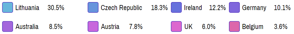
The reason to have value labels is that we can align and arrange them into columns, which makes them more prominent and easy to read, then if they would be mashed together with the name labels.
Just take a look at these two images for comparison, to see what we mean by that:
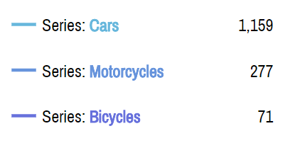
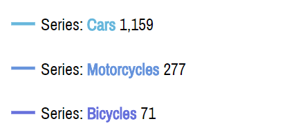
It's much much clearer when we have values arranged in a separate column, isn't it?
What goes in there is determined by legendSettings.valueText, which is empty by default on an XY Chart, but is set to "{value}" on a Pie chart (yes, Pie chart is also a serial chart in amCharts 4) so that each slice's value is displayed next to its name in Legend.
As with the name label, it can have static text, formatting blocks, and placeholders, or any combination of.
Say, we want to display a series' close (last) value next to its name. We can use {valueY.close} placeholder for it.
series1.legendSettings.valueText = "{valueY.close}";
series1.legendSettings.valueText = "{valueY.close}";
{
  // ...
  "series": {
    "type": "LineSeries",
    // ...
    "legendSettings": {
      // ...
      "valueText": "{valueY.close}"
    }
  }
}
See the Pen amCharts V4: Legend (labels 3) by amCharts (@amcharts) on CodePen.
TIP Could we have included "{valueY.close}" into labelText? Yes, absolutely. We'd be be sacrificing our ability to arrange values in a separate column, though.
Interacting with cursor
Now that we know our way around Legend's static labels, let's talk about dynamic ones.
Legend can be set up to change its labels dynamically based on user's interaction with the chart.
For that we will need to enabled a chart Cursor.
SIDE READING Enabling a cursor is as easy as creating a cursor of appropriate type (XYCursor for XY chart, or RadarCursor for Radar chart) and assigning it to chart's cursor property. We're not going to get into it here, though. Make sure you check out our "Chart Cursor" article for more juice on this super-useful tool.
We already have a Cursor in our previous examples. All we need to do is to configure our legendSettings to apply different information on Legend items once the cursor goes through the chart.
Similarly to how we used labelText and valueText, we're going to use itemLabelText and itemValueText.
The latter two function exactly like the former ones, except they are applied only when chart Cursor is hovering over plot area. If set, these will override static labels.
Let's try overriding our value label (which currently shows close value for each series) with a value under Cursor:
series1.legendSettings.itemValueText = "[bold]{valueY}[/bold]";
series1.legendSettings.itemValueText = "[bold]{valueY}[/bold]";
{
  // ...
  "series": {
    "type": "LineSeries",
    // ...
    "legendSettings": {
      // ...
      "itemValueText": "[bold]{valueY}[/bold]"
    }
  }
}
Now, when we glide over our chart with a Cursor, the values next to Legend items will change to reflect actual values under Cursor.
It's not just value that can change, we can apply the whole different label, including formatting. (notice how we made "rollover" values bold in the above example)
See the Pen amCharts V4: Legend (labels 4) by amCharts (@amcharts) on CodePen.
Styling labels
Basic styling options
As we mentioned before, the templates for legend item labels are accessible via legend.labels.template and legend.valueLabels.template.
Those contain objects of type Label, which can be used to apply all kinds of styling to it.
For example, if we want our labels to be painted in red, instead of default black, we would do something like this:
chart.legend.labels.template.fill = am4core.color("#f00");
chart.legend.valueLabels.template.fill = am4core.color("#f00");
chart.legend.labels.template.fill = am4core.color("#f00");
chart.legend.valueLabels.template.fill = am4core.color("#f00");
{
  // ...
  "legend": {
    // ...
    "labels": {
      "fill": "#f00"
    },
    "valueLabels": {
      "fill": "#f00"
    }
  }
}
That's it: we've painted labels of our legend red.
Easy? Not so fast. There's one thing to consider: disabled state. Read on.
Styling disabled state
When a legend item is enabled it is in its "default" state.
When we click it, it is "disabled" and along it related item, such as Series on an XYChart or a slice on a PieChart.
To visually distinguish disabled items, a special state is pre-created in legend. That state is (a bit confusingly) called "active" state.
MORE INFO A "state" is a way to quickly apply a set of property values to an object when certain actions are triggered, such as legend item is disabled. For more information check out "States" article.
Since legend's default behavior is to paint labels of the disabled items gray, it has set fill property value set in it's pre-created "active" state.
Thus, if we want to modify how our labels look when disabled, we need to modify the "active" state for them.
As a matter of example, let's make the labels of a PieChart legend strike-through, rather than gray out when disabled:
chart.legend.labels.template.textDecoration = "none";
chart.legend.valueLabels.template.textDecoration = "none";

let as = chart.legend.labels.template.states.getKey("active");
as.properties.textDecoration = "line-through";
as.properties.fill = am4core.color("#000");

let as2 = chart.legend.valueLabels.template.states.getKey("active");
as2.properties.textDecoration = "line-through";
as2.properties.fill = am4core.color("#000");
chart.legend.labels.template.textDecoration = "none";
chart.legend.valueLabels.template.textDecoration = "none";

var as = chart.legend.labels.template.states.getKey("active");
as.properties.textDecoration = "line-through";
as.properties.fill = am4core.color("#000");

var as2 = chart.legend.valueLabels.template.states.getKey("active");
as2.properties.textDecoration = "line-through";
as2.properties.fill = am4core.color("#000");
{
  // ...
  "legend": {
    // ...
    "labels": {
      "textDecoration": "none",
      "states": {
        "active": {
          "textDecoration": "line-through",
          "fill": "#000"
        }
      }
    },
    "valueLabels": {
      "textDecoration": "none",
      "states": {
        "active": {
          "textDecoration": "line-through",
          "fill": "#000"
        }
      }
    }
  }
}
There are a couple of things that need clarification about the above code:
- We need to set
textDecorationto"none"on the label templates directly, to make sure that when disabled label is re-enabled, the strike-through styling is removed. When we set value on an element directly, it updates "default" state with it, hence it returning to that value when item is no longer "disabled". - Since "active" state for legend labels has their
fillset to gray, we reset it here to black color, so it is not grayed out.
Here's a working example. Go ahead and try clicking some items off:
See the Pen amCharts 4: Show labels of disabled items in Legend as with strike-through styling by amCharts team (@amcharts) on CodePen.
Aligning value labels
There are two properties that affect placement and alignment of legend labels: align and textAlign.
align indicates label position, whereas textAlign alignment of within the label itself.
We can combine the two to arrange labels and value labels into columns or simple lists the way we want them. E.g.:
chart.legend.valueLabels.template.align = "left";
chart.legend.valueLabels.template.textAlign = "end";
chart.legend.valueLabels.template.align = "left";
chart.legend.valueLabels.template.textAlign = "end";
{
  // ...
  "legend": {
    // ...
    "valueLabels": {
      "align": "left",
      "textAlign": "end"
    }
  }
}
The following screenshot table shows how changing various settings affect legend layout.

valueLabels.template.align = "right"valueLabels.template.textAlign = "end"
Default setup
valueLabels.template.align = "right"valueLabels.template.textAlign = "start"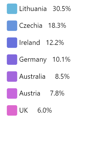
valueLabels.template.align = "left"valueLabels.template.textAlign = "end"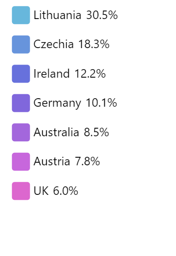
valueLabels.template.align = "left"valueLabels.template.textAlign = "start"
Controlling spacing
Normally, there's some spacing applied around each legend item. To be exact: 10 pixels on top and bottom.
If you'd like to increase or reduce that spacing it's as simple as setting padding for Legend's item container template:
chart.legend.itemContainers.template.paddingTop = 5;
chart.legend.itemContainers.template.paddingBottom = 5;
chart.legend.itemContainers.template.paddingTop = 5;
chart.legend.itemContainers.template.paddingBottom = 5;
{
  // ...
  "legend": {
    "itemContainers": {
      "paddingTop": 5,
      "paddingBottom": 5
    }
  }
}
Handling events
A Legend by itself does not have any specific events. However, you can still attach generic events to its items.
We're going to be using Legend's itemContainers list template for that. It's a list template, so we can put any events on its template object and they will be added to any actual Legend items created.
For example, if I'd like to add "hit" event on a legend marker, I'd add that event on Legend's itemContainers.template:
chart.legend.itemContainers.template.events.on("hit", function(ev) {
  console.log("Clicked on", ev.target);
});
chart.legend.itemContainers.template.events.on("hit", function(ev) {
  console.log("Clicked on", ev.target);
});
{
  // ...
  "legend": {
    "itemContainers": {
      "events": {
        "hit": function(ev) {
          console.log("Clicked on", ev.target);
        })
      }
    }
  }
}
MORE INFO Refer to our "Event Listeners" article for more juice on event handling.
An event file, received by the handler function will contain reference to the actual Container for clicked item.
By itself it's not very useful to us. However, using its properties, we can easily deduce the Series it belongs to.
The target Container for the event, contains dataItem, which in turn contains dataContext property, which will hold reference to related Series.
So, reworking our example from before, this looks much more useful:
chart.legend.itemContainers.template.events.on("hit", function(ev) {
  alert("Clicked on " + ev.target.dataItem.dataContext.name);
});
chart.legend.itemContainers.template.events.on("hit", function(ev) {
  alert("Clicked on " + ev.target.dataItem.dataContext.name);
});
{
  // ...
  "legend": {
    "itemContainers": {
      "events": {
        "hit": function(ev) {
          alert("Clicked on " + ev.target.dataItem.dataContext.name);
        })
      }
    }
  }
}
Try clicking on legend items here:
See the Pen amCharts V4: Legend (events) by amCharts (@amcharts) on CodePen.
Adding custom items
You can create a standalone instance of a Legend, that is not tied into any of the chart's data or objects, with completely custom items.
For that, we will need to instantiate a new Legend object, add our item info directly to it's data property, as well as push it into one of the chart's container's, such as chartContainer.
This is best explained with an example:
let legend = new am4charts.Legend();
legend.parent = chart.chartContainer;
legend.background.fill = am4core.color("#000");
legend.background.fillOpacity = 0.05;
legend.width = 120;
legend.align = "right";
legend.data = [{
  "name": "2016",
  "fill":"#72A6B2"
}, {
  "name": "2017",
  "fill": "#667E93"
}, {
  "name": "2018",
  "fill": "#488BB2"
}];
var legend = new am4charts.Legend();
legend.parent = chart.chartContainer;
legend.background.fill = am4core.color("#000");
legend.background.fillOpacity = 0.05;
legend.width = 120;
legend.align = "right";
legend.data = [{
  "name": "2016",
  "fill":"#72A6B2"
}, {
  "name": "2017",
  "fill": "#667E93"
}, {
  "name": "2018",
  "fill": "#488BB2"
}];
{
  // ...
  "chartContainer": {
    "children": [{
      "type": "Legend",
      "width": 120,
      "align": "right",
      "background": {
        "fill": "#000",
        "fillOpacity": 0.05
      },
      "data": [{
        "name": "2016",
        "fill":"#72A6B2"
      }, {
        "name": "2017",
        "fill": "#667E93"
      }, {
        "name": "2018",
        "fill": "#488BB2"
      }]
    }]
  }
}
IMPORTANT Natural temptation would be to assign our custom Legend to chart's legend property. If we did that, chart would take over legend's data. So, we're adding it to one of the chart's containers.
MORE INFO For more information on chart built-in containers, visit "Pre-defined chart containers".
TIP If you'd like some of the items to be disabled by default, add visible: false to their data.
Let's see how it works on a live example: (on a map actually)
See the Pen amCharts V4: Map (legend) by amCharts (@amcharts) on CodePen.
MORE INFO If you'd like more info on how adding and arranging children of containers work, make sure you read our "Working with Containers" article.
And here's another example of how we can use custom legend to group PieChart slices together using custom legend with automatically pre-calculated percentage:
See the Pen amCharts 4: Grouping PieChart slices via legend by amCharts team (@amcharts) on CodePen.
Scrollable legend
Version 4.8.0 adds an additional Legend setting: scrollable (default false).
In a nutshell it means that if legend does not fit, a scrollbar will appear so users can scroll the legend to see all its items. Basically it works as CSS's overflow: auto.
It's easy to turn it on:
chart.legend.scrollable = true;
chart.legend.scrollable = true;
{
  // ...
  "legend": {
    // ...
    "scrollable": true
  }
}
The automatic scrolling works differently for vertical and horizontal legends, though.
If your legend's position is set to either "left" or "right", it will work automatically, as the maximum height of the legend is constrained by height of the chart itself.
For "top" and "bottom" positioned legends, you will need to set maxHeight. Without it the legend will automatically grow to accommodate all of its contents, so setting scrollable will not have any effect on it.
Here's an example of a chart with a scrollable legend:
See the Pen amCharts 4: Scrollable legend by amCharts team (@amcharts) on CodePen.
NOTE Horizontal scrolling of legends is not (yet) supported.
Heat legend
A Heat legend is used to depict a range of values and their corresponding color (heat).
It's so cool, we have a separate article for it: "Heat Legend".
Related tutorials
Below are some links to tutorials, related to advanced Legend usage:
- Chart Legend in an External Container
- Disabling toggling of items in Legend
- Using adapters to modify legend item appearance
- Truncating legend labels
- Individual legend item for each column
- Highlighting column series on legend click
- Toggling multiple series with a single legend item
- Non-standard legend alignment
- Custom external legend
- Reversing the order of Legend items
- Custom order of legend items


