This tutorial will show how you can use Range Selector plugin (available since version 4.9.25) to create HTML-based controls for alternative zooming methods of Axes.
NOTE Range Selector is a plugin. For information about using plugins, refer to this article.
Using the plugin
Including the module
Before you can use this plugin you need to make sure you include it.
If you are using it in a TypeScript/ES6 application, you can import it as module. For pure JavaScript applications you'll need to include a .js vesion
import * as am4plugins_rangeSelector from "@amcharts/amcharts4/plugins/rangeSelector";
<script src="//cdn.amcharts.com/lib/4/plugins/rangeSelector.js"></script>
Enabling
Enabling the plugin will require the following requisites:
- Fully operational chart object with all axes added.
- A
<div>or other container in the DOM to place Range Selector in. - An instance of an appropriate Range Selector class.
- Set
axisproperty of the Range Selector indicating which Axis selector will control.
Contrary to many other amCharts 4 plugins, Range Selector is a standalone module, and does not require to be pushed into plugins list of the target chart.
Here's a typical usage scenario:
let selector = new am4plugins_rangeSelector.DateAxisRangeSelector();
selector.container = document.getElementById("selectordiv");
selector.axis = dateAxis;
var selector = new am4plugins_rangeSelector.DateAxisRangeSelector();
selector.container = document.getElementById("selectordiv");
selector.axis = dateAxis;
// Range Selector is not (yet) supported in JSON configurations
Example:
See the Pen amCharts 4: Using Range Selector plugin by amCharts team (@amcharts) on CodePen.
Styling control elements
Selector loads a set of default CSS that controls layout its controls.
Since Selector's controls are HTML elements, like <input>, they will inherit CSS targeted at such elements from other stylesheets on the same page, too.
Targeting controls using own CSS
Each control created by Selector will have an appropriate class name attached, to it.
For example, a "from" date input field will have amcharts-range-selector-from-input set.
Each control group will also have a descriptive class name. E.g. date input fields will be wrapped in the <div> with a class name amcharts-range-selector-range-wrapper.
We can use those in our own CSS rules to target specific elements, e.g.:
.amcharts-range-selector-range-wrapper input {
  font-size: 1.5em;
}
Using and disabling default CSS
As we mentioned before, Selector also loads a set of default CSS rules. The main purpose of these built-in CSS rules is to layout and space controls so they look OK without any additional styling.
The default CSS also takes into account Selector's position setting, which is explained in the next chapter.
To disable built-in CSS, use Selector's defaultStyles property:
selector.defaultStyles = false;
selector.defaultStyles = false;
// Range Selector is not (yet) supported in JSON configurations
Selector layout
Since Selector itself is placed in an external HTML container, we don't have any control about where it is actually positioned.
However, we still have a position setting (options: "top", "bottom" (default), "left", and "right").
Setting those will modify class names of the main wrapper <div>, which in turn will trigger default CSS rules, affecting actual layout of the controls.
E.g. setting position = "left" will set class name of the selector control wrapper to amcharts-range-selector-wrapper amcharts-range-selector-left.
The default CSS rules are set up in such way that "top" and "bottom" values will trigger rules that try to arrange Selector controls horizontally (input fields on the left; buttons on the right), whereas "left" and "right" assume a narrow column space, and thus arranging elements in a column.

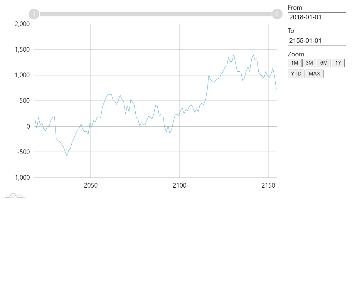
Horizontal layout ( toporbottom)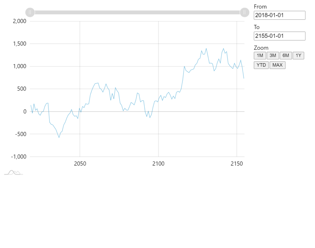
Vertical layout ( leftorright)
Example:
See the Pen amCharts 4: Using Range Selector plugin by amCharts team (@amcharts) on CodePen.
Using with DateAxis
Range Selector uses derivative class that is meant for DateAxis: DateAxisRangeSelector.
As you saw in the code snipped above, we need to instantiate this class rather than Range Selector itself.
By default, DateAxisRangeSelector produces two types of range controls:
- From/to date input fields.
- Predefined period list buttons.
Let's look at them one-by-one.
Date input fields
There are two date input fields: from and to.
Whenever chart (or rather target DateAxis) is zoomed, the fields are updated to show start and end date/time of the current selection.
User can also update the fields and trigger zoom of the axis.
Date/time format of the input fields
By default, the Selector will use date/time format as set in chart's dateFormatter.dateFormat.
You can override the format using Selector's own inputDateFormat property:
selector.inputDateFormat = "yyyy-MM-dd";
selector.inputDateFormat = "yyyy-MM-dd";
// Range Selector is not (yet) supported in JSON configurations
MORE INFO For more information about available date/time formats check out "Formatting Date & Time".
Using 3rd party date picker
Selector's input fields are regular HTML <input> elements.
This means that you can attach any custom date picker to them.
When doing so, we need to make sure we get two things:
- Set up date picker's date/time format to match ours, keeping in mind that actual syntax and time unit codes may differ.
- Invoke
selector.udpateZoom()method whenever date picker selects the date.
Here's how it looks like for jQuery UI DatePicker:
selector.events.on("drawn", function(ev) {
  $(".amcharts-range-selector-range-wrapper input").datepicker({
    dateFormat: "yy-mm-dd",
    onSelect: function() {
      selector.updateZoom();
    }
  });
});
selector.events.on("drawn", function(ev) {
  $(".amcharts-range-selector-range-wrapper input").datepicker({
    dateFormat: "yy-mm-dd",
    onSelect: function() {
      selector.updateZoom();
    }
  });
});
An here's a live demo:
See the Pen amCharts 4: Using Range Selector plugin with jQuery UI DatePicker by amCharts team (@amcharts) on CodePen.
Predefined periods
Another option to allow users to zoom to various meaningful periods without needing to input actual dates, is using predefined period buttons.
Buttons will automatically zoom to some period, e.g. 3 months.
The Selector comes with these default buttons:
- 1M (1 month)
- 3M
- 6M
- 1Y (1 year)
- YTD (year to date)
- MAX (full zoom out)
Naturally, you can add to, remove from, or completely change the this list as necessary.
The list of buttons comes as an array of IDateAxisRangeSelectorPeriod objects, accessible via periods property.
Each object has two properties:
name- this will be shown as button label.interval- an interval to zoom to. It can be either named ranges like"max", or"ytd", or aITimeIntervalobject, e.g. ({ timeUnit: "minute", count: 15 }).
Say, we want to add a 3 day period to the beginning of the list:
selector.periods.unshift(
  { name: "3D", interval: { timeUnit: "day", count: 3 } }
);
selector.periods.unshift(
  { name: "3D", interval: { timeUnit: "day", count: 3 } }
);
// Range Selector is not (yet) supported in JSON configurations
If you'd like some period to come up by default when chart data loads, you can do so via datavalidated event and selector's setPeriodInterval() method:
chart.events.on("datavalidated", function(ev) {
  selector.setPeriodInterval("ytd");
});
chart.events.on("datavalidated", function(ev) {
  selector.setPeriodInterval("ytd");
});
// Range Selector is not (yet) supported in JSON configurations
Other axis types
At this moment DateAxis is the only axis type supported by Range Selector plugin.
We are planning on adding other types in the future. This tutorial will be updated accordingly when support for other axis types is added.
Translating the plugin
Range Selector does not come with translations to other languages, so buttons like "YTD" would be rendered in English.
Luckily, translating those is easy: just add specific prompts to current locale you are using:
chart.language.setTranslationAny("%1Y", "%1A");
chart.language.setTranslationAny("%1M", "%1M");
chart.language.setTranslationAny("YTD", "ESTE AÑO");
chart.language.setTranslationAny("MAX", "TODO");
chart.language.setTranslationAny("%1Y", "%1A");
chart.language.setTranslationAny("%1M", "%1M");
chart.language.setTranslationAny("YTD", "ESTE AÑO");
chart.language.setTranslationAny("MAX", "TODO");
See the Pen amCharts 4: translating Range Selector plugin by amCharts team (@amcharts) on CodePen.