We've all been there: creating a Pie chart with labels a tad too long to fit. This tutorial lists a few things you can do to work around it.
The problem
The PieChart does not measure and resize actual diagram based on the length and quantity of labels. It's by design, because doing so would lead to quite unpredictable results.
So what can we do if we have a chart that does have long labels and they do not fit?

There are a few things we can do. Let's look at them one-by-one.
Keep in mind that there's no silver bullet. You might need to combine a few of the below techniques in order to achieve perfect combination for your particular setup.
Possible solutions
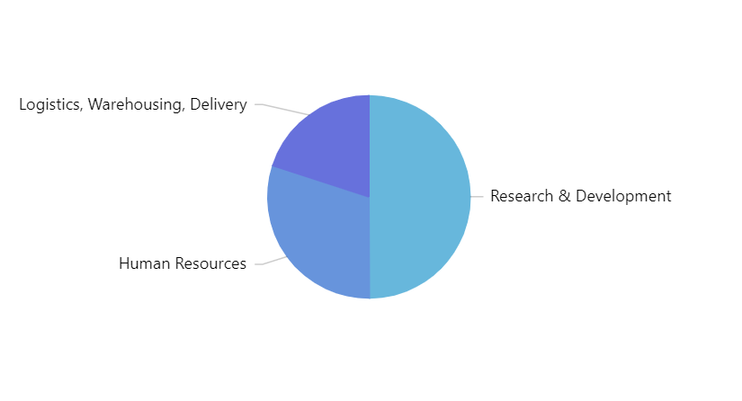
Wrap or truncate labels
This seems like the best option.
To make it work we will need two things:
- Set label's
maxWidthto a pixel value. - Set label's
wrap(if we want a label to wrap to next line) ortruncate(if we want label truncated).
pieSeries.labels.template.maxWidth = 130;
pieSeries.labels.template.wrap = true;
pieSeries.labels.template.maxWidth = 130;
pieSeries.labels.template.wrap = true;
{
  // ...
  "series": [{
    // ...
    "labels": {
      "maxWidth": 130,
      "wrap": true
    }
  }]
}
That should make it better:
wrap = true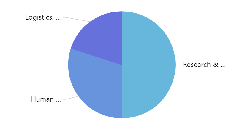
truncate = true
Reduce font for labels
If your labels don't fit by just a few characters, playing with fontSize value of the labels might be an easy way out:
pieSeries.labels.template.fontSize = 11;
pieSeries.labels.template.fontSize = 11;
{
  // ...
  "series": [{
    // ...
    "labels": {
      "fontSize": 11
    }
  }]
}
Reduce pie radius
By default, pie takes 80% of the available height or width, whichever is smaller.
We can reduce the radius by changing chart's radius property:
chart.radius = am4core.percent(50);
chart.radius = am4core.percent(50);
{
  // ...
  "radius": "50%"
}
Change label content
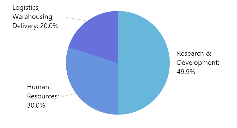
By default, labels display category and its percent representation.
We can change it to display anything else - e.g. just percent, or just category - and let users rely on rollover tooltips or legend for additional information.
pieSeries.labels.template.text = "{category}";
pieSeries.labels.template.text = "{category}";
{
  // ...
  "series": [{
    // ...
    "labels": {
      "text": "{category}"
    }
  }]
}
text = "{category}"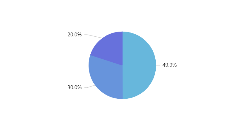
text = "{value.percent.formatNumber('#.0')}%"
Un-align labels
By default, labels are arranged into aligned columns on both sides of the pie.
By switching off the default alignLabels setting of the PieSeries, we can make them stick to their respective slices, and therefore potentially have more room for themselves.
pieSeries.alignLabels = false;
pieSeries.alignLabels = false;
{
  // ...
  "series": [{
    // ...
    "alignLabels": false
  }]
}
Example
See the Pen amCharts 4: Wrapping PieSeries labels by amCharts team (@amcharts) on CodePen.