This tutorial will explain how you can use regular Line Series to create functional timelines, complete with bullets and annotations.
Creating a chart
Data
Since basic Timeline charts are used to depict sequence of events, rather than exact time or value scale, exact values in our data are not important. However, since we are going to be emulating Timeline with basic Line series, we still need to work within rules of an XY chart - that is to specify X and Y values for each reference point.
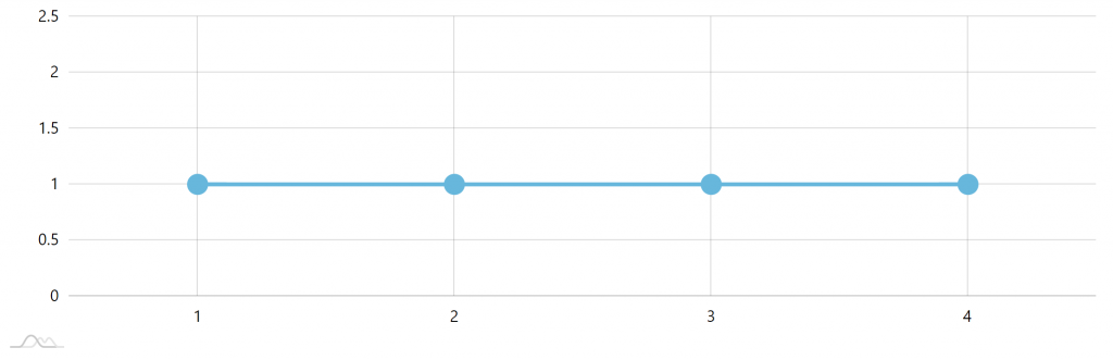
Here's how our data could look like:
[{
  "x": "1",
  "y": 1
}, {
  "x": "2",
  "y": 1
}, {
  "x": "3",
  "y": 1
}, {
  "x": "4",
  "y": 1
}]
The Xs are strings, because we're going to be using it as categories. The Ys are all same value, because we are building a straight line.
Series with bullets
The above data is enough to create a simple Line series with bullets.
let series = chart.series.push(new am4charts.LineSeries());
series.dataFields.categoryX = "x";
series.dataFields.valueY = "y";
series.strokeWidth = 4;

let bullet = series.bullets.push(new am4charts.CircleBullet());
bullet.circle.radius = 10;
var series = chart.series.push(new am4charts.LineSeries());
series.dataFields.categoryX = "x";
series.dataFields.valueY = "y";
series.strokeWidth = 4;

var bullet = series.bullets.push(new am4charts.CircleBullet());
bullet.circle.radius = 10;
{
  // ...
  "series": [{
    "type": "LineSeries",
    "dataFields": {
      "categoryX": "x",
      "valueY": "y"
    },
    "bullets": [{
      "type": "CircleBullet",
      "circle": {
        "radius": 10
      }
    }]
  }]
}
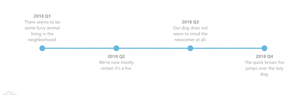
Here's what we get:
Cleaning up axes
The above chart contains too much noise: axes and their grid and labels.
Those do not have any specific meaning, so we're going to clean them up.
While we're at it, we may just as well fix Value axis (Y) scale, so that out time line is directly in the middle.
let xAxis = chart.xAxes.push(new am4charts.CategoryAxis());
xAxis.dataFields.category = "x";
xAxis.renderer.grid.template.disabled = true;
xAxis.renderer.labels.template.disabled = true;
xAxis.tooltip.disabled = true;

let yAxis = chart.yAxes.push(new am4charts.ValueAxis());
yAxis.min = 0;
yAxis.max = 2;
yAxis.strictMinMax = true;
yAxis.renderer.grid.template.disabled = true;
yAxis.renderer.labels.template.disabled = true;
yAxis.renderer.baseGrid.disabled = true;
yAxis.tooltip.disabled = true;
var xAxis = chart.xAxes.push(new am4charts.CategoryAxis());
xAxis.dataFields.category = "x";
xAxis.renderer.grid.template.disabled = true;
xAxis.renderer.labels.template.disabled = true;
xAxis.tooltip.disabled = true;

var yAxis = chart.yAxes.push(new am4charts.ValueAxis());
yAxis.min = 0;
yAxis.max = 2;
yAxis.strictMinMax = true;
yAxis.renderer.grid.template.disabled = true;
yAxis.renderer.labels.template.disabled = true;
yAxis.renderer.baseGrid.disabled = true;
yAxis.tooltip.disabled = true;
{
  // …
  "xAxes": [{
    "type": "CategoryAxis",
    "dataFields": {
      "category": "x"
    },
    "renderer": {
      "grid": {
        "disabled": true
      },
      "labels": {
        "disabled": true
      }
    },
    "tooltip": {
      "disabled": true
    }
  }],
  "yAxes": [{
    "type": "ValueAxis",
    "min": 0,
    "max": 2,
    "strictMinMax": true,
    "renderer": {
      "grid": {
        "disabled": true
      },
      "labels": {
        "disabled": true
      },
      "baseGrid": {
        "disabled": true
      }
    },
    "tooltip": {
      "disabled": true
    }
  }]
}
Let's see how our chart looks like:

Yup, looks much cleaner now.
MORE INFO For more information about what we did there with axes configuration please visit our "Axes" article.
Callouts
So far we had only line. Let's make it useful and add text callouts.
Updating data to include callout text
Let's add the text we want to be displayed on each bullet to data:
[{
  "x": "1",
  "y": 1,
  "text": "[bold]2018 Q1[/]\nThere seems to be some furry animal living in the neighborhood."
}, {
  "x": "2",
  "y": 1,
  "text": "[bold]2018 Q2[/]\nWe're now mostly certain it's a fox."
}, {
  "x": "3",
  "y": 1,
  "text": "[bold]2018 Q3[/]\nOur dog does not seem to mind the newcomer at all."
}, {
  "x": "4",
  "y": 1,
  "text": "[bold]2018 Q4[/]\nThe quick brown fox jumps over the lazy dog."
}]
Adding label bullet
To make that text display next to our regular bullets, we'll need to add another bullet to our series: LabelBullet.
let labelBullet = series.bullets.push(new am4charts.LabelBullet());
labelBullet.label.text = "{text}";
labelBullet.label.maxWidth = 150;
labelBullet.label.wrap = true;
labelBullet.label.truncate = false;
labelBullet.label.textAlign = "middle";
labelBullet.label.verticalCenter = "bottom";
labelBullet.label.paddingTop = 20;
labelBullet.label.paddingBottom = 20;
labelBullet.label.fill = am4core.color("#999");
var labelBullet = series.bullets.push(new am4charts.LabelBullet());
labelBullet.label.text = "{text}";
labelBullet.label.maxWidth = 150;
labelBullet.label.wrap = true;
labelBullet.label.truncate = false;
labelBullet.label.textAlign = "middle";
labelBullet.label.verticalCenter = "bottom";
labelBullet.label.paddingTop = 20;
labelBullet.label.paddingBottom = 20;
labelBullet.label.fill = am4core.color("#999");
{
  // ...
  "series": [{
    // ...
    "bullets": [{
      "type": "CircleBullet",
      // ...
    }, {
      "type": "LabelBullet",
      "label": {
        "text": "{text}",
        "maxWidth": 150,
        "wrap": true,
        "truncate": false,
        "textAlign": "middle",
        "verticalCenter": "bottom",
        "paddingTop": 20,
        "paddingBottom": 20,
        "fill": "#999"
      }
    }]
  }]
}

And here's a live version:
See the Pen Timeline by amCharts team (@amcharts) on CodePen.
Bells and whistles
Our timeline above is quite functional but pretty boring. Lets jazz it up a little.
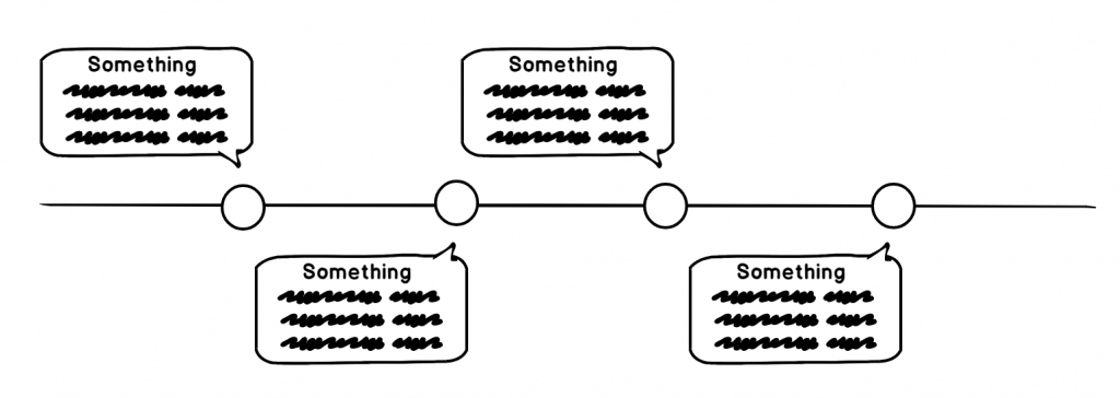
Alternating callout positions
To make the chart suitable for narrower spaces, and also liven it up a bit, let's place some callouts below the line.
We could do that automatically with adapters. However, we're going with another approach: specifying callout position directly in data. This gives us opportunity to micromanage positions of each callout, without reverting to some predefined algo.
Previously, we controlled label bullet position using its verticalCenter property. By setting it to "bottom" we ensured that labels go above the line.
Let's use "property fields" to tie that property's value to a field in data:
labelBullet.label.propertyFields.verticalCenter = "center";
labelBullet.label.propertyFields.verticalCenter = "center";
{
  // ...
  "series": [{
    // ...
    "bullets": [{
      "type": "CircleBullet",
      // ...
    }, {
      "type": "LabelBullet",
      "label": {
        // ...
        "propertyFields": {
          "verticalCenter": "center"
        }
      }
    }]
  }]
}
This basically means: "when setting the value of verticalCenter for the label, check "center" in data first".
Of course, we'll need to add those fields in our data as well:
[{
  // ...
  "center": "bottom"
}, {
  // ...
  "center": "top"
}, {
  // ...
  "center": "bottom"
}, {
  // ...
  "center": "top"
}]
How does that affect our chart?
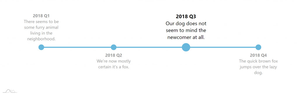
Hover effect
Now, let's make out chart a bit more interactive by making currently hovered item more prominent.
When user puts a cursor near some item, we're going to make bullet and text grow as well as change the color of the text.
For that we are going to use "states" and "chart cursor".
Adding chart cursor
First of all, let's add and configure a chart cursor.
chart.cursor = new am4charts.XYCursor();
chart.cursor.lineX.disabled = true;
chart.cursor.lineY.disabled = true;
chart.cursor = new am4charts.XYCursor();
chart.cursor.lineX.disabled = true;
chart.cursor.lineY.disabled = true;
{
  // ...
  "cursor": {
    "type": "XYCursor",
    "lineX": {
      "disabled": true
    },
    "lineY": {
      "disabled": true
    }
  }
}
We need the cursor for one particular reason: when we have a cursor it automatically triggers hover effect on all bullets in the category that cursor is currently over, without needing to hover directly over those bullets.
Since the above is sole reason of having a cursor, we are also disabling cursor lines so they do not appear on the chart.
Setting up hover states
As we already explained, moving cursor across the chart will automatically apply "hover" state to all nearby bullets.
All we need to do now is set up "hover" states for our bullets and properties we need overridden:
- For our circle bullets, we are going to increase
radiusof the circle. - For label bullets we will both change color to full black and also make it bigger by using
scaleproperty.
//...
bullet.setStateOnChildren = true;
bullet.states.create("hover");
bullet.circle.states.create("hover").properties.radius = 15;

// ...
labelBullet.setStateOnChildren = true;
labelBullet.states.create("hover").properties.scale = 1.2;
labelBullet.label.states.create("hover").properties.fill = am4core.color("#000");
{
  // ...
  "series": [{
    // ...
    "bullets": [{
      "type": "CircleBullet",
      // ...
      "setStateOnChildren": true,
      "circle": {
        // ...
        "states": {
          "hover": {
            "properties": {
              "radius": 15
            }
          }
        }
      }
    }, {
      "type": "LabelBullet",
      "setStateOnChildren": true,
      "states": {
        "hover": {
          "properties": {
            "scale": 1.2
          }
        }
      },
      "label": {
        // ...
        "states": {
          "hover": {
            "properties": {
              "fill": "#000"
            }
          }
        }
      }
    }]
  }]
}
IMPORTANT Note how we are using setStateOnChildren. Cursor sets hover state on the bullet, but it does not set it on bullet's child elements, like circle element of the CircleBullet. Setting setStateOnChildren = true ensures that state propagates to children and our state properties are set.
Sequenced animation
Let's add one final touch: make our Timeline/Line Series appear gradually - bullet by bullet.
For that we will need to both enable "animated" theme as well as "sequenced interpolation".
series.sequencedInterpolation = true;
series.sequencedInterpolation = true;
{
  // ...
  "series": [{
    // ...
    "sequencedInterpolation": true
  }]
}
Final chart
Let's plot all of the above into a single live chart:
See the Pen Timeline by amCharts team (@amcharts) on CodePen.
Vertical version
See the Pen amCharts 4: Vertical timeline by amCharts team (@amcharts) on CodePen.
Advanced example
We're just going to leave it here:
See the Pen amCharts 4: Advanced timeline by amCharts team (@amcharts) on CodePen.