Chart scrollbars come pre-configured with certain looks, in part influenced by used themes. This tutorial show how we can customize the looks of scrollbars.
Test subject
During the course of this tutorial we will be torturing a scrollbar of this chart:
See the Pen amCharts 4: Custmizing XYChartScrollbar by amCharts team (@amcharts) on CodePen.
Customizing grips
Let's start by customizing the grips.
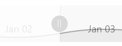
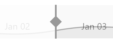
Default grip look 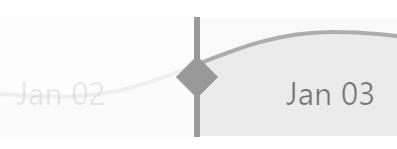
Target custom look
Accessing grip objects
Both of them are objects of type ResizeButton and are accessible via scrollbar's startGrip and endGrip properties.
In this section we will be accessing objects in those two properties a lot.
Since there are two of the grips, and we don't want to repeat code twice, we'll start off by creating a function that we can use to apply customizations to both buttons.
function customizeGrip(grip) {
  // This is empty for now
}

customizeGrip(chart.scrollbarX.startGrip);
customizeGrip(chart.scrollbarX.endGrip);
function customizeGrip(grip) {
  // This is empty for now
}

customizeGrip(chart.scrollbarX.startGrip);
customizeGrip(chart.scrollbarX.endGrip);
{
  // ...
  "scrollbarX": {
    // ...
    "startGrip": {
      // JSON config will have to have options repeated to avoid using functions
    },
    "endGrip": {
      // JSON config will have to have options repeated to avoid using functions
    }
  }
}
Removing default icon
We already decided we don't want a default icon that shows two parallel lines.
That icon is in the grip object's icon property. All we have to do to get rid of it is to disable it:
grip.icon.disabled = true;
grip.icon.disabled = true;
{
  // ...
  "scrollbarX": {
    // ...
    "startGrip": {
      "icon": {
        "disabled": true
      }
    },
    "endGrip": {
      "icon": {
        "disabled": true
      }
    }
  }
}
Since grip is a Button which is sized to fit it's contents, once we disable the icon, shrinks to a tiny cute dot.
Configuring grip background
Similarly to icon we already got rid of, grip's background has own property too. It's named very predictably background.
If we would like to change its fill color and/or opacity we could do just that:
grip.background.fill = am4core.color("#c00");
grip.background.fillOpacity = 0.5;
grip.background.fill = am4core.color("#c00");
grip.background.fillOpacity = 0.5;
{
  // ...
  "scrollbarX": {
    // ...
    "startGrip": {
      // ...
      "background": {
        "fill": "#c00",
        "fillOpacity": 0.5
      }
    },
    "endGrip": {
      // ...
      "background": {
        "fill": "#c00",
        "fillOpacity": 0.5
      }
    }
  }
}
However, since we want to completely get rid of the background, we'll do the same thing we did with the icon: disable it.
grip.background.disabled = true;
grip.background.disabled = true;
{
  // ...
  "scrollbarX": {
    // ...
    "startGrip": {
      // ...
      "background": {
        "disabled": true
      }
    },
    "endGrip": {
      // ...
      "background": {
        "disabled": true
      }
    }
  }
}
Adding elements to grip
OK, so we now have an invisible, or more like empty, grip, which is a perfect place to start building our own design from the ground up.
We want to have a double-arrow with a straight line running through it. Since there is none of such shape in amCharts 4 arsenal readily available, we'll need to build one out of basic shapes.
In fact, one shape: a rectangle.
One rectangle, rotated at 45 degrees will serve as bi-directional arrow. Another one, stretched thin, as a dividing line.
We'll also need to do some positioning of the two so they are right in the middle of our for now invisible grip button.
let img = grip.createChild(am4core.Rectangle);
img.width = 15;
img.height = 15;
img.fill = am4core.color("#999");
img.rotation = 45;
img.align = "center";
img.valign = "middle";

// Add vertical bar
let line = grip.createChild(am4core.Rectangle);
line.height = 60;
line.width = 3;
line.fill = am4core.color("#999");
line.align = "center";
line.valign = "middle";
var img = grip.createChild(am4core.Rectangle);
img.width = 15;
img.height = 15;
img.fill = am4core.color("#999");
img.rotation = 45;
img.align = "center";
img.valign = "middle";

// Add vertical bar
var line = grip.createChild(am4core.Rectangle);
line.height = 60;
line.width = 3;
line.fill = am4core.color("#999");
line.align = "center";
line.valign = "middle";
{
  // ...
  "scrollbarX": {
    // ...
    "startGrip": {
      // ...
      "children": [{
        "type": "Rectangle",
        "width": 15,
        "height": 15,
        "fill": "#999",
        "rotation": 45,
        "align": "center",
        "valign": "middle"
      },  {
        "type": "Rectangle",
        "width": 60,
        "height": 3,
        "fill": "#999",
        "align": "center",
        "valign": "middle"
      } ]
    },
    "endGrip": {
      // ...
      "children": [{
        "type": "Rectangle",
        "width": 15,
        "height": 15,
        "fill": "#999",
        "rotation": 45,
        "align": "center",
        "valign": "middle"
      },  {
        "type": "Rectangle",
        "width": 60,
        "height": 3,
        "fill": "#999",
        "align": "center",
        "valign": "middle"
      } ]
    }
  }
}
And, voilà.
And here's a complete working example:
See the Pen amCharts 4: Custmizing XYChartScrollbar by amCharts team (@amcharts) on CodePen.
Customizing fills
Now, let's customize scrollbar's fills.
Scrollbar's background
Like with backgrounds of most elements in amCharts 4, they are configured via Rectangle object in their background property.
Thus, if we want to change background color and opacity of the scrollbar, we change fill and fillOpacity properties of its background.
chart.scrollbarX.background.fill = am4core.color("#dc67ab");
chart.scrollbarX.background.fillOpacity = 0.2;
chart.scrollbarX.background.fill = am4core.color("#dc67ab");
chart.scrollbarX.background.fillOpacity = 0.2;
{
  // ...
  "scrollbarX": {
    // ...
    "background": {
      "fill": "#dc67ab",
      "fillOpacity": 0.2
    }
  }
}
See the Pen amCharts 4: Custmizing XYChartScrollbar by amCharts team (@amcharts) on CodePen.
Thumb element
A "thumb" element is what we call an area between two grips. It's called thumb because it's all draggable.
In regular Scrollbar it's gray by default. In an XYChartScrollbar is completely invisible.
We can access its object (which is another element of type Button) by scrollbar's thumb property.
Similarly to scrollbar's fill, we can also set fill/opacity of the thumb's background element.
chart.scrollbarX.thumb.background.fill = am4core.color("#67dcab");
chart.scrollbarX.thumb.background.fillOpacity = 0.2;
chart.scrollbarX.thumb.background.fill = am4core.color("#67dcab");
chart.scrollbarX.thumb.background.fillOpacity = 0.2;
{
  // ...
  "scrollbarX": {
    // ...
    "thumb": {
      "background": {
        "fill": "#dc67ab",
        "fillOpacity": 0.2
      }
    }
  }
}
See the Pen amCharts 4: Custmizing XYChartScrollbar by amCharts team (@amcharts) on CodePen.
Unselected area
This section is relevant to XYChartScrollbar only. Regular Scrollbar does not have any content in it so there's nothing to configure in the unselected area.
VERSION INFO The public property described in this chapter is available from version 4.6.1. If it does not work as expected, it probably means you have an earlier version.
XYChartScrollbar has a property unselectedOverlay which holds an object that acts a semi-transparent "curtain" producing dimming effect on everything in an unselected area - an area outside of the grips.
To control which color and what opacity the dimming occurs, use overlay's fill (default is theme's background color) and fillOpacity (default 0.8) properties:
chart.scrollbarX.unselectedOverlay.fill = am4core.color("#fff");
chart.scrollbarX.unselectedOverlay.fillOpacity = 0.9;
chart.scrollbarX.unselectedOverlay.fill = am4core.color("#fff");
chart.scrollbarX.unselectedOverlay.fillOpacity = 0.9;
{
  // ...
  "scrollbarX": {
    // ...
    "unselectedOverlay": {
      "fill": "#fff",
      "fillOpacity": 0.9
    }
  }
}
Customizing series
We now come to the last part comprising the scrollbar - series.
This section is not relevant for regular Scrollbar since, well, it does not display any series.
When you add a series to an XYChartScrollbar by pushing it into its series list, scrollbar makes an exact copy and places it into series list of its child element: scrollbarChart, which is a separate copy of XYChart.
We'll use those "clone series" to change how they look in the scrollbar.
Re-enabling colors
Besides making it an exact copy of the "original" series, scrollbar also applies a "Desaturare" filter on the whole plot area of the scrollbar chart, so that all series in it are stripped of all color and appear in a shade of gray.
If we want to bring back the color, we just need to remove the filters from the the plot container of the scrollbar chart.
chart.scrollbarX.scrollbarChart.plotContainer.filters.clear();
chart.scrollbarX.scrollbarChart.plotContainer.filters.clear();
{
  // ...
  "scrollbarX": {
    // ...
    // Well, this is somewhat awkwardly looking in JSON, but... oh well
    "callback": function() {
      this.scrollbarChart.plotContainer.filters.clear();
    }
  }
}
Configuring series
The series object we retrieve from scrollbar's scrollbarChart is a full-fledged series (just like scrollbarChart is a fill-fledged chart).
This means we can apply any properties we want to configure it's appearance.
Say, we want to lose the fill, and also make the line dotted.
let scrollSeries1 = chart.scrollbarX.scrollbarChart.series.getIndex(0);
scrollSeries1.filters.clear();
scrollSeries1.fillOpacity = 0;
scrollSeries1.strokeDasharray = "2,2";
var scrollSeries1 = chart.scrollbarX.scrollbarChart.series.getIndex(0);
scrollSeries1.filters.clear();
scrollSeries1.fillOpacity = 0;
scrollSeries1.strokeDasharray = "2,2";
{
  // ...
  "scrollbarX": {
    // ...
    // Well, this is somewhat awkwardly looking in JSON, but... oh well
    "callback": function() {
      var scrollSeries1 = this.scrollbarChart.series.getIndex(0);
      scrollSeries1.filters.clear();
      scrollSeries1.fillOpacity = 0;
      scrollSeries1.strokeDasharray = "2,2";
    }
  }
}
See the Pen amCharts 4: Custmizing XYChartScrollbar by amCharts team (@amcharts) on CodePen.
Customizing axis
As you already know, an XYChartScrollbar is essentially a full-fledged XYChart. This means that we can customize its axis as well.
It does not have a visible Y axis, but it mirrors whatever X axis the main chart has. We can configure it just like any other regular axis.
Retrieving axis object
To make changes, we'll need to first retrieve the axis object. The XYChart object is located in scrollbar's scrollbarChart property. And, since it's a chart, it will have the xAxes list.
All we need to do is to grab the first axis:
let scrollAxis = chart.scrollbarX.scrollbarChart.xAxes.getIndex(0);
var scrollAxis = chart.scrollbarX.scrollbarChart.xAxes.getIndex(0);
{
  // ...
  "scrollbarX": {
    // ...
    "scrollbarChart": {
      "xAxes": [{
        // ...
      }]
    }
  }
}
Disabling labels and grid
Now that we have axis object we can modify their elements like grid and labels, or disable them altogether:
let scrollAxis = chart.scrollbarX.scrollbarChart.xAxes.getIndex(0);
scrollAxis.renderer.labels.template.disabled = true;
scrollAxis.renderer.grid.template.disabled = true;
var scrollAxis = chart.scrollbarX.scrollbarChart.xAxes.getIndex(0);
scrollAxis.renderer.labels.template.disabled = true;
scrollAxis.renderer.grid.template.disabled = true;
{
  // ...
  "scrollbarX": {
    // ...
    "scrollbarChart": {
      "xAxes": [{
        "renderer": {
          "labels: {
            "disabled": true
          },
          "grid: {
            "disabled": true
          }
        }
      }]
    }
  }
}
Here's a live version of the chart with a "naked" scrollbar:
See the Pen amCharts 4: Disabling scrollbar labels and grid by amCharts team (@amcharts) on CodePen.
Disabling system tooltips
A scrollbar has also some selection information in its hidden attributes, which display as a system tooltip when hovered:
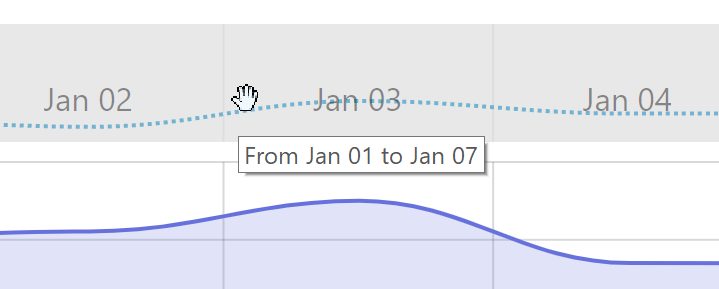
Various elements of scrollbar - thumb, grips, and scrollbar itself - all display some kind of system tooltip information.
Should we want to disable them, we can use showSystemTooltip property of respective elements:
chart.scrollbarX.showSystemTooltip = false;
chart.scrollbarX.thumb.showSystemTooltip = false;
chart.scrollbarX.startGrip.showSystemTooltip = false;
chart.scrollbarX.endGrip.showSystemTooltip = false;
chart.scrollbarX.showSystemTooltip = false;
chart.scrollbarX.thumb.showSystemTooltip = false;
chart.scrollbarX.startGrip.showSystemTooltip = false;
chart.scrollbarX.endGrip.showSystemTooltip = false;
{
  // ...
  "scrollbarX": {
    // ...
    "showSystemTooltip": false,
    "thumb": {
      // ...
      "showSystemTooltip": false
    },
    "startGrip": {
      // ...
      "showSystemTooltip": false
    },
    "endGrip": {
      // ...
      "showSystemTooltip": false
    }
  }
}
Setting height
By default, XYChartScrollbar will come at roughly 60 pixels in height (or 60 pixels in with if it's a vertical scrollbar).
The height is controlled using its minHeight property (or minWidth for vertical one, respectively).
So, to change the height of the scrollbar, all we need to do is to change its minHeight.
chart.scrollbarX.minHeight = 100;
chart.scrollbarX.minHeight = 100;
{
  // ...
  "scrollbarX": {
    // ...
    "minHeight": 100
  }
}
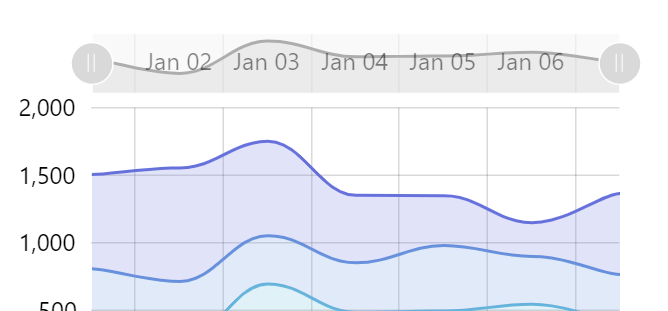
minHeight = 40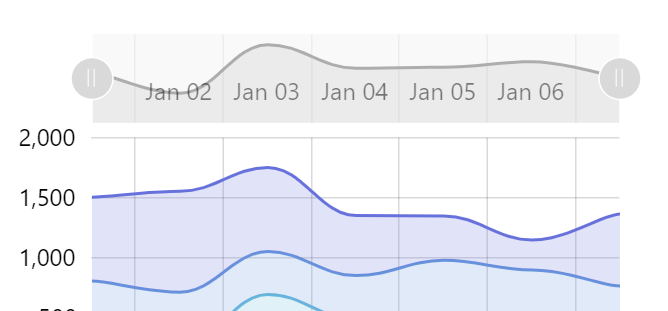
Default 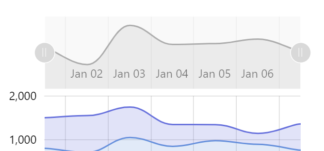
minHeight = 100
Customizing default colors
This section will explain a couple of different ways to change default coloring of the scrollbar elements, like grips and thumb.
Modifying controls directly
As we explained earlier, start and end grips of the scrollbar are accessible via startGrip and endGrip properties respectively.
Likewise, the thumb - mid section of the regular (non XY) scrollbar - is accessible via thumb property.
Grips are objects of type ResizeButton, whereas thumb is a Button.
To set the color of any button, we use its background property:
chart.scrollbarX.startGrip.background.fill = am4core.color("#CBA5A4");
chart.scrollbarX.endGrip.background.fill = am4core.color("#CBA5A4");
chart.scrollbarX.thumb.background.fill = am4core.color("#CBA5A4");
chart.scrollbarX.startGrip.background.fill = am4core.color("#CBA5A4");
chart.scrollbarX.endGrip.background.fill = am4core.color("#CBA5A4");
chart.scrollbarX.thumb.background.fill = am4core.color("#CBA5A4");
{
  // ...
  "scrollbarX": {
    // ...
    "startGrip": {
      "background": {
        "fill": "#CBA5A4"
      }
    },
    "endGrip": {
      "background": {
        "fill": "#CBA5A4"
      }
    },
    "thumb": {
      "background": {
        "fill": "#CBA5A4"
      }
    }
  }
}
To change the color of the vertical lines on those grips, we may use grip's icon:
chart.scrollbarX.startGrip.icon.stroke = am4core.color("#8A5658");
chart.scrollbarX.endGrip.icon.stroke = am4core.color("#8A5658");
chart.scrollbarX.startGrip.icon.stroke = am4core.color("#8A5658");
chart.scrollbarX.endGrip.icon.stroke = am4core.color("#8A5658");
{
  // ...
  "scrollbarX": {
    // ...
    "startGrip": {
      // ...
      "icon": {
        "stroke": "#8A5658"
      }
    },
    "endGrip": {
      // ...
      "icon": {
        "stroke": "#8A5658"
      }
    }
  }
}
Buttons (both grips and thumb are buttons) also change colors when they are hovered and pressed down on.
Those are applied via "states", which we'll need to modify as well, if we're not happy with the default colors that the theme we are using sets.
// Applied on hover
chart.scrollbarX.startGrip.background.states.getKey("hover").properties.fill = am4core.color("#BC8C8A");
chart.scrollbarX.endGrip.background.states.getKey("hover").properties.fill = am4core.color("#BC8C8A");
chart.scrollbarX.thumb.background.states.getKey("hover").properties.fill = am4core.color("#BC8C8A");

// Applied on mouse down
chart.scrollbarX.startGrip.background.states.getKey("down").properties.fill = am4core.color("#AD7371");
chart.scrollbarX.endGrip.background.states.getKey("down").properties.fill = am4core.color("#AD7371");
chart.scrollbarX.thumb.background.states.getKey("down").properties.fill = am4core.color("#AD7371");
{
  // ...
  "scrollbarX": {
    // ...
    "startGrip": {
      // ...
      "background": {
        "states": {
          "hover": {
            "properties": {
              "fill": "#BC8C8A"
            }
          }
        }
      }
    },
    "endGrip": {
      // ...
      "background": {
        // ...
        "states": {
          "hover": {
            "properties": {
              "fill": "#BC8C8A"
            }
          }
        }
      }
    },
    "thumb": {
      // ...
      "background": {
        // ...
        "states": {
          "hover": {
            "properties": {
              "fill": "#BC8C8A"
            }
          }
        }
      }
    }
  }
}
Here's a working example:
See the Pen Setting Scrollbar colors by amCharts team (@amcharts) on CodePen.
Applying coloring via theme
Using a custom-made theme is even easier, as all we need to do is to modify default interface colors, that are used for all buttons.
The whole process of creating custom themes for modifying interface colors is described here. Let's just put it to use to modify example above to achieve the same result using theme:
function am4themes_myTheme(target) {
  if (target instanceof am4core.InterfaceColorSet) {
    // Used for button fill
    target.setFor("secondaryButton", am4core.color("#CBA5A4"));
    target.setFor("secondaryButtonHover", am4core.color("#BC8C8A"));
    target.setFor("secondaryButtonDown", am4core.color("#AD7371"));

    // Used for grip lines
    target.setFor("alternativeText", am4core.color("#8A5658"));
  }
}

am4core.useTheme(am4themes_myTheme);
See the Pen Setting Scrollbar colors via custom theme by amCharts team (@amcharts) on CodePen.