100% Stacked Column Chart
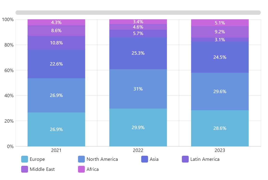
100% stacked column or bar chart is a good way to display some categories of a whole changing over time. For example, a company may use 100% stacked column chart to display what product lines contributed to its revenue by calendar quarter. The downside is that in such a chart it is quite difficult to visually compare the changes over time (except for the first item/series).
Key implementation details
You don’t need to perform percentage calculations in your code. You can pass your real values to amCharts and the chart will do the rest. For this purpose, we enable calculateTotals (more info here) on the value axis (the Y-axis in this case) and set its range to 0 to 100 (plus enforce it with strictMinMax to disable “smart” min/max features).
Then, in our series we set the valueYField to our real value, as usual. But after that we take advantage of the “Display fields” feature in amCharts. Display fields allow us to reference derivative calculated values instead of raw values from our data set. In this case we want to set our respective display field (valueYFieldShow) to display the percentage share of our real value. For this we set it to the valueYTotalPercent calculated field.
Related tutorials
- Calculated values on value axes
- Display fields – a way to show alternative values
Build this chart with AI
The prompt below can be used to build this chart with AI. For best coding results, use the most advanced AI models, like Claude Opus 4.6 and GPT-5.3-Codex. For more info and tips, check out amCharts AI docs.
100% stacked column chart where each column fills to 100%. 4 series, 6 categories. Y axis shows percentage 0-100%. Display percent labels on each column segment. Legend, tooltips showing percentage and value. Animated entrance. Generate realistic data for market share by quarter. Use amCharts 5 library.
Demo source