Animated Gauge
Gauge charts are most useful for displaying live data. This demo shows such a chart in action.
Key implementation details
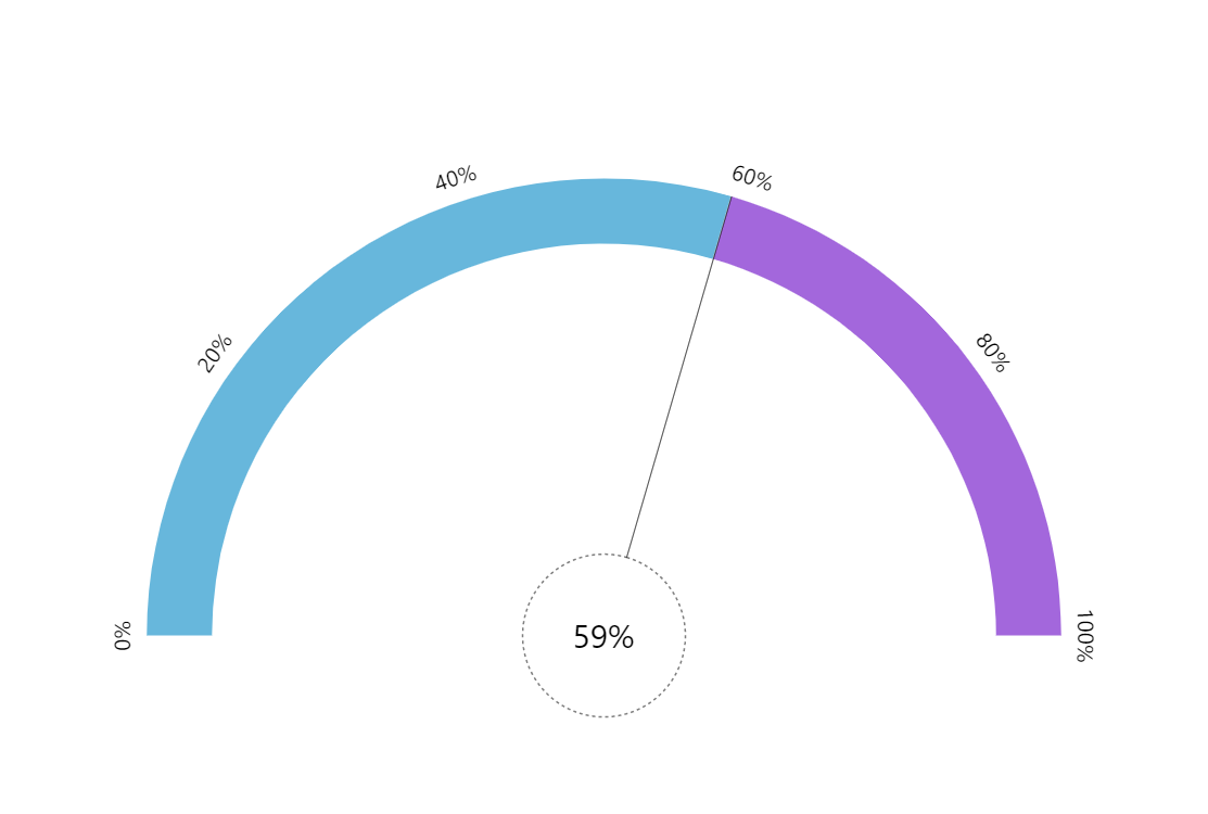
The colored bands on the circular axis are created using the axis range feature. The “clock hand” is configured to have a large “pin” in the center and a thin “hand”. Then we just animate all of these in unison when data changes.
Related tutorials
Build this chart with AI
The prompt below can be used to build this chart with AI. For best coding results, use the most advanced AI models, like Claude Opus 4.6 and GPT-5.3-Codex. For more info and tips, check out amCharts AI docs.
Create a semicircular animated gauge chart ranging from 0 to 100 percent. Display two colored bands along the circular axis: one spanning 0-50% and another spanning 50-100%. Add a needle with a large central pin, a thin semi-transparent hand extending to the gauge perimeter, and a dashed outline style. Include a centered label that dynamically displays the current percentage value and rotates in sync with the hand. Auto-update with random values between 0 and 100 every 2 seconds, animating the hand, pin, and label all in unison with smooth animation. Use amCharts 5 library.
Demo source