Radar Chart Visualizing Yearly Activities
Radar charts are great for creating stunning multi-level visualizations in a fairly compact space. This demo shows a year’s worth of daily bicycle ride data together with weekly totals, and a grand total in the same colorful interactive radial diagram.
Key implementation details
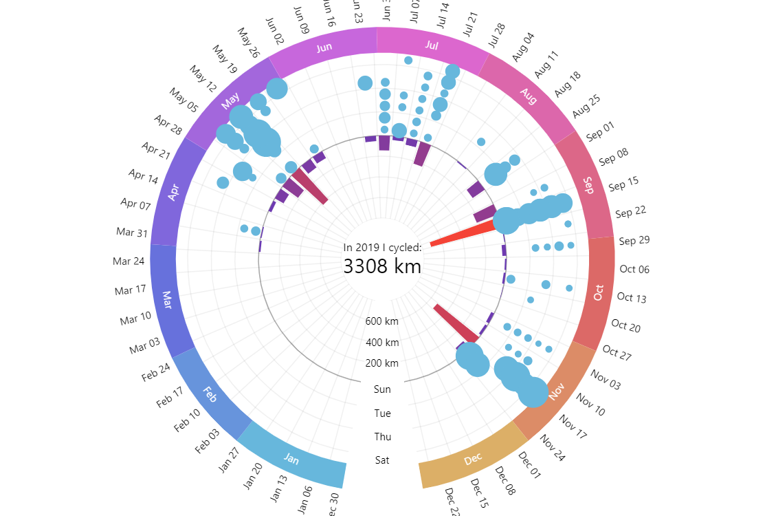
We create a date axis for the whole year as our X axis (circular outer axis), then add a couple of Y axes: the inner one for weekly distances and the outer one for weekdays. Weekly distances are represented by column series bound to the the inner distances axis. Finally, we add line series where bullet sizes represent distances cycled on specific weekdays and “attach” it to the weekday Y-axis.
Related tutorials
Build this chart with AI
The prompt below can be used to build this chart with AI. For best coding results, use the most advanced AI models, like Claude Opus 4.6 and GPT-5.3-Codex. For more info and tips, check out amCharts AI docs.
Create a multi-layer radar chart visualizing a full year (2019) of daily bicycle ride data. Use a three-axis system: a circular date axis showing 52 weeks with month labels around the perimeter, an inner radial axis for weekly cumulative distance in kilometers, and an outer categorical axis for weekdays. Display weekly distance totals as radial column bars, and individual daily rides as a bubble series positioned by weekday and week, with color and size varying based on ride distance. Add a radar cursor with horizontal zoom -- clicking month sections zooms into that period, clicking again resets. Place a central label showing the aggregate statistic ('In 2019 I cycled: [total] km'), recalculated from the ride records. Show tooltips for both weekly totals and individual ride names/distances. Use amCharts 5 library.
Demo source