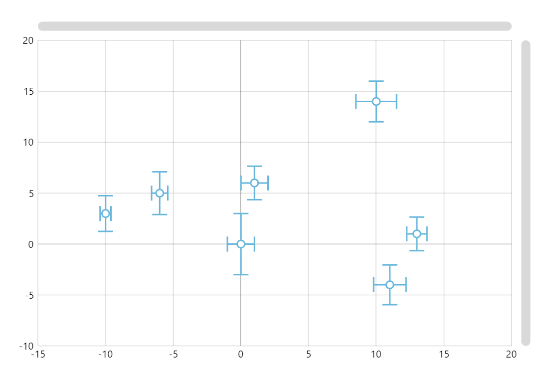
XY Error Chart
Error Charts let us display variability of data in a graphical format. This chart displays the ranges of how far the exact (error-free) value might be from the center point displayed.
Key implementation details
We use the bullets feature to display our data points. In this case we draw a custom bullet using the Graphics element of amCharts and its SVG-like drawing commands.
Related tutorials
Build this chart with AI
The prompt below can be used to build this chart with AI. For best coding results, use the most advanced AI models, like Claude Opus 4.6 and GPT-5.3-Codex. For more info and tips, check out amCharts AI docs.
Create an XY scatter plot with error bars showing measurement uncertainty. Display seven data points, each with x and y coordinates and horizontal and vertical error ranges. Render each point as a circle marker with error bars extending in both directions, including small perpendicular caps at the endpoints. Enable panning on both axes, mouse wheel zoom, and pinch zoom. Add a crosshair cursor snapping to data and tooltips showing x, y, and both error values. Include horizontal and vertical scrollbars. Use amCharts 5 library.
Demo source