Animated Sankey Diagram
Besides being visually stunning, animations in data visualizations can help direct viewer’s attention and communicate the key information.
Key implementation details
To achieve the effect in this demo we use labels in bullets on the series items. Bullets have a locationX property and we animate it from 0 to 1 (start to finish of the item). We also adjust the opacity while animating to create a fade-in-fade-out effect.
Related tutorials
Build this chart with AI
The prompt below can be used to build this chart with AI. For best coding results, use the most advanced AI models, like Claude Opus 4.6 and GPT-5.3-Codex. For more info and tips, check out amCharts AI docs.
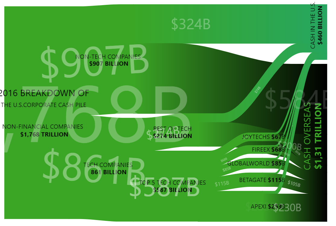
Create an animated Sankey diagram illustrating 2016 U.S. corporate cash distribution. Flow starts from $1.768 trillion total, splitting into non-tech ($907B) and tech ($861B), with tech breaking down into individual companies and all flowing to 'Cash in U.S.' or 'Cash Overseas'. Style nodes with green color on a black background with transparent node rectangles. Disable node click interactions. Add continuously animated moving dots along the flow links that travel from source to destination with fade-in and fade-out effects, looping infinitely. Use rotated text labels for destination nodes. Links should respond to hover with increased visibility. The chart should be 600px tall. Use amCharts 5 library.
Demo source