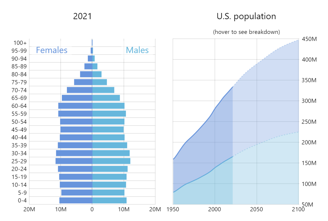
Historical Population Pyramid
A population pyramid, also called an “age-sex-pyramid” or “mirror bar chart”, is a graphical illustration that shows the distribution of various age groups in a population.
By combining and linking the pyramid with a stacked area chart we are able to create a compact and interactive visualization covering a lot of historical date.
Related tutorials
Build this chart with AI
The prompt below can be used to build this chart with AI. For best coding results, use the most advanced AI models, like Claude Opus 4.6 and GPT-5.3-Codex. For more info and tips, check out amCharts AI docs.
Create two linked charts side by side: a population pyramid on the left and a stacked area chart on the right. The pyramid shows male and female populations by age group with male bars extending left and female bars extending right. Gender labels have semi-transparent backgrounds. The area chart shows total male and female populations over decades with a date axis. Both charts have interactive crosshair cursors. Hovering over the timeline chart updates the pyramid to display the age distribution for that specific year, with smooth animated transitions. Include a subtitle hint '(hover to see breakdown)'. Load data from CSV sources. Use amCharts 5 library.
Demo source