Vertically Stacked Axes Chart
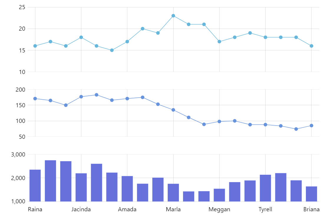
The chart above is a regular, single XY chart although it might look like a multi-panel chart with two value axes. We have a similar chart here. The only real difference is that instead of arranging Y axes side by side we stack them one above another. So the result is quite the same as a multiple-panel chart with shared x-axis.
For more gritty details about stacked, examples, and code visit this tutorial.
Related tutorials
Build this chart with AI
The prompt below can be used to build this chart with AI. For best coding results, use the most advanced AI models, like Claude Opus 4.6 and GPT-5.3-Codex. For more info and tips, check out amCharts AI docs.
Create a single chart that visually resembles multiple vertically stacked panels by using three separate value axes sharing one category axis. Generate random data for approximately 19 items with three values at different scales (around 20, 200, and 2000). Render two line series with circular bullet points and one column series, each bound to its own axis. Add spacing between the axes. Add an interactive crosshair cursor where the axis label animates vertically to follow whichever panel the cursor hovers over. Enable panning, pinch-zoom, and tooltips for each series. Animate on load. Use amCharts 5 library.
Demo source