Introducing Map Sankey Series for amCharts 5 Maps
We just shipped something pretty cool — MapSankeySeries, a new way to visualize flows and connections directly on a map.
What is it?
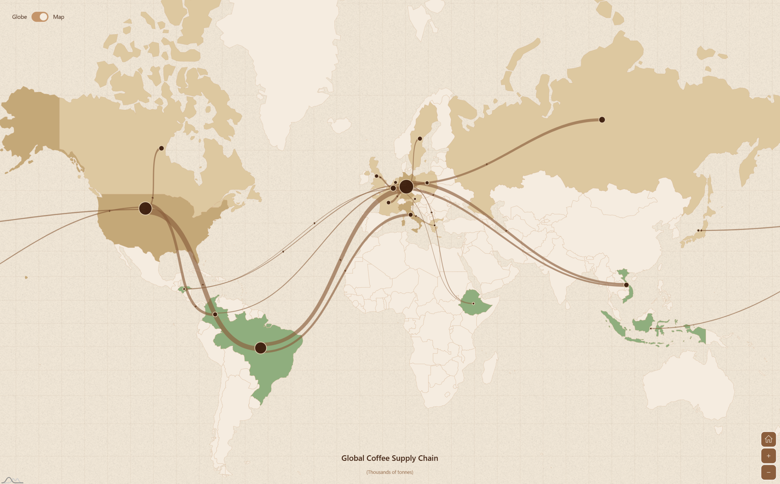
It’s a Sankey diagram, but on a map. Draw variable-width curved bands between any two geographic points — countries, cities, coordinates, whatever — where the band thickness reflects a numeric value. Think trade flows, migration data, supply chains, flight routes.
What can it do?
- Flow bands that follow the map projection — they pan, zoom, and rotate correctly, including on globes
- Multi-level flows — a node can be both a destination and a source, with bands stacking cleanly at intermediate hubs
- Flexible endpoints — use country IDs, lat/lon coordinates, or mix both
- Waypoints — route flows around land masses or through specific corridors
- Animated bullets — send particles along the paths to show direction and movement
- Node shapes — circle or bar at each endpoint, with full styling control
- Link color modes — color bands solid, or inherit color from their source or target node
- Works with any projection — Mercator, orthographic globe, Albers, you name it
Part of amCharts 5: Maps
MapSankeySeries is included in amCharts 5: Maps — no extra license needed. If you already have Maps, you’ve got this.