DataViz Tip #11: Augment Your Data for Better Visualizations
The data you have is straight to the point most of the times. When you have revenue numbers it’s usually just that. If you want to present the data as revenue-per-employee you have to transform your data to serve your vision. It’s all good while you have all the data that you need. But what if you don’t?
Don’t limit yourself with the data from a single data source. The web is full of data. Starting from the obvious sources like Wikipedia, to data exposed by various government and other organizations, and ending with commercial data marketplaces. Use these sources to improve the quality and impact of your charts.
Using Excel to Augment Your Data
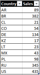
Suppose you have a data table with sales numbers by country like this:
You can take this data and create a chart based on it right away. This is what you will get:
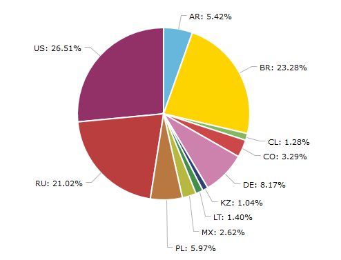
While the chart is factually correct, it is not very user-friendly. How can we improve it? Obviously, with this amount of data you can just replace country codes with names manually and be done with it. But what if you had data for every country and territory in the world with multiple rows for each country? External data to the rescue!
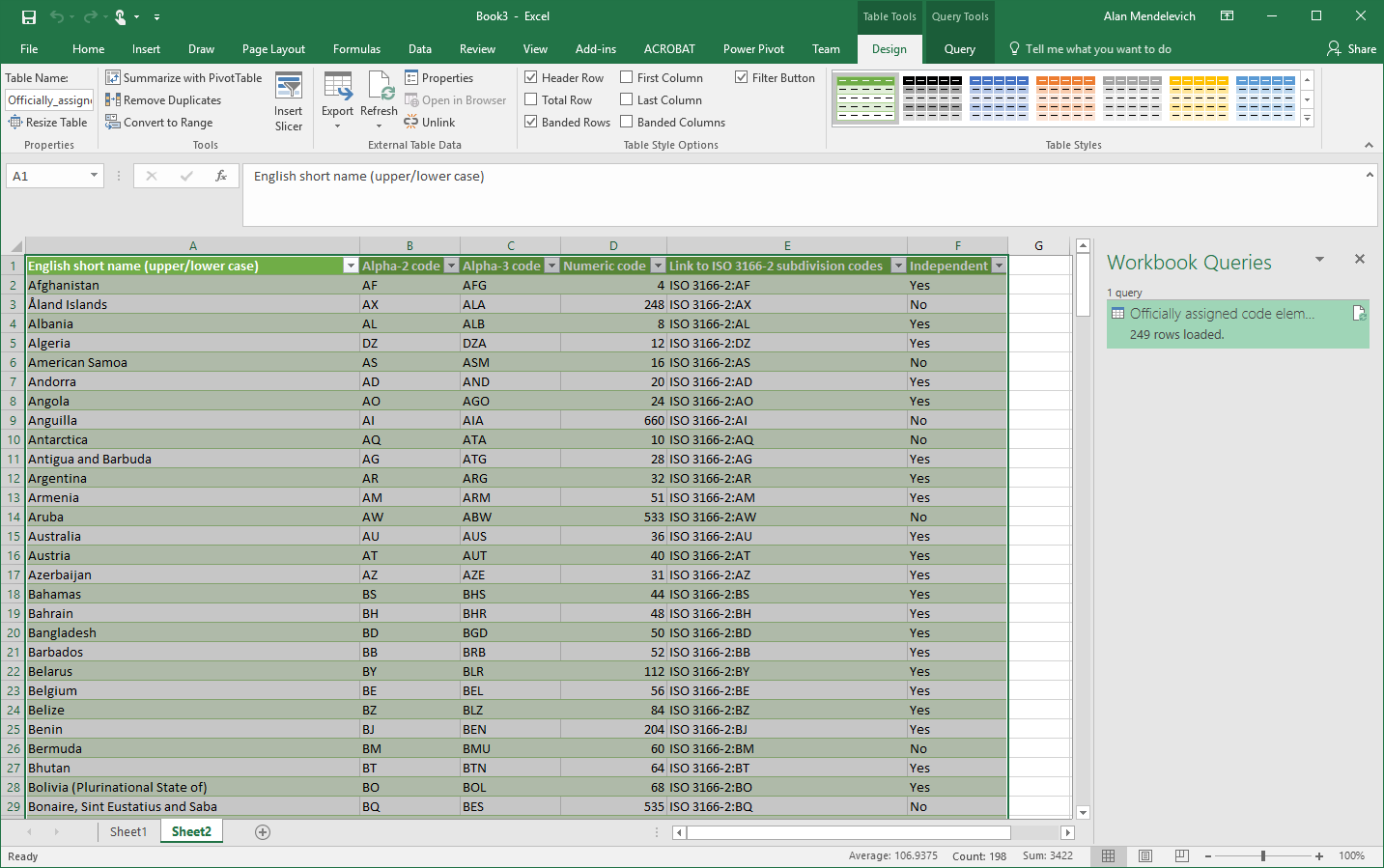
Wikipedia has a page for ISO 3166-1 standard and that page has a table titled “Officially assigned code elements.” We will use this table to augment our data with the help of Microsoft Excel.
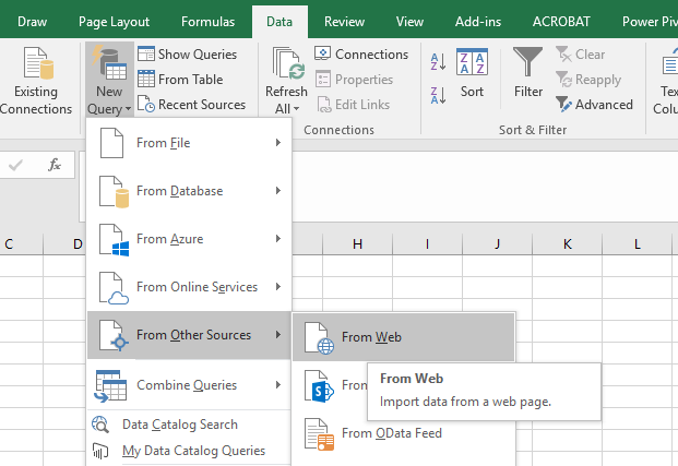
Open Excel, navigate to Data tab and click on New Query -> From Other Sources -> From Web
Paste the URL to the Wikipedia’s ISO 3166-1 page https://en.wikipedia.org/wiki/ISO_3166-1 and click OK. Excel will parse all the data tables it finds on the page and present you with this dialog:
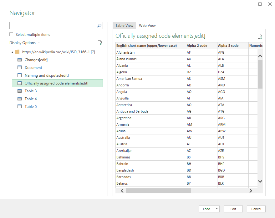
Select “Officially assigned code elements” table and press Load. The data from the page will be loaded into Excel:
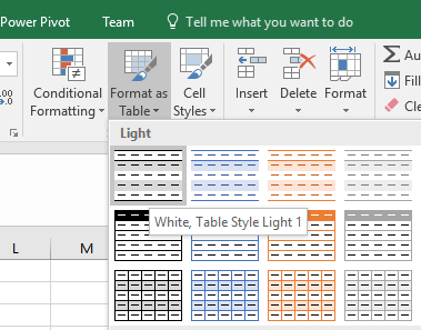
Now format your source as table by selecting it and clicking the “Format as Table” button:
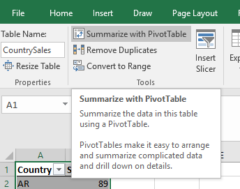
Name the table for clarity (I will use CountrySales name) and click the “Summarize with Pivot Table” button:
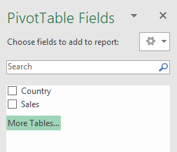
Create the Pivot Table by accepting the defaults in the following dialog. Then you will be offered to create a Pivot Table based on your source data, but that’s not what we want. What we want is to combine our source data with country data from Wikipedia. So we’ll click on the “More tables”:
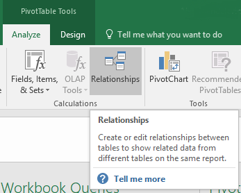
Click “Yes” when offered to create a new Pivot Table. Now we need to define relationships between our tables. Click on the “Relationships” button:
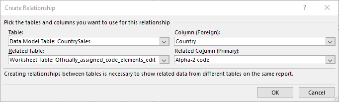
Then define a new relationship between our tables like this:
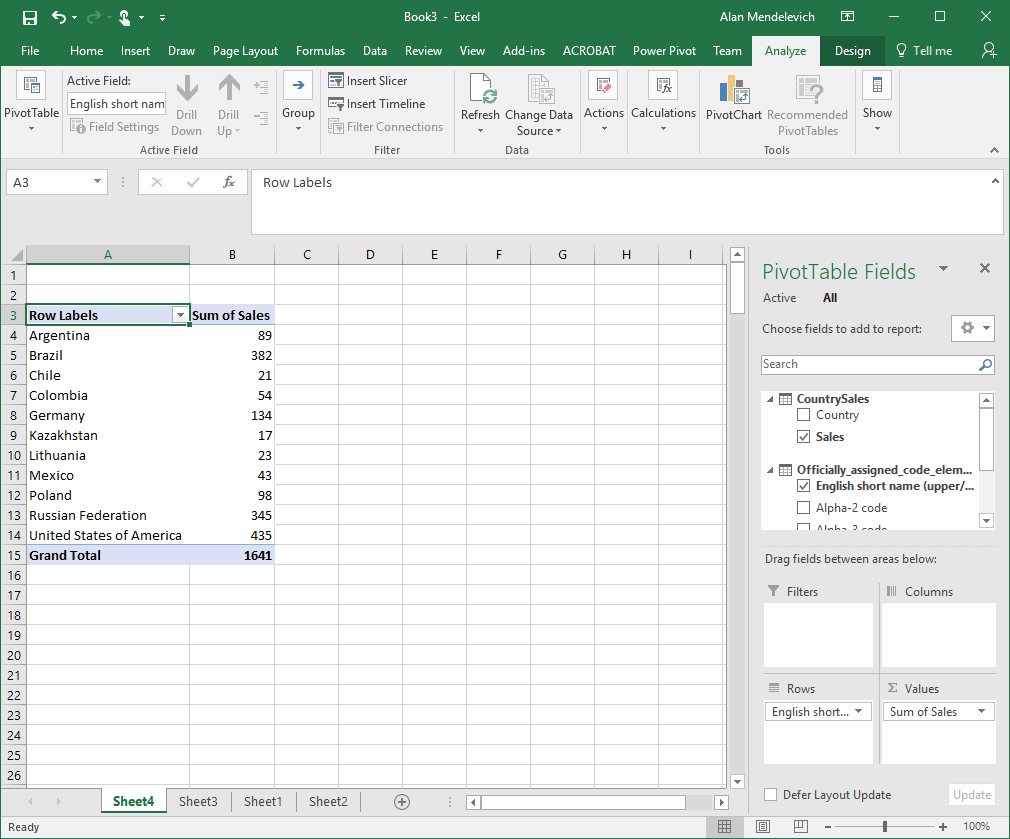
And finally we can select “English short name” field from the Wikipedia data as our rows field and “Sales” from our source data as values field to get the dataset we need:
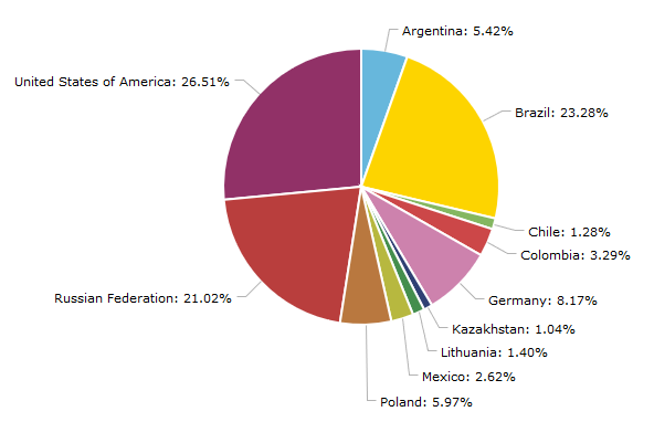
This lets us create a chart that is informative to our end-users and provides data in a form they can easily consume and internalize:
We are giving away a great data visualization book each month! Subscribe to our newsletter to get monthly tips like the one above and you’ll be automatically entered in the sweepstakes to win an awesome book.