DataViz Tip #13: Switch To Horizontal Bar Chart When Labels Don’t Fit
A column chart is classic – it’s understood by everyone, easy to comprehend and compare values. However, when you have more than a few columns and not that much space its readability breaks down a bit:
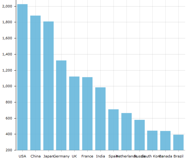
There are several ways to resolve this: you can show every other label and force users to interact with the chart to see what column represents, or you can show labels at an angle and make them tilt their heads to read the information.
You can easily accomplish both with amCharts. For example, to display labels at a 45-degree angle set autoRotateAngle and autoRotateCount on the category axis like this:
"categoryAxis": {
  "autoRotateAngle": 45,
  "autoRotateCount": 5
}
And you will get this:
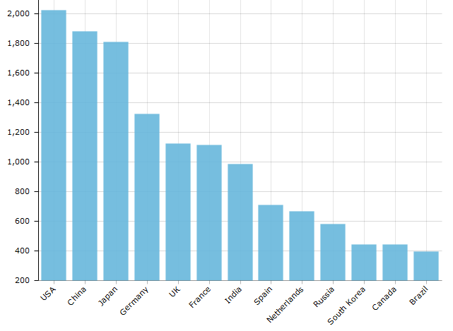
Much better! Still, I wouldn’t call tilting my head to the side the best possible user experience.
A simple and much more readable solution is to just turn the whole chart on the side and make it a horizontal bar chart:
See the Pen DataVizTip13: rotate bar chart by amCharts (@amcharts) on CodePen.
This is even easier to do with amCharts than rotating the labels. Just set "rotate": true on the chart and you are done.
We are giving away a great data visualization book each month! Subscribe to our newsletter to get monthly tips like the one above and you’ll be automatically entered in the sweepstakes to win an awesome book.