DataViz Tip #2: Remember the Color-Blind
Unfortunately, accessibility is often an afterthought in many projects. It shouldn’t be this way, and we can all contribute. Today we will talk about one aspect of it – color blindness.
While ignoring color blind audiences could be just an annoyance for them when talking about general graphic elements, it presents a much deeper issue with data visualizations. The goal of data visualization is to show and communicate information in a clear and efficient way, and it all breaks down when a notable chunk of your audience can’t see it clearly.
Red–green color blindness affects up to 8% of males and 0.5% of females of Northern European descent.
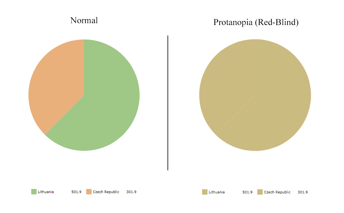
In the above image on the left, you can see a simple and perfectly legible pie chart as seen by someone with normal vision. On the right is what someone with red-blindness (protanopia) sees. As you realize, this chart is utterly worthless and confusing for such a person.
Luckily, we have tools at our disposal to test legibility of our data visualizations as seen by various color-blind people and correct the issues.
- Coblis helps people with normal vision see their creations through the simulated eyes of color-blind people. You should use it to test color palettes of your current and future visualizations.
- ColorBrewer offers color advice for best legibility and has an option to show color-blind safe palettes only.
- Colorblind Web Page Filter by Toptal allows viewing complete web pages via various filters.
Here are some additional tips to improve your results:
- Outline chart elements (bars, slices, etc.) to help everyone see the boundaries of these parts even if they are hardly distinguishable by color;
- Use data labels whenever possible to convey the data in textual form in addition to color and shape;
- Use interactivity (tooltips, contrasting outlines, distinct colors) to increase understanding of the data while exploring the chart.
Colors in amCharts
At amCharts we take accessibility very seriously. Our bundled themes, while not explicitly designed for color-blind, provide very legible results in most circumstances. Additionally, we offer a “patterns” theme that uses patterns instead of colors. To maximize clarity for every person, we recommend implementing a “theme switcher” in a similar fashion as we do on our demo page. Refer to this knowledge base article on working with themes.
Having said that, we pride ourselves on being the most customizable charting library out there, and you can express your vision by changing every color of every chart element (check out our class reference for available options). Just remember to follow the tips above and check your final product with color-blindness simulator before publishing.
Subscribe to our monthly newsletter and get more data visualization tips.
