DataViz Tip #3: Start Your Column/Bar Charts at Zero
Consider the following chart which represents monthly visits to a fictional website.
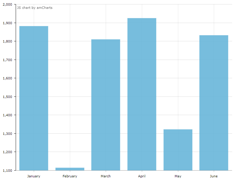
Based on your first quick impression, how many more visits did the site get in April compared to February? I’d say about 50 times more. Now, look at the values on the axis. As you can see the correct answer is less than 2x. So, the person looking at this chart is tricked by the factor of about 25x. Unless your goal was to mislead the viewers, this is not a good thing.
We use bar/column charts to visualize discrete quantities. Setting the baseline at zero gives us the most truthful representation of the data and helps viewers see the picture as is.
In amCharts you create a column chart with a “serial” chart type. It supports other serial charts such as line, area, stacked columns, etc. And it calculates the values on the value axis automatically and doesn’t default to zero baseline because of the variety of supported chart types.
To set the baseline to 0, you need to set a minimum property on the value axis like this:
"valueAxes": [{
    "minimum": 0
}]
This way you get a zero-based column chart, as it should be:
See the Pen Zero Baseline in Column chart by amCharts (@amcharts) on CodePen.
But what if I want to emphasize the difference? Absolute values just look too close.
Consider using a different chart type – a line chart would be a good candidate. It is probably still better to retain zero baseline in the line chart, but it is less jarring if you don’t, and the nature of connected lines gives a better sense of the direction.
To change chart type from column to line, just change the “type” property to “line” in the graph’s settings:
"graphs": [{
  "type": "line",
  …
}]
Better yet, instead of absolute values use relative growth compared to some base value, say, average monthly visits last year.
Suppose the monthly average last year was 1,200 visits. By recalculating the values to growth percentages, we will get a chart like this.
See the Pen Zero Baseline alternative by amCharts (@amcharts) on CodePen.
Subscribe to our monthly newsletter and get more data visualization tips.