DataViz Tip #22: Let Simplest Visualizations Lead Your Thought Process
When you get your raw data there’s usually a very straightforward way to visualize it “as is.” Instead of looking at the raw data trying to figure out interesting angles just make the simplest chart (from the data perspective) and let what you see guide your further efforts.
Every month I create reports about the state of the Windows 10 operating system in the wild. Once every few months I extract data about the percentages of PCs on the latest update by country. By just throwing this data into amCharts JavaScript Maps I get this nice result:
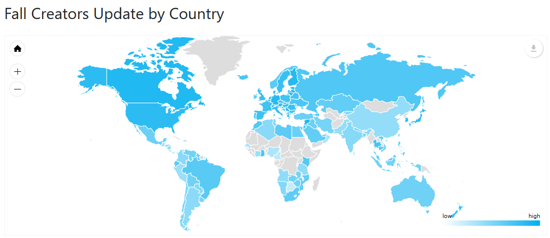
After looking at this map I had a gut feeling that there’s maybe some correlation between how wealthy the country is and the velocity with which its residents update Windows on their PCs. So, I combined this data with GDP data from International Monetary Fund and got this:
See the Pen Win10-FCU-GDPPPC-201802 by amCharts (@amcharts) on CodePen.
From this visualization I can spot that there probably is a correlation but it’s not very well pronounced. At least visualized like this.
But it gave me another idea. What if we look at the median GDP of the countries where the latest update penetration is below and above global average?
See the Pen Win10-FCU-GDPPPC-median-201802 by amCharts (@amcharts) on CodePen.
This looks like a more striking illustration of my thesis.
You can see how by just visualizing my initial dataset I was able to get ideas for possible interesting angles in it.
We are giving away a great data visualization book each month! Subscribe to our newsletter to get monthly tips like the one above and you’ll be automatically entered in the sweepstakes to win an awesome book.