DataViz Tip #21: Explanatory vs. Exploratory Charts
Sometimes you create charts to tell some specific story or drive a point home. Like in this chart of the stock market performance during 2016 US Presidential election night taken from this CNN article:

Other times you just want to give your viewers a great tool to explore the data and make their own conclusions. This Bitcoin price chart from CryptoCompare does just that:
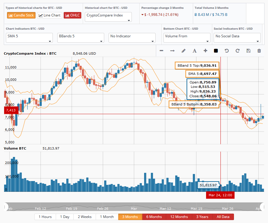
It’s interactive and viewers can explore the aspects of the data they are interested in and potentially find some unique insights.
Most of the times you have (or should have) some agenda in mind as of what you are trying to achieve with your data visualization – back your point of view or just give viewers the facts and a great tool to let them work towards their own vision. This is especially true in print or static digital visualizations. But with interactive tools like amCharts, there’s an opportunity to do both – you can call out specific events on an interactive chart, yet let the audience explore the data further.
We are giving away a great data visualization book each month! Subscribe to our newsletter to get monthly tips like the one above and you’ll be automatically entered in the sweepstakes to win an awesome book.