DataViz Tip #4: What Would Viewers Tweet About Your Chart?
An excellent way to start thinking about your visualization is to ask yourself “what would I want my viewers to tweet about this chart?”
Consider this chart of visits to a fictional website:
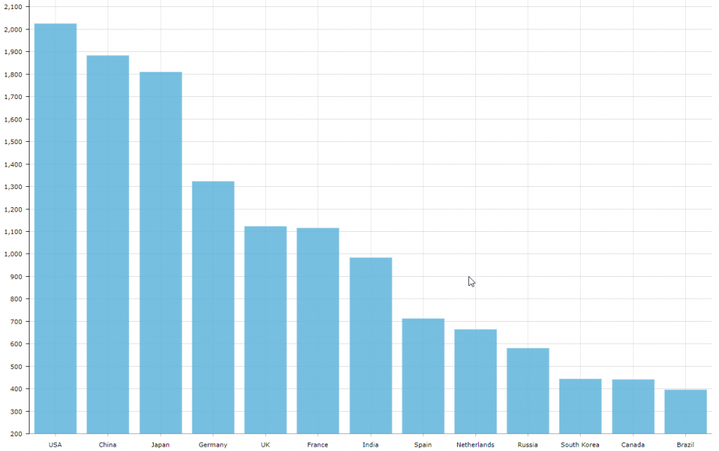
What would someone tweet after looking at this chart? Maybe something like “Most visits to the website come from the USA, followed by China and Japan.”
Now consider this visualization of the same data with one minor change:
See the Pen Viewers focus by amCharts (@amcharts) on CodePen.
First of all viewers would be interested in exploring why the bar for Japan is red. After hovering over it they’ll see the message that Japan has jumped 2 places since last year. What would they tweet now? Something like “Japan moves from 5th to 3rd place in most active countries on our website.”
But what if you included more details in that balloon? Like a growth percentage. Or a second graph showing previous year’s numbers? The tweet may look something like “The website got 2x more visitors from Japan this year compared to the previous one.”
As you can see, very minor changes in data representation can affect the narrative in viewers head quite dramatically. Thinking about your charts from this perspective is a powerful way to inform your data visualization design choices.
We are giving away a great data visualization book each month! Subscribe to our newsletter to get monthly tips like the one above and you’ll be automatically entered in the sweepstakes to win an awesome book.