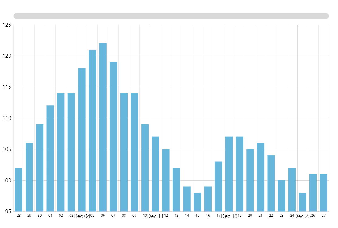
Simple Column Chart
Column Chart (also known as vertical bar chart) is one of the most common and, arguably, the easiest to read chart type when it comes to visualizing category-based values. Rectangular bars are placed along the category axis with bar length representing the value for a specific category.
In this demo, we start by creating our Root element. This is, well, the root object of every amCharts 5 visualization. We apply an Animated theme to it. Then we create our Column Chart which in amCharts 5 is represented by the XYChart class (along with every other two-dimensional chart). Next, we add a Cursor (that vertical line you see when hovering the chart). We ensure that it’s just a vertical line by hiding the horizontal one.
Next, we add the axes. The horizontal axis shows dates, so we add a DateAxis. And the vertical one represents a numeric value, hence ValueAxis.
The centerpiece of every XY Chart is its series (the actual “graph” if you will). We add a ColumnSeries to the chart’s series collection, configure its axes, specify data fields to represent on each axis, and format the tooltip text.
Finally, we add a horizontal Scrollbar for precise zooming and panning.
All that’s left is to assign our data.
As a final touch, we apply some lite animation to make everything look nicer.
Related tutorials
Build this chart with AI
The prompt below can be used to build this chart with AI. For best coding results, use the most advanced AI models, like Claude Opus 4.6 and GPT-5.3-Codex. For more info and tips, check out amCharts AI docs.
Column chart with date axis on X and value axis on Y. Show minor grid lines on the date axis. Generate ~20 data items with random values. Add a horizontal scrollbar below the chart. Tooltips on hover, animated entrance. Use amCharts 5 library.
Demo source