DataViz Tip #17: Opt For Low Detail Map Charts
Occasionally, I use Microsoft’s Power BI to analyze various business data. While I love the tool in general, the map chart part of it frustrates me, to say the least. The problem is that it is using Bing maps as the basis for the map charts which results in charts like this:
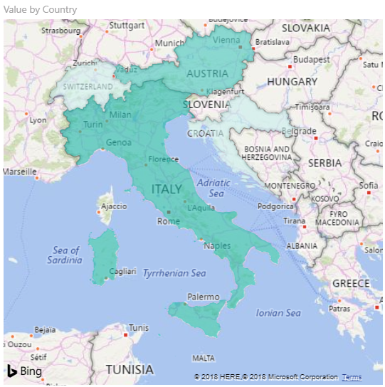
Not only does this drain resources drawing all these roads, forests and other details to the point even quite powerful PCs can hardly handle, but, more importantly, it doesn’t add any valuable information to a chart that was supposed to highlight differences in some metrics between several countries or areas. Moreover, all this detail distracts from the message of the chart and makes it difficult for viewers to get it.
A much better approach is to show as little geographic detail as possible and focus on the information that needs to be conveyed by the chart. This is the basis of amCharts JavaScript Maps:
See the Pen dataviz-017-low-detail-map-charts by amCharts (@amcharts) on CodePen.
Low resolution maps enable great performance and focus on visualazing the data at hand. But if that’s not detailed enough for your taste you can switch to a higher resolution map by setting "map": "worldHigh":
See the Pen dataviz-017-high-detail-map-charts by amCharts (@amcharts) on CodePen.
Still a much more performant no distraction chart, than using a “real” geographic map.