DataViz Tip #18: Combine Smaller Pie Chart Slices into “Other”
Pie charts have a bad reputation as slices of a circle are harder for the human brain to compare to each other than, say, bars in a bar chart. Yet, they are a great and widely recognized chart type to show values as part of a whole. Where they really break down, though, is when the number of slices is higher than 5 or so, and the majority of the slices are tiny percentwise.
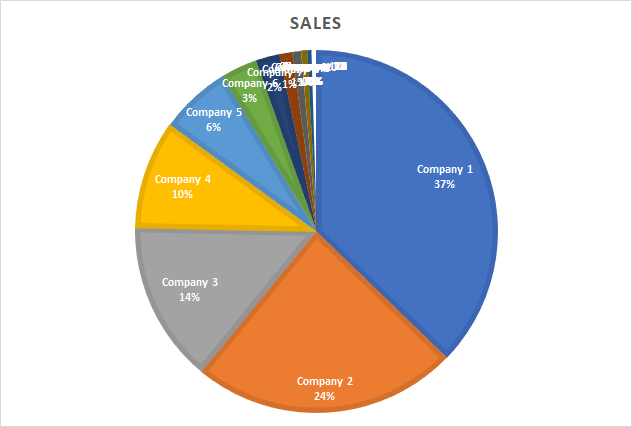
While this is quite terrible, it’s not exactly a reason to abandon the pie chart altogether. What you want to do here is combine smaller slices into one slice called Other (or something else that makes sense in your context).
In tools like Excel you will have to change the chart’s data to achieve that, but amCharts have a handy setting named groupPercent that does this automatically. In the below case we set it to 5 and get this result:
See the Pen DataViz Tip 018 – Other Slice by amCharts (@amcharts) on CodePen.
Much, much better!
We are giving away a great data visualization book each month! Subscribe to our newsletter to get monthly tips like the one above and you’ll be automatically entered in the sweepstakes to win an awesome book.