Minor Grid – Enhancing Readability of an XY Chart
How chart grids work?
A chart grid is a visual framework of intersecting horizontal and vertical lines on a graph or chart, providing a structured reference for interpreting data points and trends.
Normally, a typical XY chart would have a horizontal axis and a vertical axis, with grid line marking its categories, dates, or value increments.
This might create an issue for data-heavy charts, as their grid might become cluttered with a lot of lines and labels.
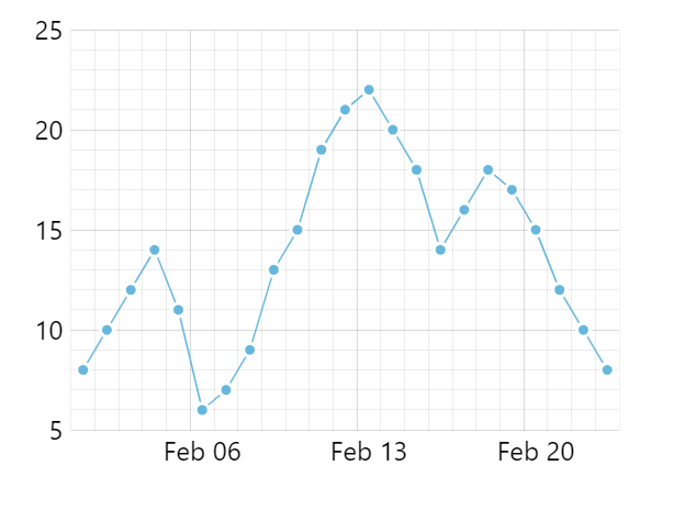
Charts solve this, by omitting some of the grid/labels. For example, on a chart with a Date Axis, it might display only grid for each month instead, when fully zoomed out.
In amCharts this process is controlled by axis renderer’s settings, such as minGridDistance.
However, concealing grid lines may diminish the ease with which a chart viewer can discern the scale and establish connections between individual data points in a series and their corresponding scale or category.
That’s where minor grid comes in!
What is minor grid?
Minor grid – when enabled – will show additional grid lines (and optionally labels) – usually less visually prominent – for skipped periods.
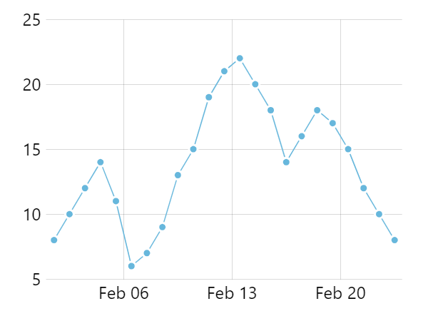
The minor grid enhances the perception of scale and the relationship of data to axis increments, without introducing excessive visual clutter to the chart.
amCharts implementation
Enabling minor grid
Enabling minor grid in an amCharts charts is as easy as setting minorGridEnabled: true in the settings of an axis. For example:
var xAxis = chart.xAxes.push(
  am5xy.DateAxis.new(root, {
    baseInterval: { timeUnit: "day", count: 1 },
    renderer: am5xy.AxisRendererX.new(root, {
      minorGridEnabled: true
    })
  })
);
The axis renderer itself will intelligently determine increments at which the minor grid lines are placed, and will ensure that the chart is still not to overcrammed with grid.
Minor grid effect on placement of axis labels
Normally, labels for a multi-period axis cell (when each increment includes several periods/categories) would be placed centered on the grid line.
Enabling minor grid would instead center the starting label on the first minor cell, so its clear which period or category it represents.

Minor grid labels
Minor grid does not display any labels by default.
They can be easily enabled with another axis renderer setting: minorLabelsEnabled: true.
var xAxis = chart.xAxes.push(
  am5xy.DateAxis.new(root, {
    baseInterval: { timeUnit: "day", count: 1 },
    renderer: am5xy.AxisRendererX.new(root, {
      minorGridEnabled: true,
      minorLabelsEnabled: true
    })
  })
);
Minor labels will display smaller than regular axis labels so they are less intrusive.
Configuring appearance of minors grid and its labels
Naturally, everything about minor grid and its labels is fully configurable.
Grid lines will automatically inherit all main grid settings such as color and width. They will just be slightly lighter in shade.
Similarly, minor labels will inherit settings from main axis labels, except will use slightly smaller font size.
If we need completely different settings for minor grid and labels, they can be applied via custom theme, e.g.:
var myTheme = am5.Theme.new(root);

myTheme.rule("Grid", ["minor"])).setAll({
  stroke: am5.color(0xFF0000),
  strokeWidth: 2,
  strokeOpacity: 0.05
});

myTheme.rule("AxisLabel", ["minor"])).setAll({
  fill: am5.color(0xe0e0e0)
});

root.setThemes([
  myTheme
]);
Demo
See the Pen Date axis with labels near minor grid lines by amCharts team (@amcharts) on CodePen.