Latest demos
Fresh from the lab.

Sankey Map With Waypoints
Animated crude oil flows from Gulf terminals through the Strait of Hormuz to refineries across Asia and Europe.
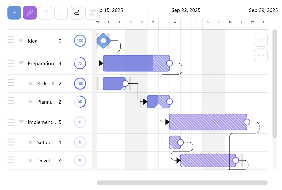
Editable Multilevel Gantt Chart
Drag-and-drop project planner with nested tasks, dependencies, and live progress updates.
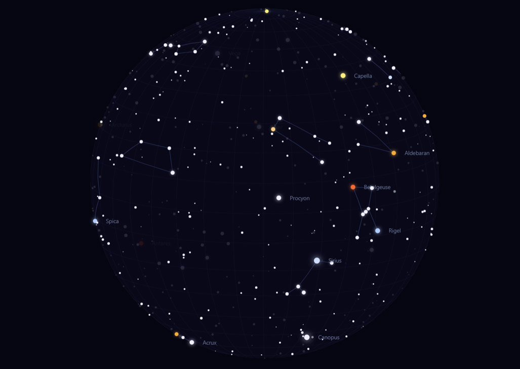
Celestial Sphere
Interactive 3D star globe with named constellations, auto-rotation, and twinkling stars.