New Themes Added
amCharts 5.20 came with a few visual enhancements among other things: we’ve added a few new themes as well as patterns.
New themes
Version 5.20 adds a batch of new themes: a dozen new color schemes, dark counterparts for every palette theme that didn’t have one, and two “parameterized” themes that build their palette from settings you pass in.
All of them are additive — they don’t touch the built-in Default, Dark, or any existing theme, so you can layer them the usual way.
root.setThemes([
  am5themes_Animated.new(root),
  am5themes_Nord.new(root)
]);
New color themes
| Theme | What it looks like |
|---|---|
Midnight | Dark theme on a deep-navy ground, with a palette tuned to read against it. |
Ember | Warm dark theme on a near-black ground; ambers, oranges and reds, plus a few cool hues so categories stay separable. |
Nord / NordDark | The Nord palette (Arctic Ice Studio). Cool, desaturated, deliberately low-contrast. Light sits on the “Snow Storm” off-white; dark on the “Polar Night” #2e3440. |
Pastel / PastelDark | Soft, low-saturation pastels. Light is a warm off-white ground; dark is a deep desaturated ground with chalky pastels. |
Colorblind / ColorblindDark | The Okabe-Ito eight-color set, which stays distinguishable under protanopia, deuteranopia and tritanopia. Colors loop rather than generate new ones, so the guarantee holds for any number of series. Like Dataviz and Kelly, the light version only sets the series palette. |
Patterns / PatternsDark | Categories encoded by shape instead of hue: every filled series gets the same gray with a distinct pattern fill (hatch, dot, star, triangle, grid). Line series are told apart by stroke width and dash. Legible for all forms of color blindness, and it survives being printed in black and white. |
Petroleum | Restrained, near-monochrome dark: gas-flare gold on a near-black ground, tight gold palette, one industrial-green accent. |
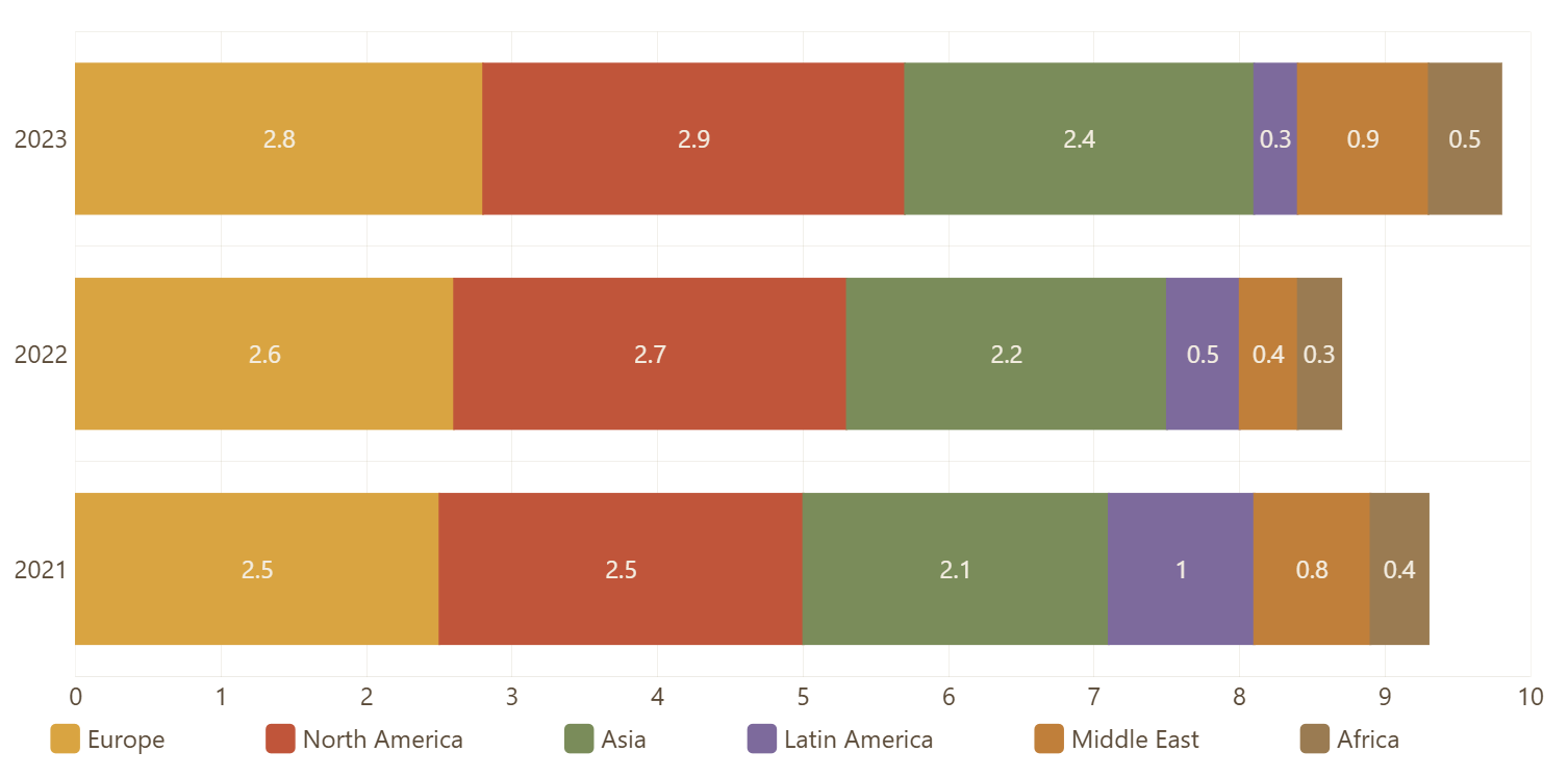
Savanna | Warm editorial light theme — cream/sepia ground with muted natural accents (amber gold, terracotta, olive, plum, ochre, walnut). |
Patterns also leans on two other 5.20 additions: the new StarPattern and TrianglePattern fills, and XYChart‘s new strokeWidths / strokeDasharrays settings.
Dark variants of existing themes
Every palette theme now has a ...Dark counterpart:
DatavizDarkKellyDarkMaterialDarkMoonriseDarkSpiritedDarkFrozenDark
A dark variant keeps its light counterpart’s series palette and swaps in a dark set of interface colors. The one exception: any palette entry too dark to be seen on a dark background gets lifted perceptually (in OKLCH) until it’s visible, holding its hue and chroma. Colors that were already bright enough are left alone.
Since they all share the same neutral dark interface colors, the variants differ only by their series palette.
root.setThemes([
  am5themes_KellyDark.new(root)
]);
Adaptive
Generates a whole palette from one or two base colors — useful when you need charts to match a brand color without hand-picking the other nine.
The generated colors are chosen in OKLCH so they stay perceptually balanced: even lightness and chroma, evenly spread hues. The first color is always the base color itself, so your brand color actually shows up in the chart.
A theme can’t take constructor parameters, so this ships as a factory function:
root.setThemes([
  am5themes_Adaptive(root, { baseColor: 0x2c6e91, dark: true })
]);
am5themes_Adaptive.new(root) also works if you want the defaults.
Settings
| Setting | Default | Description |
|---|---|---|
baseColor | #4b8e39 | Primary base color. Hex number, CSS string, or Color. The palette (and in dark mode, the interface colors) derive from it. |
baseColor2 | — | Optional second color. When set, the palette spans the two colors, interpolated in OKLCH, instead of fanning out from a single hue. |
count | 10 | How many series colors to generate. |
dark | false | Dark variant: faintly base-tinted dark background and matching interface colors. |
With one base color, the palette fans out from it in golden-angle hue steps at a moderated lightness and chroma — so even a very dark or very muted base still yields a readable set. With two, it interpolates across the arc between them and includes both endpoints.
With nothing set at all you get a green-to-yellow gradient.
// two-color gradient palette, 8 steps
root.setThemes([
  am5themes_Adaptive(root, {
    baseColor: 0x2c6e91,
    baseColor2: 0xe8a33d,
    count: 8
  })
]);
In light mode, Adaptive leaves the default look intact but drives the primary button color from the base, so buttons and controls pick up the brand hue too.
Monochrome
A single-hue lightness ramp — for when you want series ordered along a scale rather than categorically distinct, or just a restrained one-color look.
Same factory-function pattern:
root.setThemes([
  am5themes_Monochrome(root, { color: 0x2c6e91, dark: true })
]);
Settings
| Setting | Default | Description |
|---|---|---|
color | #2e7c9e | Base color the ramp is built from. Hex number, CSS string, or Color. |
accent | — | Optional accent applied to the first series only, so one series pops off the ramp (the way Dataviz uses its single color). |
dark | false | Dark variant. |
count | 7 | Steps in the ramp. |
The ramp holds the base color’s hue and chroma and varies only lightness, generated in OKLCH so the steps are perceptually even. On light backgrounds it runs mid-to-dark; on dark it runs light-to-mid, so every step keeps contrast with the ground.
// gray ramp with one highlighted series
root.setThemes([
  am5themes_Monochrome(root, {
    color: 0x888888,
    accent: 0xd94f3d,
    count: 5
  })
]);