This quick tutorial will serve as an introduction to the special type of series - CurvedColumnSeries.
Prerequisites
Just so we're in a familiar territory, let's start with a basic column chart.
It has one Column series, with an adapter coloring each column a new color.
See the Pen amCharts 4: Column chart with alternating colors by amCharts (@amcharts) on CodePen.
Your just everyday normal column chart.
Turning on the waves
To turn this boring chart into a Curved column chart, all we have to do is to switch series type from ColumnSeries to CurvedColumnSeries:
let series = chart.series.push(new am4charts.CurvedColumnSeries());
var series = chart.series.push(new am4charts.CurvedColumnSeries());
{
  "series": [{
    "type": "CurvedColumnSeries",
    // ...
  }]
}
The rest of the settings go just like it was regular Column series.
Let's see what we have now:
See the Pen amCharts 4: Curved column series (1) by amCharts (@amcharts) on CodePen.
Nice, huh?
Tweaking wave width
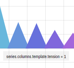
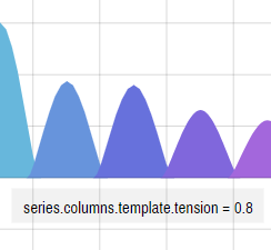
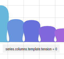
Among other things, you can also control width of the curved column by changing tension setting.
A tension is a setting which indicates how strong anchor points attract the line to it. The values can range from 0 (totally lose) and 1 (maximum force).
A setting of 1 (one) will attract the line to it, resulting in perfectly straight lines and pointy columns.
Below is n example how different tension settings affect the actual series appearance: