This tutorial will show how you can leverage a number of settings on Series and Axes to create offset/overlaid columns effect.
The task
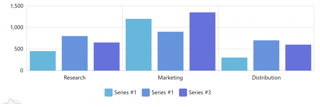
In the course of this tutorial we're going to turn this:
Into this:
Here's a live version of the source chart:
See the Pen amCharts 4: Overlaid column clusters by amCharts team (@amcharts) on CodePen.
Patient's ready. Let's get started.
Un-clustering columns
By default, all Column series on the chart get clustered, meaning that each category/date will be divvied up between each series in equal parts.
Since we want our columns to be overlaid, we need to disable that.
ColumnSeries's clustered propeprty will do the trick:
series1.clustered = false;
// ...
series2.clustered = false;
// ...
series3.clustered = false;
series1.clustered = false;
// ...
series2.clustered = false;
// ...
series3.clustered = false;
{
  // …
  "series": [{
    // …
    "clustered": false
  }, {
    // …
    "clustered": false
  }, {
    // …
    "clustered": false
  }]
}
Here's where that gets us:
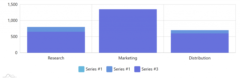
Now our columns are not clustered anymore, but they take up the whole width and overlap each other to the point of being unusable.
Let's see what we can do about it.
Shifting columns
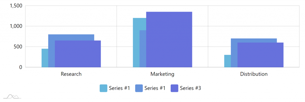
To make our chart more usable, let's shift our first column a bit to the left, and the third column a bit to the right. This will give us a bit of a non-overlapping space, so all columns are visible to some extent.
To shift any object in amCharts horizontally, we can use its dx property. It basically tells "move the object to the right (or left if value is negative) by X pixels".
series1.columns.template.dx = -20;
// ...
// We don't want middle column to shift, so we don't set dx on it
// ...
series3.columns.template.dx = -20;
series1.columns.template.dx = -20;
// ...
// We don't want middle column to shift, so we don't set dx on it
// ...
series3.columns.template.dx = -20;
{
  // …
  "series": [{
    // …
    "columns": {
      "dx": -20
    }
  }, {
    // …
    // Middle column stays put
  }, {
    // …
    "columns": {
      "dx": 20
    }
  }]
}
Here's the result:
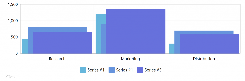
OK, now we can easily make out each individual column, bringing our chart back to the realm of useful data viz.
The columns look a bit fat, though. Let's slim them down.
Controlling column width
By default, each column takes 80% of the width allotted to it. If we need to change that, we can use column template's width property.
MORE INFO The whole logic of column width and its relation to clustering, axes, cells, and related stuff is thoroughly explained here.
Let's set the columns to use just 50% of the available space.
series1.columns.template.width = am4core.percent(50);
// ...
series2.columns.template.width = am4core.percent(50);
// ...
series3.columns.template.width = am4core.percent(50);
series1.columns.template.width = am4core.percent(50);
// ...
series2.columns.template.width = am4core.percent(50);
// ...
series3.columns.template.width = am4core.percent(50);
{
  // …
  "series": [{
    // …
    "columns": {
      // …
      "width": "50%"
    }
  }, {
    // …
    "columns": {
      // …
      "width": "50%"
    }
  }, {
    // …
    "columns": {
      // …
      "width": "50%"
    }
  }]
}
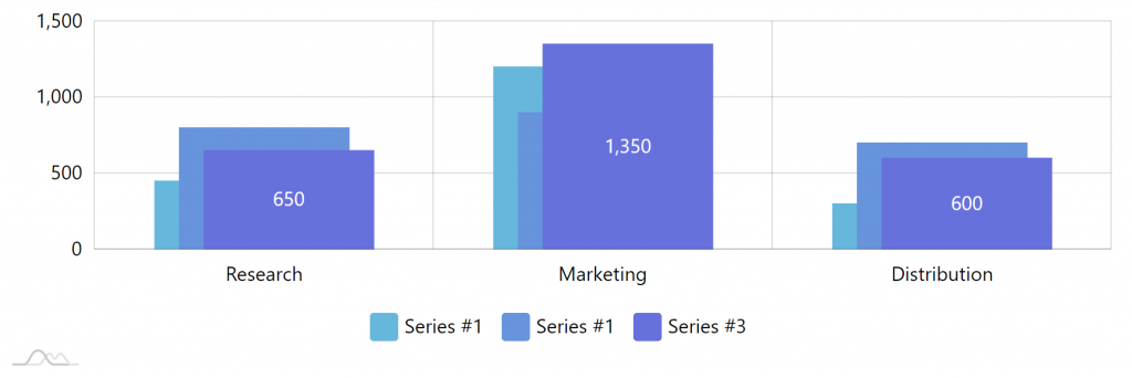
The result:
Looks quite nice now. Let's add the final cherry on the top.
Final example
See the Pen amCharts 4: Overlaid column clusters by amCharts team (@amcharts) on CodePen.