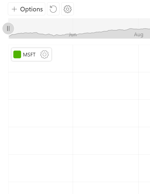
It's a generic control that can be populated with custom items for user to choose from, allowing enhancing stock toolbar with proprietary functionality.
Adding
Like any other control, it should be instantiated using new() syntax, and pushed into toolbar's controls list:
// Add custom dropdown
let myDropdown = am5stock.DropdownListControl.new(root, {
  stockChart: stockChart
});

// Add toolbar
let toolbar = am5stock.StockToolbar.new(root, {
  container: document.getElementById("chartcontrols"),
  stockChart: stockChart,
  controls: [
    myDropdown
  ]
});
// Add custom dropdown
let myDropdown = am5stock.DropdownListControl.new(root, {
  stockChart: stockChart
});

// Add toolbar
var toolbar = am5stock.StockToolbar.new(root, {
  container: document.getElementById("chartcontrols"),
  stockChart: stockChart,
  controls: [
    myDropdown
  ]
});
This will add a control, but it won't be useful just yet. We still need to:
- Add items to the list.
- Set up an event to handle selections.
Populating the list
To add items to the list, we need to supply an array of objects that correspond to IDropdownListItem interface.
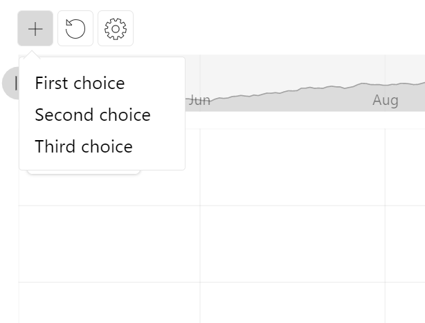
Basic labels
While there are a number of options available for each list item, the two required ones are: id and label.
id- a unique ID of the element. It will be used to identify chosen item internally, and in DOM.label- a textual label to display.
// Add custom dropdown
let myDropdown = am5stock.DropdownListControl.new(root, {
  stockChart: stockChart,
  items: [{
    id: "id1",
    label: "First choice"
  }, {
    id: "id2",
    label: "Second choice"
  }, {
    id: "id3",
    label: "Third choice"
  }]
});

// Add toolbar
let toolbar = am5stock.StockToolbar.new(root, {
  container: document.getElementById("chartcontrols"),
  stockChart: stockChart,
  controls: [
    myDropdown
  ]
});
// Add custom dropdown
var myDropdown = am5stock.DropdownListControl.new(root, {
  stockChart: stockChart,
  items: [{
    id: "id1",
    label: "First choice"
  }, {
    id: "id2",
    label: "Second choice"
  }, {
    id: "id3",
    label: "Third choice"
  }]
});

// Add toolbar
var toolbar = am5stock.StockToolbar.new(root, {
  container: document.getElementById("chartcontrols"),
  stockChart: stockChart,
  controls: [
    myDropdown
  ]
});
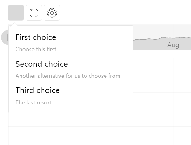
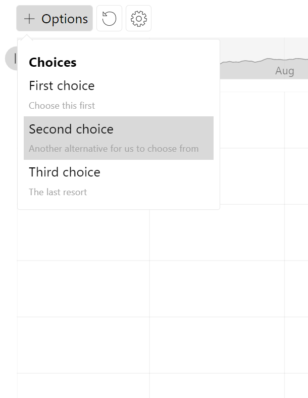
Sub-labels
Just like we are using label property of a list item to set main label, we can also add a second line using subLabel:
// Add custom dropdown
let myDropdown = am5stock.DropdownListControl.new(root, {
  stockChart: stockChart,
  items: [{
    id: "id1",
    label: "First choice",
    subLabel: "Choose this first"
  }, {
    id: "id2",
    label: "Second choice",
    subLabel: "Another alternative for us to choose from"
  }, {
    id: "id3",
    label: "Third choice",
    subLabel: "The last resort"
  }]
});

// Add toolbar
let toolbar = am5stock.StockToolbar.new(root, {
  container: document.getElementById("chartcontrols"),
  stockChart: stockChart,
  controls: [
    myDropdown
  ]
});
// Add custom dropdown
var myDropdown = am5stock.DropdownListControl.new(root, {
  stockChart: stockChart,
  items: [{
    id: "id1",
    label: "First choice",
    subLabel: "Choose this first"
  }, {
    id: "id2",
    label: "Second choice",
    subLabel: "Another alternative for us to choose from"
  }, {
    id: "id3",
    label: "Third choice",
    subLabel: "The last resort"
  }]
});

// Add toolbar
var toolbar = am5stock.StockToolbar.new(root, {
  container: document.getElementById("chartcontrols"),
  stockChart: stockChart,
  controls: [
    myDropdown
  ]
});
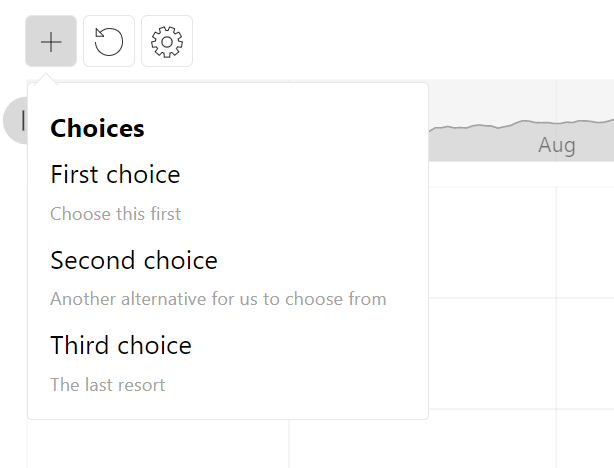
Headings
If we need to display a non-selectable item, such as heading, we can use className property to apply specific class names.
amCharts comes with a pre-defined CSS classes, that can be used for such occasions: "am5stock-list-info am5stock-list-heading":
// Add custom dropdown
let myDropdown = am5stock.DropdownListControl.new(root, {
  stockChart: stockChart,
  items: [{
    id: "heading1",
    label: "Choices",
    className: "am5stock-list-info am5stock-list-heading"
  }, {
    id: "id1",
    label: "First choice",
    subLabel: "Choose this first"
  }, {
    id: "id2",
    label: "Second choice",
    subLabel: "Another alternative for us to choose from"
  }, {
    id: "id3",
    label: "Third choice",
    subLabel: "The last resort"
  }]
});

// Add toolbar
let toolbar = am5stock.StockToolbar.new(root, {
  container: document.getElementById("chartcontrols"),
  stockChart: stockChart,
  controls: [
    myDropdown
  ]
});
// Add custom dropdown
var myDropdown = am5stock.DropdownListControl.new(root, {
  stockChart: stockChart,
  items: [{
    id: "heading1",
    label: "Choices",
    className: "am5stock-list-info am5stock-list-heading"
  }, {
    id: "id1",
    label: "First choice",
    subLabel: "Choose this first"
  }, {
    id: "id2",
    label: "Second choice",
    subLabel: "Another alternative for us to choose from"
  }, {
    id: "id3",
    label: "Third choice",
    subLabel: "The last resort"
  }]
});

// Add toolbar
var toolbar = am5stock.StockToolbar.new(root, {
  container: document.getElementById("chartcontrols"),
  stockChart: stockChart,
  controls: [
    myDropdown
  ]
});
NOTEWe can also use className to add any custom class attribute to our list items.
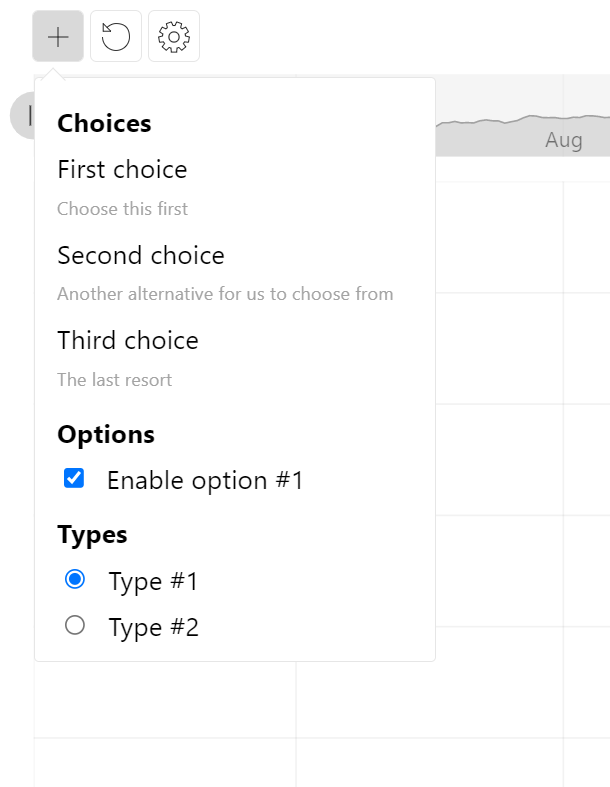
Form fields
Besides text labels, an item can contain form elements like radio and check-boxes.
The type of the form element is determined via item's form property. Currently it supports only two values: "radio" and "checkbox".
Besides form, it also provides two additional properties that are related to form fields:
value- a text value attribute of the checkbox.checked- a Boolean value indicating whether radio/checkbox is checked on by default.
Please note that radio items that need to belong to the same group must have the same id set.
NOTEradio items that need to belong to the same group must have the same id set.
// Add custom dropdown
let myDropdown = am5stock.DropdownListControl.new(root, {
  stockChart: stockChart,
  items: [{
    id: "heading1",
    label: "Choices",
    className: "am5stock-list-info am5stock-list-heading"
  }, {
    id: "id1",
    label: "First choice",
    subLabel: "Choose this first"
  }, {
    id: "id2",
    label: "Second choice",
    subLabel: "Another alternative for us to choose from"
  }, {
    id: "id3",
    label: "Third choice",
    subLabel: "The last resort"
  }, {
    id: "heading2",
    label: "Options",
    className: "am5stock-list-info am5stock-list-heading"
  }, {
    id: "check1",
    label: "Enable option #1",
    form: "checkbox",
    value: "1",
    checked: true
  }, {
    id: "heading3",
    label: "Types",
    className: "am5stock-list-info am5stock-list-heading"
  }, {
    id: "type1",
    label: "Type #1",
    form: "radio",
    value: "1",
    checked: true
  }, {
    id: "type2",
    label: "Type #2",
    form: "radio",
    value: "2"
  }]
});

// Add toolbar
let toolbar = am5stock.StockToolbar.new(root, {
  container: document.getElementById("chartcontrols"),
  stockChart: stockChart,
  controls: [
    myDropdown
  ]
});
// Add custom dropdown
var myDropdown = am5stock.DropdownListControl.new(root, {
  stockChart: stockChart,
  items: [{
    id: "heading1",
    label: "Choices",
    className: "am5stock-list-info am5stock-list-heading"
  }, {
    id: "id1",
    label: "First choice",
    subLabel: "Choose this first"
  }, {
    id: "id2",
    label: "Second choice",
    subLabel: "Another alternative for us to choose from"
  }, {
    id: "id3",
    label: "Third choice",
    subLabel: "The last resort"
  }, {
    id: "heading2",
    label: "Options",
    className: "am5stock-list-info am5stock-list-heading"
  }, {
    id: "check1",
    label: "Enable option #1",
    form: "checkbox",
    value: "1",
    checked: true
  }, {
    id: "heading3",
    label: "Types",
    className: "am5stock-list-info am5stock-list-heading"
  }, {
    id: "type1",
    label: "Type #1",
    form: "radio",
    value: "1",
    checked: true
  }, {
    id: "type2",
    label: "Type #2",
    form: "radio",
    value: "2"
  }]
});

// Add toolbar
var toolbar = am5stock.StockToolbar.new(root, {
  container: document.getElementById("chartcontrols"),
  stockChart: stockChart,
  controls: [
    myDropdown
  ]
});
Name of the control
Default name
By default, control will be represented with just an icon.
We can also set its name setting to supply a text label next to the icon:
let myDropdown = am5stock.DropdownListControl.new(root, {
  stockChart: stockChart,
  name: "Options",
  items: [{
    id: "id1",
    label: "First choice"
  }, {
    id: "id2",
    label: "Second choice"
  }, {
    id: "id3",
    label: "Third choice"
  }]
});
var myDropdown = am5stock.DropdownListControl.new(root, {
  stockChart: stockChart,
  name: "Options",
  items: [{
    id: "id1",
    label: "First choice"
  }, {
    id: "id2",
    label: "Second choice"
  }, {
    id: "id3",
    label: "Third choice"
  }]
});
Selectable or fixed name
Once an item is chosen from the list, it will replace default name.
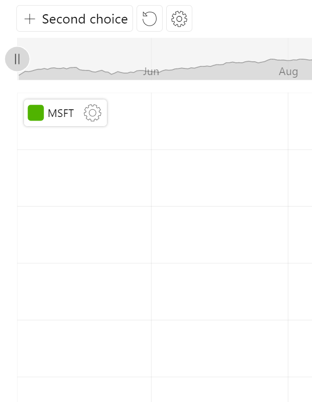
If we'd like our control button to keep the original name (or no remain label-less), we can set control's fixedLabel: true setting.
let myDropdown = am5stock.DropdownListControl.new(root, {
  stockChart: stockChart,
  name: "Options",
  fixedLabel: true,
  items: [{
    id: "id1",
    label: "First choice"
  }, {
    id: "id2",
    label: "Second choice"
  }, {
    id: "id3",
    label: "Third choice"
  }]
});
var myDropdown = am5stock.DropdownListControl.new(root, {
  stockChart: stockChart,
  name: "Options",
  fixedLabel: true,
  items: [{
    id: "id1",
    label: "First choice"
  }, {
    id: "id2",
    label: "Second choice"
  }, {
    id: "id3",
    label: "Third choice"
  }]
});
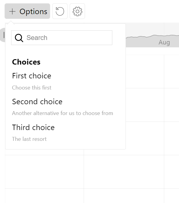
Searchable list
Enabling search
We can also enable search in the list by setting searchable: true in control's settings:
let myDropdown = am5stock.DropdownListControl.new(root, {
  stockChart: stockChart,
  name: "Options",
  fixedLabel: true,
  searchable: true,
  items: [{
    id: "id1",
    label: "First choice"
  }, {
    id: "id2",
    label: "Second choice"
  }, {
    id: "id3",
    label: "Third choice"
  }]
});
var myDropdown = am5stock.DropdownListControl.new(root, {
  stockChart: stockChart,
  name: "Options",
  fixedLabel: true,
  searchable: true,
  items: [{
    id: "id1",
    label: "First choice"
  }, {
    id: "id2",
    label: "Second choice"
  }, {
    id: "id3",
    label: "Third choice"
  }]
});
Dynamic search results
Typing in the search box, will automatically filter the list by looking for text appearances among item labels and sub-labels.
We can also supply a custom function via searchCallback setting.
It must be a function that will receive a search query, and which returns an array of list items matching that query.
let myDropdown = am5stock.DropdownListControl.new(root, {
  stockChart: stockChart,
  name: "Options",
  fixedLabel: true,
  searchable: true,
  searchCallback: function(query) {
    // ...
  },
  items: [{
    id: "id1",
    label: "First choice"
  }, {
    id: "id2",
    label: "Second choice"
  }, {
    id: "id3",
    label: "Third choice"
  }]
});
var myDropdown = am5stock.DropdownListControl.new(root, {
  stockChart: stockChart,
  name: "Options",
  fixedLabel: true,
  searchable: true,
  searchCallback: function(query) {
    // ...
  },
  items: [{
    id: "id1",
    label: "First choice"
  }, {
    id: "id2",
    label: "Second choice"
  }, {
    id: "id3",
    label: "Third choice"
  }]
});
Events
List item selected
To catch the moment user chooses something from the list, we'll use control's selected event:
let myDropdown = am5stock.DropdownListControl.new(root, {
  stockChart: stockChart,
  items: [{
    id: "id1",
    label: "First choice"
  }, {
    id: "id2",
    label: "Second choice"
  }, {
    id: "id3",
    label: "Third choice"
  }]
});

myDropdown.events.on("selected", function(ev) {
  // An item selected
  console.log(ev.item)
});
var myDropdown = am5stock.DropdownListControl.new(root, {
  stockChart: stockChart,
  items: [{
    id: "id1",
    label: "First choice"
  }, {
    id: "id2",
    label: "Second choice"
  }, {
    id: "id3",
    label: "Third choice"
  }]
});

myDropdown.events.on("selected", function(ev) {
  // An item selected
  console.log(ev.item)
});
Radio/checkbox checked
To catch an event when some form element is interacted with, we will use changed event on the control's list element:
let myDropdown = am5stock.DropdownListControl.new(root, {
  stockChart: stockChart,
  items: [{
    id: "id1",
    label: "First choice"
  }, {
    id: "id2",
    label: "Second choice"
  }, {
    id: "id3",
    label: "Third choice"
  }]
});

myDropdown.getPrivate("dropdown").events.on("changed", function(ev) {
  // Form field changed
  console.log(ev);
});
var myDropdown = am5stock.DropdownListControl.new(root, {
  stockChart: stockChart,
  items: [{
    id: "id1",
    label: "First choice"
  }, {
    id: "id2",
    label: "Second choice"
  }, {
    id: "id3",
    label: "Third choice"
  }]
});

myDropdown.getPrivate("dropdown").events.on("changed", function(ev) {
  // Form field changed
  console.log(ev);
});
Example
See the Pen Stock chart with series type control by amCharts team (@amcharts) on CodePen.